I really enjoyed taking this course. Initially, I had no idea what the course was about or what GIS was, only that it was a requirement for my degree. At first I was intimidated by the software however I found out with time that it just takes patience and attention to detail to use it effectively. I believe that an understanding of GIS is very important and useful within the world of geography, whether it be in the arts or sciences. Admittedly, my favourite parts of the course were when I finished my maps and formatted them, taking time to really understand them and try to make them appealing and legible for almost anyone. Understanding how maps are produced and can be manipulated was very interesting. I would recommend GEOB270 to anyone who is interested in maps and/or geography.
Author Archives: Mieke Vink
Final Project Statements
Abstract:
The western side of British Columbia is highly susceptible to earthquakes due to its location on the Cascadia subduction zone along the Ring of Fire. Focused on the City of Vancouver, this project analyzes and assesses the risks posed by this natural disaster and the city’s preparedness. Aided by data obtained through Statistics Canada and the City of Vancouver’s open data catalogue, our team created three maps. The first map shows the surface geology of the Greater Vancouver Area, the second map visually represents which schools have and have not been seismically upgraded within the city, and the third map demonstrates the location of disaster support hubs as well as our proposition for additional hubs. Through our representation of the surface geology, we were able to delineate hazard zones within the city. Because Vancouver is moderately safe, further research allowed us to identify different risks, such as Seismically Upgraded (or not) schools in our second map. In our third map, the preparedness of the city was assessed by creating buffers and identifying areas that would not be supported should there be a disaster. These maps were useful in determining which places in the city need spots for safe gathering when citizens require support services. With this information in mind, we propose that there should be 9 additional hub locations.
Project Management:
Our group was very efficient. We had ideas for a map based on science and maps based on the social aspect of our topic. We split up into 2 groups of 2 and one pair worked primarily on the social aspects of our project while the other worked on the geological map and conclusions. We had a group chat on Facebook and there was at least one person working on the project almost every day. We had very good communication and initiative within our group.
What I learned:
I learned a lot about Vancouver’s procedures that are in place in case of a disaster. I did not know that there were planned safety support hubs all over the city and I found it very interesting. It makes me wonder how Toronto (the city that I’m from) would deal with a disaster and if we have a similar action plan to Vancouver’s, even though we are not as susceptible to earthquakes. I also learned a lot about the geology of the GVA and how earthquakes affect different types of sediment and geological materials.
I also learned that group projects can be a lot of fun with the right people, open communication and lots of planning as I have had bad experiences with group projects in the past. Arc-GIS is sometimes difficult to navigate and wrap my head around but I learned that there are many online resources that can help with understanding the program better.
Lab 5
Hypothetical Memo:
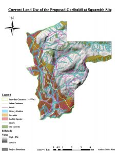
The Garibaldi at Squamish project aims to erect a mountain resort that would cater to the public as a year-round recreation and leisure facility. The project is estimated to take about 20 years to build on a controversial site due to the area’s undisturbed natural state and beauty. It has taken almost 20 years for the project to finally get environmental approval. As a natural resource planner, this has been a very interesting story to follow and take part in the decision making. Through this assessment I have further considered the project through GIS analysis.
The data from this analysis was obtained from DataBC, a very credible source.
I used the data to analyze the project area in terms of certain endangered (red-listed) species along with the snowline of 555m which determines areas of consistent and reliable skiing snow. Interestingly, the area below 555m (29.92% of the project area), where there may not be enough snow, is similar to that of the area where the red-listed species exist (24.83% of the project area). This means that skiing would most likely not occur over the areas where the species exist. This being said, the area may be used for other purposes and the project would most likely still have a negative effect on those species. The snowline contour was made with the digital elevation model (DEM) of the land. The file was raster but converted to a vector polygon to make analysis possible. The red-listed species data was isolated from a larger file and the areas that these species inhabit were added up. The percentages were taken from the area of the project boundary polygon.
The ungulate habitat area was extracted from the UWR layer and represents 7.89% of the project area. Old growth forest data was obtained with the OGMA layer and occupy 6.78% of the total project area. The TRIM_trivr layer was used to obtain information about the fisheries. A buffer was used to create polygons as opposed to lines and therefore making it possible to calculate the area of the fish ecosystems which is 26.02%. This means that 52.62% of the project area falls on protected areas.
Because the majority of the project area lies on environmentally protected areas, I still stand by my previous stance to oppose the project. No matter how the areas in question are protected, the natural resources and other organisms will be affected by development or any kind within the project boundary. There are no ways to avoid this fact, only precautions that can be made to lessen the negative effects the project would have on the proposed project environment. Since the project has already been approved, my biggest worries are that the biodiversity of the protected areas will go down, therefore further endangering the red-listed species and also the effect that the vast amount of tourism will have on the project’s land, negatively affecting the existing environment and wildlife. The most that can be done to prevent damaging the eco-systems is for the park to enforce strict rules for everyone to follow that will aid the protection of the species and ecosystems. For example, strict no-littering rules can be put in place and they can fence off the protected areas. The park can help by actively taking care of the land including smart waste removal and helping to maintain the wildlife.
Note:
Because of the reasons stated in my memo, I would still oppose the project. No matter what happens, any development and change to the land will affect the existing wildlife and habitats within the project boundary and most likely the areas surrounding the project boundary. This is an issue especially for the endangered species as their fundamental niches will be diminished and so will their realized niches therefore giving them less options as to where they can survive and endangering the biodiversity and the species further. Not only will the development of the area will affect the species, but the sudden influx of tourists which will further damage the ecosystems and throw them off balance.
Lab 4
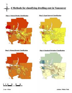
Quantitative Data Classification
QUESTION 5 (5)
Since you are a journalist, putting together maps of housing cost in Vancouver, which classification method would you choose for your audience and why? What if you are a real estate agent preparing a presentation for prospective home buyers near UBC? Are there ethical implications for your choice of classification method? This data is from 2011 – it is now 2017 – should you even be using this data? Discuss.
As a journalist, I would want to classify the data with natural breaks because I would want to show the most accurate representation of the data. Using natural breaks, the system divides the data based on its distribution, reducing the amount of error.
As a real estate agent, I would choose manual breaks because I would want my clients to think of Vancouver as an affordable city. Using manual breaks, it would also be possible to show my clients the most affordable houses/apartments based on their budget.
I believe that there are definitely ethical implications that come with choosing one method of data classification over another. For example, a journalist would most likely use the most accurate representation of the data however depending on the story they trying to portray, I could chose a method that might . But as a real estate agent, I may want to report on or the story they want to tell and the biases of that story. This being said, a real estate agent would want to portray the data in the least intimidating way possible to their client. They would choose the method of classification that would best suit the client and what they are looking for according to price range or even wealth/socioeconomic class of the neighbourhood.
Housing affordability in Vancouver has changed in the past 6 years as the real estate market has grown, so using the 2011 data would not be representative of housing affordability in Vancouver today.
Housing affordability:
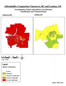
The categories for rating affordability go: Affordable, Moderately Unaffordable, Seriously Unaffordable, Severely Unaffordable
It is to be noted that affordability is not always a good indicator of livability. This being said, areas that are more livable tend to have more expensive housing costs.
Lab 3
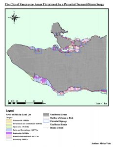
Facilities that are in danger:
health facilities:
- False Creek Residence
- Broadway Pentecostal
- Lodge, Yaletown House Society
- Villa Cathay Care Home
Education facilities:
- St Anthony of Padua
- École Rose des Vents
- False Creek Elementary
- Emily Carr Institute of Art and Design (ECIAD)
- Henry Hudson Elementary.
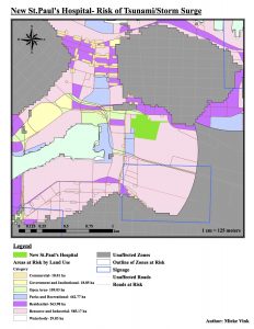
From the New St. Paul’s Hospital Map, we can see that it lies within the area that is vulnerable to damage by a tsunami or a storm surge. This location may be less than suitable for the hospital that must take care of already vulnerable people.
Lab 2
QUESTION 2 (1)
What is the difference in distance? Although the difference may not be substantial for such a long distance, it does show the need to pay attention to the coordinate system used when performing spatial analysis.
4446.526656km -4441.732918km= 4.793738km
QUESTION 3 (1)
Landmasses attain different shapes and areas depending upon the coordinate system and map projection. Find Ellesmere Island in northern Canada. Note its shape. Change the dataframe coordinate system back to Geographic Coordinate System>NAD_83 (CSRS). Look at Ellesmere Island now. Which does a better job of maintaining shape?
Elsmere Island appears to be much more stretched in the Geographic Coordinate System NAD_83 (CSRS). It is now a lot wider and a lot longer, “pointing” and bending towards the right of the screen. Canada Lambert Conformal Conic is the better projection at maintaining Elsmere Island’s shape.
QUESTION 10 (3)
Landsat data provides a repository of raster data imaging of the world, in approximately 16 day intervals, since 1972. You have had a glimpse of the power of this dataset to geographic analysis in comparing Landuse change after the volcanic eruption of Mt. St. Helen’s. Give another example where Landsat data would be useful for geographic analysis. In your answer, describe the question you need to research, the geographic location, and the time interval you would select from Landsat images. Are there any requirements for time of year or season?
Since Lansat collects data by measuring the differences in surface albedo on land, a good use for Landsat data for geographic analysis would be glacial activity over time as glaciers have high albedos so it easy to monitor their size and movement. One would have to research a question along the lines of “What is the rate at which glaciers are receding/melting?”. The geographical location would need to be areas where there are glaciers such as the artic. The time interval of data collection would have to be continuous over a timespan of many years, perhaps decades. The data could then be used to calculate year-long averages or seasonal averages for glacier land cover and size since the values will fluctuate throughout the seasons as the climate transitions from warm to cold or vice versa.
Meet Nzilani
Description:
One of the first topics we covered in one of my courses, titled Geography, Environment and Globalization, was the concept of “Imaginative Geographies”. During this unit, I learned that an imaginative geography is essentially what an individual or a collective group recalls when they think of a place. This means that everything a person is exposed to in relation to a specific place will affect their imaginative geography of that location. These constructs can be easily skewed by the media, peers and personal experiences. This topic has become of increasing interest to me as I have come to realize just how much my personal life and everyone’s lives are affected by imaginative geographies on a daily basis. We are surrounded by a society that self-categorizes everything into groups, always creating an “us vs. them” dynamic. It is interesting to study how these constructs affect how individuals perceive the world and how the world perceives them.
In this assignment, I analyze a piece of media and how it plays into an affects its viewers’ imaginative geographies. This video that I chose is called “Meet Nzilani, a 6 Year Old Girl Living in Kenya” posted by the Canadian World Vision channel. This video is not of my making, it is simply the subject of my report. The video is posted below:
Imaginative Geographies Assignment
“Meet Nzilani, a 6 Year Old Girl Living in Kenya” is a video made by a popular private relief and development agency called World Vision. This video outlines a Kenyan girl’s life emphasizing her daily hardships; the main goal being to persuade people to donate money towards World Vision’s Sponsor a Child Fund. Every detail that a person acquires about a place, whether it be from a firsthand source or secondhand source that has been through a series of political filters is added to that person’s understanding of the life and culture in that given location. This set of knowledge is called an imaginative geography as it is the information a person recalls and takes to embody the entire geographical or conceptual territory. The images and ideas conveyed through this video are a distortion of Kenyan culture and life and contribute to a negative imaginative geography of Kenya.
The video starts with footage of a young Kenyan girl walking, with a seemingly young voice over actor narrating in first person “I feel sad today. My teacher sent me home again because I didn’t have any money for school fees.”(0:00). Immediately, a disconnect is created between Nzilani, the girl featured in the video and the viewers. This video is posted by World Vision Canada meaning that the targeted audience is Canadians, who would not encounter the same issues that face Nzilani. For example, in Canada, it is mandatory for children of Nzilani’s age to attend school and the education system is government funded. Throughout the entire video this dynamic stays constant- “Nzilani” recounts elements of her daily life that most likely evoke shock and empathy from the viewers as they are accustomed to a different standard of living to that of the girl in the video. Thus, a power dynamic is developed and increasingly legitimized as the video progresses continuously portraying Nzilani as a poor and helpless little girl. This power dynamic is especially strengthened when it becomes evident to the viewer that they are the one who has the power to “save” her. At the end of the video, “Nzilani” says, “I just wish I could have water that is clean and doesn’t make me feel sick, that would be good. But these things are just my wishes, I don’t know if they will ever come true. All I can do is to hope that it is so.”(2:10). If we accept that knowledge is a form of power, then viewers of this segment are automatically placed in the position of power and are consequently held accountable for their actions regarding this child’s future.
The tone that the voice actor uses to portray Nzilani is grave and helpless throughout the entire segment. Her life and daily regime builds on the imaginative geographies that the viewers have constructed of Kenya. Nzilani is the only individual portrayed in the video which insinuates a certain level of loneliness and enforces the idea that there is a lack of community in her life and therefore, perhaps Kenya. The idea that there is no sense of community originates from when “Nzilani” mentions, “Since Momma died, my three sisters and I are all alone. We don’t have a house of our own. A lady in our village lets us stay with her, the four of us are allowed to use one room if we do chores for her.” (0:30). The simple use of the words “lets” and “allowed” makes it seem as if the lady is not welcoming or caring of the girls when this may not be the case. Another piece that might be left to misinterpretation is that a cultural difference exists in that it is more common and expected of children to help out and do chores in rural Kenya whereas in other, “more privileged” cultures, this would be less common. Additionally, the video further separates “us” the viewers from “them” the Kenyans by using a stereotypical but exotic African symbol, the elephant as one of Nzilani’s many perils.
While Nzilani may unfortunately encounter all of the complications and hardships portrayed in this video, Word Vision’s media fails to encompass many, if any of the socio-economic, political and cultural intricacies of Nzilani’s world. The cultural difference that exists between the viewers’ culture and the one that is portrayed in the video is the driving force behind the viewers’ actions to help. This form of media, while effective does an injustice to not only the individuals, cultures and nations in question but also to the viewers whose imaginative geographies are subject to over simplification.
References:
Meet Nzilani, a 6 Year Old Girl Living in Kenya. Youtube. World Vision Canada, 19 May 2015. Web. 1 Oct. 2016. <https://www.youtube.com/watch?v=F1Zpm2ljx60>.
Hello world!
Welcome to UBC Blogs. This is your first post. Edit or delete it, then start blogging!