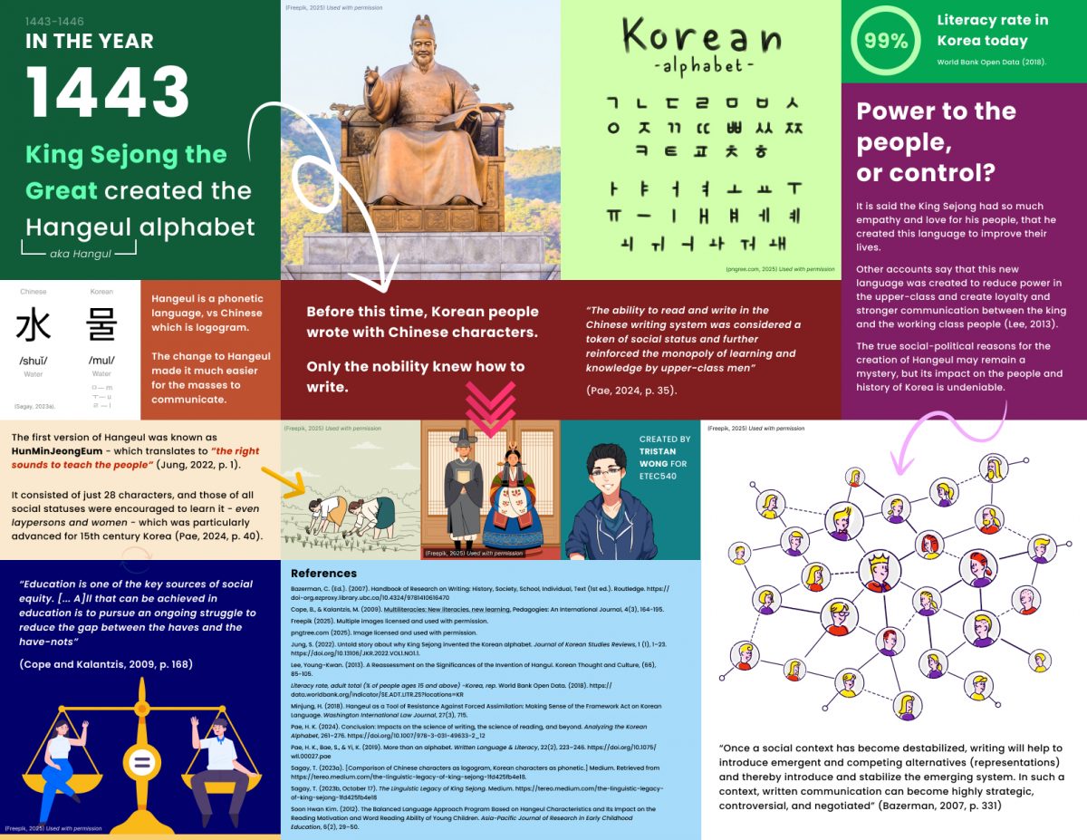
Categories
Linking

Linking Assignment

Link 1 – Task 1

https://blogs.ubc.ca/sourabhaggarwal/2025/01/15/whats-in-my-bag/

Since this was the first assignment in this course, I was really curious to see what other people included as part of their “bag”. After reading the example provided to the class, I felt very much that my bag was sort of boring and hyper-functional (as the example was going through an avid paddler’s bag!). I also felt that perhaps what I had presented felt a bit “bleached” or failed to show any information about myself. After visiting Sourabh’s submission, I felt a lot better because:

  1. He also had a bag that I felt was similar to mine in terms of function
  2. Even though his bag was similar in function, I did not at all get the sense that I could not discern information about him, in fact, it felt like there was plenty of information on display – I shared my comments on Sourabh’s post as well.

I realized (alongside my peer’s and professor’s comments) that my bag was actually interesting, and that despite my misgivings, there was actually a lot of information that could be taken from my image. I believe that this gave me a really good foundation to start the course, and opened up my mind to the different ways of thinking I may be exposed to during this course.


Link 2 – Task 3

https://blogs.ubc.ca/keizern/voice-to-text-task-3

As captured in my comments to Natalie, I felt that we shared a lot of similar outcomes from the voice to task assignment. We both mostly found that the use of punctuation was one of the larger challenges we faced with this task.

We both also agreed that a scripted version of our oral story would have been most organized – though Natalie focuses more on her own ability to “control” the outcome by speaking clearer, whereas I focused more on how the output of the text would be impacted by such a change.

Lastly, we both took away that oral storytelling is in a category of it’s own right. Natalie described it as an “art form in itself” (Keizer, 2025), while I wrote that “Oral storytelling is also in many ways a form of visual storytelling” (Wong, 2025). We both highlighted the differences between oral storytelling and written storytelling, including the pros and cons of each.

References

Keizer, N. (2025, January 25). Voice to text task 3. Text Technologies The Changing Spaces of Reading and Writing. https://blogs.ubc.ca/keizern/voice-to-text-task-3

Wong, T. (2025). Task 3: Voice to Text Task. ETEC 540 Tristan Wong. https://blogs.ubc.ca/twong540/task-3-voice-to-text-task/


Link 3 – Task 6

https://blogs.ubc.ca/twong540/task-6-an-emoji-story/

Pasted from my blog entry (linked above)

As part of my Task 6 submission, I visited my colleagues websites and took my best guess at what their emoji stories could be:

Tom Skinner created a whole bunch of really creative ideas which included: Pineapple Express, Batman, Spiderman, and Brokeback Mountain: https://sites.google.com/view/etec540-tomskinner/assignments-and-activities

Jazz Chapman wrote about some sort of medical TV show – I’m not a big TV watcher so I would have to guess Grey’s anatomy or something similar: https://blogs.ubc.ca/jasminechapmanetec540/2025/02/16/an-emoji-tv-show/

Tatiana Kloster‘s post displayed a movie that I’m not sure of the title. When I first saw the emojis, I thought of the movie “Bridesmaids”, but I realized that doesn’t match the hint of the title, so I was a bit stuck: https://sites.google.com/view/etec540/weekly-tasks/an-emoji-story

It was very interesting to see the variety of stories that my colleagues created for this task. I found that there was a wide variety of approaches with this task, with many people using emojis to describe the title, plot, and/or both! I realized that my take on this task was a bit simplistic, but I still believe it was an effective approach at conveying the crux of the movie. That being said, comments on my post made me realize that there were probably a few movies that shared a very similar plot to what I shared, which was an oversight.

I do not regularly watch movies, in fact, I usually avoid watching movies as it is not an activity that I actively enjoy. I would say that I probably watch less than five movies a year (if that). So I found this task sightly challenging while visiting other webspaces, as there were probably many “easy” emoji stories that I did not know due to my lack of knowledge. To me, this highlighted how our culture, background, and upbringing might influence how we are able to interpret and communicate with others effectively.


Link 4 – Task 7

https://blogs.ubc.ca/jgock87/2025/02/21/task-7-mode-bending/

This week, I chose Jon’s task because we both took away similar points from the week’s readings and decided to “mode-bend” by shifting the assignment to an aural format.

Interestingly, this is mostly where the similarities in our approaches end, as Jon’s direction focused on the sounds of the objects in his bag, while I focused more on a socio-cultural approach – attempting to created a “reaction-style” piece.

What I really appreciated about Jon’s post was how he highlighted the accessibility component of an auditory approach, and how the cultural contexts might heavily impact one’s perception of those sounds. I found his post to be extremely insightful and impactful on my thinking.

Meanwhile, I attempted to make a slight commentary on current-day content by paying homage to both podcasts (which have seen rapid popularity over the past few years), as well as reaction videos – an internet staple. I also thought that changing the content of the task to more personal items might be a more interesting take on the original task.

While these are both extremely valid directions to take this assignment. I felt very strongly that Jon had presented some very powerful ideas that stayed with me through the rest of the course.

References

Cope, B., & Kalantzis, M. (2009). Multiliteracies: New literacies, new learning. Pedagogies: An International Journal, 4(3), 164-195.

The New London Group. (1996). A pedagogy of multiliteracies: Designing social futures. (Links to an external site.) Harvard Educational Review 66(1), 60-92.


Link 5 – Task 8

https://blogs.ubc.ca/writingacrossthecenter/task-8-golden-record-curation/

For this link, I chose Evan’s submission. I found that while we mostly agreed on the approach, Evan had some valuable insights for his approach which I hasn’t considered.

For example, Evan’s process included dividing the audience between humans and aliens, and then focused on how to select the tracks for an alien audience – disregarding things that would not be relevant to them (such as country of origin).

Although slightly humorous, I hasn’t thought of how things that were important factors for us (e.g. country of origin) would be completely irrelevant to an alien civilization. In fact, I made a point to ensure that as many continents as possible were represented on the record.

Despite aliens not knowing our civilization, continents, and culture, I am not sure that the country of origin is something that should be discarded entirely. Although they would not care about the country of origin, it can not be argued that the country of origin does not impact the sound/music, and from a human perspective, it is important to include diverse sounds and perspectives – which is why I think it could still be an important factor in the decision-making process.

Even so, Evan and I ended up matching on five out of the ten tracks, which is not a small amount – so our similarities in approach when considering a variety of songs using factors such as instrumental/vocal nature, speed, and purpose seemed to still align in the end.


Link 6 – Task 10

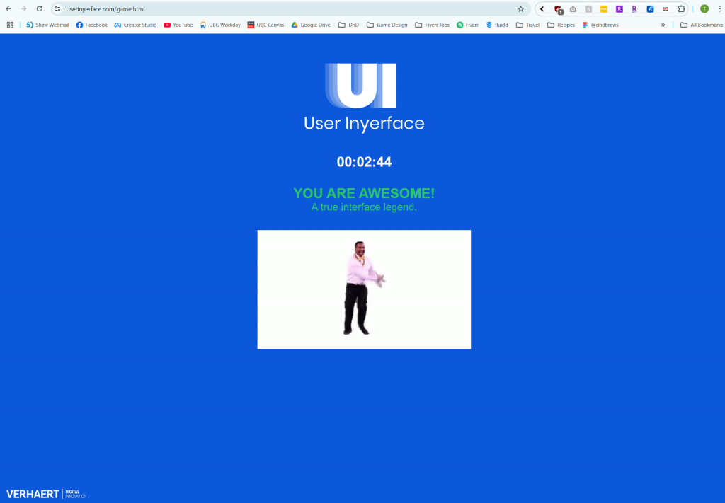
https://blogs.ubc.ca/veltri540/2025/01/12/task-10-attention-economy/

Isabella wrote about her challenges using the User Inyerface website as someone who with ADHD. As someone who has also been diagnosed with ADHD, I instantly connected with her post.

While our experiences using the website may have differed. I connected greatly to the frustration that Isabella described in her reflection. While I did not struggle on this task in a similar way, the experiences that Isabella described were things that I have felt many times over my life, in many differences scenarios.

It is always powerful to see stories of others who may experience similar things to you, and I think that this is a great example of how these sorts of tasks can link and unite people (even in a passive or roundabout way). Learning about others is how we can create a sense of community and belonging – even in a world that has become increasingly isolated and digital.

Categories
Final Project

Final Project: Describing Communication Technologies

Categories
Tasks

Task 12: Speculative Futures

For this task, I decided to analyze Copilot’s rendition of this narrative. The LLM’s response is below:

Picture this: you’re wandering through the overgrown remnants of a city, where nature has woven itself into the bones of skyscrapers and highways. Vines drape over rusted cars, and wildflowers burst through cracks in the pavement. The world as we knew it has unraveled, but amid the quiet decay, there’s an unexpected serenity.

Suddenly, something catches your eye—a glint of iridescent light beneath a tangle of ivy. Curious, you pull back the leaves to reveal a sleek, oval device that fits snugly in your hands. It’s unlike any instrument you’ve seen before, a seamless blend of organic curves and metallic sheen. This is the Lumina, a relic from the days when technology teetered on the edge of wonder and caution.

Gently, you trace your fingers along its surface, and the Lumina comes alive. Soft, luminescent patterns ripple across it like the reflection of stars on water. Then, a melody begins to emanate—not from speakers, but as if the air itself is humming. The notes are ethereal, weaving together harmonies that resonate deep within you. It’s as if the instrument is reading your emotions, translating them into sound.

Here’s the magical part: the Lumina is powered by an AI designed to interpret biometric signals—heartbeat, body temperature, even subtle shifts in your mood. In the years before society’s great shift, engineers dreamed of technology that could create art in tandem with its user. The AI doesn’t just play music; it collaborates with you, turning your innermost feelings into a symphony of light and sound.

As you explore its capabilities, the music shifts from hauntingly beautiful to playfully uplifting, mirroring the delight blooming inside you. The Lumina becomes more than an instrument; it’s a companion, a bridge between isolation and expression in this fragmented world.

Others, drawn by the captivating sounds, begin to gather. Strangers become an impromptu audience, their faces softening as the melodies touch something universal within them. Someone laughs; another sheds a tear. The AI responds to the collective presence, enriching the music, creating layers that hadn’t been there before.

In this moment, the lines between human and machine blur in the most enchanting way. Artificial intelligence isn’t a harbinger of doom here—it’s a catalyst for connection, a reminder of the creativity and empathy that endure despite everything. The Lumina demonstrates that technology can have a soul, not in the literal sense, but in how it amplifies the best parts of us.

You can’t help but feel a swell of hope. If an instrument like this exists, what else might be out there? What other remnants of innovation and beauty are waiting to be rediscovered? The delight isn’t just in the music but in the rediscovery of possibility itself.

So you share the Lumina with those around you, each person adding their own essence to the evolving harmonies. The air fills with a tapestry of sounds—joyful, complex, alive. It’s a spontaneous celebration, a fleeting yet profound connection that seems to promise that this fractured society can find its way back to something whole.

Isn’t it incredible how, even in the aftermath of upheaval, we can find gems that ignite our capacity for wonder? Instruments like the Lumina aren’t just about advanced technology; they’re about reclaiming our innate desire to create, to feel, to connect. They show that artificial intelligence, when intertwined with human spirit, can lead to moments of pure, unadulterated delight.

(Microsoft, 2025)

Reflection

I was actually very impressed by the story that Copilot created in response to this prompt. I found myself drawn to the concept that it had invented, and was invested in the narrative. I was also surprised at how well it spoke about AI (considering that it is AI). The product also made me wonder about what kind of source material the AI may be drawing from to give this output. As most output from LLMs is not ‘original’, I wondered if this concept came from an existing story or post on the internet.

I also found it interesting that the LLM wrote to story in second person POV (e.g. you). It felt to me much more like a roleplay simulator than a story, but I also found it to be a compelling way to connect with the material being presented.

The ideas presented in the output are legitimately profound, and match the prompt well. The idea of this sort of instrument that is played with our emotions seems futuristic, but also perhaps something that could be a reality (in the style of s polygraph machine of sorts – using biological indicators to suggest mood). The writing is mostly smooth, and to me, does not heavily come off as AI writing – which I appreciated. I found the whole thing to be a bit scary, as AI seems to be getting better and better at writing as a human. This highlights the importance of technologies such as Synthid, which can help watermark AI text and make it more detectable for humans especially as AI continues to improve.

References

Lab, S. (n.d.). The Thing From The Future. Situation Lab. Retrieved December 14, 2022, from https://situationlab.org/project/the-thing-from-the-future/

Microsoft. (2025). Copilot [Large language model]. https://copilot.microsoft.com/chats/

Synthid. Google DeepMind. (n.d.). https://deepmind.google/technologies/synthid/

Categories
Tasks

Task 11: Text-to-Image

Note. Images generated using Microsoft Copilot

1st and 2nd attempts
Left image description below:

The Southlands is the poorest region of the kingdom of Arcelia, and it is often overlooked and ignored by the rest of the kingdom. Located in the southernmost part of the kingdom, the Southlands is a barren and harsh land, plagued by drought and famine. Despite its challenges, the people of the Southlands are a resilient and proud people, who have always made the best of what they have. They are hardworking and resourceful, and have managed to eke out a living in this difficult land.

3rd Attempt & Regeneration
Final Attempt
PROMPT: draw a representation of “text technologies”

Reflection

This week, I generated images using Copilot. This was only my 2nd or 3rd time ever using Copilot, but I was pleasantly surprised at how easy it was to use. The image generation was also a lot faster than I remembered. When I had tried to generate images previously it was an unengaging amount of time.

I asked for a wide variety of images in order to get a large sample size. Originally, I wrote more specific prompts as instructed by multiple guides (Research guides: Artificial intelligence for image research: Prompt engineering), however, I found that despite attempting to be specific, the images were often not what I expected. For example, I wanted a sweeping landscape digital art of a fantasy kingdom, but Copilot decided to put it on a black circle with broken text underneath. With the second image, I wanted to create an “anime-style” avatar of Albert Einstein, but instead I got a random character with Einstein in the back. I don’t think that the character that was generated was made to look like him at all.

It was hard for me to infer much about the process, as I didn’t really detect any patterns with the generation. Although this is probably more of a good thing, I found it frustrating that the results could very so widely when giving prompts, which made me unsure of how I might become a “power user” of this sort of technology (I generated many other images that I did not post here).

For my third attempt, I asked it to recreate a classic painting in the style of Monet (my favourite!). The result seemed heavily influenced by starry night and not so much Monet, so I attempted a new prompt, which I think was much more successful.

Finally, for the text technologies image, the output was very similar to many AI generated images I had seen before. This one seemed to be an homage to early training models with the bright colors and “burst-like” design. This one was the most open-ended and also ended up being one of the images I was most satisfied with. This may be a lesson that having low expectations is the best way to use this sort of tool. Still, I really enjoyed trying Copilot and seeing the possibilities.

References

How to use AI image prompts to generate art using dall‑e. Learn at Microsoft Create. (2024). https://create.microsoft.com/en-us/learn/articles/how-to-image-prompts-dall-e-ai

Research guides: Artificial intelligence for image research: Prompt engineering. Prompt Engineering – Artificial Intelligence for Image Research – Research Guides at University of Toronto. (n.d.). https://guides.library.utoronto.ca/image-gen-ai/prompt-engineering

Microsoft. (2025). Copilot [Large language model]. https://copilot.microsoft.com/chats/

Categories
Tasks

Task 10: Attention Economy

I did it!

The website is filled with many manipulative elements and dark patterns. I actually went through this website before when I was doing my Bachelor’s in Design. Still, I had forgotten how frustrating it was to complete.

Some of the main dark patterns I noticed were:

  • Hidden close buttons
  • Confusingly coloured toggles/confirm buttons
  • Misleading language

Other poorly designed UI elements included:

  • Opposing checkboxes
  • Misaligned or hidden objects
  • Placeholders that do not disappear

It was annoying to get through the website, and I got caught a few times by the intentionally bad design. It sort of made me think of older websites, at a time where websites were not so optimized – except on purpose.

In addition, it made me reflect on the state of the internet today. I often forget how the internet “truly” looks, since I have ad-blockers and many other extensions to enhance my browsing experience. When I see an older family member without adblock use the internet, I am shockingly reminded of how the internet looks to those users, and I am appalled. This website reminded me of the shock I experienced when seeing webpages full of popups and advertisements.

Dark patterns exploit gestalt principles, which are psychological guidelines that control how we perceive and interpret web-based design (Interaction Design Foundation – IxDF, 2016). Dark patterns are embedded in everyday life and many online applications. For example – McDonalds kiosks used to show sizes from large to small, assuming you might click the leftmost option. In addition, websites like Temu place countdown timers, stock indicators, and offer “limited time discounts” to pressure users into completing their purchases. These are unethical ways to get users to spend more money. fern (2024) discusses how the kiosks make more money than cash register purchases using bundling and creative psychology on consumers.

References

Bagaar. (2019). User Inyerface [web game]. 

Brignull, H. (2011). Dark patterns: Deception vs. honesty in UI design. A List Apart, 338.

fern. (2024, July 30). The $2.1 Billion McDonald’s Machine. YouTube. https://www.youtube.com/watch?v=BKX6EhDrgqQ

Interaction Design Foundation – IxDF. (2016, August 30). What are the Gestalt Principles?. Interaction Design Foundation – IxDF. https://www.interaction-design.org/literature/topics/gestalt-principles

Categories
Tasks

Task 9: Network Assignment

Largest Community – 50 Connections (contains me!)

I was very pleased and surprised to learn that I was part of the largest community when looking at the Palladio data. As someone who studied music for many years, I really enjoyed the previous task, and had spent considerable time deliberating which songs to keep in and out of the limited ten.

Through looking at the data, I also learned that I had “correctly” chosen 6 out of the most popular 10 songs. Despite this having no real value, it was interesting to reflect on the sense of accomplishment this made me feel, despite having no real meaning.

The largest community contained 5 people and 22 total songs. Of those songs, 8 of them were not shared amongst any of the 5 members. For reference, the remaining communities consisted of:

  • 4 people, 17 songs, and 6 solos
  • 3 people, 18 songs, and 9 solos
  • 3 people, 17 songs, and 8 solos
  • 3 people, 19 songs, and 12 solos
  • 2 people, 14 songs, and 11 solos

Despite the breadth of these statistics, the actual intention behind each persons’ decision remains unknown. Null choices can not be interpreted using this data, and even using the communities grouping can be misleading. For example, in my community, there were 8 songs that had “no connection” (they were displayed as solo nodes). Even though there were no connections in this community, some of these songs were in the top 10 most popular choices for the entire class, but by looking at just our community, you wouldn’t believe this to be the case.

If you read my notes on the curation assignment, you’d know that I had many considerations including: “country of origin, length, genre, and if the song was instrumental or vocal” (para 1, 2025). Sadly, this analysis is lost through this data, as it is for every member who participated.

Still, there are some data points that instill curiosity. For example, Jamie, Joan, and David all selected less than 10 songs. I wonder what their reasoning was for their decision making. Did they have a hard time deciding? Did they decide that they didn’t need 10 options to create a well-rounded set? We may never know.

Much like real life, these groupings show individuals with like interests, but also obscure much of the total picture. In one group, it may seem like a particular song was horribly unpopular, but if you explore other groups, that song may be very well-represented. Although looking at similarities can join us together, it can also create divide and alienation. It is important that we continue to challenge our assumptions about the communities we are in, and continue to seek outside information.

References

Wong, T. (2025). Task 8: Golden record curation assignment. ETEC 540 Tristan Wong. https://blogs.ubc.ca/twong540/task-8-golden-record-curation-assignment/

Categories
Tasks

Task 8: Golden Record Curation Assignment

Below are the 10 songs I chose to keep for this task:

Country of OriginCompositionArtist(s)Length
PeruWedding Songrecorded by John Cohen0:38
United StatesNavajo Indians, Night Chantrecorded by Willard Rhodes0:57
Senegalpercussionrecorded by Charles Duvelle2:08
United States“Johnny B. Goode”written and performed by Chuck Berry2:38
AustriaMozart, The Magic Flute, Queen of the Night aria, no. 14Edda Moser, soprano. Bavarian State Opera, Munich, Wolfgang Sawallisch, conductor2:55
Indiaraga, “Jaat Kahan Ho”sung by Surshri Kesar Bai Kerkar3:30
GermanyBach, Brandenburg Concerto No. 2 in F. First MovementMunich Bach Orchestra, Karl Richter, conductor4:40
Javacourt gamelan, “Kinds of Flowers”recorded by Robert Brown4:43
Bulgaria“Izlel je Delyo Hagdutin”sung by Valya Balkanska4:59
Chinach’in, “Flowing Streams”performed by Kuan P’ing-hu7:37

Reflection

I wanted to choose a variety of songs to preserve the original intent of the golden record. Some major considerations I had when determining my opinion of “variety” were: country of origin, length, genre, and if the song was instrumental or vocal. This list contains both short and long songs (in fact, it keeps both the shortest and longest track on the record!), represents each continent of the world, and has a mix of vocal and instrumental tracks. Overall, I also tried to include songs that differed from each other tonally, as I felt that would have the strongest impact.

References

Music from Earth. (n.d.). NASA.

Taylor, D. (Host). (2019, April). Voyager golden record [Audio podcast episode]. In Twenty thousand hertz. Defacto Sound. 

Categories
Tasks

Task 7: Mode-bending

Audio File – Describing what’s in my “memory boxes”

For this task, I chose to redesign it, by changing it more to a “reaction-style” audio recording. I thought that by going through an old shoebox of personal belongings, I would be able to elicit some genuine reactions, which could help others gain insights into my life from a different perspective.

Cope and Kalantzis (2009) write, “In a pedagogy of multiliteracies, all forms of representation, including language, should be regarded as dynamic processes of transformation rather than processes of reproduction” (p. 125). In light of reading this, I made the decisions to change both the semiotic and sensory modes of the task. Firstly, it is no longer about what is in my bag, but rather what is in an old box that I’ve stored special things in. However, to change it up even more, I narrated the experience instead of taking a new photo. The change-up from visual and written to mostly oral also in and of itself represents a large shift.

I felt like a reaction-style recording was very fitting for this assignment, as reaction videos are highly popular on YouTube, and “live” audio sort of pays an homage to the livestreaming culture of today. The New London Group (1996) writes, “people are simultaneously members of multiple lifeworlds, so their identities have multiple layers that are in complex relation to each other” (p. 71). I think that this task in tandem with Task 1 really highlight the meaning behind this message. In Task 1, others were able to get a glimpse of my “professional” life, and make some guesses about things that I might enjoy. In this task, some of my other hobbies are now revealed, and you get a closer look at some of my more personal belongings.

In this narrative style, I describe things that are related to my hobbies – I may use jargon or terms that are not easily understood. In this case, only others with knowledge about those hobbies might understand what I am saying. Each time this assignment is done, different “literacies” and abilities are at play and engaged. As I went through other students’ webspaces, I personally found audio really fun to listen to, and I preferred it over scouring over photos of their bag’s contents. I wonder how many others shared the same opinion.

References

Cope, B., & Kalantzis, M. (2009). Multiliteracies: New literacies, new learning. Pedagogies: An International Journal, 4(3), 164-195.

The New London Group. (1996). A pedagogy of multiliteracies: Designing social futures. (Links to an external site.) Harvard Educational Review 66(1), 60-92.

Categories
Tasks

Task 6: An emoji story

My Emoji Story

Without giving away the title of the movie, TV show, or book, reflect on the process and challenges that you encountered in translating the title and plot of the chosen work into emojis. The following questions can lead your reflection:

For this task, I picked a movie that I had seen recently (I don’t watch many movies). This was a movie that I watched with my wife, and I really enjoyed it. It was a story that resonated strongly with both of us, so I thought it would be fitting to choose for this assignment.

At first, I thought about how I might translate the title of the movie into emojis but I quickly found that it was a bit challenging, so I explored the potential of representing the story through emojis. I went with a more conceptual approach rather than syllabic or word based for this task. I chose not to break the movie down into parts, because I thought that it might be too confusing to follow. I think that although the emojis give a more conceptual idea – it allows others to make their own assumptions about the visuals being presented. I found that adding extra lines of emojis ended up muddling the concept and making things a bit too confusing.

Part of me did choose this movie because I thought it would be an effective example for this class (i.e. not too challenging), but even so, I found myself brainstorming many different ways that I could accomplish my goal during the creation period.

Explore your colleagues’ entries and see if you can translate their titles and synopses. 

This area will be populated with some of my colleagues’ examples once they have been posted.

Tom Skinner created a whole bunch of really creative ideas which included: Pineapple Express, Batman, Spiderman, and Brokeback Mountain: https://sites.google.com/view/etec540-tomskinner/assignments-and-activities?authuser=0

Jazz Chapman wrote about some sort of medical TV show – I’m not a big TV watcher so I would have to guess Grey’s anatomy or something similar: https://blogs.ubc.ca/jasminechapmanetec540/2025/02/16/an-emoji-tv-show/

Tatiana Kloster‘s post displayed a movie that I’m not sure of the title. When I first saw the emojis, I thought of the movie “Bridesmaids”, but I realized that doesn’t match the hint of the title, so I was a bit stuck: https://sites.google.com/view/etec540/weekly-tasks/an-emoji-story?authuser=0

References

Bolter, J. D. (2001). Writing space : Computers, hypertext, and the remediation of print. Lawrence Erlbaum Associates. 46-69.

Categories
Tasks

Task 5: Twine task

Play in fullscreen or click here to download the file.

Reflection

This was a really fun activity for me. As someone who has experience with programming, I was excited to try out this new tool and see what I could be able to make it do! My approach for this task was to make a dungeons & dragons-style encounter where they player “rolls a dice” to determine the outcome of their decisions. I thought that this would be a great way to leverage the abilities of using a digital platform. Although there were pictures in The Temple of No, I wanted to pay homage to the retro text-based games while focusing on immersing the player in the narrative. As a dungeon master – I felt like I wanted the story to stand on its own without the help of visual aids, and this is the result of that decision.

In exchange, I implemented more complex logic and made used of multiple variables, and spent a bit less time on the colors and visuals. Even after spending hours creating and testing this Twine, I still enjoyed playing it from start to finish.

I think that Twine is great at pushing the limits of how we can use text to communicate. For example, the animations are a really effective way of communicating context and emotion, and the color and weight can also add additional information for the reader. I found that this reminded me of Cinelli’s (2020) proposal for additional punctuation and visual inflection. These animations allow us to add this sort of inflection to the writing, which greatly assists the reader in connecting with the text.

References

Cinelli, M. (2020). Speculative characters for visual inflection. Core77 Design Awards. https://designawards.core77.com/speculative-design/94899/Speculative-Characters-for-Visual-Inflection.html

Spam prevention powered by Akismet