Final Project: Assistive Technology Infographic

Final Project: Assistive Technology Infographic

References:

Assistive Technology Industry Association. (2019). What is AT? Retrieved November, 2019, from https://www.atia.org/at-resources/what-is-at/

Joseph P. Akpan, Joseph; Beard, Lawrence. (2013).
Overview of assistive technology possibilities for teachers to enhance academic outcomes of all students  Universal Journal of Educational Research, 1(2), 113.

Statistics Canada. Computers in the classroom: Opportunity and challenge. Retrieved November, 2019, from https://www150.statcan.gc.ca/n1/pub/81-004-x/200409/7017-eng.htm

Statistics Canada. Type of disability for persons with disabilities aged 15 years and over, by age group and sex, canada, provinces and territories

Young, Gabrielle, & MacCormack, Jeffrey. (2014). Assistive technology for students with learning disabilities. Retrieved November, 2019, from https://www.ldatschool.ca/assistive-technology/

Linking Assignment

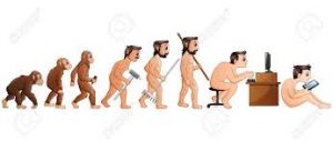
Ben’s Task 1: What’s in Your Bag?

Ben’s items in his bag, though wildly different from my own, speak to me because they closely resemble the values I hold as well. His bag held items such as a rain jacket for hiking, a Hydro Flask for staying hydrated, the book The Power of Now to focus on mindfulness throughout the day. It’s fascinating to observe the ways in which one person’s items and activities compare to my own. One point Ben makes in his assignment is that “the narrative within the bag closely resembles the narrative [he] outwardly project[s].” The items in his bag appear to have almost daily value, whereas I consider them to be of use as a treat, when I have the time, however I should probably re-evaluate my priorities and consider such activities as hiking and mindfulness routines as vital and not “treats.” 

In regards to the tool used, I was surprised to have a Google Document open, as I found the platform to be rarely used among my peers in this course. In my own experience, Google Docs have been used in collaboration with others for projects, or to save documents in the cloud for the sake of accessibility. Using it as a presentation format is new to me, but makes a lot of sense. 

Tanya’s Task 7: Mode Bending

Tanya’s creative way to redo her Task 1 using Audio in this Mode Bending task is incredibly creative! I am most impressed by her ability to have chosen such a unique perspective here. Tanya chose to be the bag in this task, and sit down in an interview where she (the bag) described what was happening in the “What’s in Your Bag?” task. Her ability to personify the bag is unique and had me more engaged than I imagine others were when listening to my own recording… I chose to highlight Tanya’s task here because I myself struggle with completing assignments and tasks in “creative” ways, and often opt for the simplest format.

Basia’s Task 8: Golden Record Curation

Basia’s Audio Decathalon is chosen because her experience contrasts my own reasons for choosing the songs I did in the Golden Record Curation. Basia states that she removed all lyricless, classical, and whale songs from her curation because it is best to share intentional messages than might be understood by other beings, than ones we cannot understand but other beings may, such as the whale’s language (I hope I have understood you correctly, Basia).  I suppose I disagree with Basia’s view of the fundamental purpose of the Golden Record. Where Basia views it as a time capsule transmitting vital information of human-kind, I considered it to be encompassing of more so than just humans, and also of  presenting the sounds we are capable of making, whether using our voices, or man-made tools.

We view text technologies to be those that relay language and message, but who are we to say that other intelligent beings view our language with such distinction as we view lyricless music? It may make no difference to them.

Jess’ Task 11: Algorithms of Predictive Text

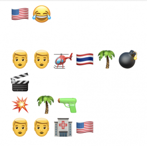
Jess’ Predictive Poetry post stood out to me because I love her perspective of the task as poetic. Jess made it evident that though it was difficult to come up with statements that made sense a lot of the time, she was less concerned about getting a clear point across the way I was, and more intentional about relaying something wacky, somewhat philosophical, and generally thought provoking for the reader. Though we both agree on the underwhelming and limited word choice offered by the predictive text function on our phones, our intentions were staggeringly different as I tried very hard to relay an intentional point in my message (and failed nevertheless). Her view of this task was more artistic than mine, and I commend her for being able to think that way, as I often find my mind to be very literal. It was a refreshing and comical read.

Evan’s Task 12: Speculative Futures 

Evan’s use of Piktochart to present her two future scenarios was a refreshing change from the other types of formats used in this course by myself and many of my peers. Her visual approach was easy to follow, yet I appreciated the rationale and clarification below. When examining the first part of Evan’s infographic, it is clear that the challenges presented are already very relevant today; they will simply become more extreme. The second part of her infographic highlights two different types of lives – one that is appealing, and one that will certainly bare the hypothetical effects of the disastrous downturns our planet is facing. Her use of broad global issues rather than specific technology-based ones that may or may not affect only a subset of people is also a nice variation.

I also liked Evan’s mention of the “inherent optimism” that designers often hold, as described by Dunne and Raby (2013), and that design is such an integral part of problem-solving; I found myself really stopping and appreciating this part of the reading as well.

Nicky’s Blog

I chose to highlight Nicky’s general Blog here, instead of any particular assignment. Her use of graphics combined with the ease of navigation makes her blog space one of my favourites. Though her site offers similar features to mine (had I chose to utilize more graphics and a navigation menu), it is very pleasing to the eye and portrays a great sense of individuality because of her “character” in each task’s icon. Each one of Nicky’s subpages also has a creative banner with her character on it. I suppose I was just pleasantly surprised by the vibrance and thought put into the design of her space, and have to commend you for it, Nicky! Evan also needs to get a shout out here for utilizing a similar character and navigation system that I enjoyed.


Task 12: Speculative Futures

Having browsed through the Core 77 Design Awards 2019, one in particular stood out that I can already personally relate to, and that is Community Choice Prize winner Pinelopi Papadimitraki’s speculative inflatable devices “that disrupt our current tech-based quirks or generate new ones, as a means to enact alternative interaction repertoires between ourselves and our environment”
(Core 77 Design Awards 2019).

One of the presented designs is the “Detext” which  wraps around an individual’s neck to prop one’s head upwards rather than allowing it to point downwards in the typical “texting” position. This led me to think about my own challenges with back pain since having a baby. My chiropractor has told me that the constant positioning of my head downwards (while breastfeeding and generally looking towards the floor to meet my toddler’s eyes) is taking a considerable toll on my posture and causing back pain. Surprisingly, he also stated that this problem is no longer confined to new mothers, but is shared by the texting generation (which I’m certainly a part of as well). Thus, a speculative future one must consider as not far from today, is one characterized by increased back pain. It may seem like a small issue, hardly one that should define a whole future, but in reality, this affects so much more than one’s back. Students will face postural and spinal issues at younger and younger ages; alternative seating will be the norm in classrooms to compensate for the horrible posture that personal devices will be forcing; and images such as the one below will be frighteningly accurate in illustrating the evolution of our physical bodies.

To counteract this however, a rise in physical activity will be essential, but difficult to enforce, because, traditional classrooms will likely seize to exist in the same way they do today. Tech companies are already encouraging/supporting alternatives work hours, under the belief that productivity cannot be confined to 9-5. This leads me to propose a second speculative future, one that will likely occur in a more distant future than the issues presented in the one above. Future classrooms will likely employ the same ideas used by the corporate world today, and that is, encouraging learning outside of the traditional classroom, and inevitably, outside of traditional school hours. Home-based learning, project- and inquiry based learning will be even more influential than today, teachers will be moderators and facilitators, often providing virtual meetings over physical ones, and AI will be more prevalent.

However, it’s difficult to accurately assess the degree to which these technological advancements will overshadow physical well-being – if at all – because Social Emotional Learning will continue to be prioritized, even more so than it is today. At present, we are seeing a balance evolve between our use of technology but also our abilities to disconnect, with so many mindfulness and well-being approaches out there. I suspect this dichotomy will continue to compete for our time in the future, but both parts will be even more extreme – greater use of technology, and even more need for mindful,  “unplugged” routines.

Task 11: Algorithms of Predictive Text

My idea of technology is a bit of a problem for me to get through. I don’t know what to say about it because it is so hard to find it out here. I think I’m just going to get through the rest of the night and then I will be sure to get back to you.

This week’s task was one of the most difficult for me thus far in the course. I spent considerable time trying out each of the provided sentence prompts, only to get frustrated each time with not being able to get my point across. In my experience, predictive text functions have been beneficial when writing simple phrases over text to someone, such as “have a good night” or “see you soon.” However, it is very difficult to get any deeper and more meaningful messages across because the word choice simply is not there. Each time I wanted to start a new sentence, without consideration of what word and punctuation my previous sentence ended with, I was only ever presented with three words to choose from: I, Hey, We. If this is any indication of what words I tend to use when communicating over text, it’s a fair assumption that I often chat about making plans, what my plans are, and greeting people with the greeting “Hey!”. I would never think to use predictive text to communicate complex ideas, as those require a much richer vocabulary than what my Messages app provides!


Task 9: Network Assignment Using Golden Record Curation

The first image indicates general groupings of individuals, characterized by each person’s choice of songs. Coloured groupings are reflective of song choice  similarities. I am unsure about whether or not the placement of each group in the larger circle is also indicative of its similarities to other groups, based on their proximity to each other. For instance, does the dark green group on the upper left likely share more in common with the red group below it than it does with the light green group in the lower right? Based on reading some other peers’ reflections, I thought this might be the case. After analyzing the second image though, I am beginning to think that might not be the case.

The second image, as shown below, expands on the first by illustrating the connections (or same song choices) made between individuals, and providing some quantitative data. One can decipher from this graph how many  connections are made with others, yet it cannot show what that connection is, or which songs were chosen. It looks quite symmetrical, in that each person has multiple lines stemming from their vertex; this indicates that individuals have made at least one same song choice with every other person that is included in the illustration – this is not unlikely, as 10 out of 25 song choices allows for an extremely high probably that any two individuals will choose at least one of the same songs. With closer inspection, you can also see that the lines vary in thickness, also representing the strength of each connection between two individuals – the thicker the line, the more song choices were shared.

The last image is a visualization of which songs from the Golden Record were chosen, and by which individuals. It also indicates how many times each song was chosen. It provides the most specific set of information, down to each person’s individual choices.

The images presented provide a simple way for one to analyze the song choices made by a small group of people. It does not, however, provide a way for null choices (or songs that were not picked) to be analyzed, as it is a visual representation of only the data that exists. In the case of our song selections, no song was not picked. This type of data analysis can be useful in distributing populations based on similarities, but it does not take into account null preferences, which, in other arenas, such as politics, might be more significant than they are here.

Task 8: Golden Record Curation

The list of 10 tracks chosen below from the Voyager’s Golden Record is a representation of various sounds created here on Earth, though specifically human-made. If, for a second, we can pretend to be extra-terrestrials with no knowledge of Earth or it’s beings, these sounds are unimportant, and cannot possibly reflect the deeper cultural significant they each carry. As such, I chose to include tracks that objectively differ from each other simply based on their sounds (instruments/vocals). My second criterion was to include a cultural/geographical representation – though simply for my own satisfaction because again, I’m not sure regional differentiation would mean anything to Earth’s outsiders – and thus, to the best of my ability, tried to incorporate (almost) each continent. I also thought it was valuable to include the greetings, which may not have a musical component, but as far as making sounds, it is equally as meaningless, or meaningful, depending on how you view these sounds as an ET.

  1. International – Greetings
  2. Peru – Wedding song (a cappella)
  3. Navajo, America – Navajo Night Chant (Indigenous)
  4. Germany – Bach – Brandenburg No 2 (classical composer)
  5. America – Chuck Berry – Johnny B Goode (rock and roll)
  6. Senegal – Tchenhoukoumen percussion (percussion)
  7. Mexico – El Cascabel – Lorenzo Barcelata & the Mari – (multi instrumental)
  8. China – Flowing Streams (strings)
  9. India – Jaat Kahan Ho – Surshri (vocals, percussion?)
  10. Azerbaijan – Ugam (bagpipes)

Task 5: Twine

Below find a link to my Twine game. As a brief intro, the story you will read is an interpretation of the wordless picture book, The Umbrella, by Ingrid and Dieter Schubert.

I found this task to be quite difficult. I had imagined creating images for each page of the story, but could not figure out how to add these in, as the original images from the picture book are difficult to find.

The Umbrella.html

Task 4: Potato Printing

The 5-letter word I chose to create as a stamp is my dog’s name, Oscar. I chose it because of the sentiment, and did not pay attention to the particular letters in the word. As such, some letters were quite difficult to form, particularly the “S” in my experience.

Stamp 1:     

Stamp 2:     

The process of creating each stamp was certainly challenging. For one, any marker I used to sketch the outline of the letters would quickly stop working on the damp surface of the potato, ultimately forcing me to carve the letters out freehand on the second attempt; this made it virtually impossible to create 2 similar, let alone identical, stamps. Also, the curvature of the letters made it difficult to form some of the letters.

In total, the process took approximately 30 minutes, with the second stamp taking less time than the first, as I began to get a feel for the process. However, the speed with which I worked is reflected in the stamp, as it looks sloppier, is unevenly spaced out, and has parts of its letters missing.

The mechanization of writing has created such large scale accessibility to print. The process of creating this stamp, however, truly gives one an appreciation for the labour intensive work it takes to create an initial text technology, before that labour goes away completely and one can use these technologies with minimal effort. A quote that struck me in the podcast episode “The Printed Book: Opening the Floodgates of Knowledge” is a Christian monk’s statement that “writing is excessive drudgery” before he goes on to describe the pain involved in printing by hand. I imagine though, that this quote would also have resonated with those who initially worked on woodcut printing in the 1400s, especially since the technology was short lived, and moveable type printing evolved.


Spam prevention powered by Akismet