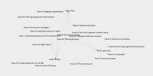
During this task, we had to observe our Golden Record network that was created in Palladio where it showed the musical choices from the quiz that students in ETEC 540 took. My results did not make the cut for this network. Therefore, I just chose Golden Record B for my analysis. There were 17 students recorded. The image below shows the network of connections between students and tracks. I found this very difficult to read so I moved around the network so that the tracks were on the outside and the students were in the middle.

In this network graph, there are nodes and edges. The nodes represent the students which have dark grey circles and the edges in this network graph represent the connection between a student and the 10 tracks they chose during the quiz. Not only are the lines connecting a student to the 10 tracks that they chose, but with each track, there are connections that link together with all those chose that track. Surprisingly there were no tracks that did not have a connection.
Track 19 (Izlel je Delyo Hagdutin) only has two degrees of connectivity that connect to the two individuals that chose that music. Whereas Track 7 (Johnny B. Goode) has the most connections and degree of connectivity with being linked to twelve students. I analyzed this by selecting the largest circle and then by counting the lines that I visually observed.
Next, I decided to explore and analyze Community 3 which included Yijun Ding, Junel Lapinskie and Helen Zhang. It is unclear how these communities are made, but I assume it is because they had the most similar choices among the 10 tracks that were picked. In this community, there were 8 tracks that had multiple common connectivity. There were 3 tracks that connected to all three participants (Track 8, 22, 24).
It would be interesting to investigate this data further by figuring out why each student chose the tracks that they did. The graph does visualize the connections between tracks but there is no data on why each person selected these tracks. As well, it would have been effective to also have data where the tracks could also be connected to the instruments that occur in each song. With this data, we could see if there were any correlations between the types of instruments and all the tracks that each student picked for their top ten tracks.
When I think about the political implications, I think back to why I consider a committee from Cornell University were the chosen ones to determine which tracks would be placed on the Golden Record. Did they have biases on the tracks they decided to choose?
Out of all the music in the world, how did they narrow it down to just 27 tracks? Also, how come not all musical genres were represented on this track? There are significant information gaps on the Golden Record and with the tracks that were selected for this voyage.
Reflecting on the political implications of the current data taken for this task, there are some missing gaps. With the visualizations of the data, viewers can identify which tracks were most liked and which were not. However, we can only see who the curators are and what tracks they chose instead of why they picked the tracks that they did. Were the tracks chosen only on the sound of the music? Or by the instruments played on the track? Or did individuals prefer instrumental music opposed to hearing someone sing? Without any reasoning or criteria behind why these tracks were chosen, the data really does not provide us with the whole picture.