By Tanner Braithwaite: http://wiki.ubc.ca/Documentation:R_Coding_Examples
Resources and Code examples: http://wiki.ubc.ca/LFS:Seminars/R
By Tanner Braithwaite: http://wiki.ubc.ca/Documentation:R_Coding_Examples
Resources and Code examples: http://wiki.ubc.ca/LFS:Seminars/R
Print Fixed Numeric Notation – To print values in fixed numeric notation instead of scientific notation use the command:
options(scipen=999) # positive integer for scipen. negative for showing scientific notation.
This example is for demonstrating the usage of the dig.lab parameter for setting the number of digits to display for the frequency ranges. Removing the dig.lab parameter will default the ranges listed in scientific notation. In this case the range numbers are set to 4 digits. e.g. [7000, 7300)
A <- read.csv(“Altitudes.csv”, header=FALSE, stringsAsFactors=FALSE) #import data
A #view A
Altitudes<-A[[1]] #extract Altitudes
range(Altitudes) #identify range of data;
breaks=seq(7000,9100,by=300) #break data into 7 classes with width = 300
breaks #view breaks
A.cut<- cut(Altitudes,breaks,right=”False”, dig.lab=4) #assign observations to classes
A.cut
A.freq<-table(A.cut) #make frequency counts
A.freq #view frequency distribution
cbind(A.freq)
> x <- read.table(“h:\\Altitudes.csv”,header=F)
> y = x[[1]] # set first column to y
> y
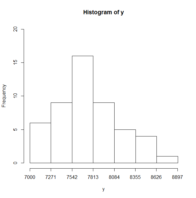
[1] 8848 8611 8586 8511 8463 8201 8167 8163 8125 8091 8068 8047 8035 8012 7885 7852 7820 7816 7815
[20] 7788 7785 7756 7756 7756 7756 7742 7723 7720 7719 7690 7654 7619 7555 7553 7546 7495 7485 7439
[39] 7406 7398 7313 7291 7285 7273 7245 7150 7142 7135 7134 7129 # output of values in array
> range(y) # range of values from beginning to end
[1] 7129 8848
> hist(y,breaks=seq(7000,8900,by=(8900-7000)/7),axes=F,ylim=c(0,20)) # histogram of the frequency of y values classified into the intervals set by breaks. No axis labels and set y-axis range from 0 to 20
> axis(side=1,at=seq(7000,8900,by=round((8900-7000)/7))) # add x-axis with interval values
> axis(side=2) # add x-axis
>
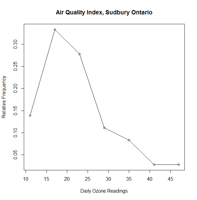
> AirQualityIndex <- read.csv(“h:\\AirQualityIndex.txt”, header=TRUE, stringsAsFactors=FALSE)
Read in data into table AirQualityIndex
> AQI=AirQualityIndex$AQI.O3
Set AQI array to data in column AQI.03
> range(AQI)
[1] 8 49
Range of values for AQI
> breaks=seq(8,50,by=6)
Create an array of values broken into intervals of 6 beginning at 8, then 14,…
> AQI.cut=cut(AQI,breaks,right=F)
Data is classified into intervals
> AQI.freq=table(AQI.cut)
Summarizes data, counting the frequency of data per interval
> AQI.freq
AQI.cut
[8,14) [14,20) [20,26) [26,32) [32,38) [38,44) [44,50)
5 12 10 4 3 1 1
Outputs the the freqency of values per interval
> nrow(AirQualityIndex)
[1] 36
Row count of values.
> AQI.relfreq=AQI.freq/(nrow(AirQualityIndex))
Calculate the percentage of values per interval divide the interval count by the total number of rows
> AQI.relfreq
AQI.cut
[8,14) [14,20) [20,26) [26,32) [32,38) [38,44) [44,50)
0.13888889 0.33333333 0.27777778 0.11111111 0.08333333 0.02777778 0.02777778
> nrow(AirQualityIndex)
[1] 36
> midpoints.breaks=seq(11,47,by=6)
> midpoints.breaks
[1] 11 17 23 29 35 41 47
> plot(midpoints.breaks,AQI.relfreq, #plot the data x is midpoints.breaks, y is AQI.relfreq
+ main=”Air Quality Index, Sudbury Ontario”, #+ main title
+ xlab=”Daily Ozone Readings”, #+ label – horizontal axis
+ ylab=”Relative Frequency”)
> lines(midpoints.breaks,AQI.relfreq) # connects the dots with lines
> axis(side=2) # display y-axis values
Here’s an example in R – Stat you can use to produce a frequency distribution range broken into intervals of 10.
> y
[1] 74 73 71 55 91 68 93 37 78 57 65 58 83 65 72 88 85 73 97 73 75 75 62 41 68
[26] 62 78 83 63 81 56 65 67 81 95 76 81 53 57 67 82 43 69 62 31 87 78 41 98 73
*** I created a column array y with the data values.
> range(y)
[1] 31 98
*** Range outputs the range of values which is [31,98]. 31 is the minimum value in the range and 98 is the maximum value in the range.
> breaks = seq(30,100,by=10)
*** You can then use the breaks command to break the data into intervals of 10 beginning at 30 and ending at 100. So the intervals are [30,40) [40,50) ….[90,100)
> breaks
[1] 30 40 50 60 70 80 90 100
*** Outputs the break intervals beginning at 30.
> y.cut = cut(y,breaks,right=FALSE)
*** The data is classified using the cut function into the break point intervals “breaks” and intervals are closed to the left and open on the right, therefore right=FALSE.
> y.freq = table(y.cut)
*** calculates the frequency of y in each interval using table function.
> y.freq
y.cut
[30,40) [40,50) [50,60) [60,70) [70,80) [80,90) [90,100)
2 3 6 12 13 9 5
*** outputs the table, displaying this break intervals and the frequency of the y range of values for each interval. e.g. There are 2 values that fall in the range of [30 to 40) but less than 40.
> cbind(y.freq)
*** outputs the frequency distribution in a column format.
y.freq
[30,40) 2
[40,50) 3
[50,60) 6
[60,70) 12
[70,80) 13
[80,90) 9
[90,100) 5
> barplot(y.freq,ylim=c(0,15))
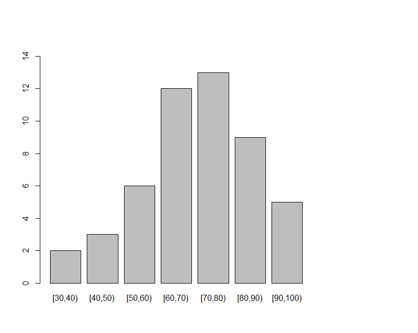
A barplot showing the frequency distribution of values at each interval of 10 beginning at 30 and ending at 100. The y-axis is from 0 to 15.
The first step is to setup the Datalink Sidekick on a computer used to scan you multiple choice sheets. The multiple choice sheets are made of paper and filled out during an in class exam or quiz or used for questionnaires and survey purposes. The datalink Sidekick can only scan patented DataLink Sidekick sheets. The one used in this example is #29240-RR.
So once you are ready to scan sheets you will need to setup the software and scanning system. For directions on how to do this, see the Quick Start Guide (UBC LFS Learning Centre) or go online to apperson.com/go/sidekickvideoscannersetup.
In general the directions are as follows:
If you are scoring the sheets, you will need to create an answer key. In DataLink Connect’s file menu choose File >> Create Key..
Choose Form number: 29240
Add an Instructor Name and then type in your key responses in the table provided. When done click Save to File. You can also import from CSV (comma delimited file) an answer key. Create an answer key in Excel by inputting your answers into one column. e.g starting with question 1 and you have 10 questions with answers, enter one answer per row beginning at row 1 in your spreadsheet. When finished save the document as a CSV file. Then in DataLink choose Import from CSV and the key response table will be auto filled with the imported answers.
When you are finished inputting your answers, press Save to File and then Send to Grid.
You are now ready to scan the sheets. Scan one sheet at a time with the sheet facing up and feeding from the top end of the page. Your sheet will be grabbed and scanned and the results will output on the computer screen displaying the correct and incorrect responses and the score for the sheet.
Once you have finished scanning all the sheets you can save the results as an Excel file by pressing the button Excel Export.
Importing Grades into Blackboard Connect Course
To import the results from scanning, a copy of the Gradebook from Grade Center is exported out from your Blackboard course and then a merge needs to be performed, which merges the Gradebook with your scanner results spreadsheet by student ID number. There are two methods for merging these two tables by Student ID:
The second method to merging the Gradebook with the scanned results data is to use Excel.
| Last Name | First Name | Username | Student ID | Last Access | Availability | Quiz1 [Total Pts: 2.5] |835932 |
| Smith | Jane | 12345678 | 12345678 | 20:56.0 | Yes | |
| Doe | John | 12345679 | 12345679 | 44:06.0 | Yes | |
| White | Sally | 12345676 | 12345676 | 01:19.0 | Yes |
| studentid | score |
| 12345678 | 60.00% |
| 12345679 | 80.00% |
| 12345676 | 70.00% |
This spreadsheet is named “Sheet1”.
| Last Name | First Name | Username | Student ID | Last Access | Availability | Quiz1 [Total Pts: 2.5] |835932 |
| Smith | Jane | 12345678 | 12345678 | 20:56.0 | Yes | 0.6 |
| Doe | John | 12345679 | 12345679 | 44:06.0 | Yes | 0.8 |
| White | Sally | 12345676 | 12345676 | 01:19.0 | Yes | 0.7 |
Linear Regression using R
– read.table(“c:\\users\\wayne\\downloads\\d.txt”,sep=” “,header=T)
> x
concentration absorb1 absorb2 absorb3
1 0 0.016 0.019 0.004
2 10 0.101 0.128 0.118
3 20 0.199 0.216 0.212
4 30 0.352 0.356 0.348
5 40 0.524 0.522 0.534
6 50 0.625 0.648 0.694
7 60 0.701 0.712 0.705
> absorb = c(x[[2]],x[[3]],x[[4]])
> absorb
[1] 0.016 0.101 0.199 0.352 0.524 0.625 0.701 0.019 0.128 0.216 0.356 0.522
[13] 0.648 0.712 0.004 0.118 0.212 0.348 0.534 0.694 0.705
> concent = c(rep(x[[1]],3))
> concent
[1] 0 10 20 30 40 50 60 0 10 20 30 40 50 60 0 10 20 30 40 50 60
> xdata = data.frame(concent,absorb)
> xdata
concent absorb
1 0 0.016
2 10 0.101
3 20 0.199
4 30 0.352
5 40 0.524
6 50 0.625
7 60 0.701
8 0 0.019
9 10 0.128
10 20 0.216
11 30 0.356
12 40 0.522
13 50 0.648
14 60 0.712
15 0 0.004
16 10 0.118
17 20 0.212
18 30 0.348
19 40 0.534
20 50 0.694
21 60 0.705
The format of your table will be two columns listing the concentration in one column and in the second column absorbance values. For other stats programs like Excel you will need to format your data in the spreadsheet like this. And then produce a scatterplot and a fitted line.
> plot(concent,absorb)
plots data, x-axis is concentration and y-axis is absorbance
> lm.data = lm(absorb~concent)
Calculates linear regression model
> lines(concent,fitted(lm.data),col=”blue”)
Adds fitted line to scatterplot.
> summary(lm.data)
Summary of linear regression analysis
Call:
lm(formula = absorb ~ concent)
Residuals:
Min 1Q Median 3Q Max
-0.045119 -0.028119 -0.001952 0.023214 0.077381
Coefficients:
Estimate Std. Error t value Pr(>|t|)
(Intercept) -0.004214 0.012909 -0.326 0.748
concent 0.012417 0.000358 34.681 <2e-16 ***
concent is the slope. Intercept is constant
—
Signif. codes: 0 ‘***’ 0.001 ‘**’ 0.01 ‘*’ 0.05 ‘.’ 0.1 ‘ ’ 1
Residual standard error: 0.03281 on 19 degrees of freedom
Multiple R-squared: 0.9844, Adjusted R-squared: 0.9836
F-statistic: 1203 on 1 and 19 DF, p-value: < 2.2e-16
*** significance, probabilty no relationship exists beteween absorbance and concentration.
Pr = probability this variable is no relevant
absorbance = 0.0124*concentration + -0.00421
Residuals = different between the actual values and the predicted values.
R-squared indicates correlation between y and x (absorbance and concentration)