Monthly Archives: January 2015

Histogram plot with Axes

> x <- read.table(“h:\\Altitudes.csv”,header=F)
> y = x[[1]]  # set first column to y
> y
[1] 8848 8611 8586 8511 8463 8201 8167 8163 8125 8091 8068 8047 8035 8012 7885 7852 7820 7816 7815
[20] 7788 7785 7756 7756 7756 7756 7742 7723 7720 7719 7690 7654 7619 7555 7553 7546 7495 7485 7439
[39] 7406 7398 7313 7291 7285 7273 7245 7150 7142 7135 7134 7129  # output of values in array
> range(y)  # range of values from beginning to end
[1] 7129 8848
> hist(y,breaks=seq(7000,8900,by=(8900-7000)/7),axes=F,ylim=c(0,20)) # histogram of the frequency of y values classified into the intervals set by breaks.  No axis labels and set y-axis range from 0 to 20
> axis(side=1,at=seq(7000,8900,by=round((8900-7000)/7)))  # add x-axis with interval values
> axis(side=2) # add x-axis
>

histrogram plot


R – Stat Frequency Plot – adding titles to graph plot

> AirQualityIndex <- read.csv(“h:\\AirQualityIndex.txt”, header=TRUE, stringsAsFactors=FALSE)

Read in data into table AirQualityIndex

> AQI=AirQualityIndex$AQI.O3

Set AQI array to data in column AQI.03

> range(AQI)
[1]  8 49

Range of values for AQI

> breaks=seq(8,50,by=6)

Create an array of values broken into intervals of 6 beginning at 8, then 14,…

> AQI.cut=cut(AQI,breaks,right=F)

Data is classified into intervals

> AQI.freq=table(AQI.cut)

Summarizes data, counting the frequency of data per interval

> AQI.freq
AQI.cut
[8,14) [14,20) [20,26) [26,32) [32,38) [38,44) [44,50)
5      12      10       4       3       1       1

Outputs the the freqency of values per interval

> nrow(AirQualityIndex)
[1] 36

Row count of values.

> AQI.relfreq=AQI.freq/(nrow(AirQualityIndex))

Calculate the percentage of values per interval divide the interval count by the total number of rows

> AQI.relfreq
AQI.cut
[8,14)    [14,20)    [20,26)    [26,32)    [32,38)    [38,44)    [44,50)
0.13888889 0.33333333 0.27777778 0.11111111 0.08333333 0.02777778 0.02777778
> nrow(AirQualityIndex)
[1] 36
> midpoints.breaks=seq(11,47,by=6)
> midpoints.breaks
[1] 11 17 23 29 35 41 47
> plot(midpoints.breaks,AQI.relfreq,                #plot the data x is midpoints.breaks, y is AQI.relfreq
+  main=”Air Quality Index, Sudbury Ontario”,       #+ main title
+  xlab=”Daily Ozone Readings”,                     #+ label – horizontal axis
+  ylab=”Relative Frequency”)
> lines(midpoints.breaks,AQI.relfreq)  # connects the dots with lines
> axis(side=2) # display y-axis values

frequency plot with titles

R – Stat Frequency distribution example

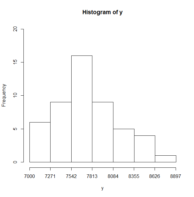
Here’s an example in R – Stat you can use to produce a frequency distribution range broken into intervals of 10.

> y
[1] 74 73 71 55 91 68 93 37 78 57 65 58 83 65 72 88 85 73 97 73 75 75 62 41 68
[26] 62 78 83 63 81 56 65 67 81 95 76 81 53 57 67 82 43 69 62 31 87 78 41 98 73

*** I created a column array y with the data values.

> range(y)
[1] 31 98

*** Range outputs the range of values which is [31,98].  31 is the minimum value in the range and 98 is the maximum value in the range.

> breaks = seq(30,100,by=10)

*** You can then use the breaks command to break the data into intervals of 10 beginning at 30 and ending at 100.  So the intervals are [30,40) [40,50) ….[90,100)

> breaks
[1]  30  40  50  60  70  80  90 100

*** Outputs the break intervals beginning at 30.

> y.cut = cut(y,breaks,right=FALSE)

*** The data is classified using the cut function into the break point intervals “breaks” and intervals are closed to the left and open on the right, therefore right=FALSE.

> y.freq = table(y.cut)

*** calculates the frequency of y in each interval using table function.

> y.freq

y.cut
[30,40)  [40,50)  [50,60)  [60,70)  [70,80)  [80,90) [90,100)
2        3        6       12       13        9        5

*** outputs the table, displaying this break intervals and the frequency of the y range of values for each interval. e.g. There are 2 values that fall in the range of [30 to 40) but less than 40.

> cbind(y.freq)

*** outputs the frequency distribution in a column format.

y.freq
[30,40)       2
[40,50)       3
[50,60)       6
[60,70)      12
[70,80)      13
[80,90)       9
[90,100)      5

> barplot(y.freq,ylim=c(0,15))

frequency bar plot

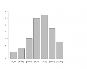
A barplot showing the frequency distribution of values at each interval of 10 beginning at 30 and ending at 100.  The y-axis is from 0 to 15.