> x <- read.table(“h:\\Altitudes.csv”,header=F)
> y = x[[1]] # set first column to y
> y
[1] 8848 8611 8586 8511 8463 8201 8167 8163 8125 8091 8068 8047 8035 8012 7885 7852 7820 7816 7815
[20] 7788 7785 7756 7756 7756 7756 7742 7723 7720 7719 7690 7654 7619 7555 7553 7546 7495 7485 7439
[39] 7406 7398 7313 7291 7285 7273 7245 7150 7142 7135 7134 7129 # output of values in array
> range(y) # range of values from beginning to end
[1] 7129 8848
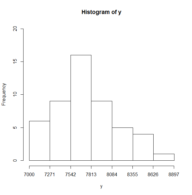
> hist(y,breaks=seq(7000,8900,by=(8900-7000)/7),axes=F,ylim=c(0,20)) # histogram of the frequency of y values classified into the intervals set by breaks. No axis labels and set y-axis range from 0 to 20
> axis(side=1,at=seq(7000,8900,by=round((8900-7000)/7))) # add x-axis with interval values
> axis(side=2) # add x-axis
>