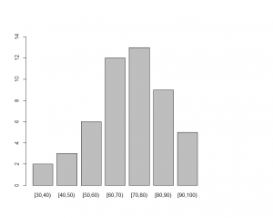
Here’s an example in R – Stat you can use to produce a frequency distribution range broken into intervals of 10.
> y
[1] 74 73 71 55 91 68 93 37 78 57 65 58 83 65 72 88 85 73 97 73 75 75 62 41 68
[26] 62 78 83 63 81 56 65 67 81 95 76 81 53 57 67 82 43 69 62 31 87 78 41 98 73
*** I created a column array y with the data values.
> range(y)
[1] 31 98
*** Range outputs the range of values which is [31,98]. 31 is the minimum value in the range and 98 is the maximum value in the range.
> breaks = seq(30,100,by=10)
*** You can then use the breaks command to break the data into intervals of 10 beginning at 30 and ending at 100. So the intervals are [30,40) [40,50) ….[90,100)
> breaks
[1] 30 40 50 60 70 80 90 100
*** Outputs the break intervals beginning at 30.
> y.cut = cut(y,breaks,right=FALSE)
*** The data is classified using the cut function into the break point intervals “breaks” and intervals are closed to the left and open on the right, therefore right=FALSE.
> y.freq = table(y.cut)
*** calculates the frequency of y in each interval using table function.
> y.freq
y.cut
[30,40) [40,50) [50,60) [60,70) [70,80) [80,90) [90,100)
2 3 6 12 13 9 5
*** outputs the table, displaying this break intervals and the frequency of the y range of values for each interval. e.g. There are 2 values that fall in the range of [30 to 40) but less than 40.
> cbind(y.freq)
*** outputs the frequency distribution in a column format.
y.freq
[30,40) 2
[40,50) 3
[50,60) 6
[60,70) 12
[70,80) 13
[80,90) 9
[90,100) 5
> barplot(y.freq,ylim=c(0,15))
A barplot showing the frequency distribution of values at each interval of 10 beginning at 30 and ending at 100. The y-axis is from 0 to 15.
