
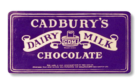
Cadbury, a British confectionary company, established in Birmingham in 1824, is best known for its products the Dairy Milk, which is the bestselling product in Cadbury’s history. Recently, Cadbury lost the five-year legal battle to trademark its chocolate bars purple. (see http://www.theguardian.com/business/2013/oct/04/cadbury-dairy-milk-purple-trademark-blocked) It leads us to reconsider the definition of distinctive brand image and the boundary of protection of intellectual property.
The exclusive use of brand color is not reasonable, because the brand image, as a whole, most of the time is not only a pure color block, but the permutation of different colors, patterns, logos, etc. To Cadbury, the color purple means a lot, which informs the world that it is a historic, somehow survived WWI, with certain links to Britain Loyal, and reliable quality. It is Cadbury’s value proposition. As Al Ries and Jack Trout stresses in their book, Positioning: The Battle for your Mind, it is really important to get into the mind of the consumers. From my perspective, it would be more effective if Cadbury consistently set the Pantone 2685C (the purple shade) over its wide range of products, so that consumers would spontaneously think of Cadbury chocolate bars whenever they see the purple color.
Still an interesting issue years later. For example, Tiffany Blue is protected, as is UPS’ brown. There are multiple examples of companies registering specific colours as trademarks and then, in certain cases, blocking competitors from using the same colour.
With the recent updates in Canada’s trademark legislation, the ability to register a specific colour as a trademark is an important issue – both for those registering these colours, and when offices like ours (Toronto Trademark Lawyer.ca) are providing clients with advice.
As you mentioned here, consistency in the shade and use of a colour is important. The problem with Cadbury’s trademark – right up to 2019 – was the use of the word “predominant” in describing its packaging. This opened them up to the argument that the trademark went beyond one specific shade of purple, and convinced London’s Court of Appeal to rule against them due to concerns that the wording of the trademark could extend to “stripes, spots, a large central blob, or in any other form.”