
X/Y two-dimension competitive analysis is more suitable to be used by an existing company which has launched products into the market, rather than by an early-stage startup which has actual and solid data showing how its company’s future performance and competitive advantages will be like.
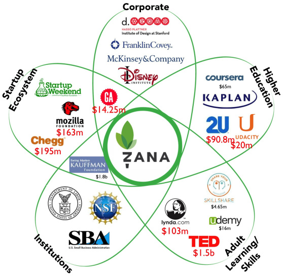 image via Steve Blank’s blog
However, in this case, Petal Diagram will be a better choice to present the market competition. Each of the 9 sections of Business Model Canvas (customer segments, key partners, etc) can be demonstrated in the form of a flower and contents more detailed and specific.
Additionally, Petal Diagram is more visualized in telling the VCs the amount of capital founded, by quantifying the petals, in other words, scaling the size of petals. It directly shows how hot, how promising the company is.
The most distinct point is that it allows ambiguous area among each segments (petals) which is a common situation where startup wants to enter multiple markets or a new market still not exiting. X/Y axis analysis limits competition within only one market, while as times and technology develop, the frequent emergence of integral inter-market products informs that X/Y axis competitive analysis should be updated.
Reference: