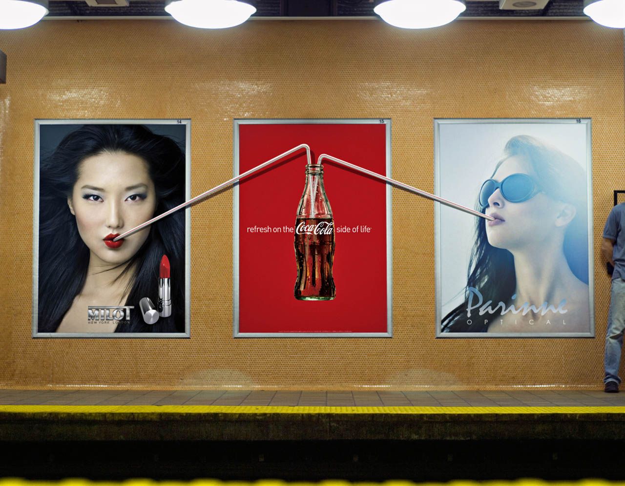
Outdoor ads are the best spot for creative use of space and angles. Coca Cola’s billboard ads released in September 2010 are great examples of such technique. (by the way the ads were created by a Canadian agency MacLaren McCann, Toronto, Canada for those of you exploring Canadian advertising market)
Simona-Iozefina Oprea wrote beautiful review of those ads with some great comments. You can read more about it on her blog (linked to her name).
On the other hand I would like to comment on something they (Coca Cola) have missed. When I found about this campaign, I saw this picture first :
My first thoughts were that Coca Cola did great job creating an ad campaign with other companies (Milot New York and Parinne Optical) . I thought it was a great example of collaborative marketing action. Imagine my surprise when after googling those names nothing came up 🙁
I’m guessing either Coca Cola didn’t want to get associated with any particular brand at this moment or couldn’t find a brand willing to be associated with them. In any case, I think it would’ve been more fun if some other big brads were part of this campaign too.
