Quoting Michael Jackson: that might have captured your attention. Disagreeing with his quote – Genius! . Its all allowed in this game we call marketing.
Please pardon my choice of indulging in casual discourse. I prefer to do so owing to my topic of discussion – ” Readability “.
Yes. I was referring to the color of fonts and their respective backgrounds in my potentially controversial header. This might come as a surprise but there is a reason why news papers have black text and white backgrounds; why the most effective brochures have maximum black text on white background; why websites (including this one) have black text on white background. The answer is – “Readability”. It has scientifically been established that lengths of text are more readable when the text is black with a white or slightly off-white background.
On the contrary an image is said to grab more attention when placed against a black background rather than a white background. Also, larger white text on black background is perceived to be more captivating to the eye (Refresh the page, observe the first thing you notice. You tend to notice this header with white text on black background and not the main header). This has everything to do with contrast. The larger the contrast between the factors that are to be differentiated against, the more captivating the elements become. But as they say, too much of everything is too bad. The same applies to contrast, continuos black text on white background leads to faster reading speeds but also results in diminished comprehend-ability. This is a result of loss in concentration due to strain caused on the eye since the color white reflects all the light without absorbing any. This problem can be overcome using off-white backgrounds instead. This is why most novels now use brown-ish white paper and magazines preferably use cream as their basic background while incorporating large texts.
I had to deal with the contortions of contrast while designing my company website. I chose to stick to research and use white background for all texts while making sure all the pictures were engulfed by black. To ensure continuity, a general trick used by graphic designers is to place clean lines all over the place. This guides the eye around the surface without allowing stark contrasts between varying backgrounds to effect read-ability. Once I was done designing that, I compared it to what I would have intuitively done i.e kept all background black with some white text on it, the difference in readability was noticeable and thats when I figured “It does matter if its Black or White.”
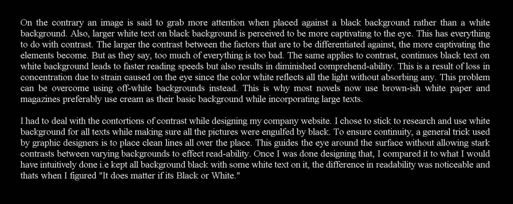
Try reading the same text but on a black background – you might observe slower reading, also you might give up after 3 sentences or so. To be fair, if you click on the image you can get a better-sized version.
Tags: 2 Comments


2 responses so far ↓
Contrast has an interesting effect on perception, doesn’t it? It can make things seem to jump out at us; fatigue our eyes or give them a rest; give us something to focus on or blur everything together… Thanks for exploring this idea in your first post and in linking it to your real-world experience in design.
BTW, did you know that the readability of reversed-out fonts (light colour on dark background) is also affected by whether or not that font is serif or sans serif? Your example at the end of your post uses a serif font; it would be more readable if it were a sans serif font on that black background.
Keep it up, Adnan! But try to keep your posts a little shorter – this one gets close to 500 words… If you want to really explore a topic, consider writing it in two parts to maximize readability.
Contrast does a lot of magic when trying to maneuver one`s attention around. I have had a hard time dealing with this topic over the course of my designs since I have a weakness for black and it looks amazing but the pay-off is readability.
I did want to go into the details of using serif and sans-serif fonts but I have never been able to manage my words too well. When I was researching this topic I also came across a whole list of dos and donts for publishing print media. Some specifics like 7 worded lines, there was also some data on how each method of highlighting words (Underlining / bold / italics / Changing color/ changing font size and style) was more successive than the other and which method is more affective in what sort of typography. Perhaps I could explore this in my next blog as well.
Oh! and I did use the serif font with the black back ground on purpose just to make a clear point that it was relatively un-readable :p I guess you caught me on that trick there. Thanks Tamar, for such a detailed comment and I will definitely put up more posts instead of one relatively long one. Have a great Sunday!