Categories
Advertising Commentary Marketing & Advertising Visuals Media Management - Marketing

Evolutionary identity created by Logo – morphosis.

It is interesting how logos change over time. Some change for the better and some for the worse. Recently Starbucks changed their logo too, upon reading about the reasons for this modification I learnt that a changed logo was meant to symbolize a change in the company’s value proposition and focus to allow for growth. The nature of conventional logos do not allow for freestyle change, once a certain logo is picked, that’s it, it can symbolize growth, it can symbolize change but by itself it cant change or grow.

The new  Deichmanske Library in Bjørvika, Oslo was in need of a logo. The challenge was to design a logo that clearly symbolizes change and evolution. The new Library was opened to serve various needs of the community, it not only served as a place for unlimited access to great information but it also provided space for concerts and encouraged guest lecturers and professors to hold debates. It is a cultural institution that aims at becoming most modern and functional libraries in Europe.

With this new challenge at hand and given the nature of conventional logo graphic designers were left puzzled until Mikael Floysand came up with an evolving logo. The logo not only symbolizes the strength of the institution and fusion of the traditional and modern systems but it is designed to allow for morphosis. This ability of the logo allows it to be recognizable to everyone even though it is never the same. This characteristic exaggerates the evolutionary nature of the institution successfully.

This concept of conceptualizing a logo and just fascinates me. As a graphic designer, to me this concept marks the beginning of a new generation of logos. This generation will be characterized by creativity and it will (hopefully) destroy the monotony that corporations use get into our retrieval sets.

Here is the masterpiece in action, very simple, very memorable but never the same.

Categories
Advertising Commentary Marketing & Advertising

First it was celebs, then athletes, now Rhinos !?!

Like how movies have trailers, this post has one too. I didn’t want to repeat the same header “Badvertising – the good, the bad and the Ugly.”  So I actually decided to use the first thought I had when I read about this campaign as a header just to give you a good idea of what you would be reading about.

Now I will elaborate on what I meant exactly by the digression of a company’s ad campaign over the year and how it went from being the good, to the bad and finally ended up at the ugly. The Mohawk Industries survived the great depression, but can their image survive an Ad campaign that has affected their brand image, even possibly permanently.

First the company launches a brilliant advertisement, the concept is unique and the message comes across beautifully. This advertisement appeals not only to the Cognitive thinking capabilities of the target audience but successfully manages to leave strong memories of the products and it unique qualities without sacrificing the factor of appeal.

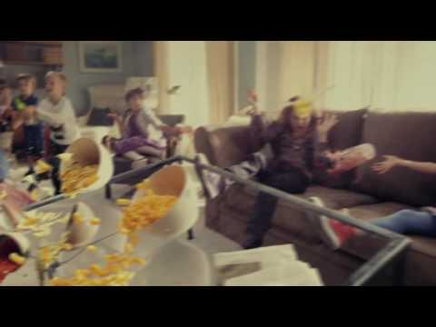
Here is a superb advertisement that Mohawk used to highlight the stain resistance of its carpets.

YouTube Preview Image

After that the company launches the “Rhino Challenge”.  The campaign is definitely one of the most effective ways to communicate the fact that the carpet is “stain resistant”, only glitch I noticed was that they show clips of the Rhino ‘taking a leak’ on the carpet. The clip has created a wide spread sense of disgust that has now become associated with the brand itself.

Heres the other advertisement that they used to highlight the stain resistance of the carpet, but things get messy. Effective but not all appealing.

YouTube Preview Image

The advertising blog – ‘She-conomy’ highlights how research suggests that when it comes to the carpet industry 80% of the ‘deciders’ or the decision makers are women and how women are not amused by this advertisement. The article in ‘She-conomy’ then talks about how these clips have managed to make a good lot of the female audience associate Mohawk carpets with images of a “Rhino doing its dirty business.” After reading around, I found out that some people were actually disgusted by the idea of owning a Mohawk carpet owing to these clips of this campaign.

My question to the Creative director of this campaign would be, why Rhino? Wouldn’t it have been more affective to use cute pigs? This would work quite well even in the cognitive department of thought since pigs are more likely to be associated with dirt and stain than a rhino. Also, videos of cute but dirty and messy pigs playing around it the carpet making a mess would not only get a reaction of  “Aww!”, from the female audience but it would effectively convince all pet owners to choose Mohawk. Even if it wasn’t pigs, dirty but cute dogs, coupled with a few pigs and perhaps even a messy hampster would have done the trick.

Categories
Advertising Commentary Marketing & Advertising

Before we start off, it is necessary for me to define my sly concoction of the words: Bad and Advertising.  It surprises me how this word hasn’t yet been coined given the clear meaning and, my favorite: the ring it has to it.  By bad, I intend to refer at unsuccessful advertising, or what is opinionated as unsuccessful advertising.

Now advertisements are multi faceted, most try to kill two birds with one stone by making ads that not only appeal to the cognitive segment but posses a charm that solidifies either the brand or the product in the memory of their target audience. The charm is best disguised as humor, so research suggests. But there are the other times where some advertisements try to kill too many birds with one stone. Pardon the extension of the metaphor, but they manage to pulverize one and as a result completely offshoot the other one.

That is what I mean by Badvertising. Effective in the sense that it makes a strong point. The facts are flowing but the factor (of appeal) is not.  When there is a slight mis-balance in the fact to factor ratio, one tends to make up for the other but when things go wrong, they soon turn from the good, then to the bad and land up finally being – The Ugly ( all this digression despite solidly enforced facts ).

All these metaphors and all the ambiguous references made in the above three paragraphs are my prelude to the analysis of a very strong advertising campaign. By strong I mean Rhinoceros strong.

If your considering the fact that, me not giving out explicit references to what campaign I am talking about, is Badvertising. Think again.  I am just following good advice and the age of policy of “divide and rule” only this time I am battling the ‘word count’.

Spam prevention powered by Akismet