An Isotope of Advertising.

Plain. Simple. Marketing.

An Isotope of Advertising. header image 4

Presentation Ideas- Dove`s Problem package.

March 30th, 2011 by aaeranpurwala
Respond

Well just this week we have all had our presentations for the marketing course. Personally, I was extremely happy with how our presentation went, this was not cause my group was really good (which it was!) but because together we came up with really interesting and feasible ad – campaign solutions.

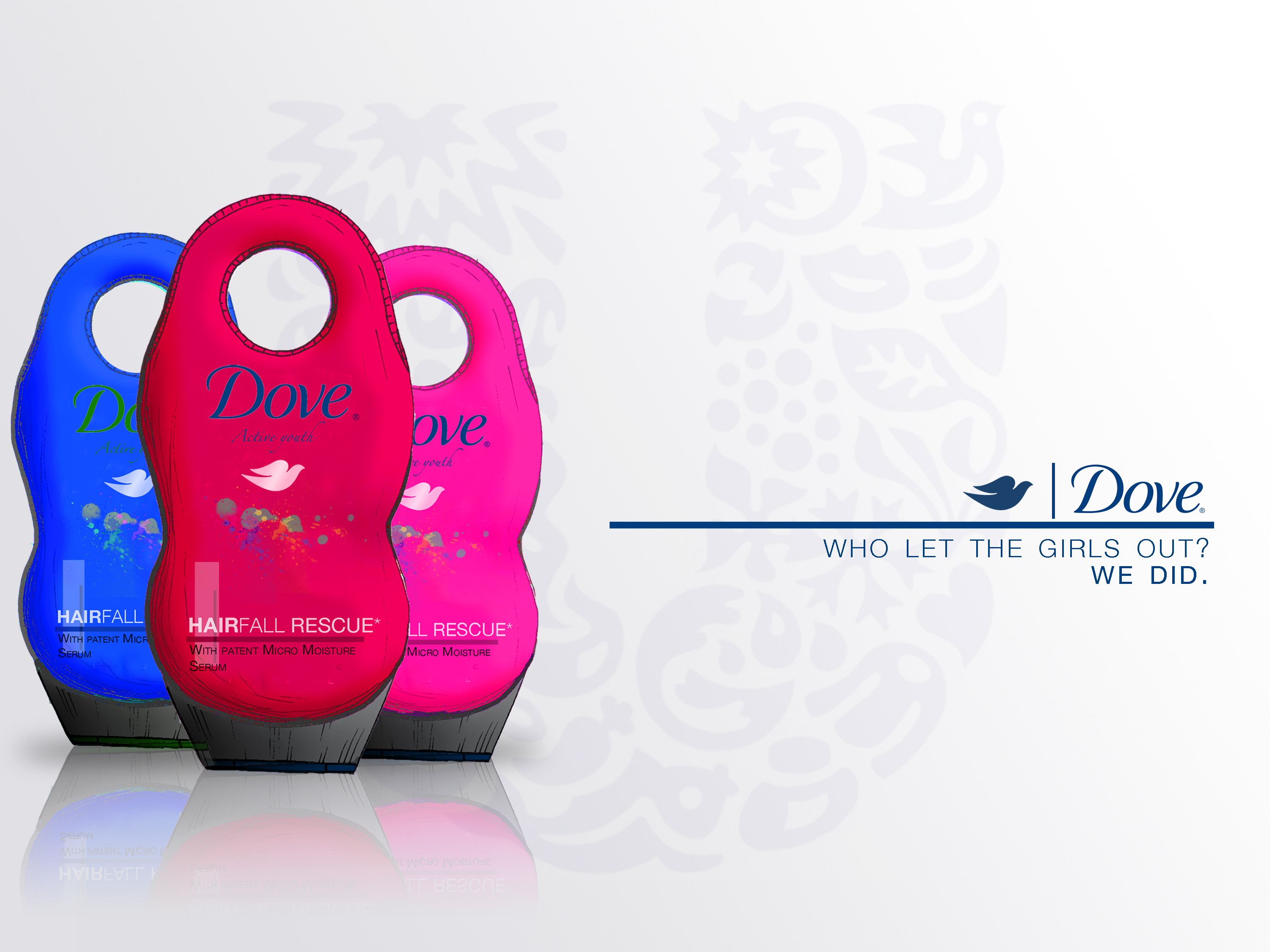
We talked about Unilever`s Dove brand, recommended that they invest time and money into creating a specific product that appeals to the younger generation of women. We basically wanted them to package their product in such a way, that allows them to become the axe of the female category, not necessarily vulgar and sexy but more on the lines of sweet and sexy.  We created an interesting package, with bright colors to attract the attention of the youth within us, cause personally its light, boring and highly repetitive package of dove is not that appealing, also the smooth outer exterior doesn’t allow for any grip especially with soapy hands.  To battle that we added a hook, and a more curved features to allow for better grip.

Heres the package I created, Made it into a poster form for the presentation. Im glad the controversial yet funny tag line went un-questioned

Also, when I wanted to create a good solution to the existing package, I analyzed a few of their existing packages, being a Dove men + Care user I had to jot down my experiences with that packages, sort out any problems that I had with it, then, I had to fix them. I mostly used the product after swims in the highly chlorinated UBC swimming pool, so I had to carry this bulky dull colored blob of a product just to wash my almost non existent hair, sometimes all the effort wasn’t worth it!  Keeping this in mind, while researching product design and carefully considering options, it makes sense for Dove to produce slightly smaller packages made of Post consumer recycled plastic [ the same thing toothpaste packages are made of ] which would not only make the package more portable but perhaps reduce costs considering the current packages are of hard plastic.  This would also reduce wastage of the product, since you can squeeze the living juice out of a toothpaste tube, do the same with shampoo.

These additions could possibly lead to a successful venture into this segment. I sincerely hope similar ideas have already been considered and discarded because of really good reason.  It would be interesting to know their take on this suggestion.

.

Tags: No Comments.

Evolutionary identity created by Logo – morphosis.

March 18th, 2011 by aaeranpurwala
Respond

It is interesting how logos change over time. Some change for the better and some for the worse. Recently Starbucks changed their logo too, upon reading about the reasons for this modification I learnt that a changed logo was meant to symbolize a change in the company’s value proposition and focus to allow for growth. The nature of conventional logos do not allow for freestyle change, once a certain logo is picked, that’s it, it can symbolize growth, it can symbolize change but by itself it cant change or grow.

The new  Deichmanske Library in Bjørvika, Oslo was in need of a logo. The challenge was to design a logo that clearly symbolizes change and evolution. The new Library was opened to serve various needs of the community, it not only served as a place for unlimited access to great information but it also provided space for concerts and encouraged guest lecturers and professors to hold debates. It is a cultural institution that aims at becoming most modern and functional libraries in Europe.

With this new challenge at hand and given the nature of conventional logo graphic designers were left puzzled until Mikael Floysand came up with an evolving logo. The logo not only symbolizes the strength of the institution and fusion of the traditional and modern systems but it is designed to allow for morphosis. This ability of the logo allows it to be recognizable to everyone even though it is never the same. This characteristic exaggerates the evolutionary nature of the institution successfully.

This concept of conceptualizing a logo and just fascinates me. As a graphic designer, to me this concept marks the beginning of a new generation of logos. This generation will be characterized by creativity and it will (hopefully) destroy the monotony that corporations use get into our retrieval sets.

Here is the masterpiece in action, very simple, very memorable but never the same.

Tags: No Comments.

The Subconscious Sales Catalyst: Music.

March 10th, 2011 by aaeranpurwala
Respond

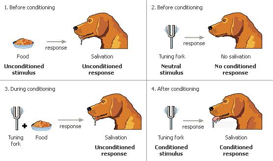
Being an avid listener of music, I always wondered if the mood changing quality of music can be put to profitable use. My friend Pierre, who is one of the best music directors I know, is also a Sauder student who has explored this curious statement in his blog. His blog is dedicated to marketing and its inseparable ties with music. Specifically, his blog “Music and its effect on consumers” caught my attention. In this blog post he introduces the topic of Classical conditioning and explains to us why or how music tends to affect consumers. He illustrates this by taking us through an experiment conducted by Gorn. I want to emphasize that music is being used to sway consumers in more ways than we can consciously recollect. To achieve this goal I will be enumerating more contemporary  situations where this ability of music is being used to churn sales.

For starters, It is used in-stores to sway our buying patterns. More specific places where we can actually observe how music can translate into sales are restaurants and coffee shops. Factors that need to be observed to gain an understanding of what is the “expected” result of the music being played are: the decibels (loudness), the tempo of the music, the genre and the bpm (beats per minute). Observing these elements can allow you to predict the pricing strategy the management is employing.

Fast paced, loud music means the management prefers that you remain upbeat and eat to get going. This means they concentrate on creating more number of sales, hence a sales orientation is implied. If the music is low, calming and soothing it would mean that the management prefers you relax and enjoy your meal, perhaps lounge there for a bit and order an extra treat for yourself. Here the focus is enjoying and relishing the product, presumably a quality product, which is bound by a profit orientation or maybe even a value based strategy.

The principles on which these tactics work is best described as classical conditioning, but the only modification that occurs here is that the clever marketing strategists determine what music has what effect on their target market, once the desired state is reached they present their product as the most conveniently available option. In essence, they don’t necessarily “condition us” to becoming hungry when the tuning fork is struck, they wait for that to happen, then they just ring the tuning fork and present their tempting pastries. Thus disguising music as a perfect sales catalyst.

Heres the Diagram Pierre uses, I am using it to illustrate the tuning fork metaphor I use in my concluding statement.

Tags: No Comments.

Logos – Under rated identity.

March 7th, 2011 by aaeranpurwala
Respond

This one is for all those people who believe a logo is just something they need to get out of the way before they can start working on a new project. This one is for everyone who assume a logo is going to cost them a maximum of 50$. Its not worth 50$, in fact it is priced at what you perceive the price of your company to be. Obviously that price is not a cost, but that’s the worth of the logo.

A logo is an identity, it is a representation of your company values. It is the most versatile form of reaching out to your target audience. It is that thing that gets into peoples head and acts as a salesman. It grows on them, it grows on you, to become a part of you and your company. If your thinking a logo is the easiest thing to design, your mistaken. As a matter of fact, most designers admit that a logo is the hardest more stressful to design. It needs creativity, it needs cleverness, it need outside the box thinking- which means everything in the box of is thought of first to get a clear definition of outside the box. It involves making at least 5 drafts. It is custom made for you preference, there is never a template. It needs research, it needs experience to become in to that mirror that perfectly reflects the purpose of your company while displaying your core values. It needs to be concise, and clever. Not to forget the most important element, visually eye catching and memorable.

All these little but extremely important element makes a good logo. If you ever host an event or start a company, make sure your designer checklists all these elements before he gets started. If he doesn’t, let your budget allow it, and even then if he doesn’t find another. This is important for you, make sure the money you set aside for this reflects that idea.

Tags: No Comments.

The Swiss Inspiration. Helvetica.

February 25th, 2011 by aaeranpurwala
Respond

The storm churned up by the industrial revolution is something everyone is familiar with, but little do people know how this revolutionary mindset had its implications on the design industry. Along with traditional manufacturing methods, even the serifs in fonts were dropped during the start of the 19th century. Initially, this was just a form of non – conformity with an ironic capability of symbolizing conformity and order.

With the dashes (serifs) dropped and additional horizontal slashes on the exceptionally distinct e, the sans serif revolution gave birth to something that is quoted to be as ominous as air itself. Helvetica. This typeface was invented in the modest workshop of the Haas foundry, Switzerland. The purpose of this font was to strip a typeface of character and emotion, to create a typeface that instantly absorbs or rather reflects the characteristics of its context. Successfully satisfying these requirements allowed this 59 year old to become to most widely used typeface in the history of mankind.

With the figure ground relationship between the font and the background mastered so well that established designers go as far as describing Helvetica as a typeface that feels like an “icy glass of distilled water offered to a nomad stranded in the hot dusty desert”. This uni-weighted font was not about the black of the font on the white of the paper it was about the white of the paper holding the black of the font together, it was clean, it was crisp, it was smooth, it looked authoritative and it was the only font the corporate logos were boasting ( Staples, MetLife, Greyhound, BMW, Toyota, Sears, Tupperware, Nestle, Lufthansa, Oral –B, Knoll, NASA, American Apparel, target, Verizon, North Face, Jeep).

With every governmental organization and Multi national corporation sending out in –office notices informing employees to start using Helvetica as the new default font, with road signs and public notices now giving directions in Helvetica, it is said that if Helvetica was a person he/she would be easily twice are more influential than all dictators and presidents put together.

Helvetica was the birth child of an specific advertising need. If something so small can conceive something so big that can achieve so much, what is stopping us? After all Helvetica is just a typeface, we are human.

Like the Rome has Romans, these guys below are all Helveticans.

Imagine the royalties, if you were Helvetica.

Tags: No Comments.

What’s the net worth of the net of networks?

February 14th, 2011 by aaeranpurwala
Respond

A flying thought slammed straight onto my forehead and conveniently walked right into my basket of unsolvable question that’s been piling up since my imagination first came up with: what is the magic spell that does all your homework? The only difference has been that since then, I’ve given up on looking for spell books and Id like to think I’ve grown out of ‘that’ phase. Only recently did I learn that growing out of ‘that’ imaginative, wildly creative phase isn’t particularly a good thing. Ken Robinsons talk on creativity being killed by the education system was the stimulus that lead to this realization.

Since then, I have reached back to that old pile of thoughts and I have tried getting the answers to the question bank in my head. Successfully, I have solved some of the mysteries, but this thought of being able to quantify branding has really started to hinder my day-to-day activities. I need answers.

I use Social Networking all the time, I try to remain active on the websites I do use. But if a company was to socially network itself, how would we be able to quantify this? What would the number of hits mean? Should we be even looking at the hits to quantify this presence? Offensive/ ridiculously abusive websites tend to get a lot of hits, but how can I differentiate those hits from other hits? What other qualitative factor should be paired with hits to prove positive associative satisfaction?

An other thought on the same track, why is the ratio of questions to answers so unbalanced? So many questions, but too few answers. Although It might seem like I am drifting to the philosophy side of things, but would philosophy be about questions if it wasn’t advertised as such? Wouldn’t it be about perspectives?

Lets get answering.

Google.

(This serves as an interesting copywriting ad pitch, since all these questions make you want answers. This entire search for answers makes you wish you had all the answers. Your answer is, Google.)

PS- let me know if you actually used Google after reading.

Tags: No Comments.

First it was celebs, then athletes, now Rhinos !?!

February 2nd, 2011 by aaeranpurwala
Respond

Like how movies have trailers, this post has one too. I didn’t want to repeat the same header “Badvertising – the good, the bad and the Ugly.”  So I actually decided to use the first thought I had when I read about this campaign as a header just to give you a good idea of what you would be reading about.

Now I will elaborate on what I meant exactly by the digression of a company’s ad campaign over the year and how it went from being the good, to the bad and finally ended up at the ugly. The Mohawk Industries survived the great depression, but can their image survive an Ad campaign that has affected their brand image, even possibly permanently.

First the company launches a brilliant advertisement, the concept is unique and the message comes across beautifully. This advertisement appeals not only to the Cognitive thinking capabilities of the target audience but successfully manages to leave strong memories of the products and it unique qualities without sacrificing the factor of appeal.

Here is a superb advertisement that Mohawk used to highlight the stain resistance of its carpets.

YouTube Preview Image

After that the company launches the “Rhino Challenge”.  The campaign is definitely one of the most effective ways to communicate the fact that the carpet is “stain resistant”, only glitch I noticed was that they show clips of the Rhino ‘taking a leak’ on the carpet. The clip has created a wide spread sense of disgust that has now become associated with the brand itself.

Heres the other advertisement that they used to highlight the stain resistance of the carpet, but things get messy. Effective but not all appealing.

YouTube Preview Image

The advertising blog – ‘She-conomy’ highlights how research suggests that when it comes to the carpet industry 80% of the ‘deciders’ or the decision makers are women and how women are not amused by this advertisement. The article in ‘She-conomy’ then talks about how these clips have managed to make a good lot of the female audience associate Mohawk carpets with images of a “Rhino doing its dirty business.” After reading around, I found out that some people were actually disgusted by the idea of owning a Mohawk carpet owing to these clips of this campaign.

My question to the Creative director of this campaign would be, why Rhino? Wouldn’t it have been more affective to use cute pigs? This would work quite well even in the cognitive department of thought since pigs are more likely to be associated with dirt and stain than a rhino. Also, videos of cute but dirty and messy pigs playing around it the carpet making a mess would not only get a reaction of  “Aww!”, from the female audience but it would effectively convince all pet owners to choose Mohawk. Even if it wasn’t pigs, dirty but cute dogs, coupled with a few pigs and perhaps even a messy hampster would have done the trick.

Tags: No Comments.

January 26th, 2011 by aaeranpurwala
Respond

Before we start off, it is necessary for me to define my sly concoction of the words: Bad and Advertising.  It surprises me how this word hasn’t yet been coined given the clear meaning and, my favorite: the ring it has to it.  By bad, I intend to refer at unsuccessful advertising, or what is opinionated as unsuccessful advertising.

Now advertisements are multi faceted, most try to kill two birds with one stone by making ads that not only appeal to the cognitive segment but posses a charm that solidifies either the brand or the product in the memory of their target audience. The charm is best disguised as humor, so research suggests. But there are the other times where some advertisements try to kill too many birds with one stone. Pardon the extension of the metaphor, but they manage to pulverize one and as a result completely offshoot the other one.

That is what I mean by Badvertising. Effective in the sense that it makes a strong point. The facts are flowing but the factor (of appeal) is not.  When there is a slight mis-balance in the fact to factor ratio, one tends to make up for the other but when things go wrong, they soon turn from the good, then to the bad and land up finally being – The Ugly ( all this digression despite solidly enforced facts ).

All these metaphors and all the ambiguous references made in the above three paragraphs are my prelude to the analysis of a very strong advertising campaign. By strong I mean Rhinoceros strong.

If your considering the fact that, me not giving out explicit references to what campaign I am talking about, is Badvertising. Think again.  I am just following good advice and the age of policy of “divide and rule” only this time I am battling the ‘word count’.

Tags: No Comments.

“It dont matter if its Black or White.” Actually, It does.

January 20th, 2011 by aaeranpurwala
Respond

Quoting Michael Jackson: that might have captured your attention. Disagreeing with his quote – Genius! . Its all allowed in this game we call marketing.

Please pardon my choice of indulging in casual discourse. I prefer to do so owing to my topic of discussion – ” Readability “.

Yes. I was referring to the color of fonts and their respective backgrounds in my potentially controversial header. This might come as a surprise but there is a reason why news papers have black text and white backgrounds; why the most effective brochures have maximum black text on white background; why websites (including this one) have black text on white background. The answer is – “Readability”. It has scientifically been established that lengths of text are more readable when the text is black with a white or slightly off-white background.

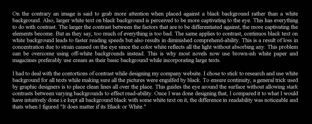
On the contrary an image is said to grab more attention when placed against a black background rather than a white background. Also, larger white text on black background is perceived to be more captivating to the eye (Refresh the page, observe the first thing you notice. You tend to notice this header with white text on black background and not the main header). This has everything to do with contrast. The larger the contrast between the factors that are to be differentiated against, the more captivating the elements become. But as they say, too much of everything is too bad. The same applies to contrast, continuos black text on white background leads to faster reading speeds but also results in diminished comprehend-ability. This is a result of loss in concentration due to strain caused on the eye since the color white reflects all the light without absorbing any. This problem can be overcome using off-white backgrounds instead. This is why most novels now use brown-ish white paper and magazines preferably use cream as their basic background while incorporating large texts.

I had to deal with the contortions of contrast while designing my company website. I chose to stick to research and use white background for all texts while making sure all the pictures were engulfed by black. To ensure continuity, a general trick used by graphic designers is to place clean lines all over the place. This guides the eye around the surface without allowing stark contrasts between varying backgrounds to effect read-ability. Once I was done designing that, I compared it to what I would have intuitively done i.e kept all background black with some white text on it, the difference in readability was noticeable and thats when I figured “It does matter if its Black or White.”

Try reading the same text but on a black background – you might observe slower reading, also you might give up after 3 sentences or so. To be fair, if you click on the image you can get a better-sized version.

Tags: 2 Comments

Hello world!

January 17th, 2011 by aaeranpurwala
Respond

Welcome to UBC Blogs. This is your first post. Edit or delete it, then start blogging!

Tags: 1 Comment