Categories
Marketing & Advertising Text and Type

The Swiss Inspiration. Helvetica.

The storm churned up by the industrial revolution is something everyone is familiar with, but little do people know how this revolutionary mindset had its implications on the design industry. Along with traditional manufacturing methods, even the serifs in fonts were dropped during the start of the 19th century. Initially, this was just a form of non – conformity with an ironic capability of symbolizing conformity and order.

With the dashes (serifs) dropped and additional horizontal slashes on the exceptionally distinct e, the sans serif revolution gave birth to something that is quoted to be as ominous as air itself. Helvetica. This typeface was invented in the modest workshop of the Haas foundry, Switzerland. The purpose of this font was to strip a typeface of character and emotion, to create a typeface that instantly absorbs or rather reflects the characteristics of its context. Successfully satisfying these requirements allowed this 59 year old to become to most widely used typeface in the history of mankind.

With the figure ground relationship between the font and the background mastered so well that established designers go as far as describing Helvetica as a typeface that feels like an “icy glass of distilled water offered to a nomad stranded in the hot dusty desert”. This uni-weighted font was not about the black of the font on the white of the paper it was about the white of the paper holding the black of the font together, it was clean, it was crisp, it was smooth, it looked authoritative and it was the only font the corporate logos were boasting ( Staples, MetLife, Greyhound, BMW, Toyota, Sears, Tupperware, Nestle, Lufthansa, Oral –B, Knoll, NASA, American Apparel, target, Verizon, North Face, Jeep).

With every governmental organization and Multi national corporation sending out in –office notices informing employees to start using Helvetica as the new default font, with road signs and public notices now giving directions in Helvetica, it is said that if Helvetica was a person he/she would be easily twice are more influential than all dictators and presidents put together.

Helvetica was the birth child of an specific advertising need. If something so small can conceive something so big that can achieve so much, what is stopping us? After all Helvetica is just a typeface, we are human.

Like the Rome has Romans, these guys below are all Helveticans.

Imagine the royalties, if you were Helvetica.
Categories
Marketing & Advertising Text and Type

“It dont matter if its Black or White.” Actually, It does.

Quoting Michael Jackson: that might have captured your attention. Disagreeing with his quote – Genius! . Its all allowed in this game we call marketing.

Please pardon my choice of indulging in casual discourse. I prefer to do so owing to my topic of discussion – ” Readability “.

Yes. I was referring to the color of fonts and their respective backgrounds in my potentially controversial header. This might come as a surprise but there is a reason why news papers have black text and white backgrounds; why the most effective brochures have maximum black text on white background; why websites (including this one) have black text on white background. The answer is – “Readability”. It has scientifically been established that lengths of text are more readable when the text is black with a white or slightly off-white background.

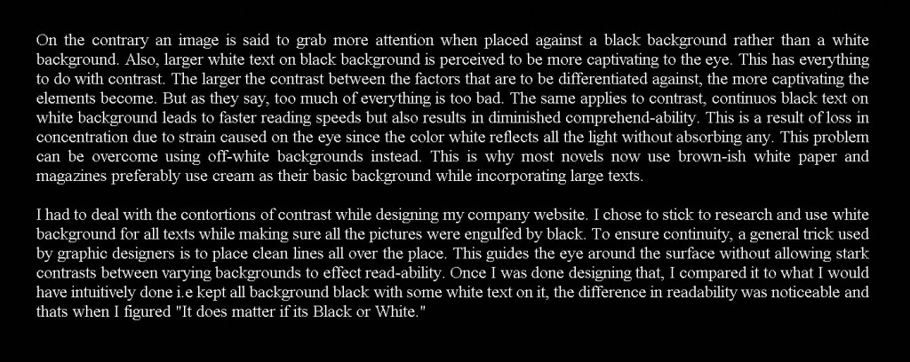
On the contrary an image is said to grab more attention when placed against a black background rather than a white background. Also, larger white text on black background is perceived to be more captivating to the eye (Refresh the page, observe the first thing you notice. You tend to notice this header with white text on black background and not the main header). This has everything to do with contrast. The larger the contrast between the factors that are to be differentiated against, the more captivating the elements become. But as they say, too much of everything is too bad. The same applies to contrast, continuos black text on white background leads to faster reading speeds but also results in diminished comprehend-ability. This is a result of loss in concentration due to strain caused on the eye since the color white reflects all the light without absorbing any. This problem can be overcome using off-white backgrounds instead. This is why most novels now use brown-ish white paper and magazines preferably use cream as their basic background while incorporating large texts.

I had to deal with the contortions of contrast while designing my company website. I chose to stick to research and use white background for all texts while making sure all the pictures were engulfed by black. To ensure continuity, a general trick used by graphic designers is to place clean lines all over the place. This guides the eye around the surface without allowing stark contrasts between varying backgrounds to effect read-ability. Once I was done designing that, I compared it to what I would have intuitively done i.e kept all background black with some white text on it, the difference in readability was noticeable and thats when I figured “It does matter if its Black or White.”

Try reading the same text but on a black background – you might observe slower reading, also you might give up after 3 sentences or so. To be fair, if you click on the image you can get a better-sized version.

Spam prevention powered by Akismet