2-Dimensional Gaussian Filtering Visualized
Whenever you use a new technique, it’s important to know exactly what it’s doing – otherwise, we’ll be potentially in the dark when it comes to actually interpreting the results of the technique.
For the case of my project, I’ve been interested for a while now in implementing Mike Zanetti’s suggestion to apply filtration and roughness calculation methods from the metrology community (as in the study of measurement, not to be confused with meteorology!). On that basis, the Gaussian filter has been for several decades the industry standard – and specifically, the 2D Gaussian filter, when it comes to decomposing surfaces into ‘waviness’ and ‘roughness’. These somewhat arbitrary concepts concern the variability of a surface throughout different scales. For instance, let’s say that there’s a mountain, and we’d like to investigate its roughness. For this purpose, we’re probably interested in the ‘fine-scale’ variability (denoted roughness) of the mountain topography, and probably not so interested in the large-scale variability (denoted waviness) of the mountain’s height over, say, several kilometres.
In the same vein, when it comes to lava flows (whether in Craters of the Moon, or as impact melt flows on the Moon), since we’re interested in the fine-scale roughness (on the scale of approximately 1-10s of metres), the variability of topography over scales much larger than these is probably not relevant to us, and therefore something we would want to ‘remove’ from our consideration. While this may seem intuitive in principle, the devil lies in the details, in 2 key respects:
a) The distinction between waviness and roughness is arbitrary, depending necessarily upon the roughness scales under consideration. For instance, do we decide to make the roughness/waviness cut-off at 10m? 20m? 100m? For our case, this threshold should depend upon the wavelengths of radar used, if we are to test the desired hypothesis that there exists a correlation between the intensity/scattering of the incident electromagnetic waves from our instruments (radar/LiDaR) and the roughness of the surface off of which these electromagnetic waves are scattered.
b) Even if we’ve identified the scales we’d like to remove, how do we actually go about performing this ‘removal’ process?
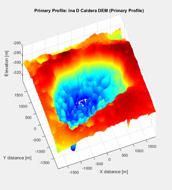
First, let’s take a look at the field site once again: Ina D Caldera, on the Moon. Below is a 3D visualization of Ina (with significant vertical exaggeration), from which you can clearly see the steep depression formed by the caldera, as well as its interior structure.

The general idea of the Gaussian Filtration process is that we take 2D Discrete Fourier Transform (DFT) of the ‘primary surface’ (ie. the grid of elevation points visualized above), then the 2D DFT of the discrete representation of the Gaussian function, known as the ‘Gaussian kernel’. If we then multiply these two transformed entities together, then apply the 2D Inverse Discrete Fourier Transform (IDFT) to convert from frequency-space to our familiar 3-dimensional space, we should obtain an image like that above, but with long-wavelength components accentuated, and shorter-wavelength components attenuated. This is a key point: attenuated, but not suppressed entirely. Owing from the smooth nature of the Gaussian filter, there is no strict wavelength cut-off, below which no short-wavelength signals are expressed; rather, there is a smooth continuum, as the frequency-response graph below demonstrates:
![]()
The graph shows how, even at the ‘cut-off’ wavelength of 100m (which was specified as an input to the filter), 50% of 100m wavelength signal will still be expressed in the final image. For wavelengths of ~50m and below, virtually all of the signal is expressed; conversely, for wavelength of ~1km and greater, virtually no signal will be expressed. Between these extremes, however (ie. between 50-1000m), we see that the final image will be comprised of a complex superposition of waves of different wavelengths, albeit heavily weighted towards wavelengths at smaller scales. Note, however, that the choice of cut-off wavelength was arbitrary, corroborating supposition (a). We would in turn attain a different frequency-response curve were we to specify a different cut-off wavelength.
To outline the process, we begin by applying the 2D DFT to the primary surface (the first picture). Mathematically, this is represented by the formula
where z(k,j) is the height/elevation of the primary surface at the row and column indices k and j, respectively,
nx/ny is the size of the array in the x/y direction,
dx/dy is the spacing between adjacent elements of the array in the x/y direction, and
fx/fy is a vector of spatial frequencies in the x/y direction.
In more heuristic terms, we multiply each and every point in the array by an exponential function, producing an array of frequency information of the same dimensions as our original elevation array. While this array will most likely be populated by complex numbers, because the phase information is not particularly useful for our purposes, we can just extract the real part in order to plot amplitudes at various frequencies.
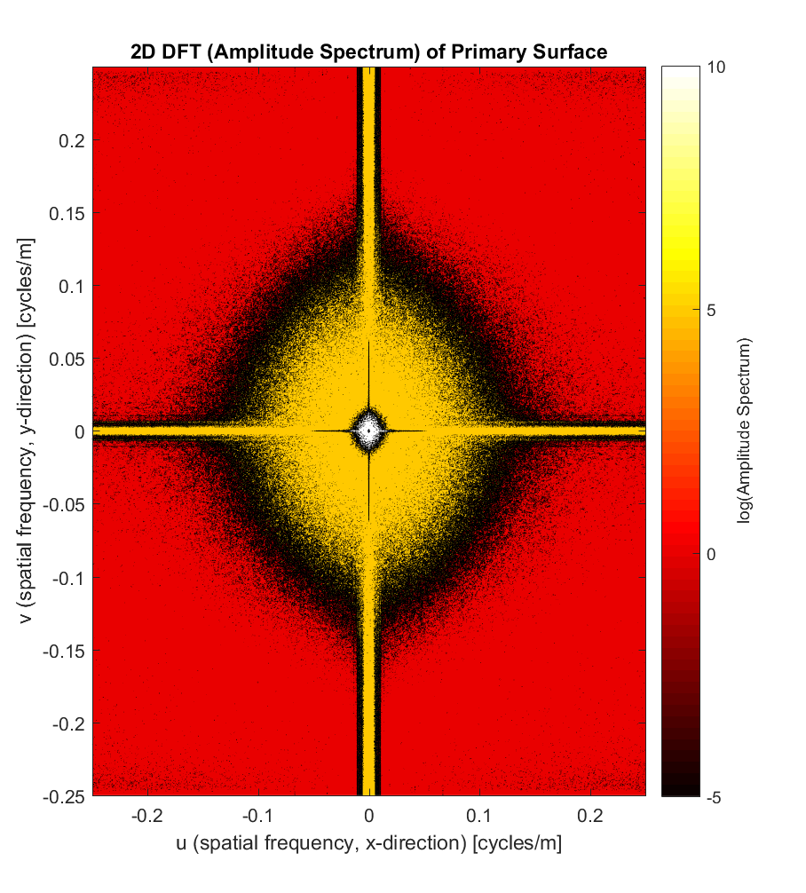
If you’re anything like me, one key question will be lingering in your mind: what are the values of the frequency vectors fx and fy, and how are they decided? The answer is that the smallest frequency interval in the x/y direction is simply the extent of the spatial domain in that direction, ie. the x/y dimensions of the elevation array. On that basis, a larger array (in terms of the space it encompasses) will have higher frequency resolution, while a smaller one will have coarser frequency resolution.
Formally, the frequency will range from [ 1/(1*dx) 1/(2*dx) 1/(3*dx) … 1/(nx*dx) ]. For Ina D, since the spatial resolution dx=dy=2m, and nx~=ny~=2000, our frequency vectors will look like fx~=fy~=[1/4000 2/4000 3/4000 … 2000/4000 ] spatial cycles/m, such that our frequency range is about 1/4000 = (0.00025-0.5) cycles/m. The plot below shows the result of the 2D DFT, as applied to the Ina D elevation array, where we’ve performed a shift, such that the 0-frequency is shifted to the centre of the plot. What’s notable is that the frequency amplitude information is symmetrical for both positive and negative frequencies; a consequence of the fact that the signal we began with (elevations) was purely real (I’m not sure what an imaginary elevation would look like, much less actually mean…). In addition, looking at the amplitude spectrum (where the colourbar spans an astronomical 15 orders of magnitude in log-log space!), there’s an amplitude spike in the centre of the plot for very low frequencies (large wavelengths), then lower amplitudes for frequencies of 0.02-0.1 cycles/m (10-50m wavelengths), and negligible amplitudes for frequencies greater than 0.1 cycles/m (less than 10m wavelengths). As expected, this pattern mirrors that which we anticipated from our frequency-response curve, at least to first approximation.
Next, we take the 2D DFT of the Gaussian kernel, which is essentially just 2 orthogonal Gaussians together (one oriented along the x direction, and another along the y). The 2D Gaussian kernel’s functional form is
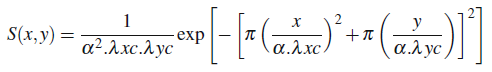
where alpha is the constant sqrt(ln(2)/pi), and
lambda(xc)/lambda(yc) is the cut-off wavelength in the x/y direction (100m for both in our case).
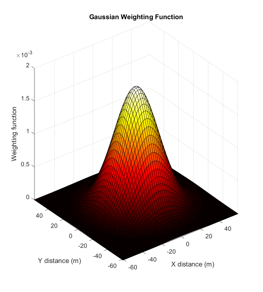
Here is the 2D Gaussian kernel:
And the 2D DFT of such:
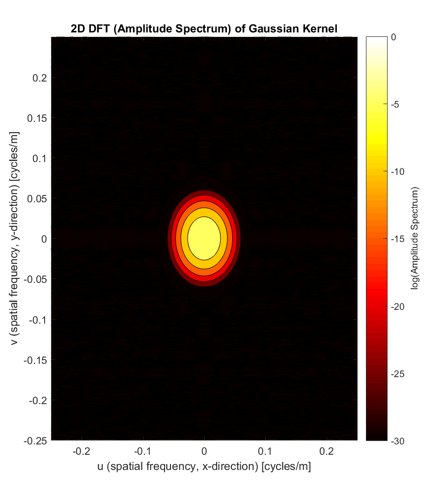
We see that, like its spatial representation, the Gaussian attenuates very quickly away from the central peak; in fact, the Fourier Transformed Gaussian is just another Gaussian function (albeit scaled), as suggested by the contour plot. This is a property unique to the Gaussian function: it is the only function that is its own Fourier Transform.
Now that we have the 2D DFT’s of both the primary surface and the Gaussian kernel, we can multiply them together element-by-element (eg. (1,1)*(1,1); (1,2)*(1,2); …) to produce the amplitude spectrum of the waviness (long-wavelength) surface:
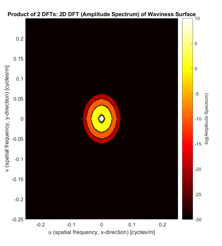
But this doesn’t mean much until we apply the inverse DFT to get back to the 3-dimensional space we know and love, the result of which you can see below, juxtaposed with the primary profile we started out with:
The waviness surface appears, as predicted, smoother than its progenitor. To really tease out the differences, however, it’s more instructive to plot the roughness surface, which is just the elevations of the primary surface subtracted from those of the waviness surface:
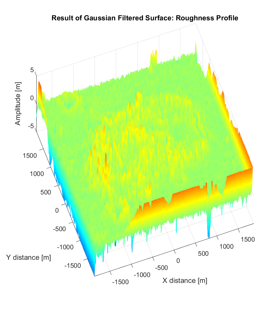
The roughness surface we’ve produced now seems more like the kind of ‘de-trended’ surface upon which our calculation of roughness parameters (such as the RMS slope and Hurst exponent) will be more physically relevant, seeing as we’re only interested in roughness at relatively fine scales, and not the large-scale, global topographic trend. That said, the edges of the roughness surface must be treated with care: the Gaussian filter results in notorious ‘edge-effects’, such that the anomalously high and low values close to the edges of the image are erroneous. The recommended solution to this advocated by the metrology literature is to remove the outermost 0.5-1 cut-off wavelengths, corresponding to the outermost 50-100m of our Ina D roughness surface map.