Data Table
| Data | Data Type | Source |
| Housing Characteristics (Housing values, Rental Costs) | Tabular | Census Bureau |
| Occupant Characteristics (Education, Poverty, Racial demographics) | Tabular | Census Bureau |
| Atlanta Region Census Tracts (2000) | Vector Polygon | Atlanta Regional Commission Open Data and Mapping Group |
| Greenspace | Vector Polygon | Atlanta Regional Commission Open Data and Mapping Group |
| Hospital Community Facilities | Vector Point | Atlanta Regional Commission Open Data and Mapping Group |
| ESRI North America Amenity Layer | Vector Point | ESRI, OpenStreetMap |
Table 1: Data types and sources
Methodology
The study employed a multi-step approach to understanding the relationship between the presence of community amenities and gentrification. First, a gentrification index was created to model factors linked with gentrification and score each census tract based on a combination of these factors. Amenities were then grouped as subcategories to include as explanatory variables in a geographically weighted regression (GWR) analysis. Explanatory variables included hospital community facilities, grocery and dining locations, universities and colleges, and green spaces.
Gentrification Index
Model Design
Following a review of various published approaches to gentrification mapping (Eckerd, Kim & Campbell, 2018; Heidkamp & Lucas, 2006; Yonto & Schuch, 2020), Holm & Schlutz’s 2018 GentriMap approach was chosen as a guideline for creating a gentrification index for Atlanta. The GentriMap model combines two sets of factors, real estate and social factors, to create a single multi-dimensional gentrification model designed to be adaptable to use in any city. This framework was particularly useful due to both the flexibility of the variable categories and the relative simplicity of the dual-axis model.
To adapt the model to the Atlanta context, relevant variables were identified within census data available from the chosen interval of 2011 to 2019, which represented the largest window of results possible using the Census Bureau’s American Community Survey data. Median home values and rental costs were selected as real estate variables to represent pricing changes across the housing landscape. Changes in the social landscape were modeled using demographic data on educational attainment, poverty status, and race. Given Atlanta’s specific local dynamics as a majority-Black city, racial demographics were split into two factors: increases in white population and decreases in Black population. This design allowed for recognition of gentrification by new white populations into non-white neighbourhoods, as well as the more specific experience of the displacement of primarily Black neighbourhoods, which carry particular significance as evolving artifacts of Black and African American history in the American South (Rotenstein, 2019).
Using the combination of these six factors, the model design was finalized, with the resulting model as displayed in Figure 1.
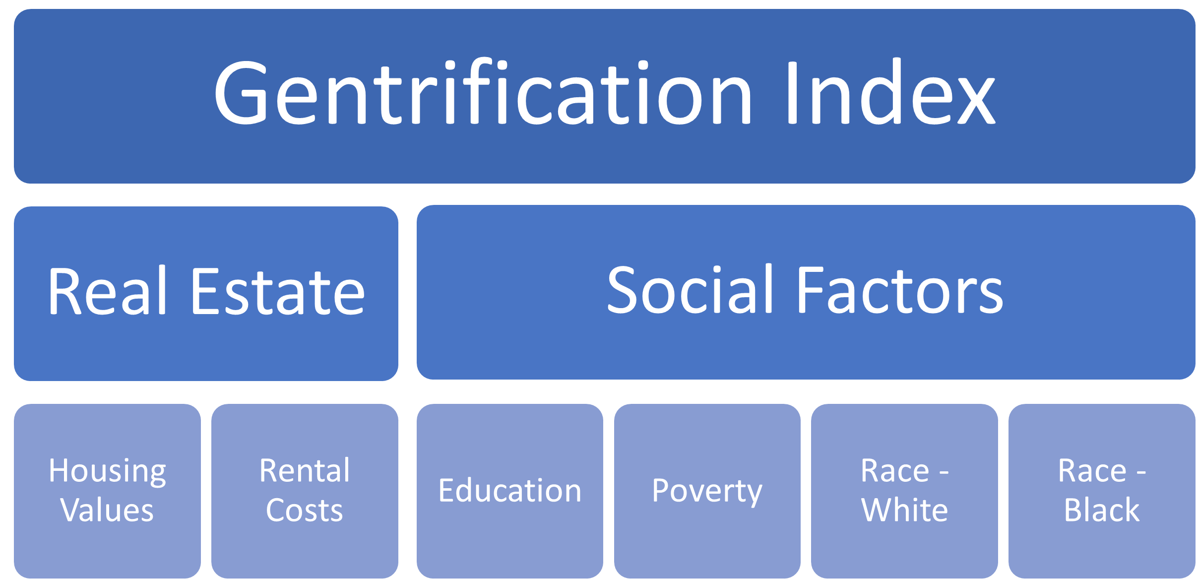
Figure 1: Gentrification Index design, based on GentriMap model
Index Variables
Using the above model design, the selected variables were normalized, then the normalized values were scored on a binary scale, with 1 representing a factor increasing the likelihood of gentrification and 0 representing the absence. The details of each variable’s normalization and scoring are contained in Table 2. Following the scoring of each variable, the variables were combined into an index score ranging from 0 to 6.
| Index Variable | Scoring System |
| Housing Values | Percent rate of change in home value between 2011 and 2019 calculated for each tract, then values above the regional median rate of change scored as a 1, all others scored as 0 |
| Rental Costs | Percent rate of change in rental cost between 2011 and 2019 calculated for each tract, then values above the regional median rate of change scored as a 1, all others scored as 0 |
| Education | Tracts with greater than 5% increase in percentage of 25+ with a Bachelor’s degree or higher scored as 1, all others scored as 0 |
| Poverty | Tracts with lower than 5% decrease in percentage under poverty level scored as 1, all others scored as 0 |
| Race – White | Tracts with greater than 5% increase in percentage of white population scored as 1, all others scored as 0 |
| Race – Black | Tracts with lower than 5% decrease in percentage of Black population scored as 1, all others scored as 0 |
Table 2: Gentrification Index variable scoring
Gentrification Index Corroboration
While a review of literature highlighted the difficulty of reproducing matching measures of gentrification (Easton, Lees, Hubbard & Tate, 2019; Eckerd, Kim & Campbell, 2018), a published comparison of four modeling approaches did suggest the likelihood of some overlaps between different models, particularly in areas where gentrification is widely acknowledged to be present (Preis, Janakiraman, Bob & Steil, 2020, p. 417). To test the usefulness of the Gentrification Index, the resulting map of values was cross-checked using the Urban Displacement Project’s Displacement Typology map for Atlanta (Chappel & Thomas, 2020). In line with the aforementioned findings on model overlaps, the tracts around Atlanta BeltLine were used as a focus region for comparison, due to the known concentration of gentrifying neighbourhoods in that area (Chappel & Thomas, 2020). Census tracts around the BeltLine were randomly selected, and the scores compared with the values assigned to the Displacement Typology map.
The majority of tract scores compared reflected their displacement map counterparts, with index scores of 4-5 corresponding with neighbourhoods labeled as “Early/Ongoing Gentrification” or “Advanced Gentrification” and index scores of 2-3 corresponding with neighbourhoods marked as “At Risk of Gentrification”. While this comparison was only qualitative, the similarities shown demonstrate the relevance of the chosen Gentrification Index factors in modelling the presence or risk of gentrification.
Explanatory Variables
According to Chapple (2009), the most notable driver of gentrification during the 1990s was the presence of amenities. For this reason, the present of amenities was chosen as a study focus. Given the diversity of research exploring the link between different types of amenities and gentrification, we aggregated our amenities to four subcategories, including: hospital community facilities, colleges/universities, green spaces, and food locations. The food locations subcategory was used to aggregate restaurants, cafes, juice bars, and Whole Foods locations.
To account for potential imbalances, variable categories with low densities across the region (e.g. hospital community facilities and colleges/universities) were processed using kernel density analysis to measure access in a gradient across larger search radiuses, while green spaces and food locations were analyzed using small buffer areas and densities within tracts.
Kernel Density Analysis
For hospital community facilities and colleges/universities, a kernel density analysis was performed to realistically represent access at the scales usually served by these institutions. An 800m cell size was chosen to represent a half-mile block neighbourhood, with an 8km search radius for hospital community facilities and a 4km search radius for colleges/universities, to reflect reasonable service areas for the facility type.
A model (Figure 2) was created to perform the kernel density analysis and transform the resulting raster layer into a choropleth map usable for final analysis. Values were rescaled from 0-100 using continuous functions to represent the non-linear changes in utility at different differences, then reclassed into integer categories for transformation into vector polygons. Finally, the resultant polygons were spatially joined to a layer of census tracts using the median value within each tract as the final score.
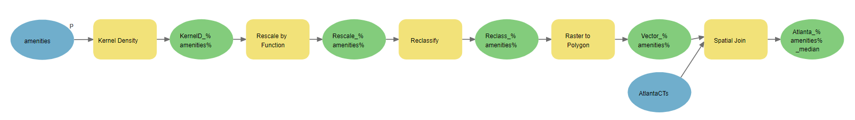
Figure 2: Processing model for amenity classes requiring kernel density analysis
Buffer and Summarize Within/Nearby Analysis
For the food and green space categories, scores were calculated using density analysis within each census tract. 800m buffers were created around the green space polygons to reduce the sharpness of arbitrary boundary lines and account for reasonable travel distances. For example, a park that was half block outside a census tract boundary would not be counted as an amenity for that census tract without the use of a buffer, despite being clearly accessible to that tract’s residents. Following the buffering of the polygons, Summarize Within was used to calculate the area covered by buffered green space, which was then expressed as a percentage of the total tract area.
Food locations were analyzed similarly but using the Summarize Nearby tool with a buffer of 800m around census tract edges to count point density. Resulting density ranged from 0-90 and thus was comparable to the scale of the other explanatory variables.
Regression Analysis
Moran’s I Test for Autocorrelation
Prior to any regressions being performed, a Moran’s I test for autocorrelation was performed on the Gentrification Index layer to understand the clustering pattern of neighbourhoods based on index score (Figure 5, Results & Discussion).
Exploratory Regression
An exploratory regression was performed to test the correlation strength of the four explanatory variable layers and identify variable combinations for the geographically weighted regression.
Geographically Weighted Regression (GWR)
Using all variables as identified in the exploratory regression, a geographically weighted regression was performed to understand the relationship between amenities and gentrification while accounting for spatial autocorrelation. A resulting map was created for further analysis (Figure 6 – Figure 9, Results & Discussion).