Categories
Marketing

Smoking Kills

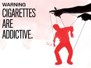
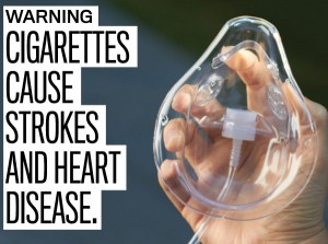
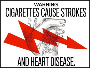
The following are WARNING images that will printed on cigarette packages. These new images are a part of the FDA’s tabaccoprevention efforts. Instead of the old “Warning” messages that were printed on the old cigarette boxes, the government has attempted to capture the attention of the general public by printing these shocking and graphic images of the negative implications of smoking.

How effective do you think these ads will be? Or will regular smokers continue to smoke regardless of what is printed on the packages?

The ads feature 9 different messages. Here are a few from each category (I’ve omitted some that are slightly more graphic. These images are taken from http://www.fda.gov/TobaccoProducts/Labeling/CigaretteProductWarningLabels/ucm2024177.htm if you’d like to find out more):

WARNING: Cigarettes are Addictive.


WARNING: Tobacco smoke can harm your children.

WARNING: Cigarettes cause fatal lung disease.


WARNING: Cigarettes cause Cancer


WARNING: Cigarettes cause strokes and heart disease.


WARNING: Smoking during pregnancy can harm your baby.

WARNING: Smoking can kill you.

WARNING: Tobacco smoke causes fatal lung disease in nonsmokers.

WARNING: Quitting smoking now greatly reduces serious risks to your health.

Although these advertisements do achieve the shock-element factor, I have to question the ethics of printing such graphic and disturbing images on these cigarette packages. I think that the last series of photos which reflect a more optimistic and hopeful image of a tobacco-free future seems like a better way to reach out to regular smokers. In the society we live in now, most people are well-aware of the negative health effects of smoking, and so printing these graphic and disturbing images would not necessarily change the habits of regular smokers.

Despite the ethical arguments behind this campaign, it is apparent that images do speak louder than words – and that these new images would probably catch more attention than their old Warning text counterparts.

Categories
Marketing

RE: “This is funny, Period.” Olivia Chiang’s Marketing Blog Post

Have you ever heard a girl mention that she’s “riding the Crimson wave/cotton pony” or that she’s having her “monthy visitor”? Or perhaps you’ve begun to think that every other girl out there has a Aunt called “Aunt Flo” who visits frequently throughout the year.

Sorry guys, but the bloody truth (pun intended) is that those statements are actually incognito ways of saying “I’m on my Period”.

Now before you all squirm uncomfortably in your seats about the “P” word, and proceed to close this internet browser – take a minute to think about those brilliant tampon and pad commercials you see on TV. Things aren’t so bad, right? Those tampax girls are usually showing their pearly-white smiles, dressed in vibrant-coloured, floral-decked, sun dresses who spin around as if the world were dainty and fun. There’s not a worry in the world when you’re time of the month comes! I believe most girls would agree with me when I say “YEAAAA righhtttt”.

This severe dissonance was brought to my attention when I was reading Olivia Chiang’s marketing blog post entitled  “This is funny, Period.” First of all, props Olivia, I love your blog post title. It made me lol, literally.

But prior to reading her blog post, I had never realized how distorted some tampon/pad advertisements are in portraying this monthy burden that half the population must endure for a good 50-60 years of their lives. Albeit, I do not have as much angst towards the tampax/always advertising as the Texan woman mentioned in Olivia’s post, but I can’t deny that she does make a valid point. “Have a happy period” – is that even possible? This Always brand tagline is featured all over their commercials and advertisements, even on the pad itself! and yet, can a single pad really conquer that monthy hormonal change that stresses and inhibits a girl from continuing her day-to-day activities? Not to mention the cramps that some girls get!

Although the ads are effective in portraying what a period is like for a girl in an ideal situation/world, those happy girls who prance around the beach during their period are simply unrealistic. My main concern is not the advertisement themselves, but the distorted view that tampon and pad commercials portray of having your period. Trust me, it’s not as fun as it looks.

Categories
Marketing

Google Goggles – Kerazy stuff!

Hey everyone,

Have you ever looked at an item – be it a book, a magazine, a landmark, a logo, or whatever it may be… and experienced a dire need to find out exactly what that thing is!? What brand it is, what company it belongs to, what year it was made, you just wanted to know. So you log on to Google, and stare at your blinking cursor – wondering what to type in order to fit the item’s description. But what if words fail you, and whatever adjectives you can muster up simply do not fit the description completely.

Well earlier on this week, I was introduced to a feature that would help solve this problem. My older sister showed me a new app. from Google that included a new feature called “Google Goggles”. She took a random book from our library, took out her phone, and used the google app to take a photo of it. Little blue, green, and red boxes appeared on the screen – scanning the photo carefully –  and within 10 seconds, a google search had been conducted simply based on the photo itself. I proceeded to immediately download his app, and then decided to search it up on youtube.

And this is what I found: YouTube Preview Image

I loved this ad in particular because of its creativity, and artistic simplicity. The majority of the commercial features black & white caricatures that look as if they’ve been drawn with a black sharpie. Any colour that is added in to it is shown to emphasize the more important points of the ad – the informative features of this new google invention.

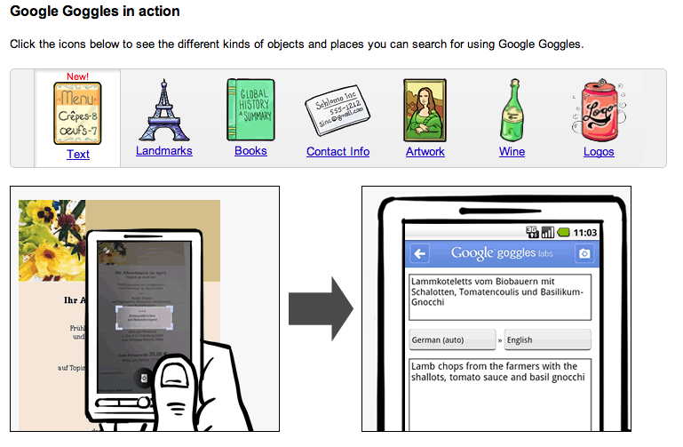
What to search using Google Goggles

All in all, it amazed me how far technology is growing. The ability for Google to develop such a far-reaching, ambitious, and complicated app. juxtaposed to the simple commercial ad made the app extremely appealing. Despite the complexity of the programming that goes behind this app. that I probably wouldn’t ever begin to comprehend, the simple and cute ad made the app. seem super easy to use!

If you have a smartphone – download the app. for free and see for yourself! It’s pretty darn cool to say the least. 🙂

Categories
Marketing

Eco-friendly cars from Volvo

This advertising campaign launched by Volvo displays several images of Volvo cars with an animal lying on its side on top of the hood of the car. The message? To inform the public that Volvo has gone eco-friendly.The following are some images from the campaign. They feature several wildlife animals assuming, what I like to call, “the Mermaid Position”.These ads do stand out in that they juxtapose a creature from nature, and a man-made, polluting machine, united and existing together in harmony. Even Volvo’s tagline “for life” could be seen as a double edge sword – it could be interpreted as a useful tool for humans during the course of our lives, or it could be interpreted as an advocate for all things living. Although the latter may not have been  Volvo’s intentional message, the advertisement could certainly be perceived that way.

Regardless, everyone loves seeing cute little forest animals chillaxing, so why not on a new eco-friendly car?

Spam prevention powered by Akismet