Open Happiness
Open Happiness. Ouvre du bonheur.
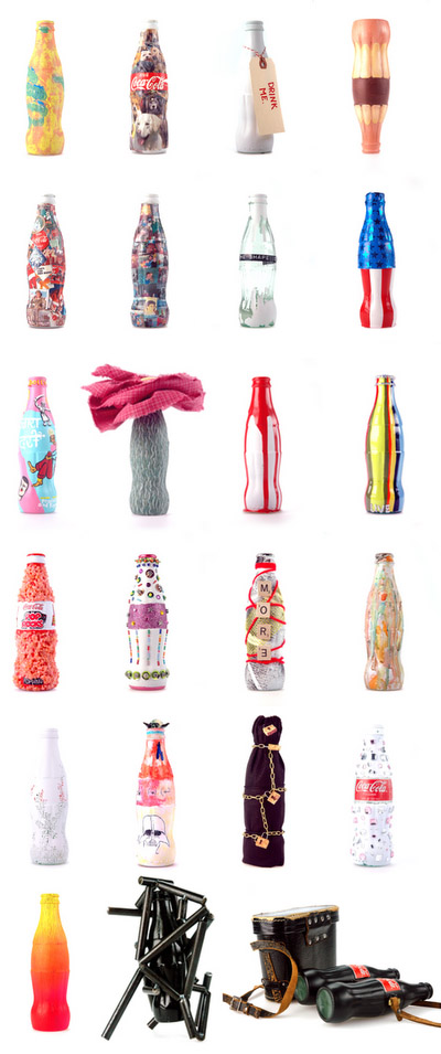
With the focus on product packaging in today’s class, Coca-Cola immediately came to mind. Launched in the late 1800s, the Coca-Cola bottle had incurred many transformations, keeping up with the world’s constant need for change. However, despite its many changes, ever since 1915, the Coca-Cola bottle has maintained its famous contour-shape.

http://popsop.com/2022
Coca-Cola’s bottle is the epitome of the importance of packaging. Because of the company’s decision to maintain the bottle’s distinct shape over the years (albeit with slight modifications), the bottle is one of the most highly recognized icons of today. Even without the words “Coca-Cola” imprinted onto the logo, one can instantly associate it with the soft-drink giant, having already instilled long-ago the bottle’s shape in his or her mind. It’s simple, it’s unique, and it is undeniably a sustainable advantage of the company.

http://tinsiders.blogspot.com/2008/02/coca-cola-bottle-designs.html
On a slightly different note (but still keeping the Coca-Cola theme), one of my favourite all-time ads:

2 comments
1 ewilliamson { 03.08.11 at 7:20 am }
Great insight into the importance of packaging consistency over time, E. Remember how a key function of packaging is to reduce search time for consumers? How does Coke do this with its bottle?
E
2 Open Happiness | myzhangg { 04.04.11 at 8:54 pm }
[…] I skimmed through my friends’ blogs for inspiration, I came across Esther’s post “Open Happiness,” in which she analysed the significance of the Coke bottle shape and how it has become an […]
Leave a Comment