by Sinsi Jiang and Rico Niedo
“The purpose of data is insight, not just pictures.”
Ben Schneiderman, Founding Director of the Human-Computer Interaction Lab at the University of Maryland
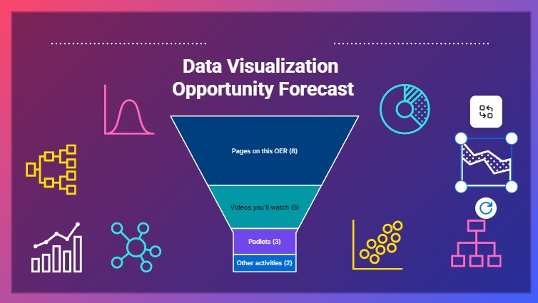
In this week’s OER we’re going to introduce to you Data Visualization in Education and Storytelling. Our apologies for misreading our dates and please take your time to complete this, we understand how much time these OERs take.
Click on the banner below to access the OER.
After going through our OER, please discuss the following with the rest of the class:
- What were some of your takeaways after learning a bit more about data visualization and its application to education and storytelling?
- What do you wish you knew more about after completing this module?
Thank you so much for your participation
Hi Rico and Sinsi!
Great job on this OER. I liked the multimodal format you took with this (images, videos, interactive presentations, etc.) Your banner was very clever in that it showed us a data visualization of what to expect for your OER!
I never connected data visualization with storytelling, so I appreciated learning about that in your OER. I am a huge visual learner, so I enjoy seeing my information in as many different visual formats as possible to increase understanding. Reading about the benefits of data visualization has further convinced me to continue presenting data to my students in a visual manner, as many of them are also visual learners like me. Especially in ESL contexts, sometimes images are easier to understand than words.
I think your OER touched on all the important aspects of data visualization! However, I would have liked to learn a little more about the potential misuse of data, especially when we think about user privacy and data for young learners. Adding AI into the mix, we definitely need to understand all the drawbacks before we head straight on into implementing such technology/tools.
Hey Didy!
Thank you 🙂 so much for your kind observation. I’m glad you got to take away something that will be helpful in your day to day work.
And yes, data visualization tools can definitely have some harms in it, especially in the social media and meme space. Insight is one of the greatest gifts of data visualization, but just like any good story, it can be manipulated to meet the story. Harvard Business Review (HBR) did a great introduction to the misuse of data 12 years ago that I think is still pertinent today:
https://hbr.org/2013/03/when-data-visualization-works-and
It’s a great short read 🙂
Hi Rico and Sinsi,
I really enjoyed your OER and how you incorporated data visualization in it to aid your storytelling–especially how you guys used it in your “About Us” section!
One of my takeaways from your OER, especially your Genially, is that different forms of data visualizations have different purposes and effects. Understanding when to use each type of data visualization to convey the intended message is crucial to effective storytelling through data.
For your second question, I think it would have been interesting to include an example of an ineffective use of data visualization. Overall, great job!
Hello Annaren,
Thank you for engaging with the OER and the Genially. I appreciate your thoughtful insight. You are right; each form of data visualization serves a unique purpose, and knowing when and how to use them is important. This will significantly impact how information is understood. Data storytelling is not just about displaying numbers, but it is about choosing the right visual to guide the audience toward the message. I am glad that this stood out to you. Your takeaway truly captures the core of data visualization.
I appreciate your comment on the second question. I want to share with you this article about bad data visualization. It discussed five ways how data visualizations are poorly crafted and mislead data.
https://online.hbs.edu/blog/post/bad-data-visualization
Thanks for the great OER Rico and Sinsi. I really appreciated your focus on the storytelling element of data visualization. It also made me think about the power of interdisciplinary approaches to problems. I also appreciated your ethical exploration of the topic. After completing you OER it made me want to understand more about data collection. I am still wondering whether we understand well enough what types of data need to be collected to provide us with the insights that we need to leverage the AI technologies that you discuss. It seems a balance is needed to collect enough data so that algorithmic systems can be effective, and not too much data where learners or teachers begin to feel like they are being surveilled.
Thank you, Mark! I am glad our OER sparked your curiosity on the interdisciplinary and the ethical aspects of storytelling. I like your point about the balance between effective data collection and maintaining a sense of privacy and trust. As we navigate AI, it is important we ask not just how much data we collect, but why we collect it and how it will be used. These questions will serve as a guide on creating a learning environment that is innovative and respectful.
Hi Rico and Sinsi,
Great work on your OER on data visualization! I never previously considered the importance of data visualization and the impact it has on our daily lives. Even something we look forward to at the end of every year, Spotify Wrapped, uses data visualization to present data in an interesting and engaging way to users. One of my main takeaways from your OER is the connection between data visualization and storytelling. Much like how there is the quote “a picture tells a thousand words”, a well-produced visual can convey patterns and analytics that a few paragraphs worth of words could not describe. One thing I wish we discussed further was the issues of privacy and data collection when integrating AI into these tools. While there is immense potential for AI to help make data analytics and visualization more efficient, we need to seriously consider the potential issues that may arise before we fully integrate AI into every aspect of our lives.
Thank you so much for your feedback, Timothy! We’re glad that our OER helped you see data visualization from a new perspective. While doing this, I was also surprised at how data visualization is more than just what we think it is, especially now that technology is transforming it into a creative and dynamic tool for communication. It is no longer just about graphs anymore; it has become a tool to tell stories and evoke emotions. We also appreciate your comment on the need for deeper discussion around data privacy and AI. You’re right; while AI can enhance visualization, it raises important ethical questions we must address proactively.
Thank you for your work, Rico and Sinsi!
I found myself popping back into a document I created to colect my thoughts for next school year (as a teacher), considering how I might use data visualization to help narrate the learning experiences of whole classes and individual students. Our district jusy switched to Spaces EDU as a e-portfolio solution, but I’m going to try and use it as a hub for learning, communication, and accessing content from home. Having gone through your OER, I look forward to seeing how Spaces EDU’s data visualization capacities will help me tell the story of our year together and the individual learning journeys as well.
Another big takeaway for me is the impact good data visualization can have on course-correcting behaviour. A good visual — presented at the right time and when the audience is ready for — can motivate people to take immediate action or better yet, to think differently and act accordingly to make healthy, positive, and productive change.
I’d like to know more about how to start adding this to my practice next year. Moving forward, I will learn through experience, by testing out Copilot — to generate data visualizations of student performance and engagement, and then use them in lessons and platforms I use, to communicate class-wide and individual growth next year.
Wish me luck. 🙂
Hello Patrick! Thank you for such a thoughtful reflection. I am happy to read that our OER inspired you to use data visualization not just for tracking progress but for storytelling and reflection in your classroom. Hmm… Spaces EDU sounds like a great tool for this, especially if you are planning to use it for communication and learning. I also like how you connected visualization to behavior change. You’re right; the right visual at the right moment can prompt deeper reflection and immediate action. Let me know what best works in your practice as you explore Copilot and other tools.
Thank you for putting together this week’s OER. It was detailed and challenged us to think of this important topic in new ways. One idea that really stood out to me was your discussion of using data visualizations to tell a story and not simply communicate discrete data points. The Vonnegut clip was an especially great way to underscore this- great pick!
Towards the end of your OER you brought up some very interesting ideas about the future of Data Visualization including the potential impact of quantum computing in this field through Quantum Data Visualization. I read the abstract for the article you linked to but haven’t had the time to dig in with assignment 3’s due date coming up. Harnessing quantum computing power to process and visualize very large data sets to be quickly and easily analyzed by humans seem like an extremely exciting use case to me! If you were looking to expand on a section in your OER I think that would be a particularly interesting and compelling addition.
Great work!
Hello, Ken!
Thank you so much for your feedback. We really appreciate it. I am glad the storytelling aspect of data visualization resonated with you. You are absolutely right that quantum data visualization is a fascinating frontier. The ability to process and make sense of vast, complex datasets with quantum computing could transform how we understand patterns and make decisions.
Thank you for your suggestion; expanding that section would add a compelling dimension to the OER.
Here is a good read about quantum computing in data visualization. This article explores how data visualization aids in understanding quantum computing concepts, like qubit superposition and entanglement, and conversely how quantum computing might enable new, powerful visualization techniques beyond the limits of classical systems.
https://www.researchgate.net/publication/374943568_Quantum_Computing_and_Visualization_A_Disruptive_Technological_Change_Ahead
One of my biggest takeaways from this module is realizing how closely data and storytelling can be connected, something I honestly hadn’t considered before. I used to think of data as dry, technical, and very separate from narrative or emotion. But this module helped me see that when data is presented as part of a story, it becomes much more engaging and meaningful. It actually makes me want to learn more, and I find myself connecting with the content on a more emotional level.
I especially enjoyed the videos included in the module. They were not only informative but also funny and very well done. They helped demystify data visualization and made the topic feel more approachable.
After completing the module, I wish I knew more about how to structure data visually in a way that enhances storytelling. I’m curious about the tools and techniques that can help turn data into compelling, audience-friendly narratives, especially in the context of education.
Hello, Yan Gao! Thank you for the insightful reflection! We are grateful to hear that the OER shifted your perspective on data and storytelling. Many of us are taught to view them as separate, or we never thought of its possibility. Yet, here we are discovering new things one at a time. Story-driven data really can spark emotional connection and curiosity, and this is helpful in a classroom setting where the goal is to engage and inspire. We are glad to know that the videos made the presentation more approachable; that is exactly what we were aiming for. I think that diving into platforms like Canva or Google Data Studio is an exciting next step to explore.
Echoing Yan here. I really liked how your OER emphasized the important relationship between good data-visualization and storytelling. Many tools in education produce dashboards and graphs that look nice, but are essentially useless. Sometimes it is because they are devoid of the context necessary to interpret them, sometimes they are irrelevant metrics that will never necessitate action, and sometimes they’re simply being shown to the wrong audience. The concept of data literacy is one I’ve encountered in previous MET courses, and describes the ability to interpret data and its visualization. It’s absolutely a skill, and I think good data storytelling really bridges the gap and can make data visualization useful for a broader audience, regardless of their data literacy.
Hey Duncan,
Agreed! I sometimes found myself surprised at the amount of research that involved the affective domain and data analysis and interpretation. The art of being able to share and connect the data to your audience is probably an underutilized and underappreciated skill, but when wielded correctly, it can become a powerful teaching tool.
The amount of times I’ve renewed services because of its data interpretation abilities like Spotify or Garmin because of how it “knows” me is surreal.
Thanks for participating 🙂
I think data visualization is one of the most important parts of data analytics. Data is incredibly valuable, but not in isolation, at least not for us “common mortals” who can’t interpret massive datasets at a glance. That’s why how we communicate data matters just as much as the data itself. It’s not just about what we know or the ideas we have, but how clearly and effectively we can communicate them, and that’s exactly where data visualization shines.
In today’s world of data everywhere, visualizing it meaningfully is essential, especially when it comes to learner data. We have to be cautious and intentional about how that data is presented and interpreted. A poorly designed visualization can mislead, oversimplify, or create assumptions that aren’t supported by the full picture.
That said, I’m genuinely excited about the potential of data visualization to support learning personalization. If used well, it can help educators better understand student needs, track progress, and adjust strategies in real time. But also, as a learner, if I can see and understand my own learning patterns: my strengths and weaknesses, I can actually do something about them. That’s where real agency and self-awareness can start to grow.
As AI and automation integrate more into data dashboards, I hope we can strike a balance between simplifying information and preserving its complexity when needed. There’s still so much to develop in this space, and I’m really looking forward to seeing how it evolves.
Hey Victoria,
Thank you for your summary and analysis. Data visualization and the world of big data are fact here to stay in our daily lives as we continue to be connected to different data streams. I can empathize with you in the sense that numbers were never really my strong suit as well, but as we dwelve more and more into making data visualization more equitable to all kinds of learners, I can see us “mere mortals” become excited and even create our own data.
There is so much in data science around the research of data visualization and I highly recommend clicking here:
https://unstats.un.org/UNSDWebsite/capacity-development/data-for-now/story-details/d4n-from-data-to-impact
The United Nations has an ongoing open source web site that strives to education and update people in the world of data and data visualization, I’ve bookmarked it to keep up to date with what’s going on in the world of data visualization from a reputable source.
Hi Rico and Sinsi, thank you for the great work on the OER, and my apologies for the late contribution to your work.
First of all, I want to applaud you both on the very clear and comprehensive presentation of information in digestible bites. I also love how you cheekily incorporated the data visualization bit in your introduction at the end (A+ for creativity ^^)
Regarding your question: One of my key takeaways was how powerful data visualization can be as a tool for translating complex educational data into clear, compelling narratives. It’s not just about making data look appealing, it’s about making it meaningful and actionable and how it will make the other person feel (I really enjoyed the video you two curated).
But honestly, I am not a complex data person, and I suspect many (young) students feel the same. So perhaps recommendations on what kind of data visualization will be best suitable for which context / purpose, and especially for K-12, will be highly appreciated 🙂 Just the top of my mind – but I wonder if there’s anyway data can be presented in a fun and colorful way. Definitely will make it looks less intimidating for many people.
Hey Annie,
Not a problem at all! We appreciate any and all interactions with our OER. And thank you for your comments 🙂
And thank you for that! Sinsi and I work with higher learning and adults and we sometimes get tunnel vision when we present our data 🙂 During our analysis, presentation for kindergarteners is starting to become a booming field and the introduction of this kind of level of visualization is being trialed, some of the tools can be found here: https://www.tableau.com/academic/data-for-kids
Just like with everything with learning technologies, adaption by teachers and districts would prove highly beneficial to incorporate all kinds of data visualization from the earliest grade levels.
– Rico-