
MODEL 2: CURRENT CLIMATIC VARIABLES
As a disclaimer, I attempted to clip the output data to just Canada, but the processing time was too great and so the extent of output was left as it is and includes northern US states.
Diagnostics
From the diagnostics tables produced by ArcGIS, it shows The Count of Presence and Background Points table.
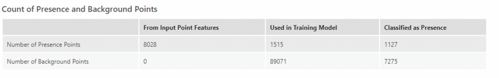
In the case of this second model, 1127/1515 or only 74.4% of the points were correctly classified as presence points, extremely similar to Model 1.

In the case of Model 2, the omission rate was 0.26, also identical to model 1. The AUC for this model was only 0.06 less than Model 1. In this case, the model is still closer to 1 and is much better than a random selection.
Omission rates and ROC rates were similar to model 1, thus a cutoff of 0.5 was kept.
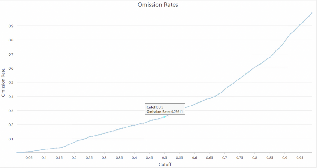
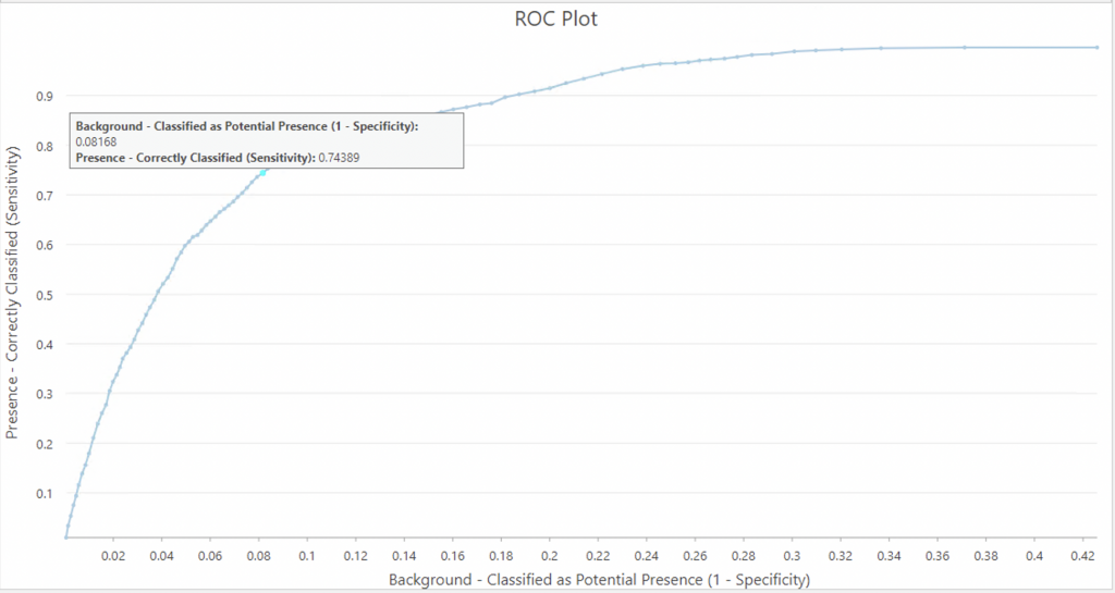
In this case, at a cutoff of 0.5, the omission rate is 0.25611 and correspondingly on the ROC plot 1-Specificity is 0.08168 and the sensitivity is 0.74389.
The Classification Result Percentages chart displays a comparison of the observed and predicted classifications with a user-defined cutoff (default is 0.5 and this is what was used).
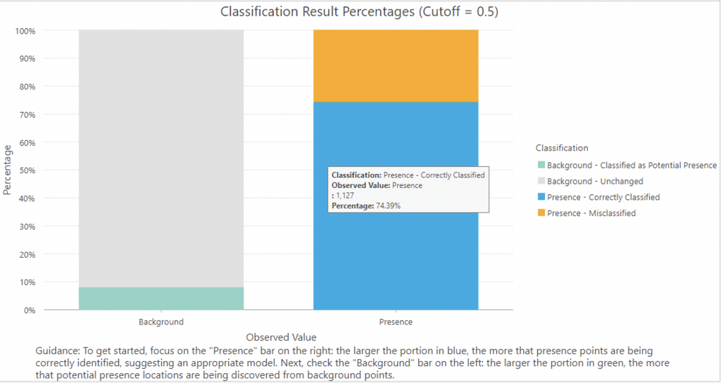
As can be seen in the image, correctly classified values (true positives) were 74.39% and misclassified points (false positives) were 25.61%. Around 8.17% of points were classified as potential presence.
As seen in the Output Trained Features map, the model was able to correctly classify points in urban areas and had a wider number of points than Model 1 for points classified as potential presence. Only a few points were misclassified.
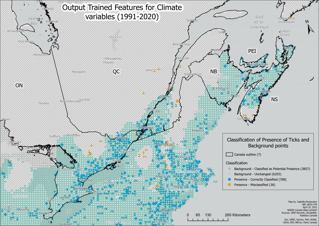
A higher resolution PDF version of this map can be found here: Trained Features Current Climate Variables.
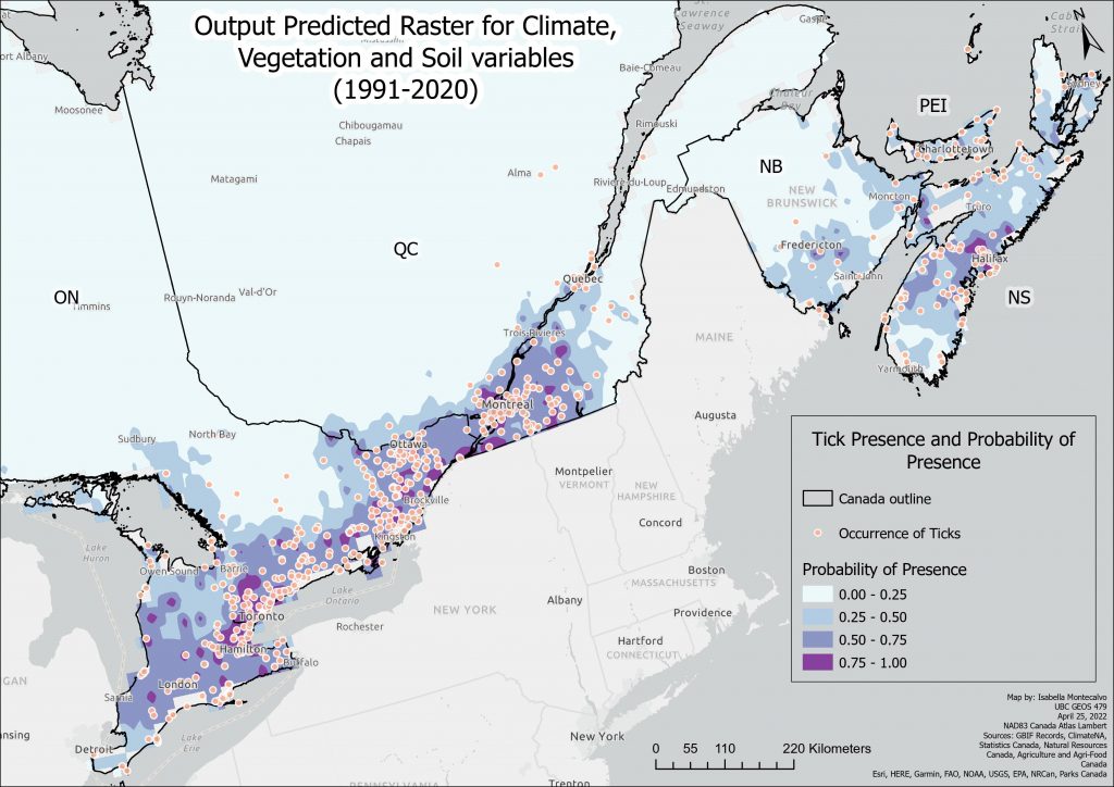
The Output Trained Raster is again symbolized with the four manual intervals of the probability of the presence of ticks. Darker purple indicates a more suitable habitat for ticks.
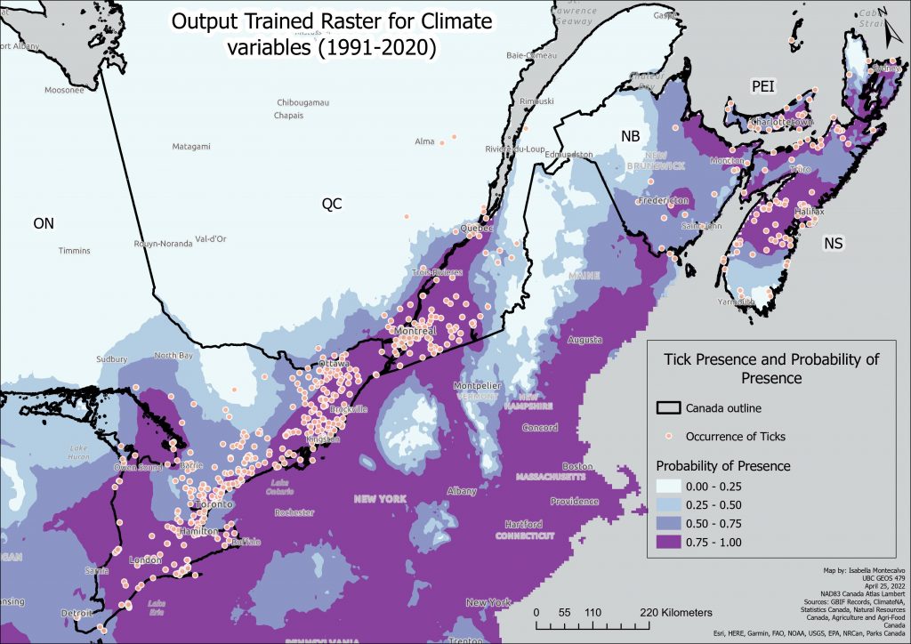
A higher resolution PDF version of this map can be found here: Trained Raster Current Climate Variables.
In the case of this trained raster output, it shows darker purple areas by urban areas and expanding out from those areas with around 50% probability. As is highlighted later in the predicted raster output, its predictions are more expansive than Model 1.
The Regression Coefficients table for Model 2:
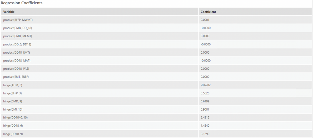
From the regression coefficients table, the most notable variables with the largest coefficients are:
- At a hinge knot order of 10, DD1040 has a coefficient of 6.4315, which is much higher than in Model 1.
- DD5 (degree-days above 5°C, growing degree-days) at a hinge knot of 10, had a very high coefficient of 5.9070. Like DD1040, this makes sense as ticks can survive at temperatures starting from 4 degrees celsius to 32 degrees.
- TD (temperature difference between MWMT and MCMT, or continentality (°C),) at a hinge knot of 5, had a coefficient 2.4105. A one-unit increase in the temperature difference between mean warmest month temp and mean coldest month temp would increase the probability of ticks by 2.41. This makes sense as ticks favour warmer temperatures.
- RH (mean annual relative humidity) at a hinge knot of 5 had a coefficient of -2.088. This does not make sense, as a one-unit increase in relative humidity decreases probability of tick presence by 2.1, which, according to previous research, should be the opposite.
- MAP (mean annual precipitation (mm)) at a hinge knot of 9 had a coefficient of 1.88.
The Partial Response of Continuous Variables chart is composed of multiple charts; each chart visualizes the effect of changing values in each explanatory variable on presence probability, while keeping all other factors the same.
The most notable variables have been examined:
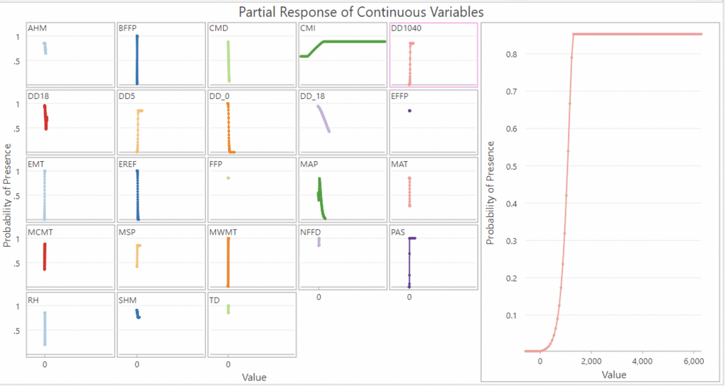
DD1040 (Degree days above 10 degrees C below 40 degrees C) is more of an exponential graph that rises sharply at a value of 1000 and then plateaus at around 1500. Again, this is the optimal temperature range for ticks so it is understandable that once a threshold has been reached tick presence remains constant at around 0.9.
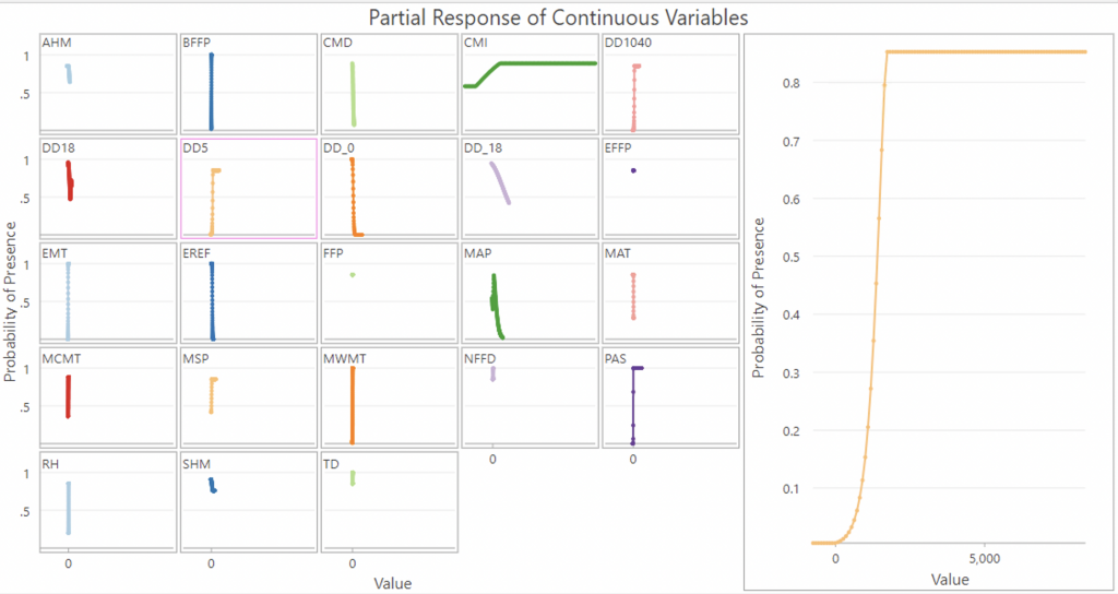
DD5 (degree-days above 5°C, growing degree-days) resemble an exponential graph as well, with a sharp rise at around 1,000 and then plateaus around 2500.
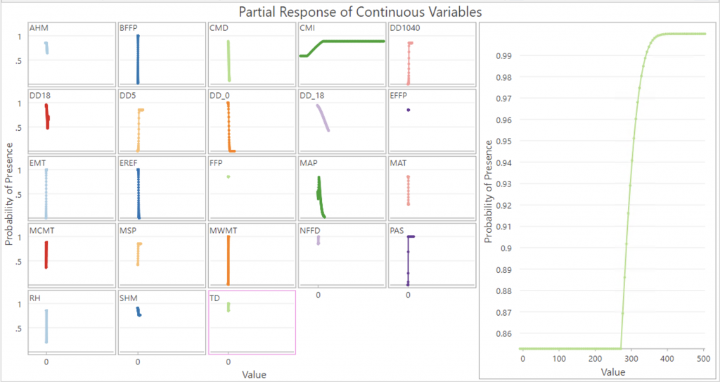
TD (temperature difference between MWMT and MCMT, or continentality (°C), spikes at around a value of 280 and rises sharply, plateauing at 380 where it predicts almost 100% probability of tick presence, which seems rather extreme.
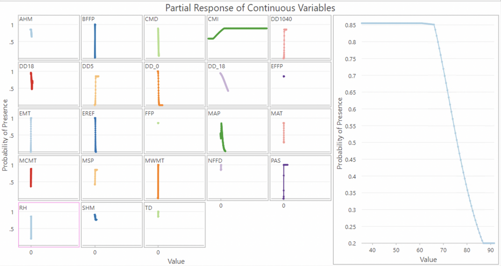
Mean annual relative humidity coefficients gave me pause – RH and tick presence have a negative correlation from the coefficients, however looking at the graph, the relationship shows that before a value of around 70, RH actually predicts a rather high probability of tick presence. It’s after a value of 70 when RH becomes a negative relationship, suggesting that too high RH values are actually detrimental for tick habitat suitability. Research has shown that when mean maximum daily relative humidity decreases below 83–85% the density of nymphs decline (Eisen et al., 2016). Perhaps Mean annual relative humidity is too broad an extrapolation for this metric and daily humidity would be a better metric. Regardless, this is a strange result and makes me question the validity of this model.
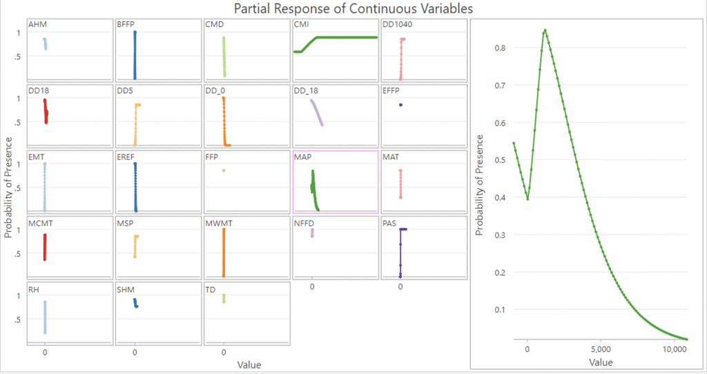
Mean annual precipitation is a strange graph with two dips which would only very specific levels of precipitation are optimal for ticks. With 0 precipitation, probability is around 0.55%, which seems unlikely since ticks need a humid environment to thrive, but then probability sharply increases at around 2,000, however falls immediately and continues decreasing after that. It’s likely that too much rain would actually wash ticks away.
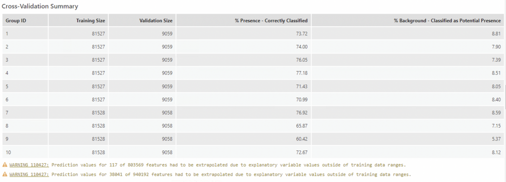
For the cross validation study, the optimal group was 4 with 77.18% correctly classified.
Finally, a predicted output raster with the current climate variables was produced:
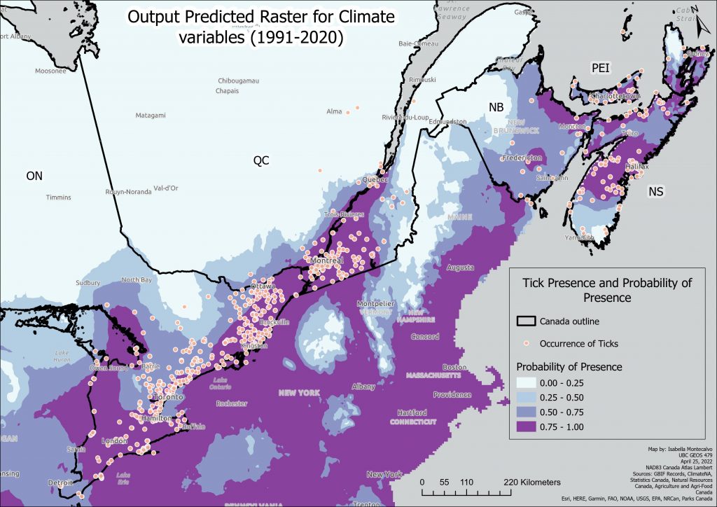
A higher resolution PDF version of this map can be found here: Predicted Raster Current Climate Variables.
Under current climate conditions, the model has predicted the probability of ticks around urban areas and their surroundings, a more expansive extent than the more conservative prediction of Model 1, which is replicated below for ease of comparison. I apologize that it is difficult to discern the differences with the additional inclusion of the US states, but it could not be fixed within this time frame.
Overall, Model 2’s predicted output expands northward slightly further than Model 1.