Welcome to UBC Blogs. This is your first post. Edit or delete it, then start blogging!
Hello world!
1 Reply
Welcome to UBC Blogs. This is your first post. Edit or delete it, then start blogging!
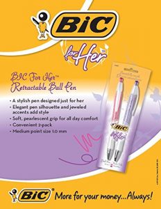
This BIC advertisement for their now defunct “BIC For Her” line of pens is yet another egregious example of an unnecessary gender division of traditionally universal, agender, and ordinary products for capitalistic gains. Companies have come to realise how lucrative dividing the market can be after seeing the huge gains experienced in industries that have already successfully gendered their products, the most notable example being the gender division success seen within the shaving razor industry. After extensive mass media messaging campaigns claiming differences in product functionality better suited for specific genders or intrinsic differences between male and female body hair, the shaving industry managed to permanently alter established consumer perceptions of razor and shaving products forever (and, in turn, were able to charge women more money for identical products). In a similar vein, this BIC advertisement uses the same kinds of messaging (“designed just for her” as if women are unable to use conventional writing instruments and require tailored products) to convince consumers of this product’s need to exist along with implicitly-sexist language to top it all off. The descriptive words employed in this advertisement, in particular the words “stylish”, “elegant”, and “soft”, reinforce trite sexist stereotypes of female fragility and a constant desire to be beautiful or womanly in all facets of life. Instead of the functionality and practicality of these pens being at the forefront of the advertisement, the pen’s appearance and design characteristics (“elegant… silhouette and jeweled accents) are the first things that are highlighted, implying superficial qualities are all that matter for female consumers and female products.
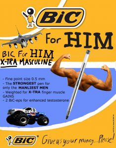
The intention of my Jam was to highlight the absurdity of a gendered pen product through the use of parody. In stark contrast to BIC’s feminine “For Her” line of pens, my ad features an imaginary “For HIM” line of hypermasculine BIC pens. The parody ad exudes machismo by including traditionally masculine imagery in the form of a fighter jet and monster truck. The “For HIM” pen itself has biceps attached to further emphasize the machismo and absurdness of gendered pens. The first line of descriptive text, “Fine point size 0.5 mm”, is reflective of BIC’s original “For Her” ad in which all of the aesthetic and non-functional characteristics of the product are highlighted first while functional characteristics are listed afterwards, implying that BIC believes women do not care about functionality and buy products based solely on “prettiness” and design. In my parody ad, functional specs are listed first, as is the norm for agender or male products, to emphasize that implicit sexism. The proceeding line reads “the STRONGEST pen for only the MANLIEST MEN”, which is intended to ridicule BIC’s statement of “A stylish pen designed just for her” by poking fun at the idea of pens being “designed” for a particular demographic as if different people had different hand structures or pen-using capabilities or needs. The following two lines, “Weighted for X-TRA finger muscle GAINS” and “2 BIC-eps for enhanced testosterone” are additional absurdist hypermasculine phrases that were added for emphasis as well as comedic effect. BIC’s slogan “More for your money… Always!” has been changed to “Give us your money… Please!” to bring attention to the fact that gendering products is generally profit-driven and not because companies view actual needs differences between genders.