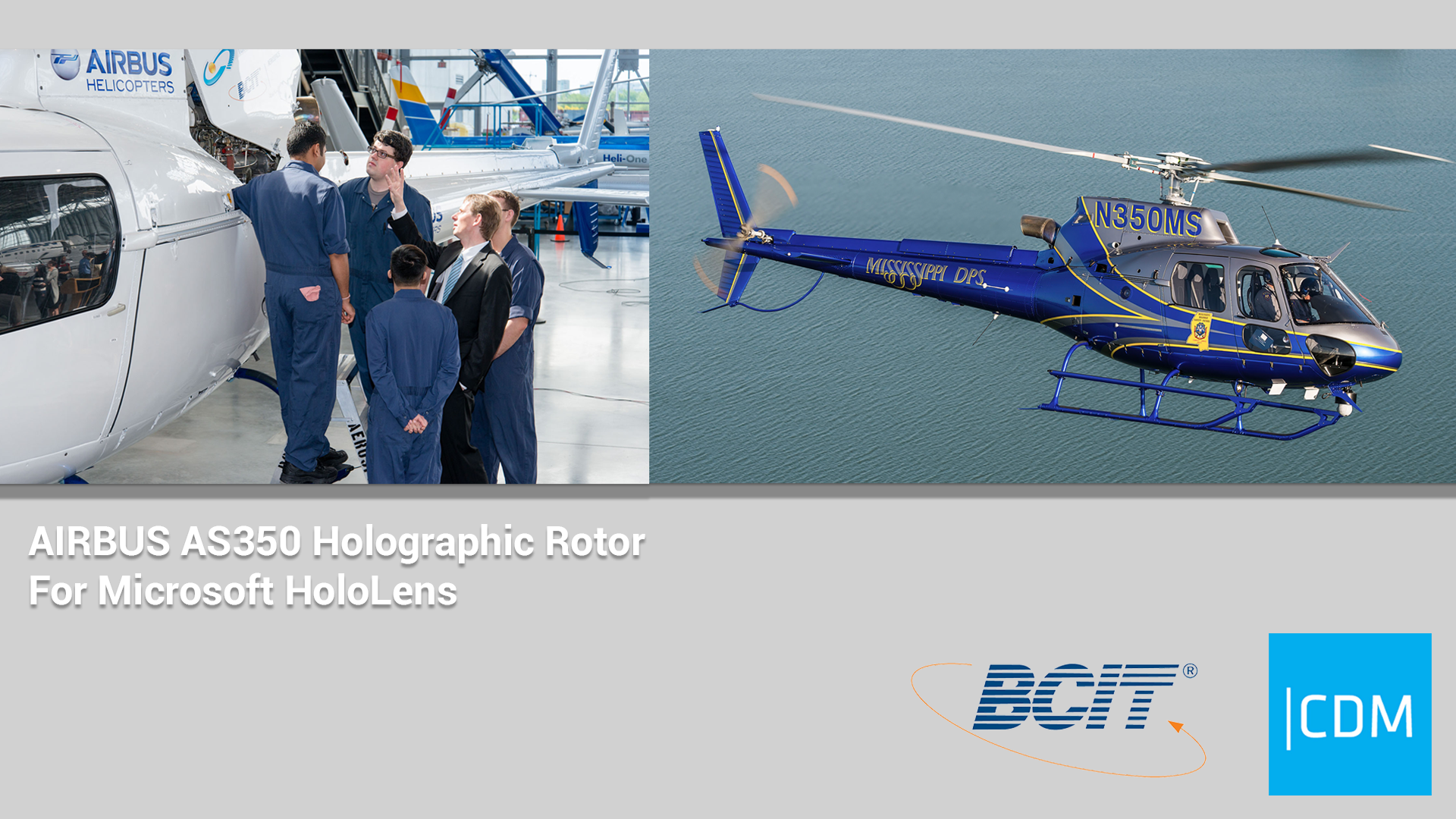
Just in case you don’t know, our project is basically to translate an existing desktop Helicopter Rotor Head application into Microsoft Hololens application. In addition, we are adding voice control and multiple user network.
 (Image Credit: John Bondoc, UX Designer)
Sounds interesting? It’s actually quite scary because none of our team members had experience developing HoloLens application previously. So we learn as we do it.
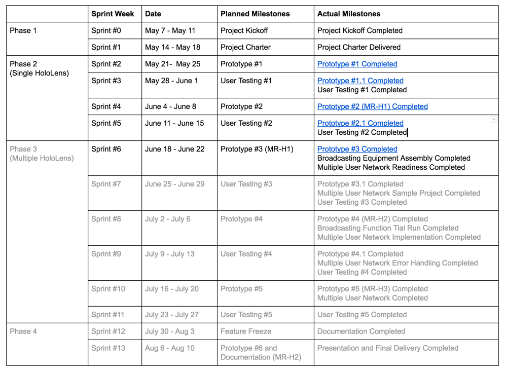
We just finished Sprint #6 and entered into Sprint #7.
 (Credit: Junsong Zhang, Project Manager)
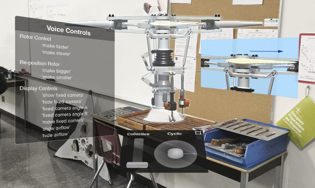
In Sprint #5, we created a prototype based on the concept art below and started adding voice control into the application. The main changes were: 1) we added a voice control command board, and 2) the controls were moved below the rotor.
 (Image Credit: John Bondoc, UX/UI Designer)
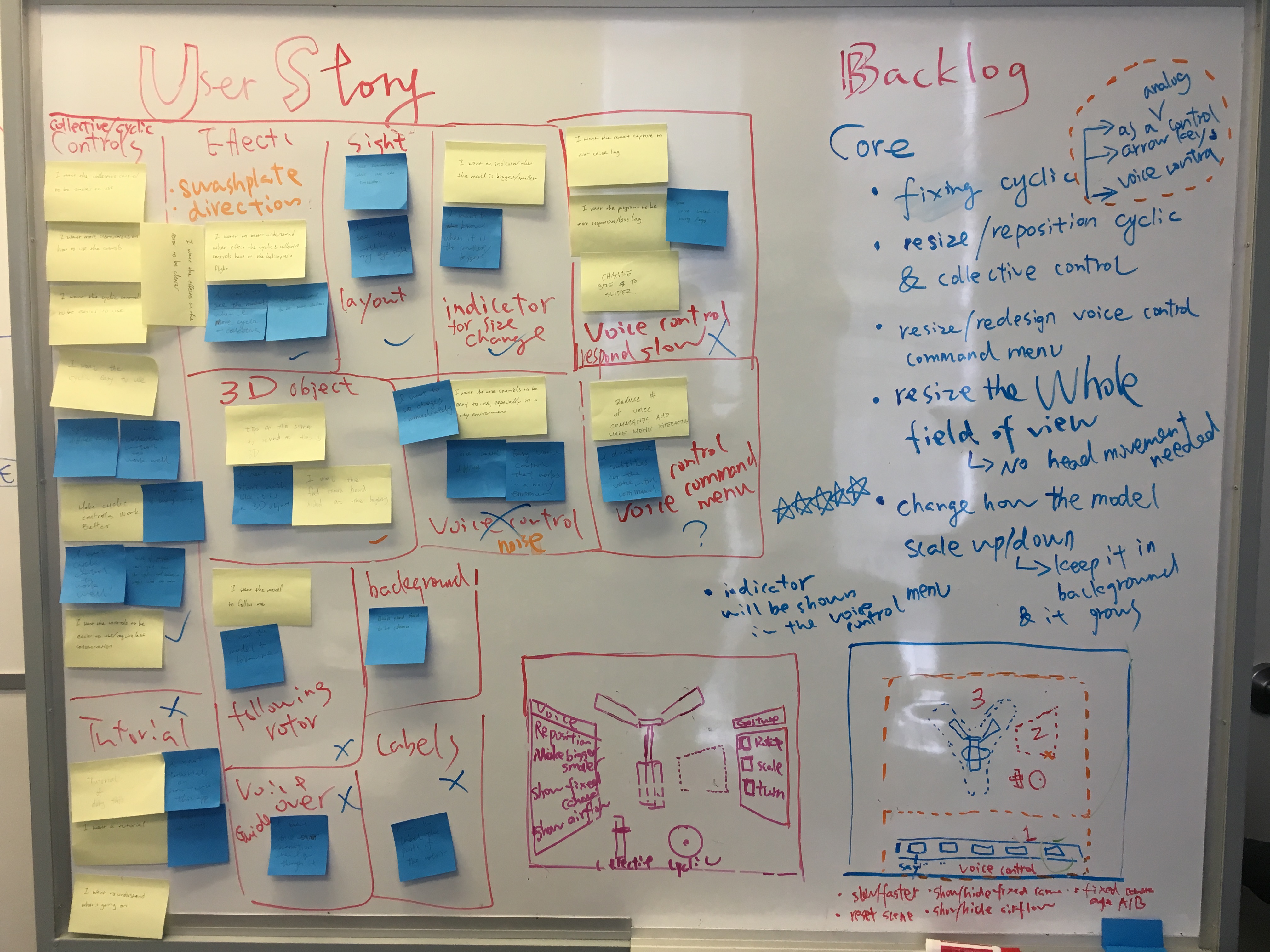
However, in Sprint #6, we tested the prototype and found that the main problems are
- Difficulties with collective/cyclic controls.
- Difficulties to see the effects such as airflow & swashplate movement.
- Difficulties in looking at the rotor while moving the cyclic/collective controls.
- Slow response with voice control.
- Confusion about voice control menu.
- Insensitivity of voice control in noisy environment.
- There are no indications when “make bigger/smaller” voice controls hit the limits.
- Not enough training/instructions with regard to how to use HoloLens.
- Users tend to take it as a 2D object instead of 3D.
Considering scope, we decided to work on the ones that are critical to the functionality of this application:
- Improve cyclic function
- Resize/reposition cyclic & collective controls
- Resize the whole field of view so users don’t need to move their heads too much at the beginning.
- Change how the model scale up and down: keep the rotor in the background while it grows bigger or smaller instead of jumping to the front.
- Redesign the voice control menu: instead of a command board, the new voice control menu will be interactions that give users instructions when they gaze/hover over the buttons.
Based on that, we came up with a new sketch that reflects that our new interface and interaction. The main changes are the positioning of controls and voice control menu, as well as how the interactions work. We’ll have to prototype and test it.
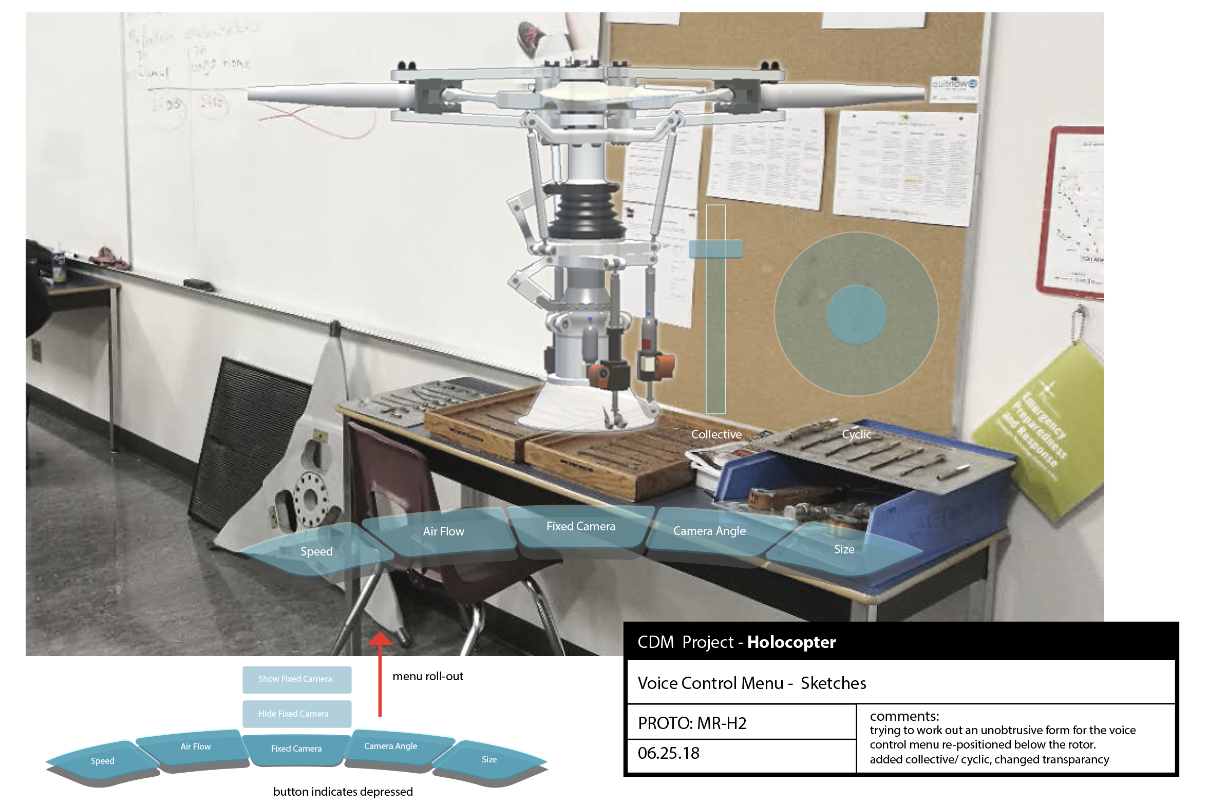 (Image Credit: John Bondoc, UX Designer)
From this week on, we will spend more time developing a multiple user network. The idea is to enable instructors to broadcast their views and modifications in the application to students in real-time.
