Exploring White Space
After browsing through the Worst Websites of 2011, I noticed that they are all very similar in that they cannot stand to waste a single pixel available on screen. So with that, I’d like to present a simple concept that could greatly impact the look and feel of these websites.
“White space” aka “negative space” is the space between objects in a composition where no text, images, or other visible elements occupy the space. You may be thinking, “If the space is there, why not make use of it and fill it with as much information as possible?” To convey the concept I’ll be using examples from print.
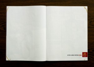
On top is a 1987 Nescafe Coffee ad whose designer seems to believe that no matter how much content they cram on there, people will read it. The creator of the Swedish McDonald’s ad took a different approach, really making use of the white space, leaving only faint coffee stains on the corners of the page and the product, price, and logo on the bottom right; in this case, it turned out to be highly effective in promoting the chain’s extra large coffee.
The amount and use on white space is a key component of a page’s readability and legibility in graphic design. Even in our daily newspaper, the micro white space between each letter makes a difference! For example, The Economist newspaper was slightly redesigned in this way and it resulted in “the content [being] more legible, and the overall feeling of the newspaper lighter, yet the amount of content remained the same.”
Last but not least I’d like to leave you with one last thought: less white space=cheap; more white space=luxury. This is one of the many tactics used in brand positioning. See in this example above, both contain the exact same content but stand on opposite ends of the spectrum. Check out these websites: Old Navy, Gap, and Banana Republic; notice the difference?


