Since the launch of the Target’s brand new home page design for Thanksgiving, we have seen waves of criticism on the web. Titles such as “What the Hell Did Target Do to Its Website” from Jezebel, and “Pretty Much Everyone Hates the New Target.com Redesign” from AdWeek are clear signs of the dissatisfaction from the general public.
So now let’s take a look at what’s Target not doing right.
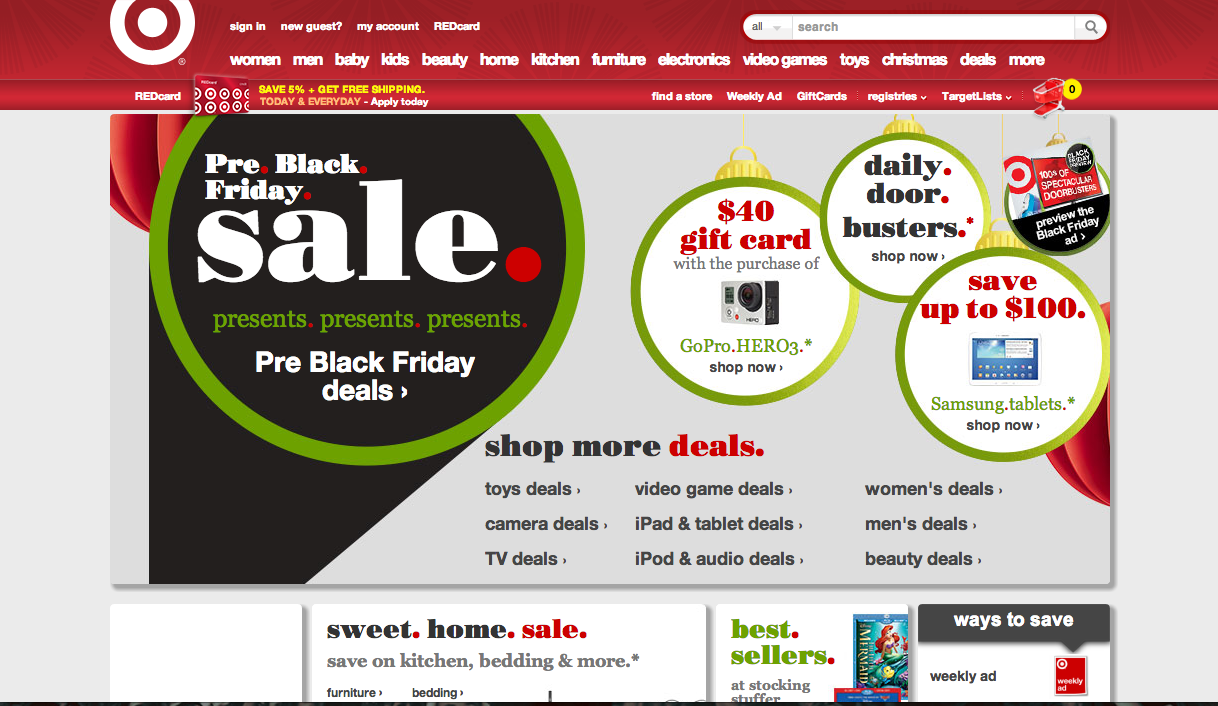 First impression: MESSY!
We are looking at circles and boxes and thumbnails and coupons all on the same page. Quoting Adweek, the website’s got a “overall cluttered-as-crap vibe”.
On top of its issue of information overload, the combination of outlining colors is somewhat misleading. With a quick glance, you might just think that Target’s calendar got messed up and they are advertising for Christmas ultra early.
Now check out the website and tell me what you think!
http://www.target.com/