Categories
Marketing

(4) Marketing Mix of IKEA

ikea.com

During the reading week, I visited IKEA with my friends as they wanted to purchase a table lamp. While I was in IKEA, I could immediately relate the materials taught in my marketing class and recognize how IKEA implemented the marketing mix to increase its customer value.

ikea.com

Product:

IKEA has a wide range of products and it has everything you need in your house (from bedroom furnishings to toys and whole kitchens). In addition, each type of products has many different styles. Take table lamp as an example, IKEA offers the very basic table lamp design as well as stylish table lamp that serve various functions.

Price:

I think that all the product prices in IKEA are quite reasonable. Quoted from IKEA’s website, “low prices are the cornerstone of the IKEA vision, business idea and concept”. It is obvious that IKEA is very concerned with charging a price that customers perceive as a good value for the products.

Place:

The products in IKEA are readily accessible for its customers. After visiting the showrooms, you can simply visit the furniture warehouse and collect the products that you would like to purchase. It is easy and fast for customers to obtain their products. Furthermore, IKEA has an IKEA Home Shopping service where customers can make orders by phone or online 24/7.

Promotion:

For promotion, IKEA publishes an annual catalogue which includes most products available in store as well as their prices. This catalogue allows IKEA to communicate with its customers about the value of its offering.

Categories
Marketing

(3) Blenz Red Band

In our marketing class last week, we were talking about the new Valentine’s project by Blenz Coffee: Blenz Red Band. This Red Band Campaign runs from February 1st till February 28th. In this Valentine’s season, when you buy a coffee from Blenz, you can choose to put the customized red sleeve on your coffee cup to indicate you are single. The red band also gives you an opportunity to talk to other singles in the city without looking awkward and maybe meet your potential dates.


vancitybuzz.com

In Jessica’s blog post about the Red Band Campaign, I agree with her that this campaign is successful because Blenz differentiate itself from their competitors such as Starbucks. As Valentine’s Day is approaching, Blenz Red Band Campaign is targeting to all the singles in the city and giving them a change to meet other people. However, on the other hand, Starbucks did not have any special promotions for Valentine’s Day. I really think that Blenz’s Red Band is a brilliant marketing idea.

Which colour sleeve will you be spotting this month? 🙂

Categories
Marketing

(2) Consumer Behaviour: Katy Perry

We know that social factor is one of the factors that influence consumer decision process. Some examples of social factors are family members, reference groups, and culture. Many companies realize how the images from consumers’ reference groups can greatly affect their purchasing behaviours, thus they always include celebrities in their advertisements.

In recent months, some of Katy Perry’s songs are very popular among teenagers. OPI make use of Katy Perry’s popularity and teamed with her to introduce the Katy Perry nail polish collection.


suzisbeautyblog.com

Consumers always try to identify and affiliate with their reference groups to create or maintain their self-image. Many teenagers may purchase the new Katy Perry Collection by OPI because they see Katy Perry as their role model and wanted to look like her: a fashionable, sexy, and talented celebrity.

Categories
Marketing

(1) Is the New Starbucks Logo a Wise Idea?

starbucks.com

Recently, Howard Schultz, CEO of Starbucks, announced that Starbucks is going to change its logo for the third time in the company history. Starbucks has been using its current logo since 1992 and they are now going to drop the “Starbucks” and “Coffee” from their logo as well as bring the Siren out of her ring.

Below is the new Starbucks logo:


starbucks.com

Quoted in the video on the company’s website, A Look at the Future of Starbucks, Howard Schultz said that Starbucks decided to evolve its logo because they find the new logo “more suitable for the future” and bringing the Siren out of the ring also symbolizes “thinking beyond coffee”.

Personally, I do not like the new design of the logo. If Starbucks changes its logo because it is thinking of expanding its product line and want to give consumers an impression that Starbucks sells more than just a cup of coffee, I think that this new change is not a wise move. Instead of dropping both “Starbucks” and “Coffee” from the original logo, Starbucks can simply drop the “coffee” and keep the company’s name. As a regular customer of Starbucks, of course I can still recognize the new logo. However, people who are not familiar with Starbucks may be confused by the new logo as they cannot relate the Siren to the company or its products. Even though changing the logo may not cause a dramatic decline in its coffee sales, I still do not consider the change a wise move.

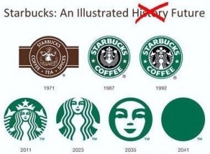
Below is just a funny picture I found:

theztyle.com

Spam prevention powered by Akismet