(1) Is the New Starbucks Logo a Wise Idea?
by Noelle ~ February 6th, 2011. Filed under: Marketing.
starbucks.com
Recently, Howard Schultz, CEO of Starbucks, announced that Starbucks is going to change its logo for the third time in the company history. Starbucks has been using its current logo since 1992 and they are now going to drop the “Starbucks” and “Coffee” from their logo as well as bring the Siren out of her ring.
Below is the new Starbucks logo:

starbucks.com
Quoted in the video on the company’s website, A Look at the Future of Starbucks, Howard Schultz said that Starbucks decided to evolve its logo because they find the new logo “more suitable for the future” and bringing the Siren out of the ring also symbolizes “thinking beyond coffee”.
Personally, I do not like the new design of the logo. If Starbucks changes its logo because it is thinking of expanding its product line and want to give consumers an impression that Starbucks sells more than just a cup of coffee, I think that this new change is not a wise move. Instead of dropping both “Starbucks” and “Coffee” from the original logo, Starbucks can simply drop the “coffee” and keep the company’s name. As a regular customer of Starbucks, of course I can still recognize the new logo. However, people who are not familiar with Starbucks may be confused by the new logo as they cannot relate the Siren to the company or its products. Even though changing the logo may not cause a dramatic decline in its coffee sales, I still do not consider the change a wise move.
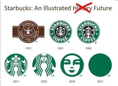
Below is just a funny picture I found:
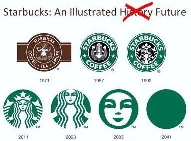
theztyle.com
February 16th, 2011 at 5:10 pm
[…] response to Noelle’s blog, I also agree with her that the new logo with only the Siren could be confusing to customers. […]