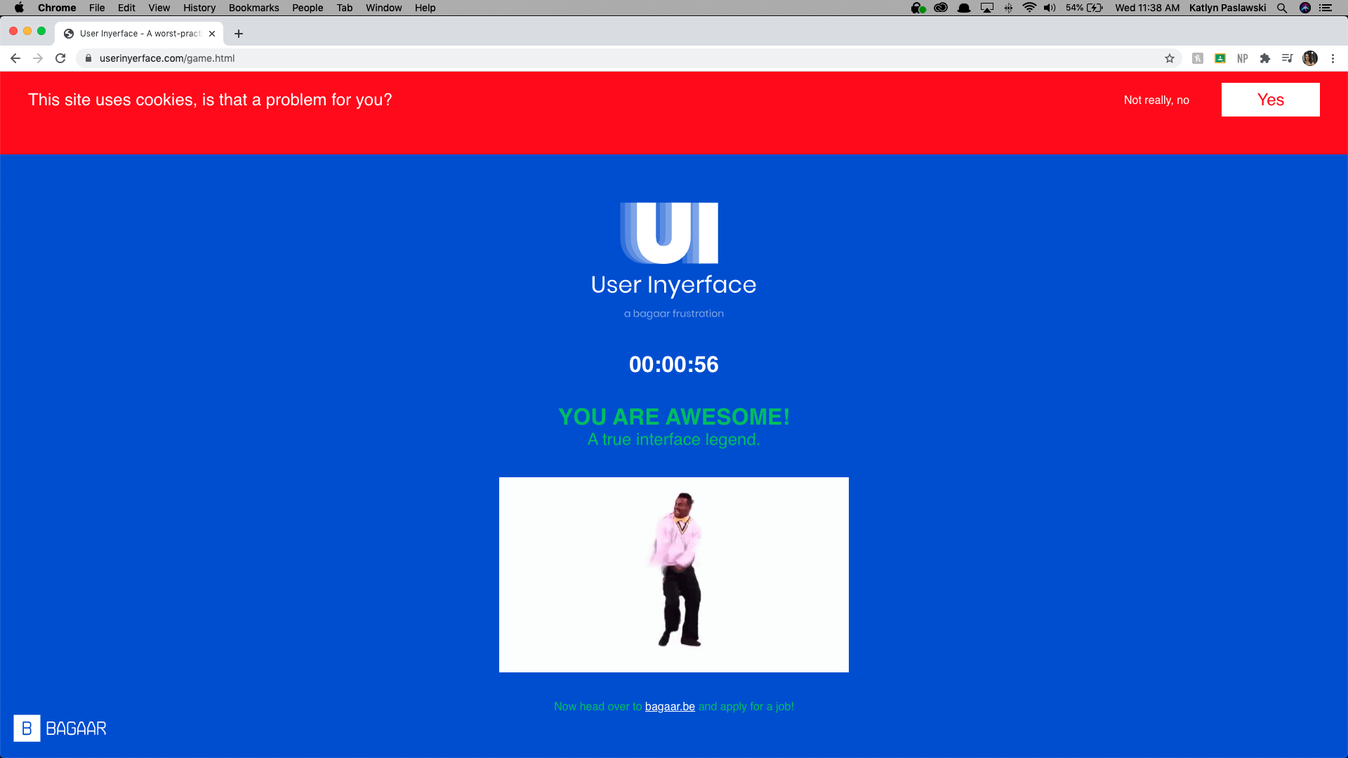
This week’s task sounded like a walk in the park. Play a game and take a screen shot, how hard could it be? Well I will tell you that it was extremely challenging, and I will tell you why.

This online game takes you through a series of activities with the goal of completing the form as quickly as possible. Initially, I tried to complete the first level by being as accurate as possible however that did not last long. I repeated the first level many times due to the 1-minute timer that would pop up. I am almost embarrassed to say this, but I did not figure out how to close the timer pop up. This meant that I played this game, repeatedly, until I beat it in under 60 seconds. This led to many frustrations and a change in computers so I could use a mouse rather than a track pad and really get into it. Did anyone else try to beat the game in under 60 seconds?

Activity 1
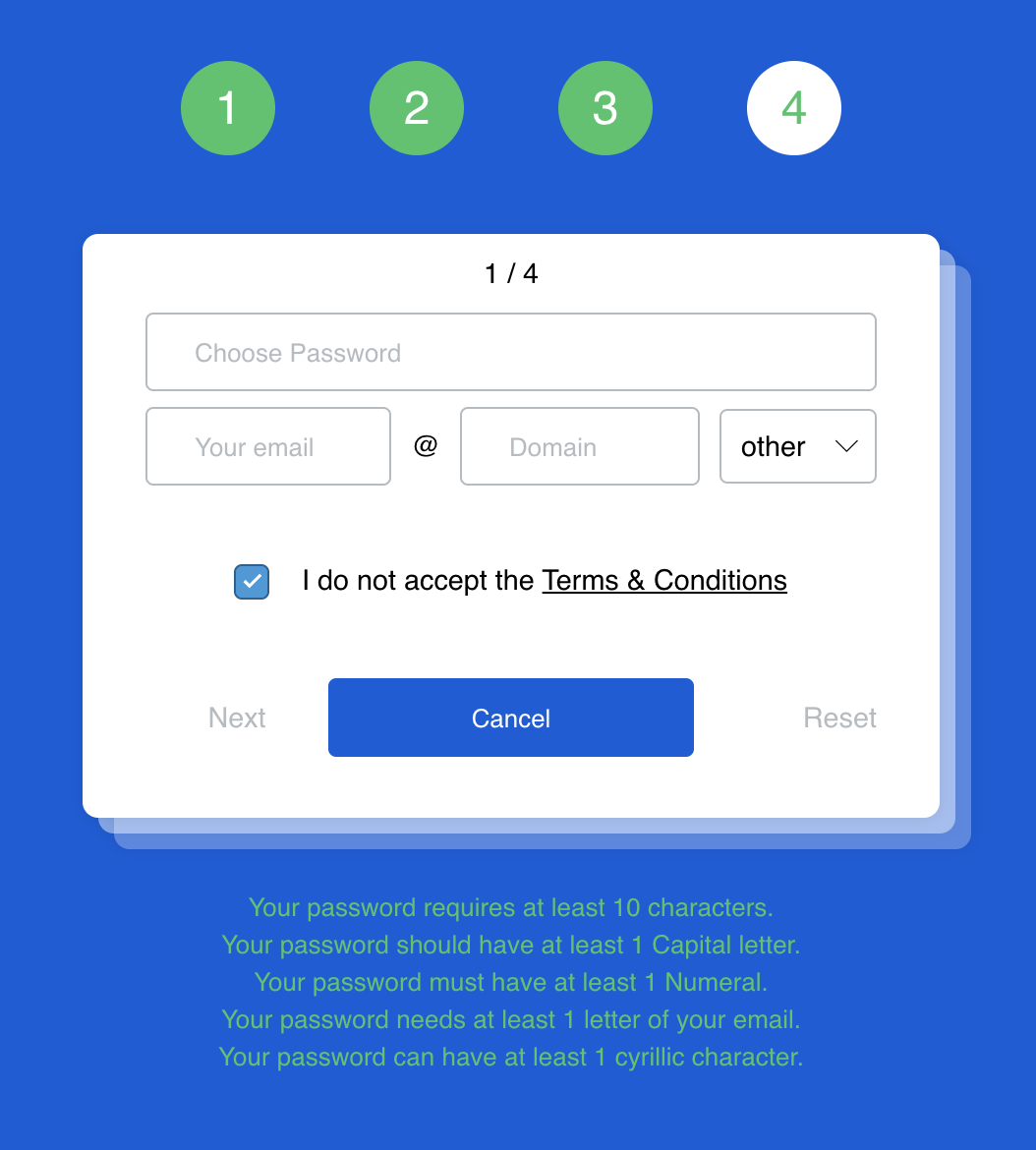
The first page is where I spent the most amount of time trying to figure out what exactly I was supposed to do. I had to google the meaning of cyrillic character in order to meet the password requirements and finally move onto the next page.
Activity 2
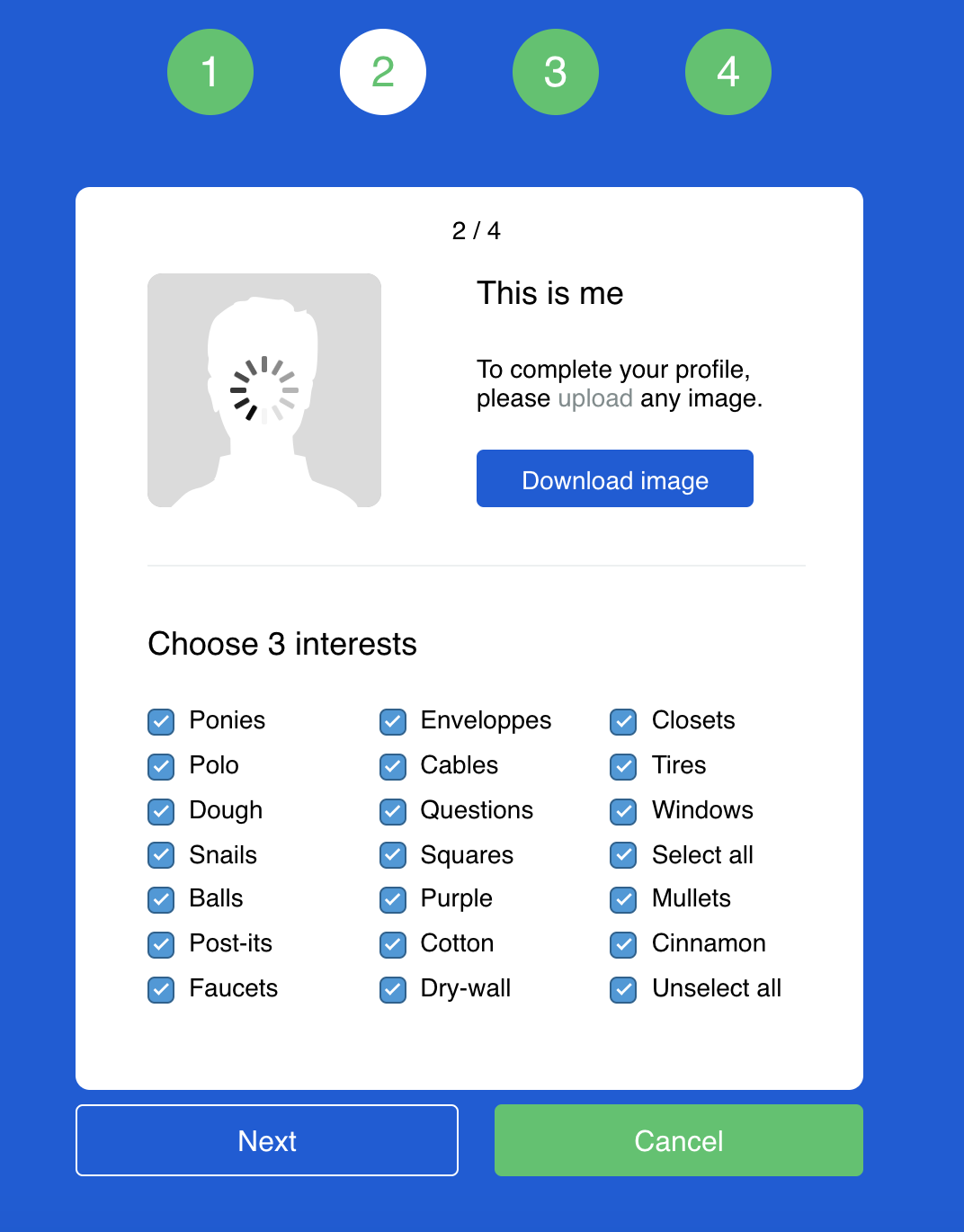
The design on the second level was actually kind of funny. I thought it was a very creative location for the “select all” button which I bet lots of people fell for. Throughout the challenges you can see the four numbers at the top, although the image shows “2” being highlighted, the numbers continuously flashed during each level. This distracts your eye from the task at hand, along with the green “cancel” button which draws your eye in resulting in clicking the wrong button.
Activity 3
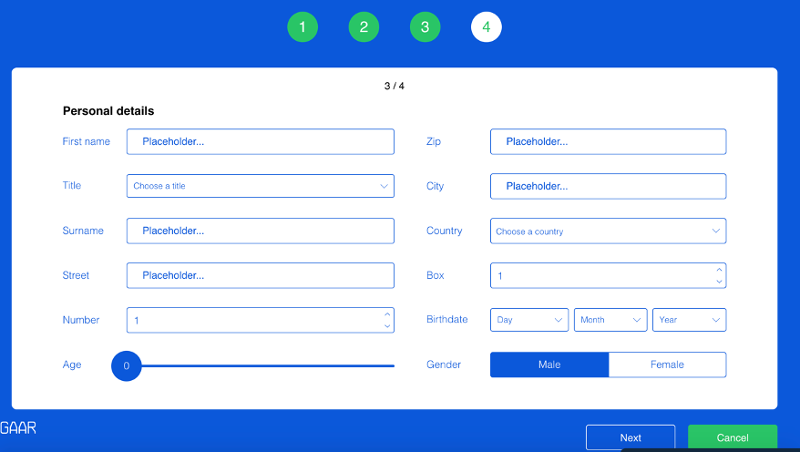
The third activity brought new challenges. At this stage I threw actual answers out the window and was only typing random letters into the boxes. I was thrown for a loop when I needed to do math to complete the age and birthday component. What I noticed about this page that is usually present on a form is the red * to illustrate it was required to be completed along with the ability to click a box and have the text automatically deleted. These minor details made the form frustrating to complete, especially so quickly!
Activity 4
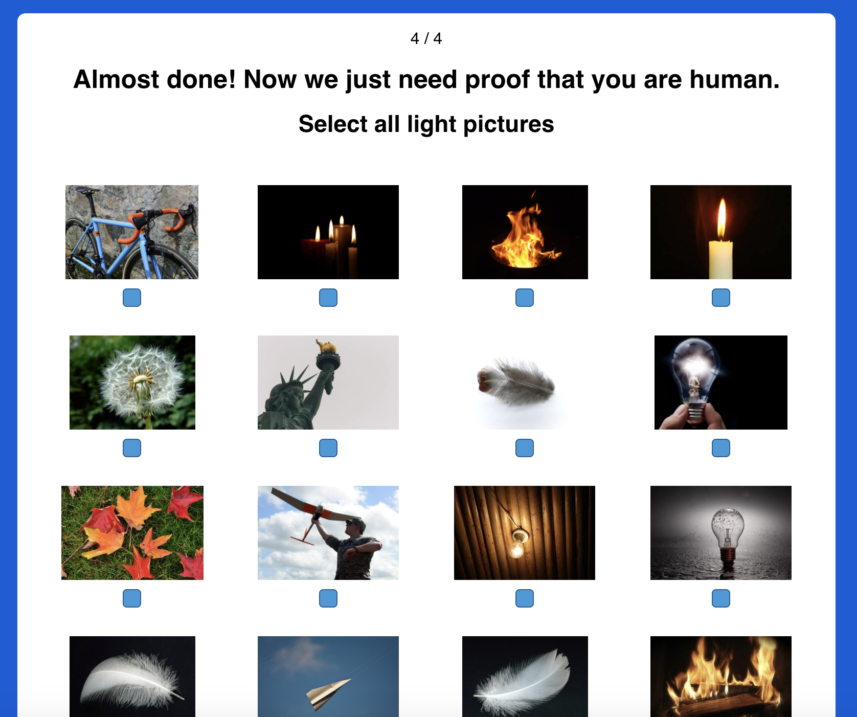
The last page replicated a CAPTCHA that is more frustrating that they usually are. On this level I was trying to go very fast because I thought I was running out of time, remember I thought you had to do it in less than 60 seconds. Once I completed this page I was overjoyed to have finally done it. I only found out about the ability to close the pop up when I read someone else’s blog post on the task. Insert face palm here.

I was never formally taught how to navigate a website, I learned overtime by a series of guess and check until I learned the common practices of website design. This game goes against what you think you know about user design and makes you question what to do next. A positive aspect of this game was it made me read all the instructions carefully which I don’t always do.

Katlyn, you are magic!!
When I saw the 00:56 in your screenshot, my first thought was, is this PhotoShop?
Kudos to you for beating the game so many times and putting up with it!
The first day I tried it I also attempted to beat it in 60 seconds, but gave up after about 5 attempts. When I came back to it a few days later, I was thinking a bit more critically and was able to see more clearly the tricks and frustrations as puzzles rather than feeling frustrated.
I’m glad I wasn’t the only one who missed it. I am a competitive person so I wonder if I just blocked the idea of it being another road block and took it as a challenge 😛
Thank you for saying you made several attempts. I am still trying to figure out how I unlocked the second screen (first task). And I have tried and succeeded a couple times now. Well done on 56 seconds! As you have taught yourself to navigate websites, at any point in the exercise did you feel like it was in a foreign language? Everything seemed so contrary to typical design.
I felt that I was typing in another language since I threw out actually typing correct responses 😛