My Palladio Community
My Palladio Community Analysis
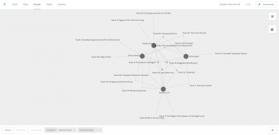
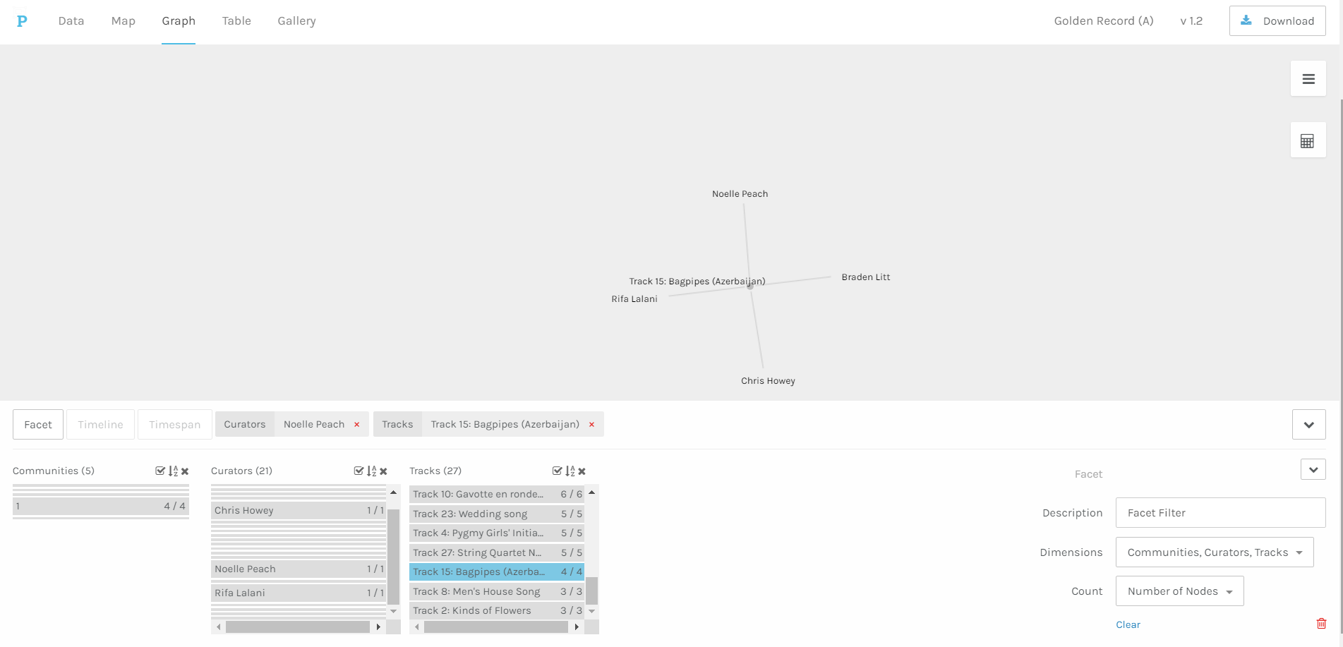
The image above shows the four members of the Golden Record Community 1. Each edge shows a network that is present in the community. The nodes represent the tracks on the Golden Record and are sized according to the number of network members who shared an interest in the same piece of music. The edges therefore represent the networks that share community members. The graph then shows the relationships between tracks and community members, not just the tracks chosen by the same community members but all of the songs they chose, including those that are not shared between community members. For example, four of us chose tracks 3, 15, and 25, but only I chose track 4 out of all of the community members. All choices are represented. Otherwise, not much other data is encoded into the graph which could be frustrating if one were trying to drill down into the data for deeper analysis or compare different attributes beyond tracks and network members.
If I generate a new graph by adding a dimension and looking only at the tracks, I can see some more interesting information in the table, as there are no connections between people shown in this option. For example, I can see the ranking of the popularity of each track and by clicking on it, who chose it. I, like most others, chose track 18 (Beethoven’s Fifth Symphony), while only three people chose track 3 (the one that described types of flowers – was it a welcome for a prince?).
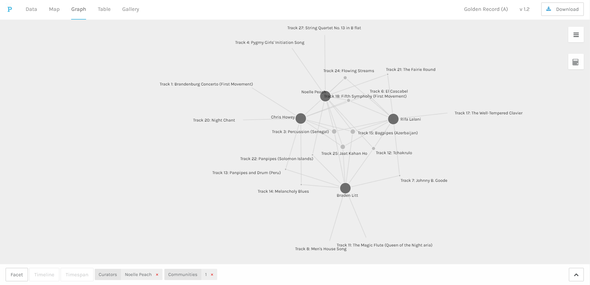
Palladio, myself extruded
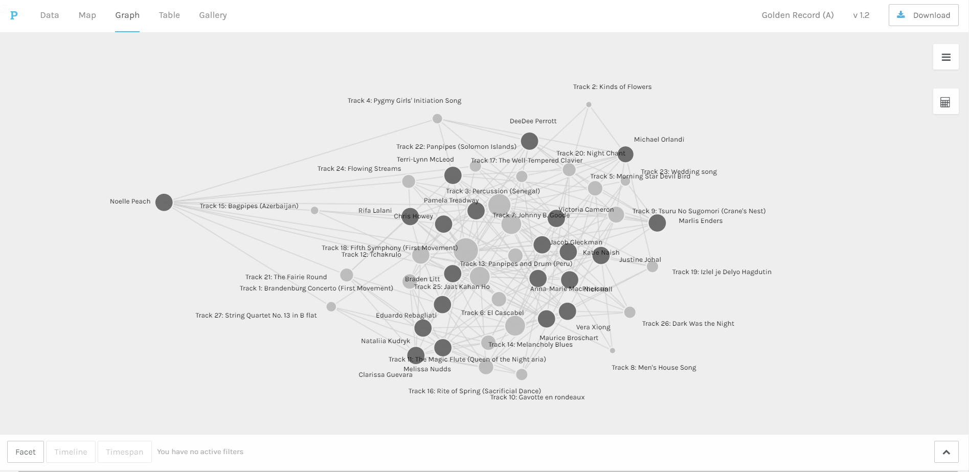
Finally, we can look at the data as a whole. I pulled my own node out a bit just to show the relative lengths of the edges of each track and to more clearly see the strength of the connected nodes. It is difficult to see relationships in this cluster of nodes and edges and I wonder when Palladio is used also with geography, whether looking at all of the data visualized together becomes clearer in map mode, or maybe once time is added on the timeline feature. Right now, I can only see the sizes of the nodes weighted for the frequency of instances their tracks were chosen and a little bit of who was close to whom in their choices, which is of course easier to see in the community facet.
Why Palladio and What Does it Do?
I want to start this reflection by first considering the role and use of Palladio. Given our resources this week in exploring networking theory and its vocabulary, I wanted to know more about what Palladio affords the humanities with regard to analyzing past events using networking visualization. According to the Stanford Humanities Center, Palladio allows one to speculate about historical interactions that both have occurred (with evidence – usually letters) and that only may have occurred (but can be discovered by correlating information about place and time) (Stanford, 2015). In other words, Palladio can reveal information about known interactions in a network, like Galileo’s letters, and also reveal information about previously unknown interactions in a network by assuming that like people in the same time and place would likely have known each other were there and interacted together. The program allows us to then uncover relationships among disparate attributes over time and space that would otherwise remain hidden.
Like anything that works with data, Palladio operates under a certain set of assumptions. Given its focus on time and space, let’s call these geospatial assumptions (Conroy, 2021). Further, since people have to be the ones to input the data and create the visualizations, there are the added assumptions of the person manipulating the data and making decisions about what is important to include, and to analyze. I think one of the most important pieces of information about Palladio that I came across was that it has taken time to determine what kinds of questions are best asked of this type of material in order that it can enhance ongoing research using other qualitative and textual research methods (Stanford, 2015). The key for me was in thinking about how Palladio generates connections and then reflecting on the implications of those connections. Palladio can’t generate hypotheses, or even really test them because it doesn’t tell us much about the data. In other words, one needs an underlying familiarity with the data set in order to find patterns of interest for further exploration.
Still with me? I’m going somewhere with this, I promise. If we don’t have underlying knowledge (or assumptions), then when analyzing the data visualizations produced in Palladio we can’t really see what we’re looking at. For example, in the Golden Record data, I felt like I was just sort of swimming around. What was I trying to find? What was I fishing through different facets and dimensions for? Without other information to go on, there really isn’t a way to determine why a connection occurred. Yes, four people chose to include the Azeri bagpipes in their list of 10 pieces of music and yes, I was one of them, but I have no idea why beyond “because we all chose it and our choices were also the same across three additional pieces of music.” I also lacked data to cross reference. For example, maybe only people 34 and under chose the Azeri bagpipes piece. Given more data, we’d know more about the kinds of connections we have with those who made similar choices. But, even still there is a danger that without having an understanding of what to look for, we’d just be guessing.
My Connection to the Bagpipes
Let’s go back to the humanities research. Something I discovered was that the Grand Tour was a subject of research on a project using Palladio for data visualization. Researchers were able to uncover previously unknown connections between travelers to Italy from Great Britain and Ireland by searching through who was in the same location at a given time (Stanford, 2015). The reason behind travel during the Grand Tour is already known. The speculation is not the reason behind why they were there or why they would have met. The speculation is purely around whether they might have interacted so that this new insight can generate research projects. Likewise, a project on Galileo’s letters was the beta test for Palladio and through visualizing his vast correspondence, connections with less famous persons who the humanities previously ignored were uncovered, as was the fact that Galileo had written in code for a time (Stanford, 2015). Once again, the connections are providing new insights into known figures that might be useful in the exploratory stage of research where there is already a starting point.
Political Implications
I think that Palladio, or this type of networking visualization offers some exciting possibilities. For example, in my analysis (more a description since I really didn’t hazard a guess why we were connected), I shared three versions of the Palladio visualization which took nearly no time to produce. The possibilities for iterating on an idea in the data are interesting. If there was more data to play with, maybe there would be more possibilities for hypothesizing about the connections given how easy it is to iterate on a visualization. However, if we’re talking about rapidly producing visualizations, for research that is primarily exploratory as I mentioned above, then we introduce a lot of room for error. We might assume connections based on our underlying knowledge of the data set that prevent us from looking for new kinds of connections. We might also make assumptions about why the connections exist in the first place and interpret reasons that are spurious driving a research agenda that would be barking up the wrong tree. For example, the most-chosen track in our data set was a very famous Beethoven symphony. I could assume that since most people in the class were raised in Western countries, that we gravitated toward the most recognizable piece of music on the record, at least in the west. But then, maybe that’s not it.
We must also consider what happens when data are missing. I gave the example above of the Grand Tour project that used the connections produced by Palladio to fill in interactions that may have taken place but where no such evidence exists. I think a few things about this. First, there are many marginalized communities that could benefit from the geospatial assumptions Palladio makes as evidence of their interactions may be missing or have been destroyed (or maybe never even taken down). If enough other information is out there, maybe Palladio can reveal unknown connections without the need for hard evidence. In our own Golden Record context however, missing data poses a real disadvantage since we don’t have a lot to go on. That’s where I think there is risk of misinterpreting what the data are telling about us. We don’t even have a common framework to work from. For example, if we had all been asked to choose our favorite ten songs from the record, then spending time wondering why we made those choices might introduce all sorts of hypotheses about gender, age, country of origin, background, familiarity with music, etc. might yield hypotheses that could then be tested based on what we know about demographics. Right now though, I can’t really say one way or the other what this information says about us, except that we like our Beethoven.
References
Conroy, M. (2021). Networks, maps, and time: Visualizing historical networks using Palladio. Digital Humanities Quarterly, 15(1). http://www.digitalhumanities.org/dhq/vol/15/1/000534/000534.html
Stanford. (2015, April 23). Humanities + digital tools: Palladio [Video]. Youtube. https://www.youtube.com/watch?v=nUUVgWxeATs