Not all website experiences are created equal. One of the most infuriating types of website experiences are those encountered while attempting to purchase flights. I recently tried booking by flight home for Christmas (already painful going from Vancouver, BC to Sydney, NS), and found myself in a weird mystery loop. I filled out the credit card information, clicked ‘proceed to purchase’ only to get an alert saying the price had dropped and re-routing me back to the credit card information page to re-confirm that I agreed to the new price. A lower price is great news on this set of flights which is usually outrageously expensive, so I agreed of course and proceeded to complete checkout. Only to be told the flight was no longer available at that price. I was again re-routed back to the credit information page to re-confirm the (original) price. I clicked to proceed, and guess what? The price had dropped again. But it was another trick! It ‘was no longer available’ again so I switched to a different site and booked with a different company. I wonder if that was intentional, or if I had found a weird airline ticket twilight zone.
The User Inyerface game experience was full of UI twilight zones. Below is a picture gallery of some of the tricky UI designs used to infuriate the user in both subtle and obvious ways.
How do you like my hierarchy?
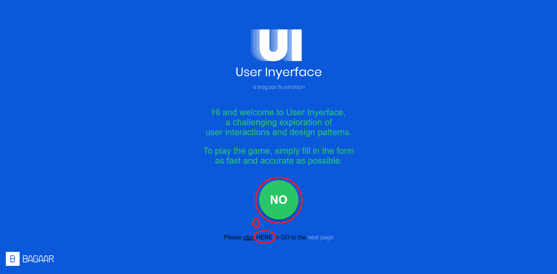
On the home page, we can see that if we were to follow traditional information hierarchy, we’d want to click on the NO. But actually the user likely wants to continue the game and so we are left with the options below the obvious big green button. These smaller, hard to see text-type buttons remind me of the teeny-tiny unsubscribe buttons on spam e-mails that you receive after even making in-person purchases and giving the company your e-mail address for the receipt (which is not giving consent to receive promotions, by the way). Often the ‘unsubscribe’ button is also buried in the copy text at the very end of the e-mail, making it twice as hard to find. In the above screen, eventually we find that the ‘HERE’ is hyperlinked to the next page of the game. But not until after you probably clicked on ‘click‘ (at least it wasn’t buried in copy).
Watching the seconds tick by.
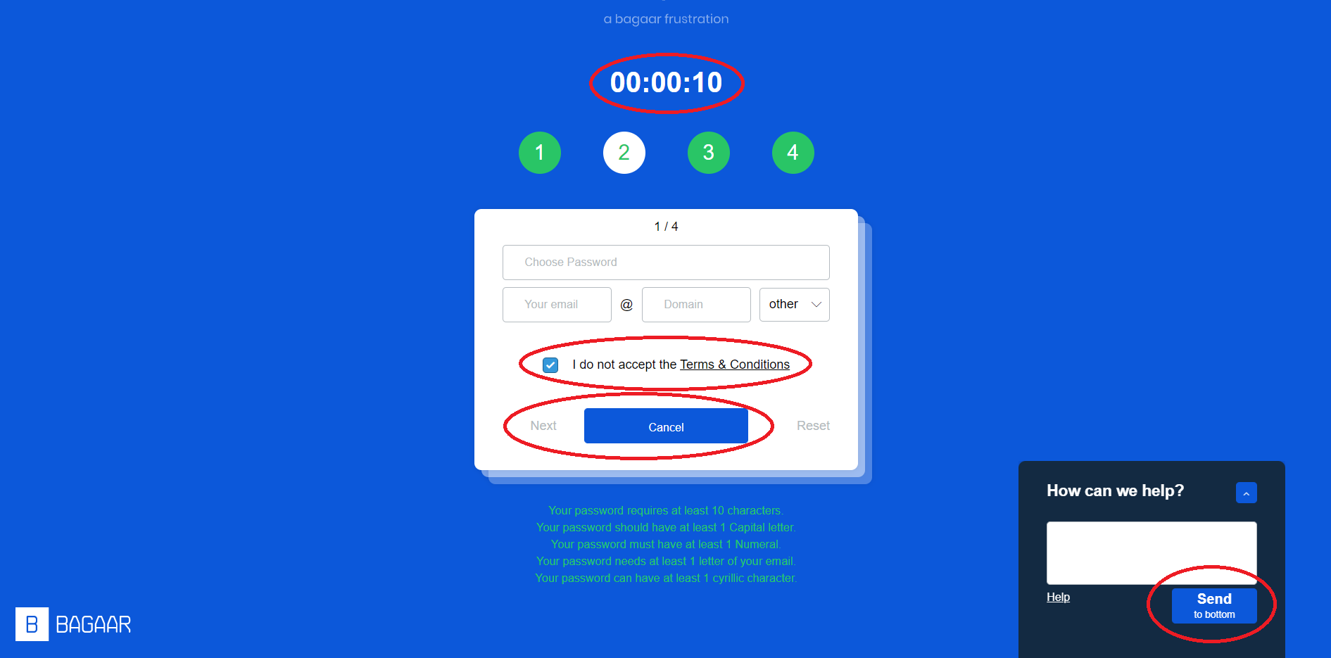
I take timed checkouts, or unnecessarily timed website pages, as a personal affront. In discussing dark patterns, Brignull (2011) notes that users don’t read webpages all that carefully. To help the reader out, a clear information hierarchy should be maintained. But even the clearest information hierarchy is entirely undermined by a countdown flashing above the task the user is trying to accomplish. Given the popularity of tucking hidden fees in unfortunate places on payment pages, the presence of a countdown makes it much more likely a user will fail to understand what they are really purchasing and for how much. They’ll miss more information than they would otherwise as they feel the pressure to complete the transaction.
Other little delights on this page include the deceptive default. Brignull (2011) describes how people don’t change the default settings as often as they leave them as is. So, this game doesn’t allow you to move forward without unchecking the box, but in real life, we often confuse which boxes we are checking or unchecking and why. Brignull also shows three examples of opt-in/opt-out checkboxes for receiving promotional information and asks the reader to determine which is the most honest. I had a hard time determining the ‘honest’ one which I think indicates how often I’m probably fooled by opt-ins/opt-outs.
Finally, we have the amazingly difficult to avoid ‘cancel’ button, when ‘next’ is to the left of it. I hit cancel a few times accidentally, demonstrating how ingrained clicking on the middle button is for me. I knew I wasn’t meant to, but did it anyway. I think this again speaks to a hierarchy of information. Why would the one you’d mostly want to choose be to the left, and tiny?
Stop rushing me!
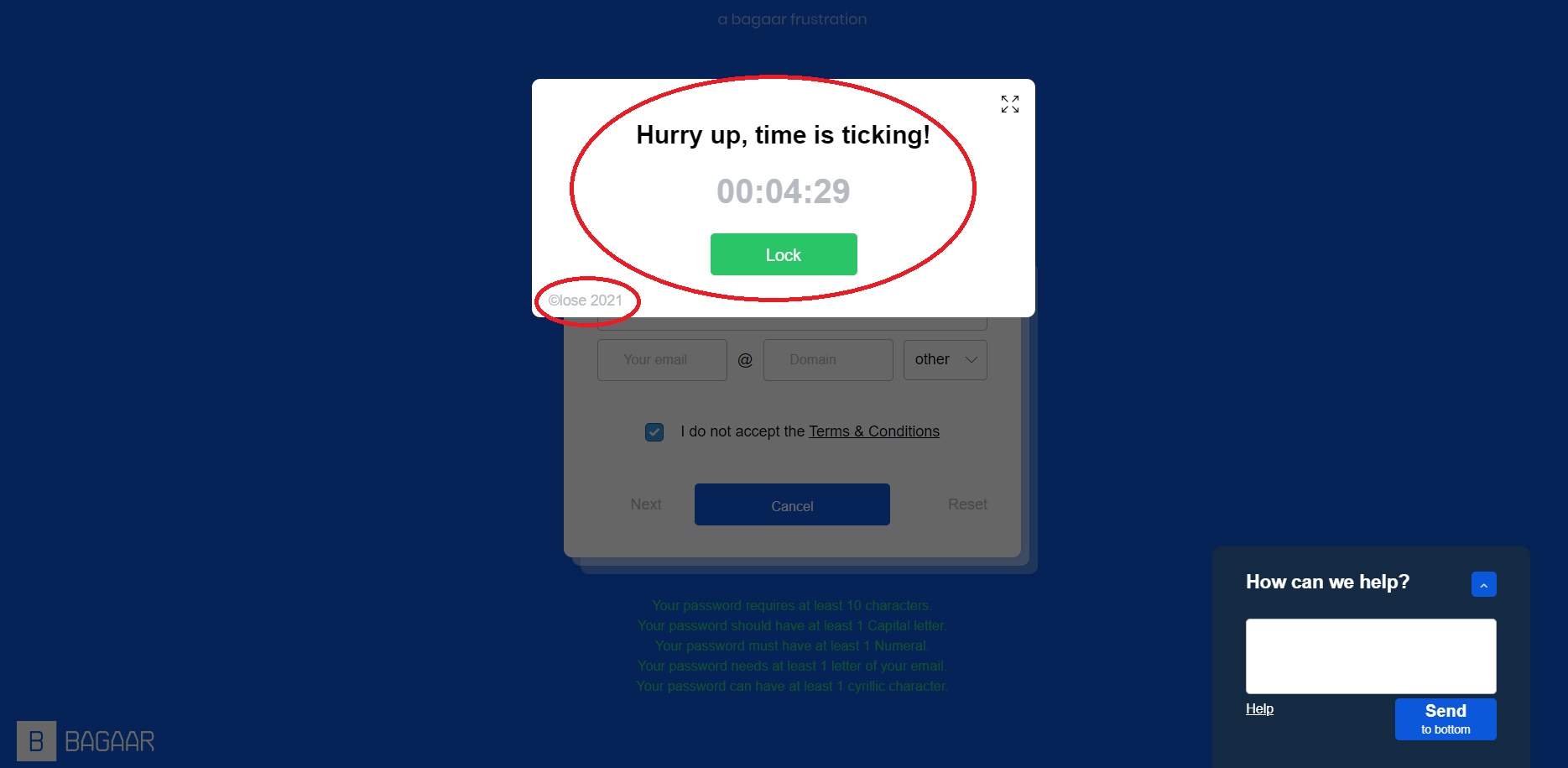
I’ve already mentioned the time problem, but this pop-up was extra annoying. I didn’t fall for clicking ‘lock’ so I don’t know what happens when we click it by accident but even seeing the time flash like this and having to click the smaller ‘close’ text was an interesting reference. It made me think of playing free versions of mobile games only to have a pop-up advertisement show up on screen. Of course, you want to make it disappear, but it’s surprisingly hard to do if the ‘x’ is in a strange place. I have accidentally re-routed myself more than once to the app store because I missed the ‘x’ or the ‘close’.
Did I mention we scan?
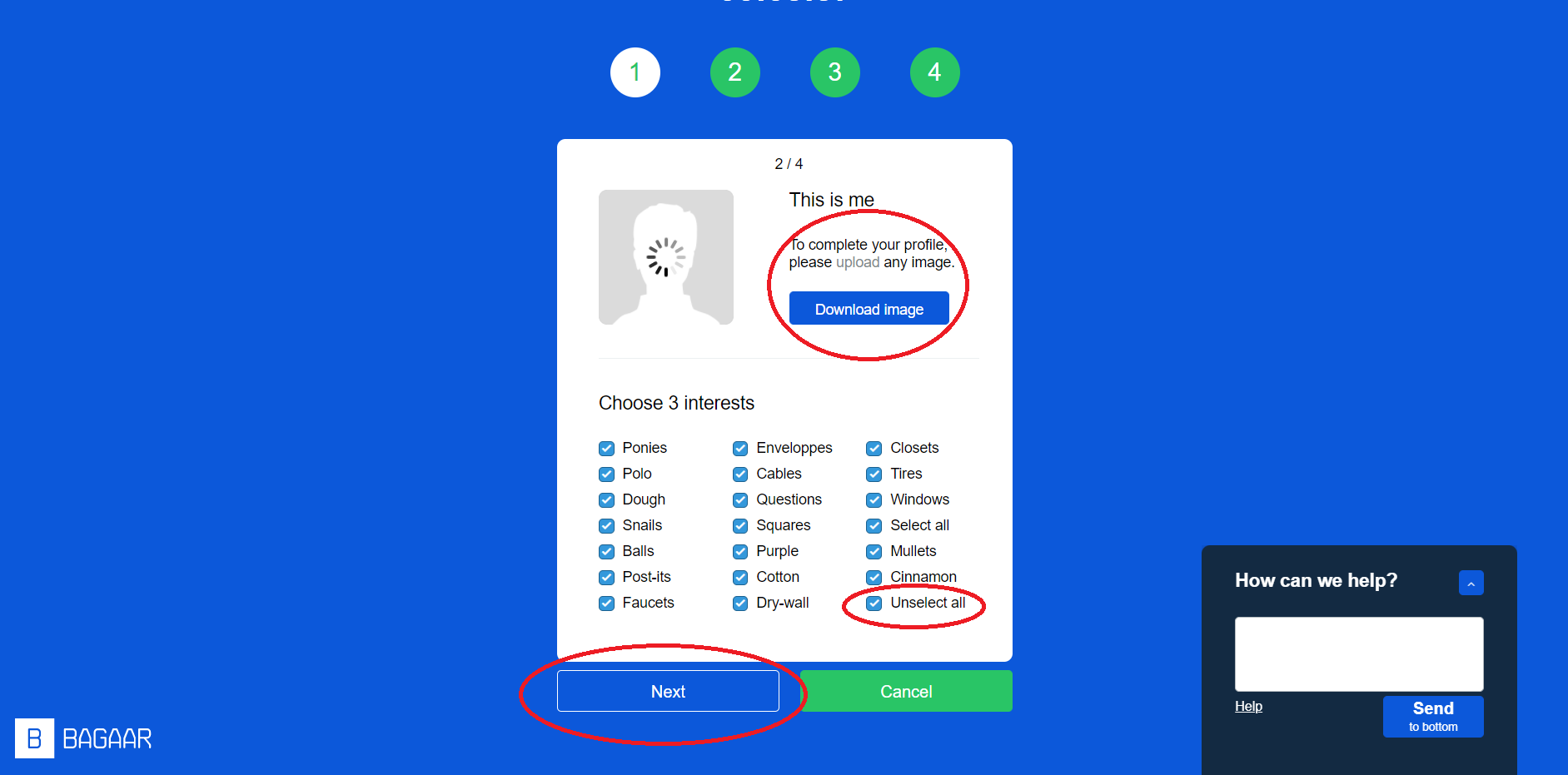
This is a great example of having important information buried in the copy rather than being made evident for the user. To progress, we need to upload a photo (instructions in the copy) but when we initially click, we are likely to hit the download button instead. In my experience, this is a common UI feature of websites offering free goods and services. The larger button might lead you to download an advertisement, or re-route you to a page offering a different service. Because all of this behavior is tracked, I often wonder what impact clicking on these traps has on the data collected by Google for example, when I’m using Chrome.
I really liked (and totally fell for) having the ‘Unselect all’ button at the end of the list. I can’t think of any real-life website equivalent that would look like this but I think it reflects poor survey design in general. The first few items on the list are more likely to get clicked than those later on the list creating a bias in how options in such a task are chosen. If this were a feedback popup for example, a user likely just wants to get past the pop-up to get on with whatever they were doing, and therefore the feedback sent to the website is not actually accurate feedback. Put positive feedback first and ta da! A perverse bias has been created ensuring a 5-star rating.
Who am I again?
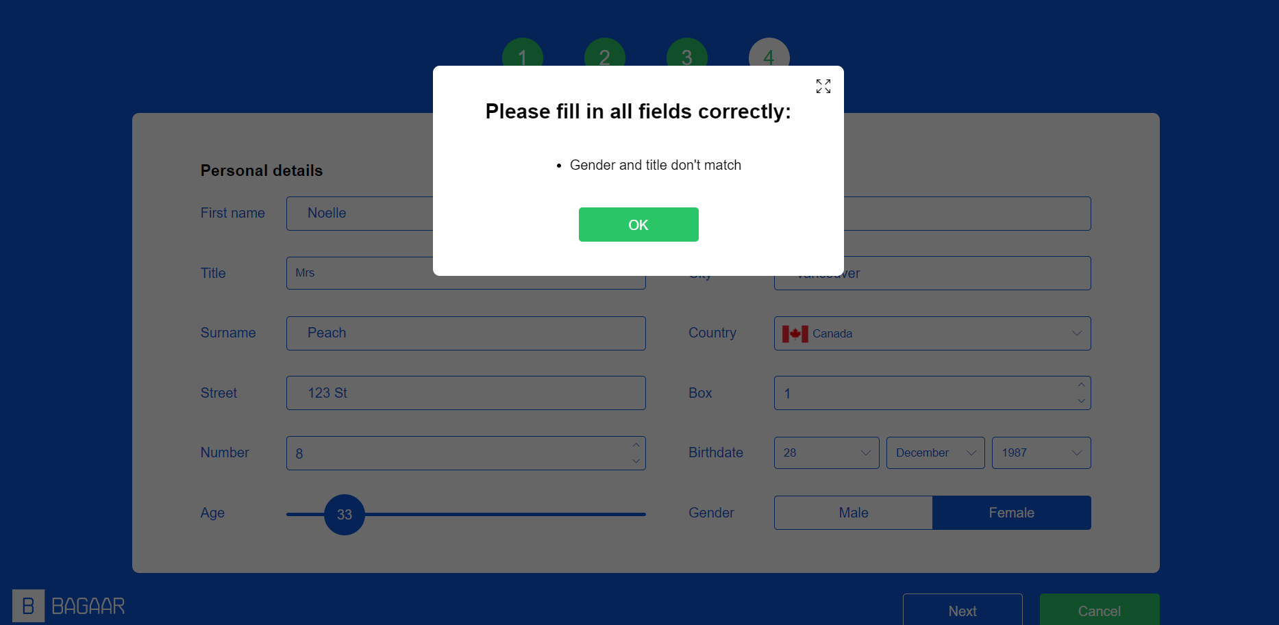
This page was interesting. I’ve been applying for jobs recently and so I’ve had to fill in a whole lot of these online ‘profiles’ which all ask you for your information in slightly different ways. In a way I don’t mind that because it tells me something about the company depending on how they created the form. If I only have options for Mr./Mrs./Ms. without the option not to answer, I can tell that they are a few steps behind where they need to be for accessibility and equity. I’m just not interested in answering ‘Ms.’ or being required to give my gender without being directly asked a gender question with the appropriate options. On French applications I need to disclose even more information like my ‘État civil’ or my ‘nationalité. I’ve never been sure what being married or unmarried, or having been born in a different country has to do with my ability to perform a job. Next. Anyway, on with the UI. This one has a confusing error where it’s hard to tell what gender you’ve selected. As in my examples, maybe it’s alluding to how forms often force users into choosing options that don’t fit them.
The Captchas always getcha
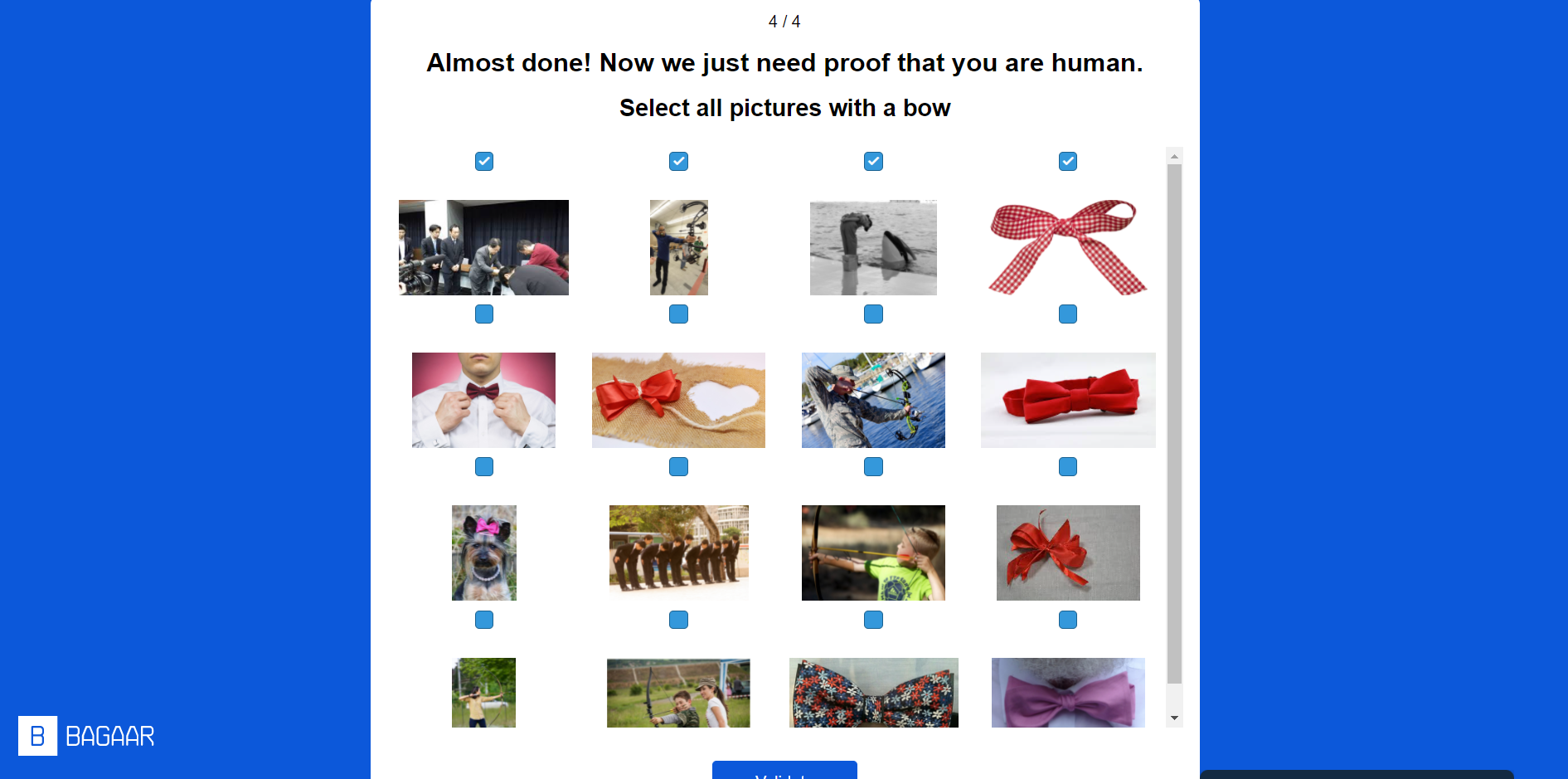
I caught on to this pretty quickly. I thought it was a very clever use of images and language to draw parallels with captchas. I listened to a podcast once on captchas and why they are so annoying and what the information is used for. Listen here. Apparently, they are used to collect information on images or pieces of text that a computer was not able to analyze on its own. I find it a bit like using people to select the options the machine couldn’t select, like filling a hole in the machine learning of an AI. And since all of us are choosing these captchas all the time, it is a reasonably efficient plug. I personally enjoy messing with them by picking all the wrong things whenever it lets me.
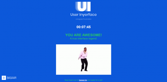
I miss Carlton.
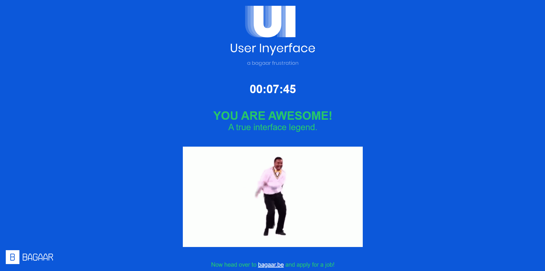
Ultimately, I got to the end in one piece. I really did like this as an exploration of how bad interfaces can confuse and manipulate users. Of course, the reality is scarier given how often we likely encounter these dark patterns in our lives and how it’s used to take economic advantage of folks. I think things get even more unethical when you combine it with what Zeynep Tufekci (2017) describes machine learning being used for. If an algorithm can predict when a bipolar user is entering a mania, then when advertising to them to entice them into making poor financial decisions, or when enticing them to gamble, a clever dark pattern in the UI could further exploit that user. Or, even just knowing the average age of your user can help a company take advantage of them. Put my dad in front of this game and he wouldn’t get past the homepage, for example. He’d find a way to buy Alfonso Ribeiro’s sweater somehow and pay twice for shipping in the process.
References
Brignull, H. (2011). Dark patterns: Deception vs. honesty in UI design. Interaction Design, Usability, 338. https://alistapart.com/article/dark-patterns-deception-vs-honesty-in-ui-design/
Tufekci, Z. (2017, November 17). We’re building a dystopia just to make people click on ads [Video]. TED. https://www.ted.com/talks/zeynep_tufekci_we_re_building_a_dystopia_just_to_make_people_click_on_ads?language=en