This activity was quite interesting, as it allowed me to see the impact of redesigning and rearranging text to enhance readability and comprehension. It was eye-opening to realize that the work I do every day as an instructional designer is actually classified as information architecture. One of the key design considerations in developing online programs in higher education, where I am involved, is overcoming the challenges associated with text-heavy contents. As more students express a dislike for text-heavy materials and report feeling pressured when reading text-only resources – often preferring to skim instead – text becomes a less engaging and effective medium for conveying information compared to graphics and videos. However, information architecture encourages us to consider the potential for using text more effectively. It gives us hope that simply reorganizing and redesigning certain aspects of text could significantly contribute to enhance readability and comprehension of the information.
In this activity, in particular, I focused on the following key areas to enhance the overwhelming array of information about the Bull Moose.
- Subtitles – I first named each paragraph based on the key topics addressed, giving readers a snapshot of what they are about to read.
- Reorganization – Next, I reorganized the paragraph for a more logical flow. It made more sense to provide a summary of the Bull Moose at the beginning rather than placing it in the middle of the content.
- Different Levels of Headers – Based on the first two steps, I incorporated different levels of headers to enhance readability, allowing readers to navigate the content more easily and efficiently.
- Bulleted Lists – In the Global Populations paragraph, some information was not at the same level as others. Specifically, details about individual U.S. states were not parallel to the information about Canada. To address this, I indented the U.S.-specific information under the overall description of the populations in the U.S.
- Italicized Text – I italicized the scientific names in brackets.
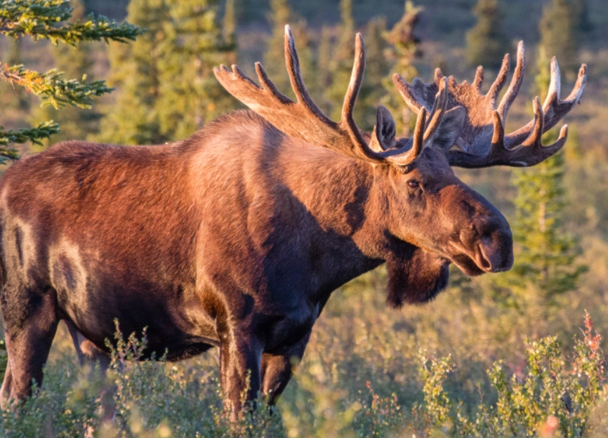
- Superscripted Text – I used superscripts to indicate reference information. (e.g., figure numbers)For further improvements, I would like to incorporate images of the Bull Moose, particularly in the Shapes and Structures section. Additionally, for the Global Populations section, I plan to create an infographic chart illustrating population distributions on a global map, effectively showing data by country.”
For further improvements, I would like to incorporate images of the Bull Moose, particularly in the Shapes and Structures section. Additionally, for the Global Populations section, I would create an infographic chart illustrating population distributions on a global map, effectively showing data by country – similar to the infographic below.
Attached is the edited file for reference.
Added notes:
I just visited Hannah Winsnes’ edits and it looks fantastic! I really like how she incorporated some visual components such as images and graphs, which significantly enhanced my understanding of the text. I also like how she provided a well-organized summary of the text-heavy material in bullet points, categorized by key topics. If you haven’t seen her work, I highly recommend checking it out!