
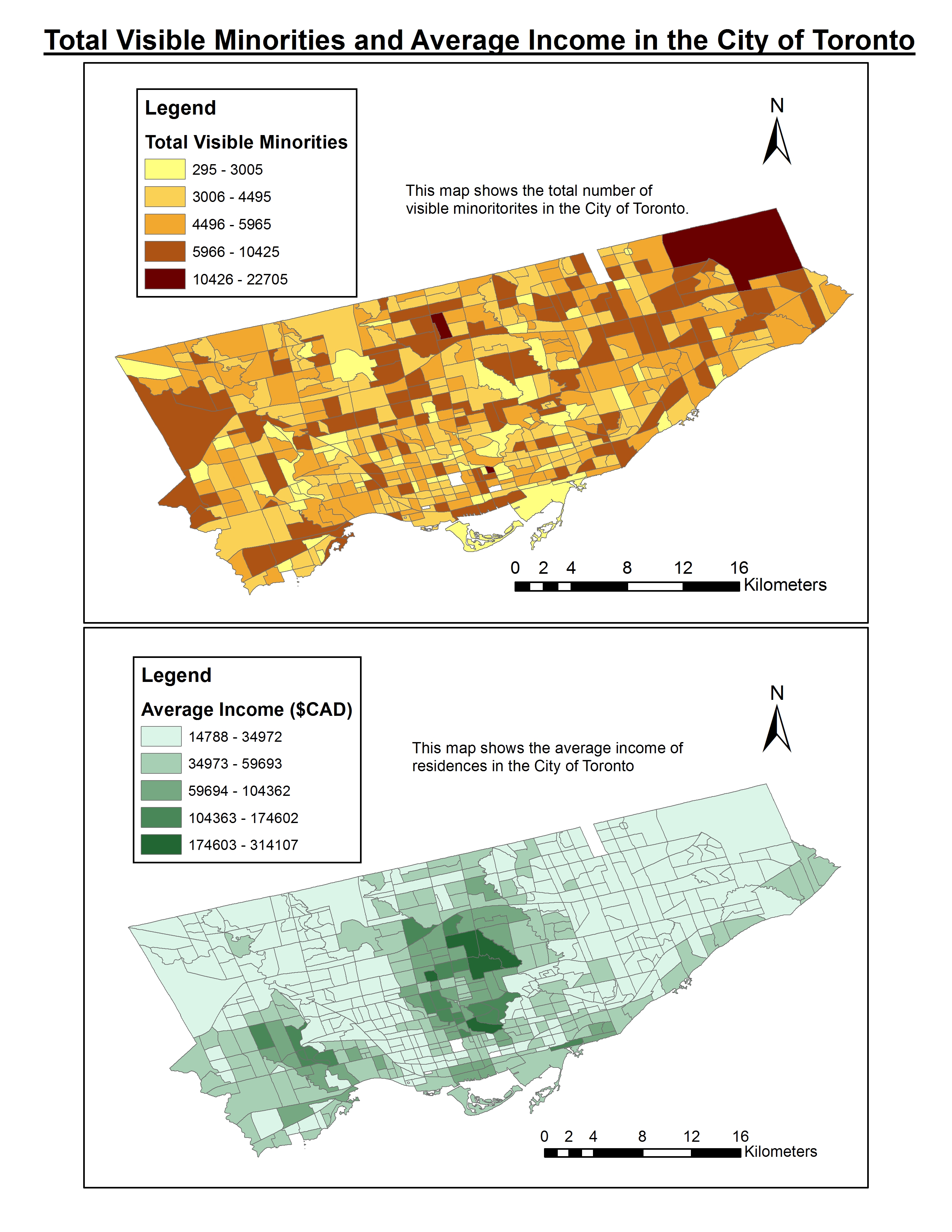
The two maps below display the rates of total visible minorities and total average income per census tract in the City of Toronto. In order to display the data in a visually pleasing way that also makes the differences within the data easily to be seen, we categorized the data into five classes using natural breaks (Jenks). Using natural breaks allowed for the most efficient visualization of the data.
Sources:
UofT Chass Website, UBC Abacus Website
UBC Geography Department
Tyler Morton; Jordan Brocato
November 30, 2013
Projection: Mercator
Geographic Coordinate System: GCS North American 1983
The maps below have 1 kilometer buffer zones around police and ambulance facilities that are overlaid onto a thematic map of violent crime rates in the City of Toronto. As shown in the first map, the four census tract areas with the highest rates of violent crime do not possess any police facilities within 1 kilometer. There is the largest cluster of facilities in the southern portion of the city where there are higher income averages as well as higher violent crime rates.
The second map shows 1km buffer zones around ambulance facilities. Here, we see that the areas with the highest rates of violent crime seem to coincide with ambulance facilities, however the distribution of ambulance facilities appears to be distributed evenly throughout the city.

Sources:
UofT Chass Website, UBC Abacus Website
UBC Geography Department
Tyler Morton; Jordan Brocato
November 30, 2013
Projection: Mercator
Geographic Coordinate System: GCS North American 1983