Violent Crime and Average Income Regression
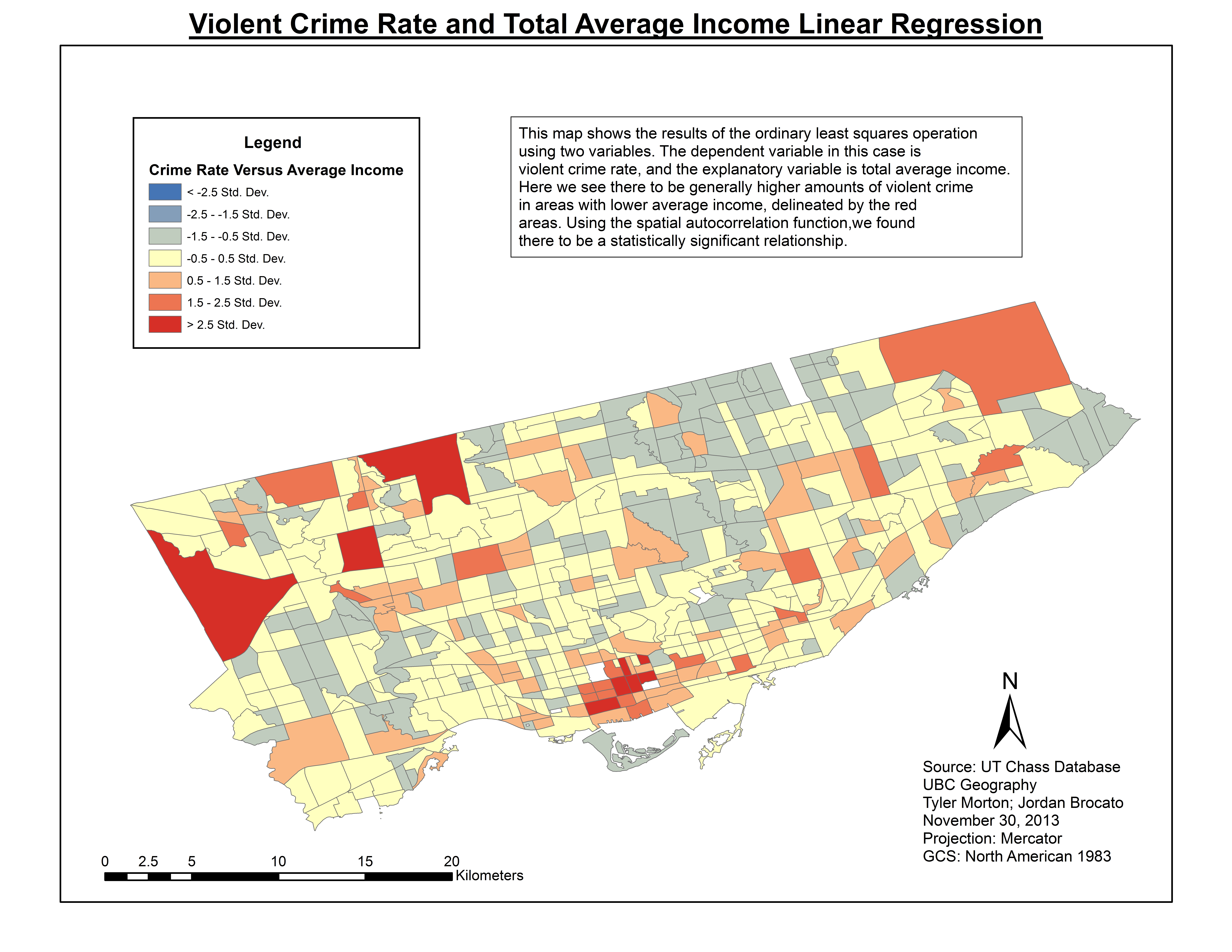
The first map displays the Ordinary Least Squares linear regression between violent crime and average income. In this case violent crime is our dependent variable while average income is our explanatory variable.
This analysis displays the census tracts with the highest level of significance of lower income areas correlating with higher rates of violent crime, shown by the dark red areas. Looking at the legend showing the standard deviation of the residuals, the red areas show a standard deviation of greater than 2.5, which means that there is a significant relationship between the two variables. Areas with standard deviation closer to zero are areas that are more likely to be due to random chance. Based on the data shown, we can say with confidence that the areas with highest rates of violent crime have lower average incomes.
Violent Crime and Visible Minorities Regression
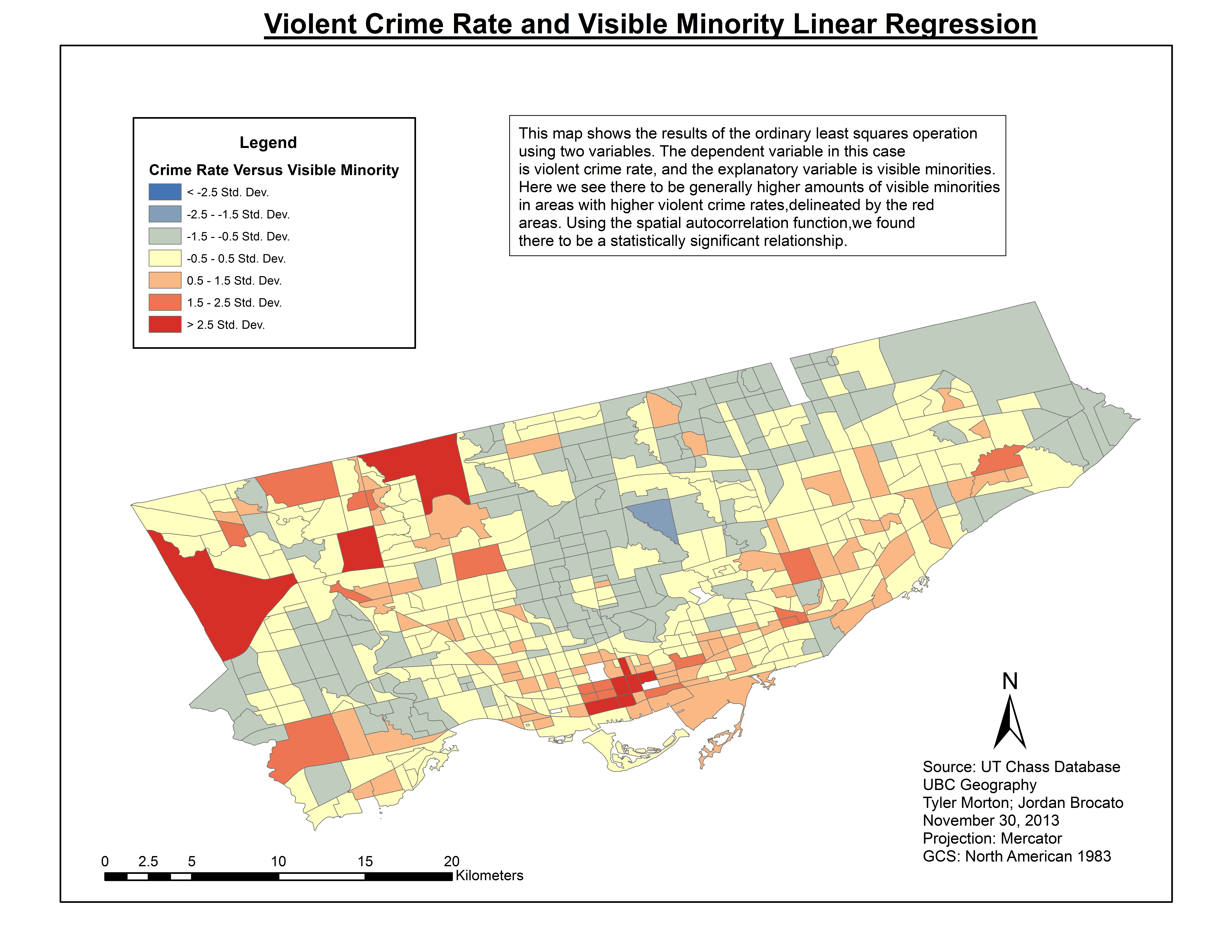
This map displays the Ordinary Least Squares linear regression between violent crime and total visible minorities. In this case violent crime is our dependent variable while visible minorities is our explanatory variable.
This analysis displays the census tracts that show a statistically significant relationship between the number of violent crime occurrences with higher numbers of total visible minorities, shown by the dark red areas. Looking at the legend showing the standard deviation of the residuals, the red areas show a standard deviation of greater than 2.5, which means that there is a significant relationship between the two variables in those areas. Census tracts with a standard deviation closer to zero shows areas that are more likely to be due to random chance. The data shown is suggesting that areas with higher rates of violent crime tend to have larger amounts of total visible minorities living in the area.
Visible Minorities and Total Average Income Regression
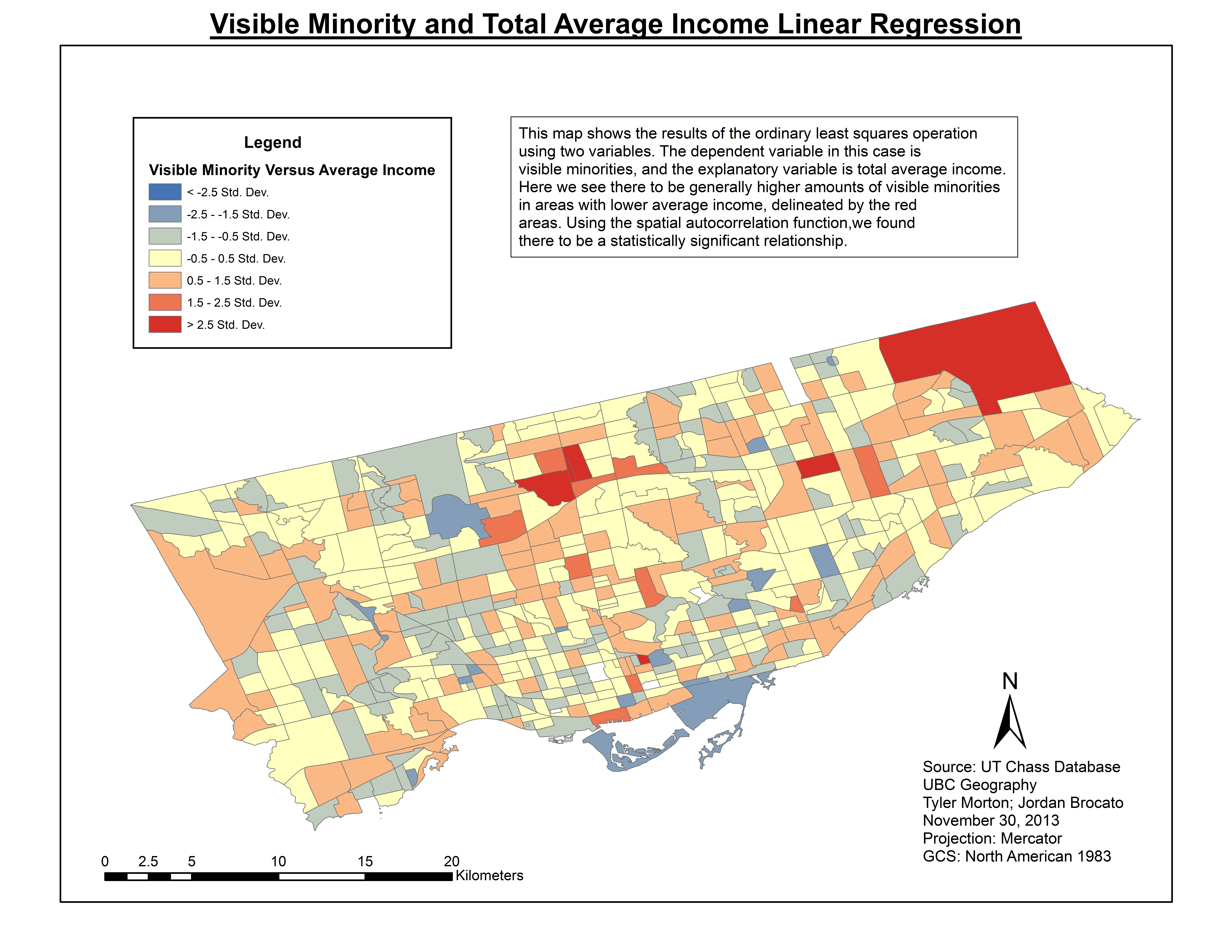
This map displays the Ordinary Least Squares linear regression between total visible minorities and the total average income. In this case, the total number of visible minorities is our dependent variable while total average income is our explanatory variable.
This analysis displays the census tracts with the highest statistical significance of lower average income areas correlating with higher numbers of visible minorities, shown by the dark red areas. Looking at the legend showing the standard deviation of residuals, the red areas show a standard deviation of greater than 2.5, which means that there is a significant relationship between the two variables. Areas that area a number of standard deviations above the mean have a significant relationship between total visible minorities and average income. Based on the data shown, we can say with confidence that the areas with the highest number of visible minorities tend to have lower average incomes.
Multi-Variable Regression Using All Three Variables
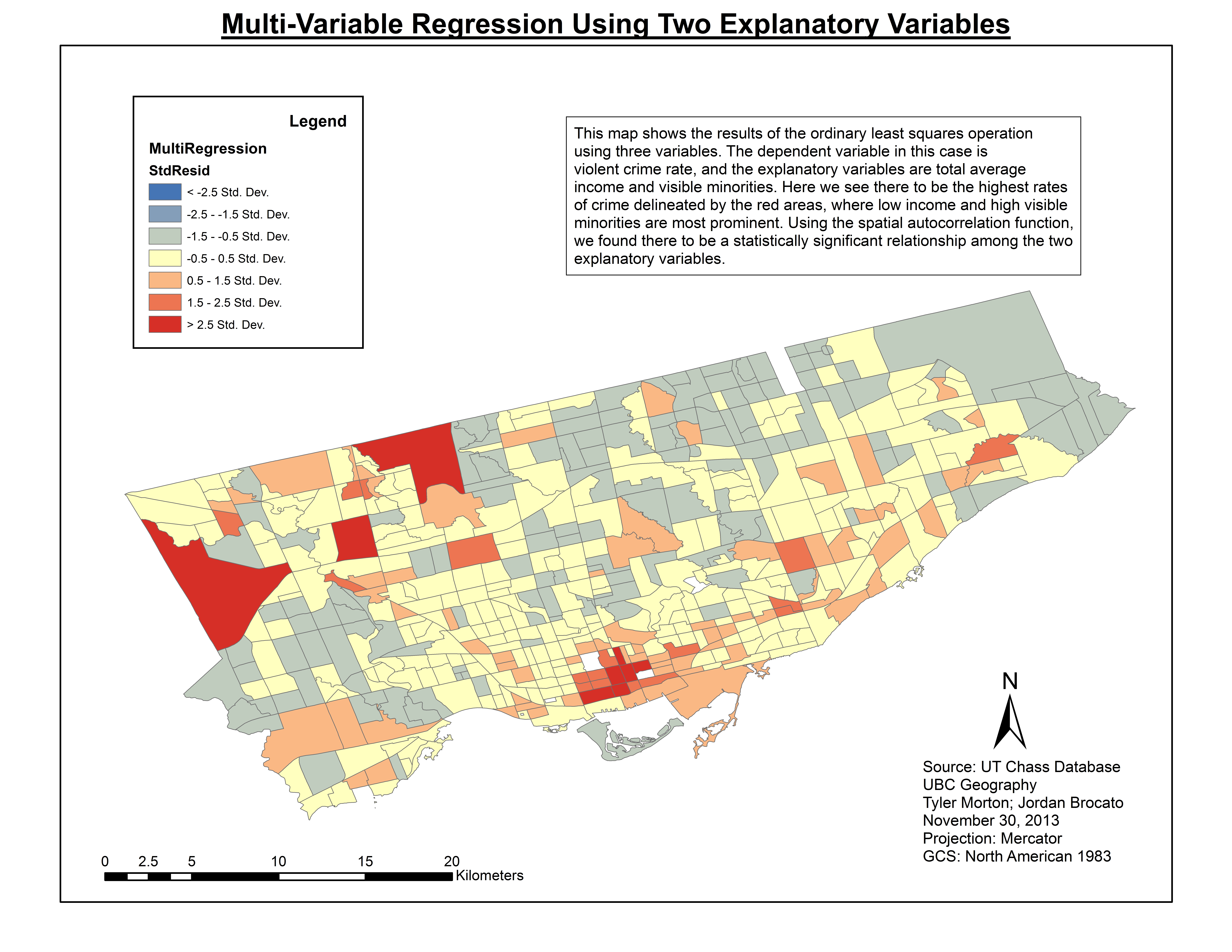
The map below shows the relationship and correlation between violent crime rates as the dependent variable with the total number of visible minorities and average income as the two explanatory variables.
Our multi-variable regression shows the level of significance between visible minorities and average income as indicators of higher crime rates. As we can see, the higher standard deviation residuals shown by dark red, expresses the areas in which crime rates are higher due to the apparent correlation of higher visible minorities and lower average income. If we refer back to the choropleth data maps showing areas of higher visible minorities and areas with lower incomes, it is clear that the dark red areas in the map above are also areas with high numbers of visible minorities and low average incomes, however there seems to be a few areas particularly in the North East of the map that we would believe to have a low average incomes and high numbers of visible minorities but are not displayed to be so in this regression model. From this, we deduce that the biggest problem areas in the city are the three census tracts coloured in dark red at the northwestern region of the city.
Spatial Autocorrelation of Multi-Variable Regression (Moran’s I)
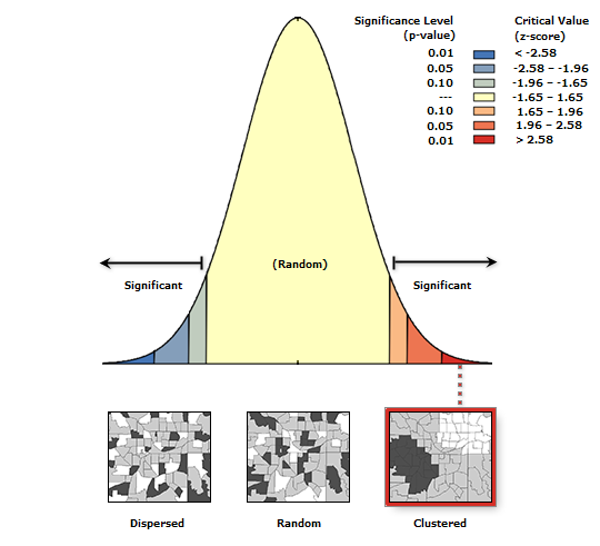
As shown by our Moran’s I test below, the red areas show the variables to be the most clustered, meaning a higher level of significance. The yellow and blue areas show less clustered or less of a relationship between variables, indicating random chance or no correlation. The results of this analysis show that there is a less than 1% probability that the results were due to random chance.

