
During the first Zoom discussion in this course, Dr. McCready mentioned his frustrations with Canvas, the Learning Management System (LMS) currently adopted by UBC, and our group members felt the same way. From our past experience of distance learning with the MET program, we all had to rely heavily on many other platforms to make up for the shortcomings of Canvas. Thus, we designed and created a simplified learning innovative management (SLIM) system based on Isa and Isaias’s (2015) seven usability criteria, Woolgar’s (1990) paper on how to configure the user, and each team members’ own understanding of “what a good LMS should be”.
Before we actually started working on our LMS, we spent a lot of time in the designing stage. First of all, we wanted the LMS to be as simple as possible while still being functional for effective online learning, to reduce distractions caused by the complexity of the website. 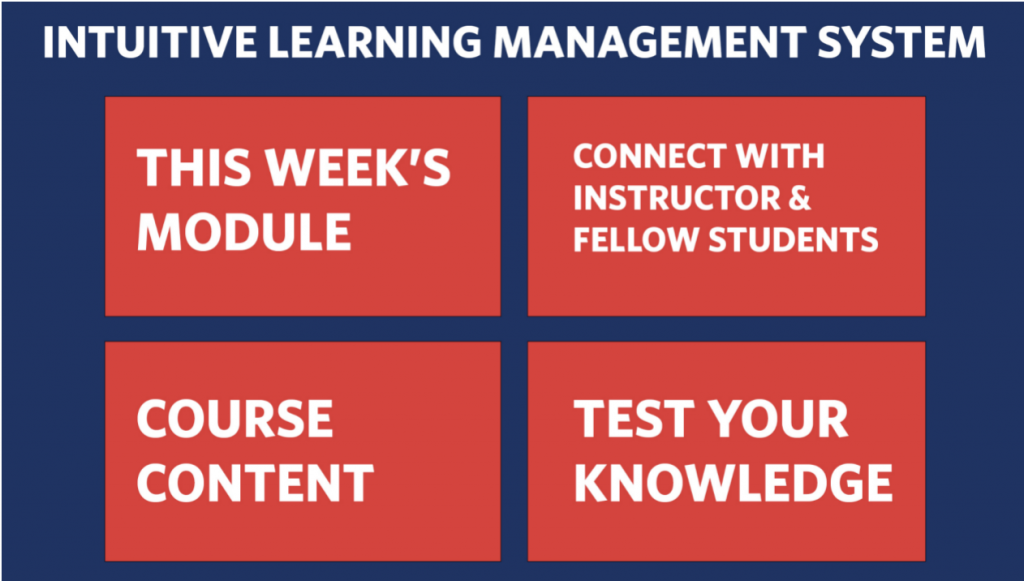
The layout of the main page – 4 options/blocks only (1st draft)
Then, three of us agreed to add an intelligent virtual assistant to our LMS to help users navigate the website and to configure their interactions.
The layout of the main page with an intelligent virtual assistant always sitting aside from the main content (2nd draft)
Comparing the final main pages of LMS and drafts, I recall those difficult times in making this website since intense discussions arose in every week’s project meeting. We had the biggest issues in selecting the hosting web service. Each of us tested the functionalities of Google Site, Wix and Weebly since they offer entirely different sets of plugins. As we intended to integrate some interactive visual programs into the LMS, the functionalities of the web service hoster matter the most. Weebly, as the optimal solution we tested at that time, also had many problems in the subsequent integration. For example, in the Assignment section, some game-based tests that work well on WordPress do not function on Weebly. In addition, the essential configuration tool in our design – an intelligent virtual assistant, had to be split into an animated introduction video and a chatbot that provides the website information.
As a team, we also had massive discussions about the main elements of the LMS. The debate was heated since we want the website to be rich in content and delivery methods while keeping the user interface simple and straightforward. As a result, we carefully examined each option’s educational importance and necessity, then decided which to keep and highlight. We also invited many of our friends and family members to test and evaluate different versions of the SLIM to gather more opinions from learners with different abilities, preferences, and backgrounds.
Before we started this project, I thought our main problem would be technical capabilities since none of the team members come from a profession in IT. But, surprisingly, we ended up spending most of the weekly meetings discussing and testing whether a particular kind of Edtech is educationally effective for our target users. This project helps me realize that creating an edtech tool is not about fancy functions. Instead, a new edtech tool should deploy appropriate technology to provide educational affordance for both learners and educators.
References
Issa T. & Isaias P. (2015) Usability and human computer interaction (HCI). In Sustainable Design(pp. 19-35). Springer, London. https://doi-org.ezproxy.library.ubc.ca/10.1007/978-1-4471-6753-2_2
Woolgar, S. (1990). Configuring the user: The case of usability trials. The Sociological Review, 38 (1, Suppl.), S58-S99.