Monthly Archives: April 2011

Short+Clearness=Epic

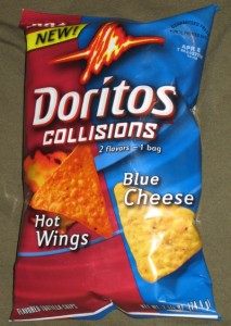
The super bowel which just finished awhile ago taught us a lot about advertising. The most important question for a super bowel advertisement is how do you deliver a clear message to the viewers in merely 30 seconds? First of all, we need to understand a 30 second commercial is considered extremely short, most of the daily advertisement we see on TV are closed to a minute. That extra 30 seconds allow companies to put way more information into a commercial and deliver a much clearer message. So, how do we achieve all this in 30 seconds? The Doritos commercial give us the answers.

 www.google.ca   www.google.ca

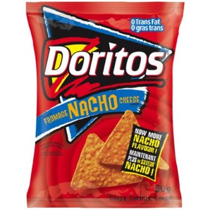
First the most important thing is telling the viewers who you are. In the pug attack commercial we can clearly see the classic red bag with a huge Doritos name on it. So people will not mistaken Doritos with any other chips companies which are also doing commercials during the super bowel. Second show viewers who you are targeting. In the pug attack commercial, we see a young couple inside a cozy house. We immediately know that Doritos is trying to target young costumers instead of adults or seniors. Third show the customers why Doritos has good products. Doritos show that by showing  that a pug will do anything for some Doritos, and Doritos will make them do crazy things.

YouTube Preview Image

All these information in a 30 second video delivered a clear message to the viewers about who they are, who Doritos are targeting, and the quality of their products.
Space Rocket as A New Commodity?

New forms of business come into the market everyday. From smart phones to tablets, from hybrid cars to electric cars, these brand new commodities have already became part of our daily life. These new forms of businesses have become extremely successful in recent years, and many of their owners earn big revenues. So if smart phones and electric cars can become popular commodities, can a space rocket become a product as well? Certainly it can.

 www.google.ca www.google.ca

 Recently, a new U.S high tech firm has begun their rocket business. This company dedicates on researching and developing new kind of cargo rockets, and it plans to have its first launch in 2013. This company has just successfully developed their new cargo rocket called Falcon. This egnormous rocket can carry 114,000 pounds of cargo, and it is the biggest rocket since Saturn V, and it has the ability to carry cargos or men into the Earth, Moon, or even Mars’ orbit. This company had already begun working with NASA and NASA actually plans to put astronauts into the rocket if the company can make several successful launches. As results it will make this company become the world’s first private rocket company.

Jennifer Aniston’s Sex’s Tape

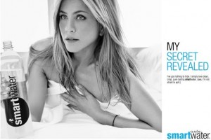
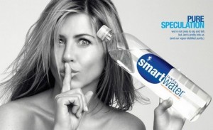
After reading Jennifer Aniston’s Sex’s Tape by Rebecca Abel, I believe Smart Water deliberately choose that title. Personally, this title has purpose. First, get people’s attention, whenever people see some outrageous things about a popular star, they will go watch it, read it or look at it. Everyone knows Jennifer Aniston, and most of the men on this planet love pornography. So a title which includes super star celebrity +pornography = unstoppable attraction.

 www.google.ca   www.google.ca

I bet a lot of people clicked that video because they thought it was a real sex tape, and a lot of them would love to see Jennifer Aniston gets naked. And I bet a lot of the viewers were actually disappointed because it was not a pornography video. The second purpose is to conduct the message to the targeted market. Clearly, smart water’s targeted market can be everyone. From kids to teenagers, from adults to seniors; these people can all become Smart Water’s targeted customers. However with this sexually appealing title, seniors are out of the list.

 www.google.ca   www.google.ca

So, did Smart Water really do a good job on communicating with their customers in this video? Personally, I disagree. There are a lot of times I don’t really understand the true messages. For example, what is the video trying to tell me when there are a lot of dogs running around Jennifer Aniston? And what is the video trying to tell me when there are three computer nerds watching Jennifer Aniston drinking water? As a result, I don’t believe this video deliver a clear message about this company’s product. And the title of this video is purely used to attract viewers. This is cheating 🙁

Cool Design Do Make A Difference

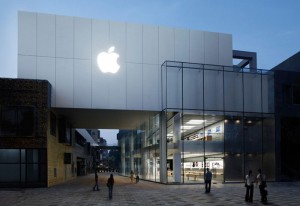
After reading Angel Hou’s blog Cool Design Do Make A Difference , I was amazed by the beauty of those buildings and stores. In fact the design of a particular building does have strong effect on its customers. From my personal opinion, I would like to see a Nike store reflects its strong dedication on athleticism. So when people see the store they know this is Nike and they know this is a sport store.

 www.google.ca  www.google.ca

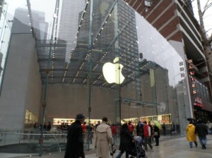
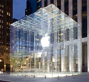
Also, all the people around the world have curiosity. So whenever we see something strange, something beautiful, or something weird, we would love to take a look. Therefore, if the design of a store is outstanding, it can attract customers who are not interested in the product, or customers who have never heard of the brand before. A store with beautiful design also triggers purchasing desires. As we learn in marketing class, a strong store atmosphere does increase sales. As I mentioned before, the design of a store also tells the customer what kind of products they are selling. The apple store in NYC 5th avenue is a great example.

 www.google.ca   www.google.ca

When people see that store, they immediately know this store sells high tech products. And the huge trade mark on the wall also tells the customers which brand they are choosing. The Apply store on NYC 5th avenue, also reflect a company’s strength compares to companies. Because people expect strong companies to have fancy stores, and Apple does exactly that. That Apples store already told customers a lot of information before they even get into the store. As a result, a beautiful design for a store does matter, and does make a difference.

Coke Zero vs Pepsi Max

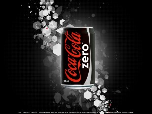
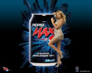
After reading Lauren Nipp’s blog about Coke Zero vs Pepsi Max, it got me thinking for a while. I do agree with Laruen that Coke does have a better name, and as male, I prefer the color outfit for coke’s container. The classical black is a strong indicator of strength and power. It has a strong appeal to man. However, the blue and black for Pepsi Max is not so appealing compare to me. I personally believe blue is a kind of neutral color.

 www.google.ca   www.google.ca

I also agree with Laruen that Coke uses a name which makes more sense when the customers are purchasing the product. However, when I first saw Pepsi Max, I didn’t really understand it is a soft drink with zero calories. Though Pepsi Max has a tagline underneath the name, it is not as important as having a good and clear name which conducts the correct message to the customers. Therefore, even Pepsi has a really good tagline underneath the name; it does not make up for having a confusing name. Also, when customers see a product at first sight, they look at the name first. Therefore, if there are any customers who don’t pay attention, they won’t even see the tagline. They might even think this is a drink with maximum calories. So from a personal point of view, I believe Coke have both better color outfit and a name which convey the clear message to the customers.