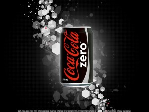
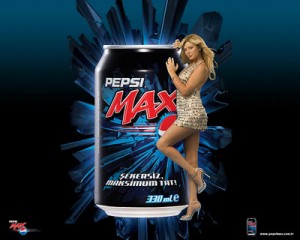
After reading Lauren Nipp’s blog about Coke Zero vs Pepsi Max, it got me thinking for a while. I do agree with Laruen that Coke does have a better name, and as male, I prefer the color outfit for coke’s container. The classical black is a strong indicator of strength and power. It has a strong appeal to man. However, the blue and black for Pepsi Max is not so appealing compare to me. I personally believe blue is a kind of neutral color.
I also agree with Laruen that Coke uses a name which makes more sense when the customers are purchasing the product. However, when I first saw Pepsi Max, I didn’t really understand it is a soft drink with zero calories. Though Pepsi Max has a tagline underneath the name, it is not as important as having a good and clear name which conducts the correct message to the customers. Therefore, even Pepsi has a really good tagline underneath the name; it does not make up for having a confusing name. Also, when customers see a product at first sight, they look at the name first. Therefore, if there are any customers who don’t pay attention, they won’t even see the tagline. They might even think this is a drink with maximum calories. So from a personal point of view, I believe Coke have both better color outfit and a name which convey the clear message to the customers.

