All posts by theresa lum

New York and Vancouver on Screen

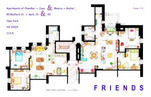
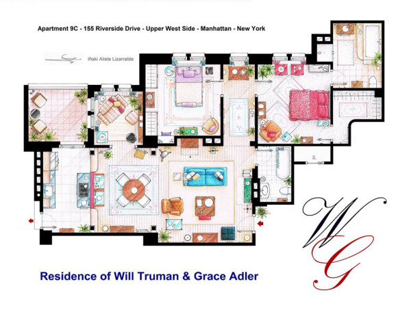
Iñaki Aliste Lizarralde draws floor plans from famous TV apartments, creating real-world maps of fictional settings. His drawing of the “Friends” apartment is part of the You Are Here: NYC collection, and many of his other maps represent New York as well. For example, he has done drawings of the apartments of  Carrie Bradshaw, Holly Golightly, Will & Grace and Lucy & Ricky, all set in New York but never truly existing within the city. These sets were mostly created in Los Angeles (with exception of the apartments of Bradshaw and Golightly, which were created on stage in New York), but are nevertheless an integral part of the populace’s perception of the city of New York.

This emphasis on the New York setting leads me to think of how Vancouver does not have a single map like this, despite being a filmmaking hub. Instead maps are made of the other places in the world that Vancouver represents on screen – like the video, “Vancouver Never Plays Itself.” This video visually maps many of the places Vancouver has pretended to be and is an interesting contrast to Lizarralde’s New York floor plans.

A Closer Look at Jelly NYC

I found it interesting to take a closer look at Liz Hickok’s project “Fugitive Geography: Jelly NYC,” which was featured in Harmon’s You Are Here: NYC. On her website, she describes her process and intent, and includes photographs of the installation. The photographs give the project a different sense of scale compared to the human body, and begin to represent how you would see and interact with a map made out of Jell-O.

“Working with Jell-O and other gelatinous materials enabled me to play the role of architect and reimagine New York City. The material took unexpected turns as it bent, glistened and melted, revealing the hidden fragility of the familiar city grid. The buildings in Jelly NYC assume a human quality as they lean on one another for support.”
(Liz Hickok)

From “You Are Here, Mapping the Psychogeography of New York City” Exhibition at Pratt Manhattan Gallery, NY

A Bias for Whales

A local visual artist, Natasha van Netten,  explores mapping from a whale’s perspective:

My current drawings and paintings revolve around the largest, most illusive creatures alive—whales. In the advancing field of Cetology (the study of whales) data is scarce and research is often speculative and hypothetical. My work translates this scientific information into a language of accumulated marks and brush strokes to give clinical data a visual meaning while exploring this mysterious space between known and unknown information. (van Netten)

In her series titled Cetacean: Chartwork (samples below), she inverts what is positive and what is negative between water and land forms. It makes me think of an interpretation of the Nolli map. One version can be occupied by humans, and another by whales.

To see more of her mapping work:
https://natashavannetten.com/cetcean-chartwork/


Dominica: -61.339, 15.447
22″ x 28″, India ink on embossed paper, 2016


Bering Sea: -161.411°, 54.795°
22″x30″, gouache on embossed paper, 2015

The Wilderness Downtown

In an interesting use of mapping technology, Arcade Fire created an interactive music video with Google Maps that transports you to the town you grew up in.

“Choreographed windows, interactive flocking, custom rendered maps, real-time compositing, procedural drawing, 3D canvas rendering… this Chrome Experiment has them all. “The Wilderness Downtown” is an interactive interpretation of Arcade Fire’s song “We Used To Wait” and was built entirely with the latest open web technologies, including HTML5 video, audio, and canvas.” (chromeexperiments.com)

Created in 2010 and directed by Chris Milk.

Click the link below, enter your home town and experience the experimental production:

http://www.thewildernessdowntown.com/

(Its recommended you watch the video with Google Chrome)

Game of Thrones: made with cogs and wheels

Games of Thrones opening credits
First aired: April 17, 2011
Location: Westeros (fictional) | created in Santa Monica, CA (digital)
Media: CG model built in Maya (made to look like natural materials)
Title designer: Angus Wall, with a team of 25-30 people
Original size/scale: intended for widescreen home TV’s
Projection system: map projected on the interior of a sphere
Target audience: fans of the Game of Thrones books

Readers of the Game of Thrones novels flip to the map at the front of the book if they need to orient themselves in the fantasy world of Westeros – and in the same way, viewers of the Game of Thrones television series watch the opening credits at the beginning of each episode. This opening sequence translates the printed map into an animated landscape that sets the tone for the show. Now with an animated form, the map is in a constant state of flux and change, just as characters and cities likewise change within the narrative. Very few title sequences are the same from episode to episode, just as nothing remains static for very long in Westeros. The gears and intricate mechanisms working beneath the surface of the map also represent the hidden and interlocking schemes of the characters vying for the throne – using the form of the map to help tell the show’s story in a new way.

http://www.artofthetitle.com/title/game-of-thrones/

Karina Puente’s Invisible Cities

This is the website for the artist who illustrated Calvino’s Invisible Cities, Karina Puente. She has images of 15 of Calvino’s cities, and they are definitely worth looking at in more detail.

http://karinapuente.com/index/

Puente’s description of her work: “They are not only drawn – I use different types of paper and draw on each one before cutting them out with exact knives. All the drawings are composed of layers of paper which are cut out and glued.”