Tag Archives: case study

Cylinder – Sounds Translated into Objects

TranslatTranslaAndy Huntington and Drew Allan
Cylinder (Series), 2003
3D Printed Plastic
20-40 cm

Huntington and Allan developed software that translates sound into STL files to be 3D printed. With this technology, they were able to map the auditory complexity of spaces, music and moments into  visual and tactile objects. What is not apparent in this body of work is how scale comes into play. The small size of the objects suggests that the designers were limited by the size of their printers and that because of this, the scale that the sounds are printed at differs. The project “grew out of a desire to create truly complex objects which hint at the overwhelming detail present in nature,” and it is safe to say that the designers did succeed in producing complex objects but perhaps not ones that reflect nature. Some of the moments that they recorded like a breath, a Saturday market in Italy or Martin Luther King’s “free at last” are representative and provide a visual and tactile map of moments in the human experience. Not only can these objects help to illustrate the energy of a sound or a room but they serve as artifacts that can help us map out these moments that have passed.


01 – Julia Presentation 1_sm

02 -Julia Presentation 1_sm

Game of Thrones: made with cogs and wheels

Games of Thrones opening credits
First aired: April 17, 2011
Location: Westeros (fictional) | created in Santa Monica, CA (digital)
Media: CG model built in Maya (made to look like natural materials)
Title designer: Angus Wall, with a team of 25-30 people
Original size/scale: intended for widescreen home TV’s
Projection system: map projected on the interior of a sphere
Target audience: fans of the Game of Thrones books

Readers of the Game of Thrones novels flip to the map at the front of the book if they need to orient themselves in the fantasy world of Westeros – and in the same way, viewers of the Game of Thrones television series watch the opening credits at the beginning of each episode. This opening sequence translates the printed map into an animated landscape that sets the tone for the show. Now with an animated form, the map is in a constant state of flux and change, just as characters and cities likewise change within the narrative. Very few title sequences are the same from episode to episode, just as nothing remains static for very long in Westeros. The gears and intricate mechanisms working beneath the surface of the map also represent the hidden and interlocking schemes of the characters vying for the throne – using the form of the map to help tell the show’s story in a new way.

http://www.artofthetitle.com/title/game-of-thrones/

BIKEMAP.ORG

BikeMaps.Org
A Crowdsource Tool for Global Mapping
of Cycling Safety
May 2007 to May 2017

BikeMaps.org is a website that bikers can share their cycling experience through this website. This website collects the information about cycling safety, hazards and bike thefts
and then uses GIS and statistics to identify hot spots of cycling safety, risk, and crime.
Excepting for the hot spots of incidents, this website also shows rider density data. This data comes directly from the Strava cycling and running mobile tracker application. Using Strava, bikers can track their commutes and recreational rides using their Android and
iPhone. This website can show data that collected in recent ten years and the map shows data reported by bikers and official report(such as ICBC report).

Compared with the cycling map made by Vancouver government. I think the advantages of bikemaps website are that the website keep updating the latest data and bikers are able to find the real-time density in the bikeways.

link:

http:// bikemaps.org

http://vancouver.ca/streets-transportation/cycling-routes-maps-and-trip-planner.aspx

Strava World Heatmap

app/website

http://labs.strava.com/heatmap

User data from over 170 million bike rides and runs from 2015 is overlayed on a tiled map using data from Mapbox and Open Streetmaps. Toggling between bike rides, runs, and both, reveals the ways in which Strava users traverse roads, paths, and in between. While the data is compiled by computer engineers, it is created by the millions of users who attached GPS devices to their bodies or bikes in an attempt to measure their speed, distance, heart-rate, energy output, etc.

9-eyes See All?

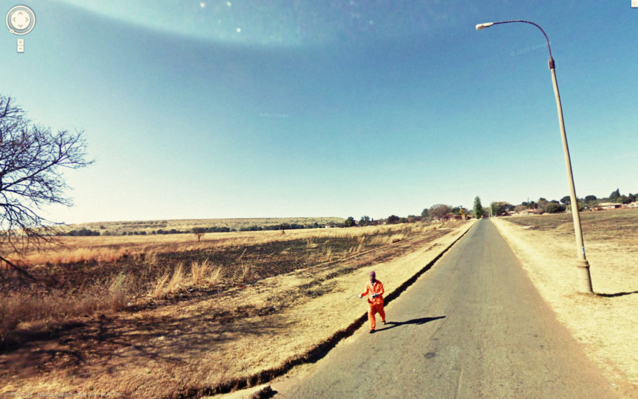
Image credit: http://9-eyes.com/

Quotes from Susan Sontag, On Photography, 1977:

“Strictly speaking, one never understands anything from a photograph….Today everything exists to end in a photograph.”

“The camera makes everyone a tourist in other people’s reality, and eventually in one’s own.”

“Needing to have reality confirmed, and experience enhanced by photographs is an aesthetic consumerism to which everyone is now addicted. ”

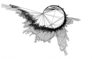
[[[[//////////////////////////\\\\\\\\\|||||||||||||||||||||/////]]]]]

9 –Eyes is a project by Canadian Artist Jon Rafman. Begun in 2009 and continuing to the present, this series is a sort of street photography taken from within mapspace. Rafman takes screenshots from the ever-evolving, distorted, and stitched web of Google Street View panoramas and posts them to this blog: 9-eyes.com. The artist, rather than strolling physical streets, drifts through cyber geospace and retroactively finds the ‘decisive moment’ described by Cartier-Bresson in poetic, violent, turbulent, pastoral, comical and ultimately ambiguous scenes. I would like to use 9-Eyes to dismantle Google Street View’s supposed neutrality.

Maps have tended to focus on geographic space and index human artifacts– our roads, houses, tweets, traffic patterns etc—as opposed to humans ourselves. Google Street View is both laudable and problematic for the inclusion of people within its archives. As some of Rafman’s images begin to show, the subjects captured are of a certain demographic. This is because, the street view cars equipped with (originally 9) but now 15 cameras only venture out in the brightest (shadowless) hours of the day, meaning most white collar workers are not occupying the street. Instead, the privacy of prostitutes, criminals, the elderly, and children to name a few, is arguably unevenly violated. While the algorithm blurs faces and license plates, it is far from perfect, and people are often identifiable. On the other hand, the repository of images of people could be mobilised for good, to illustrate, argue or prove.

However, this blurring of identity mirrors and exacerbates our lack of empathetic recognition of fellow humans. Rafman’s images are mined from countries around the globe, and divorced from their immediate context we struggle to understand the circumstances of each image and the identity of the people within in. I read this as a comment on the digital proximity yet estrangement with others we face on social media today.  The presentation format of a never-ending blogroll also contributes to this blur, as images meld together in front of the viewer, without reference.

The endlessness of Rafman’s blogroll critiques another facet of mapmaking and our online culture today: that we are faced with overwhelming amounts of data, information, and even maps available on and through the internet. This also points to another bias in Google’s Street Views. They hide their implicit authorship of the maps, behind the sheer amount of their data. In their totalizing mission, the data takes on a life of its own, they can no longer be seen responsible for the immense amount of it. Instead, it falls on the viewers to find and report any violations, or aberrations in the maps.

Rafman performs a sort of archeology of this data archive. He sifts through this constantly updating mapscape and preserves certain views, recontextualizes, or even maps them. Though originally taken by a computer-driven camera program, digitally stitched together and distorted, Rafman adds a human dimension by finding, and selecting these pictures. While certainly problematic, this has the effect of personalizing the visual data. Rafman’s project shows us how Street View is far from neutral and brings us simultaneously closer and farther than ever from the places and people represented on the map as we look on in amusement, horror, bewilderment and laughter.

LINKS:

http://9-eyes.com/

https://www.google.com/streetview/understand/

Solstice: Overlaying Realities and Experiences

by: T.Rolls, C.Winters, & S.Marcondes
Solstice, 2011
Public art installation with projection mapping
location 49°16’27.24”N, 123° 7’27.56”W
20’-0” x 10’-0 suspended at 15’-0” overhead from a wood canopy

Vancouver is a notoriously rainy city in the winter and on the rare sunny day; most people are stuck indoors working. Solstice was a public art installation that sought to bring the feeling of sun and warmth to the night sky for everyone to enjoy in the dreary winter months.

By collecting HD timelapse footage of bright, colourful Vancouver skies and using 3D projection mapping techniques, projected onto a custom sculpture, Solstice created a spatially augment reality for the viewer. The result was an abstract window into a brighter world. The project creates a representation of an enticing environment through a visual storytelling experience for the viewer. The physical narratives of this work are based in optics, illusion and the investigation of the>perception of reality (Hfour, 2017).

Hfour. (2017). Hexastart: A Video art installation featuring projection mapped geometric high-relief sculptures. Accessed from http://hfour.ca/portfolio-item/hexastar

Solstice. Tim Rolls. Vimeo.

Village Voices: An Audio Walking Tour of the Cathedral Area

Evie Ruddy is a digital media artist, freelance journalist and creative writer, specializing in digital story telling. “Village Voices: An Audio Walking Tour of the Cathedral Area,” while evidently a form of digital story telling, is also a cybercartographic map. Cybercartography is defined as “The organization, presentation, analysis and communication of spatially referenced information on a wide range of topics of interest and use to society in an interactive, dynamic, multimedia and multi sensory format (Taylor, N.D., p.2).”

This interactive, GPS located and triggered audio map shares personal and collective histories through a multi-media multi-sensory experience, facilitated through a smart phone audio guide application called izi.TRAVEL. This map prioritizes spatially located qualitative information over the creation of a graphic artifact. Its significance lies in its content, its utility, and its focus of performance and narrative.

When it comes to learning about our environments in all capacities this fully immersive and ’bottom-up’ method of communicating location-based information is very meaningful. It triggers emotional responses to location based information

One of the short fallings of this map is it its reliance access to smart phone technology. Only those privileged with the ability to spend 100$+/mo on a phone plan have access to the full, 1:1 audio map experience. This platform also relies heavily on the use of Google Maps imagery, appropriating the issues that come along side it.