Chanchan here. Day 4 of all of the elections hullabaloo, and I’m tired already. I’ve already exercised my “democratic right” so all of you should too. Unfortunately, since most of the posters for BoG and Senate are trainwrecks-in-action, I see no point in subjecting my powers of shallow that far.
Candidates for VP Academic
Matt Parson
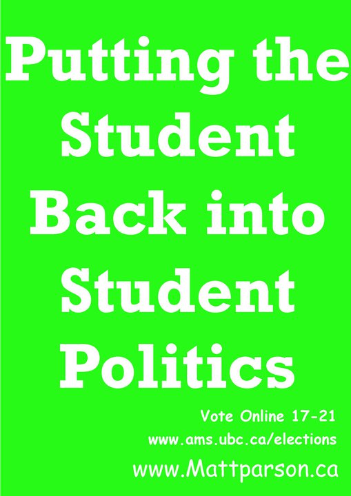
Fortunately for Matt, his real poster is much better. Unfortunately for Matt, it looks exactly like everyone else’s. I wonder if his photo shoot was at Wreck, as the scenery is just too UBC-promotions-material for it to be anything else. (You can see the photo at his website.) If this is at Wreck, the location is very apt. It perfectly describes his multi-colored Facebook campaign, complete with the devil’s font itself, Comic Sans. However, it has been shown that things written in ugly fonts can be recalled better, so he might be catching onto something.
Jennifer Wang
You have avoided my scrutiny (not criticism, Omar) by being virtually absent on paper. Congratulations.
Justin Yang
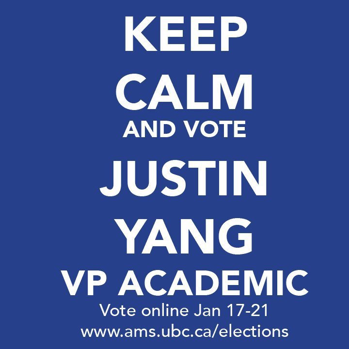
Your poster bears a striking resemblance to both British wartime propaganda and Taylor’s new favorite picture. So you should appeal to both history fanatics and girls attracted by sparkly things, right? Maybe not the former; I have read some critique of the finer nuances of your campaign. (Prod me if this is you!) Keeping calm and carrying on is a very different route than keeping calm and voting for you. At least you have capitalized upon an iconic movement without butchering it completely. Relatively so anyways. Let’s be grateful for small miracles though; not a buzzword in sight.
Candidates for VP Admin
Gord Katic
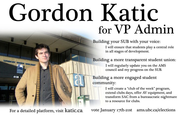
How many skinny scarves does it take to build an AMS Council?! Come on. You look like your emerging from the fog… and you can’t see a damn thing. Great look for someone who is supposedly leading us toward more engaged student community. Reading your poster was like reading an academic journal; too many words, and I gave up half way through. TL, DR. I’m not sure if “bureaucratic nightmare” is the proper term you are looking for… an exercise in tact you are not, Gord.
Mike Silley
(Chanchan could not acquire a large enough version of the poster. Apologies. Go look on Facebook if you really want.)
There’s something about argyle sweaters that makes Chanchan grin. +1, friend. -2, however, for writing an essay in a space meant for twenty or so words. I do realize that for all my harping on poster design, it is rarely the fault of the candidate, rather their poster designer, but it’s your face on it. You should be able to decide what smile you want to show up on your poster, Mike. Too bad all your photos look the same. All in all, pretty average – but when average is sub-par, you might want to re-evaluate where you stand. It’d be awesome if I could actually READ what you wrote on your poster… but I guess I’ll have to make do with ogling your argyle sweater.
Kathy Yan Li
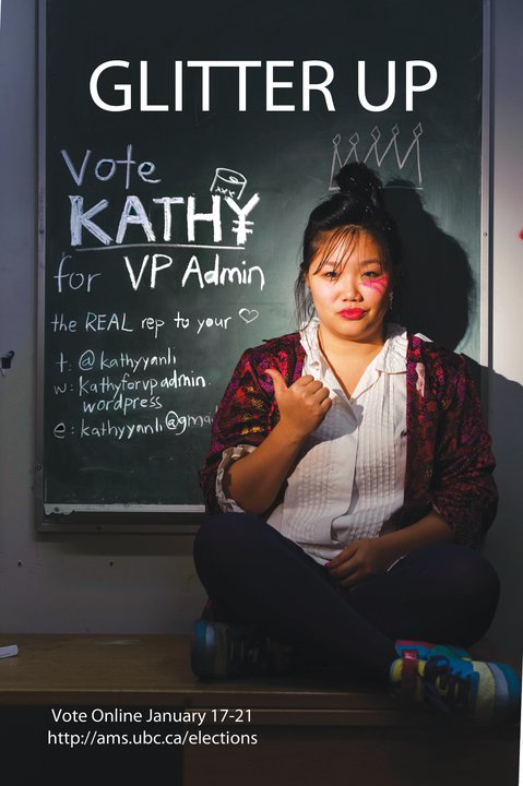
For someone that’s vaguely referencing Ke$ha, I expected more skeeviness and less conservative button ups. But don’t worry, I know someone who can take care of the Ke$ha references for you. The chalkboard crown is reminiscent of a sticker picture (I would know, I’m Asian, but so are you, Kathy) and there is a strong lack of glitter, despite the “Glitter Up” tagline. Despite these shortcomings, I find myself strangely drawn to your poster, which is more than I can say for anything else on those forsaken bulletin boards across campus. So, props, I guess.
In conclusion: If you run for a Council position with a portfolio that doesn’t begin with A, you’ll be more interesting by default. (don’t forget to vote! and you can also toss us a vote here, we love you).