Quantitative Data Classification
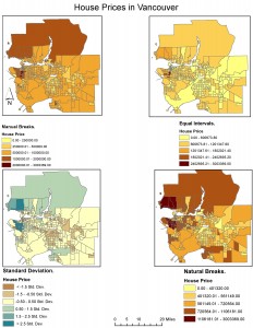
Choosing a certain classification method greatly varies how the data on your map will be displayed, and therefore how the information will be understood by an audience. As a journalist putting together maps of housing cost in Vancouver, I would choose the classification manual breaks, as it uses round numbers which are easy to read and quickly translate to the map (Figure 1). The newspaper reader would want to quickly look at the map and see in what areas have houses prices over $1,000,000 and where the houses under $250,000 are located. If I was a real estate agent, I would display a map of house prices in Vancouver using the equal interval data class, especially for preparing a presentation for prospective home buyers near UBC. Using equal intervals for this map gives the impression that although the area around UBC is the most expensive in Vancouver, only one subdivision around UBC is filled with the darkest red shade. Compared to maps using different data classes, especially the standard deviation data class, which shows the whole area around UBC as the darkest shade (the most expensive), equal intervals make house prices look the less expensive around UBC. There are ethical implications involved with this, as it could be argued that you are deceiving the home buyers on how cheap the houses actually are.
Figure 1:
Housing Affordability
The Demographia International Housing Affordability Survey has the perspective that public policy regarding housing should be focused on improving living standards and reducing poverty. Affordability is a more effective method of indicating housing affordability than house prices. This is because affordability relates the house prices to other factors such as the household income of area, indicating how likely it is the population will be able to afford a home in this area and the livability of a city. Housing affordability is calculated in this survey using the median house prices and median household incomes. The indices are defined as a median multiple of under 3 is affordable, 3.1-4 is moderately unaffordable, 4.1-5 is seriously unaffordable and over 5.1 is severely unaffordable. However, many affordability reviews only focus on national data, making differences between metropolitan markets. It must be considered if we can trust the affordability index for each area, as defining an area as ‘affordable’ or ‘unaffordable’ can have can have implications such as greater poverty, slower economic growth and less job creation (Angel et al, 2014).
Affordability is not a good indicator of a city’s livability, as highlighted by Angel et al, 2014. Severely unaffordable markets are subject to land use restrictions, leading to higher land costs and therefore higher house prices. This is known as urban containment, where new construction has development limits due to urban planning policy, therefore creating a higher density population in these severely unaffordable areas. This ‘densification policy’ leads to more congestion in the city and commuting times are increased. This shows that although you would think that if an area was severely unaffordable it would be highly livable, there are practical problems associated with a dense population living in a small area, and this is due to urban containment policies and not being able to develop on urban fringe land.
