Author Archives: amy shaw

Final Project: Mapping Peace River ALR

British Columbia’s agricultural land reserve has been honoured as one of the best in the world, however estimates of how much land the ALR covers are out of date and inaccurate.  Our team’s goal was to map the ALR of the Peace River census division to see how much of the land is being used for agriculture and how much is being used for other land uses or is threatened.  This is important because it is critical for up to date information to be available when policy decisions are made.  We found that 3% of land is physically unusable for agriculture due to rivers and lakes, however over 60% of soil is considered unusable as arable land.  Furthermore, we mapped the extensive road network in the Peace River ALR, which severely reduces the space available for agriculture.

We organised our team by creating a schedule of when we would complete each stage of the project by, and outlined this in our project proposal.  We then split the body of the report into biogeographical and social, assigning team members to complete further research and compile maps on these sections.  We met up during lab times and one other time throughout the week to compile our data and review what each team member had completed.  Furthermore, we used Google Docs to compile the written report, each taking responsibility for a particular section. My role in the project was to work with another team member to produce the social section of the project.  I also was responsible for producing the executive summary and outlining any possible errors and uncertainties in the project.

This project has taught me a lot about not only the agricultural land reserve in British Columbia, but also how effective different methods of teamwork and project management are.  Through GIS mapping, our report reveals that there are many oil and gas sites in the Peace River ALR, which is not permitted.  However, through further research we found that the ALC allows oil and gas extraction to occur in the ALR because it is deemed vital for economic development.

A key GIS technique we used was the buffer tool, which allowed us to create a buffer 10 meters on either side of each road in the ALR.  We used an array of analysis techniques such as clipping, converting feature to point, area calculations, selecting by attribute, merging layers and intersecting.

An issue we ran into was the restriction on some of the data sources which would have been helpful for our map, particularly surrounding oil data. If this data were made public, it would reduce the time taken to collect similar data from different sources and would allow for a different analysis on ALR management.

Please find attached a copy of ‘Mapping Peace River ALR’ by Kasper Richter, Elsha Noah, Amy Shaw and Hannah Griffiths. Finalwriteup.docx

Lab 5: Environmental Assessment

lab5 13-page-001

Northland Properties and Aquilini Investment Group of Vancouver have been attempting to obtain permission to build Garibaldi at Squamish Ski Resort since 1997.  Over the last 18 years, they have submitted environmental assessment reports in the hope that their application would be approved and building work could commence.  However, the BC Environmental Assessment Office did not consider their environmental impact assessment adequate in ensuring wildlife, vegetation and fish would be unharmed.  Furthermore, it was noted that much of the proposed area is below 555m, which will not receive enough snow during the ski season and therefore the area is not economically viable for a ski resort.  Through an environmental impact assessment produced using Arc GIS software, I will address these criticisms, recommend which is the most important issue to overcome and which ones are relatively minor.

The first step involved in creating an environmental impact assessment using GIS software is to obtain appropriate data.  For data relating to the proposed ski resort, I downloaded Ungulate winter range data and data showing old growth management areas from DataBC, an open source data website.  When downloading this data, I ensured that each file was using the same projection and thus will be accurately displayed on a map.  Furthermore, I used data which had been obtained, parsed and filtered by the UBC Geography department.  This included shapefiles for the project boundary and terrestrial ecosystem mapping, TRIM files on roads, rivers, contours, parks and data for protected area boundary and a digital elevation model.

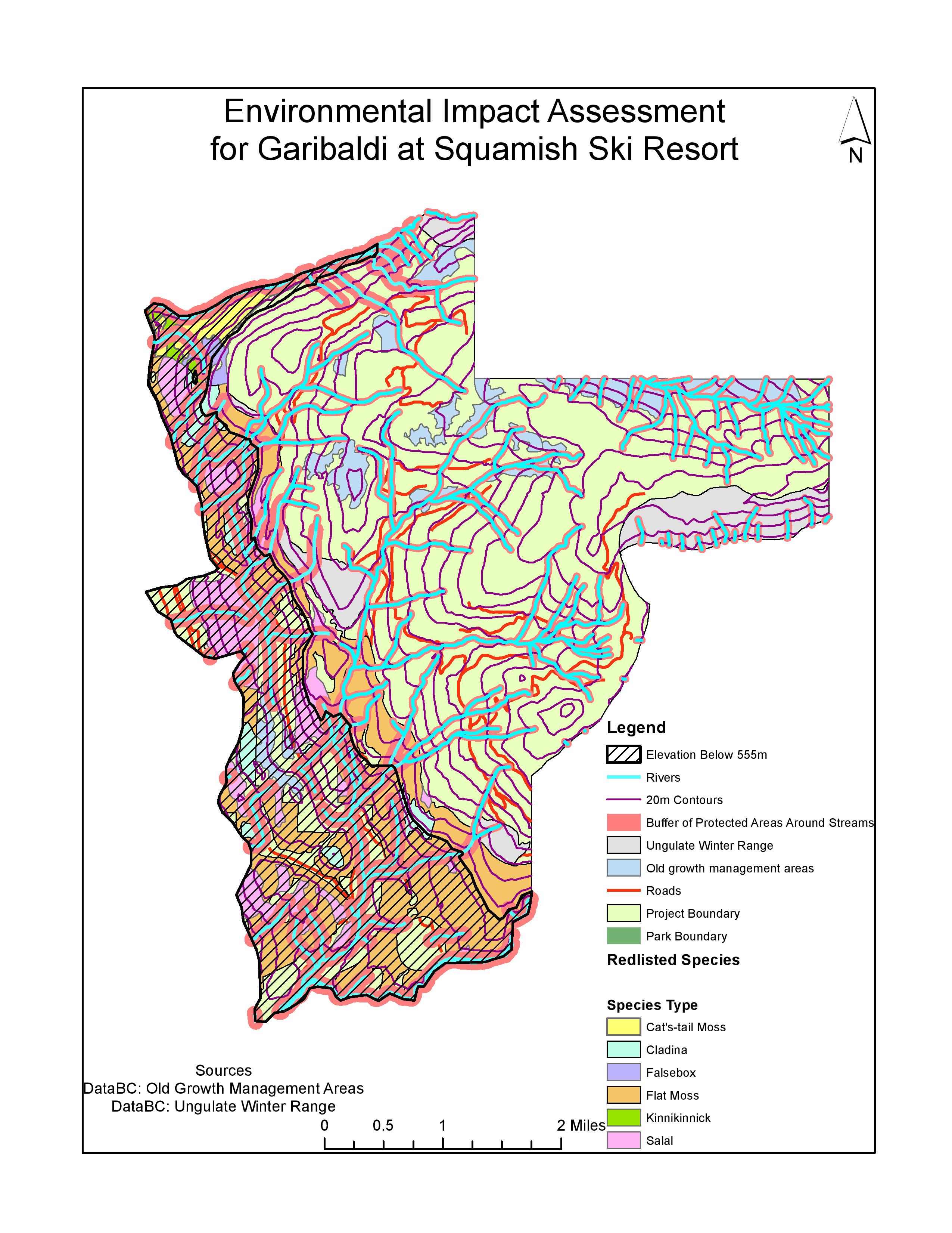
The data obtained from DataBC contains more information than is required for this environmental impact assessment, so the first analysis step was to clip the data sets for ungulate winter range and old growth management areas.  By clipping data, this means that only data within the project boundary will be shown on the map.

One of the most concerning criticisms of this location for a ski resort is how much area is below 555m, as areas below this altitude do not receive enough snow for a ski resort.  In order to show which areas are below this altitude, I divided the data into areas above and below 555m by reclassifying the data using equal intervals.  By converting this raster layer to a polygon, I was able to see how much area of the map is below 555m.  Within the proposed project area, which is 54717275m2, 16371199m2 is below 555m, which is 29.9% of the total project area.  This area is represented as black hash lines on the map.

When the first application to build this ski resort was submitted, the environmental impact assessment was rejected because it did not appropriately consider the impact on wildlife.  Data provided by DataBC contains information on the winter habitat of Mule Deer and Mountain Goat.  By looking at the attribute table for this layer, I can see areas of ungulate habitat in meters squared and display these areas on the map on top of the proposed project layer.  The total of these areas is 4315158.9m2. As a percentage of the proposed project area, 7.87% of the ski resort would be within ungulate winter habitat.  Along with ungulate habitat areas, it must be considered if endangered or threatened ecosystems are located in the proposed project boundary.  To do this, I viewed the attribute table of the terrestrial ecosystem mapping layer and selected each species by their site series and biogeoclimatic unit.  I then combined all of these areas to make a total area for each endangered species.  I repeated this process of selection and merging for six endangered species and created a new layer on the map for this data called ‘red listed species.’ To calculate what percent of the proposed project site would be in red listed ecosystem areas, I found the sum of all of the areas of red listed species, 13584529.95m2, and divided this by the total proposed project area 54717275.03m2, which is 24.83%.

To display how much of the proposed project area falls within areas with rivers and streams and therefore the potential for damage to fish ecosystems I used a variable width buffer on the rivers layer.  Rivers above 555m are less likely to contain fish so are therefore given a buffer of 50 meters, and rivers below 555m are more likely to be fish bearing so are given a buffer distance of 100 meters.  This means that when constructing a ski resort, the developers must avoid building within these buffer zones around streams. The total buffer area is 16488854m2, which means that 30.1% of the proposed project area will fall within fish bearing streams.

The combined percentage of the total project area that will directly impact old growth forest, ungulate habitat, red-listed ecosystems and fish is 69.58%.  Along with the 29.9% of the area which is below 555m so will not receive enough snow, there are some concerns of how much of the land could be used effectively and sustainably without mitigating some of the problems.

The greatest environmental concern is the large area which is below 555m and is not likely to receive enough snow each year to sustain a ski resort and make the project economically viable.  Instead of considering this land as wasted investment, other areas of the resort could be located here, such as shopping outlets and restaurants.  These are amenities which are not dependent on snow, and having an area which is separate from the skiing area could attract more non-skiing visitors to the resort.  However, another environmental concern is the large amount of the proposed project area which falls within fish bearing streams.  This is a huge environmental concern as building a ski resort in this location will destroy many fish habitats.  Mitigating this issue is problematic and is likely to be a financial burden on the project.  One potential mitigation in low lying areas where the buffer distance is 100 meters would be to build shops and restaurants around the rivers and incorporate them into the resort.  However, at higher altitudes where the ski runs will be built, it is much harder to include the rivers in the landscape alongside the ski routes, therefore if the ski resort were to be built at this location it would have a highly detrimental effect on fish populations.  If this project were to go ahead, I would suggest that the majority of construction took place in the areas above 555m, as this area has a less dense population of red listed species and the environmental degradation would be more limited.


When working as an environmental consultant, you work with the most reliable and non-bias data you can obtain in order to create a trustworthy and informative environmental impact assessment for the project you have been assigned.  However, consultants can often be involved in projects that they do not ethically believe in, which can make producing a non-bias assessment difficult when the person producing the assessment disagrees with the mitigations of problems they are suggesting.  Personally, I do not think the Garibaldi at Squamish ski resort should be constructed.  This is due to the extensive detrimental effect on wildlife ecosystems that this project would have.  Although in the memo above I suggested that the area below 555m could be used for non-skiing activities as they would not receive enough snow, I do not think there should be any construction on this land.  This is due to the large area in which red listed species inhabit in this location and the likelihood of fish populating streams in this area is high.  The 100m buffer in this location covers a large area, making it very difficult during construction to avoid damaging streams and depleting fish populations.  Furthermore, a large portion of this area is covered with flat moss which would have to be removed in order to build the ski resort here. As an environmental consultant on this project, I would need to mitigate this problem, however I believe that there is no viable solution or justification for destroying land which contains red listed ecosystems.

In conclusion, although there is steep land in the area of the map above 555m, this land is broken up with rivers and their buffer zones, ungulates and old growth forests which will be vulnerable to damage if construction of the ski resort is given permission for this area.

Lab 4: Housing Affordability

Quantitative Data Classification

Choosing a certain classification method greatly varies how the data on your map will be displayed, and therefore how the information will be understood by an audience.  As a journalist putting together maps of housing cost in Vancouver, I would choose the classification manual breaks, as it uses round numbers which are easy to read and quickly translate to the map (Figure 1).  The newspaper reader would want to quickly look at the map and see in what areas have houses prices over $1,000,000 and where the houses under $250,000 are located.   If I was a real estate agent, I would display a map of house prices in Vancouver using the equal interval data class, especially for preparing a presentation for prospective home buyers near UBC.  Using equal intervals for this map gives the impression that although the area around UBC is the most expensive in Vancouver, only one subdivision around UBC is filled with the darkest red shade. Compared to maps using different data classes, especially the standard deviation data class, which shows the whole area around UBC as the darkest shade (the most expensive),  equal intervals make house prices look the less expensive around UBC.  There are ethical implications involved with this, as it could be argued that you are deceiving the home buyers on how cheap the houses actually are.

Figure 1:

dataclass-page-001


Housing Affordability

The Demographia International Housing Affordability Survey has the perspective that public policy regarding housing should be focused on improving living standards and reducing poverty. Affordability is a more effective method of indicating housing affordability than house prices.  This is because affordability relates the house prices to other factors such as the household income of area, indicating how likely it is the population will be able to afford a home in this area and the livability of a city. Housing affordability is calculated in this survey using the median house prices and median household incomes.  The indices are defined as a median multiple of under 3 is affordable, 3.1-4 is moderately unaffordable, 4.1-5 is seriously unaffordable and over 5.1 is severely unaffordable.  However, many affordability reviews only focus on national data, making differences between metropolitan markets.  It must be considered if we can trust the affordability index for each area, as defining an area as ‘affordable’ or ‘unaffordable’ can have can have implications such as greater poverty, slower economic growth and less job creation (Angel et al, 2014).

Affordability is not a good indicator of a city’s livability, as highlighted by Angel et al, 2014.  Severely unaffordable markets are subject to land use restrictions, leading to higher land costs and therefore higher house prices.  This is known as urban containment, where new construction has development limits due to urban planning policy, therefore creating a higher density population in these severely unaffordable areas.  This ‘densification policy’ leads to more congestion in the city and commuting times are increased.  This shows that although you would think that if an area was severely unaffordable it would be highly livable, there are practical problems associated with a dense population living in a small area, and this is due to urban containment policies and not being able to develop on urban fringe land.

Accomplishment Statements

Skills Learned from GIS Labs

In Lab 1, we learned how to choose appropriate data and to be critical of the sources from which we obtain our data.  Building on this skill in lab 2, we learned how to compare metadata, geographic datums, geographic coordinate systems and map projections, allowing us to make sure we are using our data correctly.  This is a very important step in GIS mapping, as in order to create an accurate map in ArcGIS, data must be within the same coordinate system, and if this is not the case the coordinates on the map will not be plotted correctly.  In addition, making sure that the map projections are all the same so that they are all updated to the most recent projection system will increase the accuracy of the map.  By combining these skills of critical analysis of data sources and ensuring the properties of the map are aligned with each other, I now know how to create an accurate, up to date map using reliable data.

Another skill I have learned throughout the labs is gaining an understanding of remote sensing, such as Landsat data, and how this can be effective in ArcGIS.  By using Landsat data within ArcGIS, this enabled me to group layers together to create a map analysis of Mount St Helens before and after the volcanic eruption in 1980.  By creating layers of images of Mount St Helens in 1979 and in 2002 using Landsat data and changing the colours of each layer, I can turn on and off these layers to analyse how the surrounding landscape has changed.  This is a useful skill as it could be used to present a map to environmental organisations who are analysing how the topography and land use has changed around Mount St Helens since 1980.

In lab 3, I found it particularly effective to use the intersect tool in the ArcToolbox to combine data from the areas of Vancouver which were in a Tsunami danger zone and data of where schools and health facilities are located in Vancouver.  Although keeping track of the intersected layers was confusing at first (what layers had I intersected? What units are in the attribute tables?), this is a highly useful skill for presenting a map to companies or local governments to show what defense mechanisms should be set up to avoid flooding of danger zones.

Lab 4

For this lab, it was required to obtain data by ourselves instead of relying on the ‘get data’ source provided by the GEOB 270 TA’s.  In order to do this, I had to download data from Abacus in order to obtain the shapefile for the area I wanted to map.  Further, in order to collect Census data from the Census tract I wished to map, I accessed this information on CHASS.  This process allowed me to gain the skills to import data into a GIS map I have sourced myself, and the end result was a map which showed housing affordability in Vancouver compared with Montreal.  The skills I learned in this lab included changing classification methods, and how this changes the data you have collected in how it is presented and interpreted on your map.  I also understood the importance of metadata when downloading data online, as it informs the analyst what previous editing or analysis has been performed on the data, which could potentially impact the results of your final GIS analysis.

Lab 5

In Lab 5 I was given the task of mapping an environmental impact assessment of a ski resort at Garibaldi Lake.  In order to do this, I was required to perform a select by attributes function to calculate the area which is inhabited by a number of different redlisted species.  As I had collected data on different endangered species, I had to use the Arc Toolbox to perform a merge on the different species in order to create a polygon which expressed all of the endangered species.  This way, it was much easier to calculate how much area is inhabited by redlisted species as they have all been grouped together.  Further, I was tasked with displaying information on stream riparian zones.  In order to do this, I performed a multi-width buffer analysis on the stream layer.  This is a particularly useful skill as it allows the consultant to calculate, not only the area of the rivers, but the area of their 10 meter riparian zones.


Lab 3: Planning for a Tsunami Spatial Analysis, Tables, Editing

What percentage of Vancouver is in a tsunami danger zone?

To calculate what percentage of Vancouver is in danger, I firstly opened my attributes table for the layer Affected_Landuse (Figure 1).  I then added up all of the total areas in meters for each of the categories, which gave the value 14862774.11 meters. I then found the total area of Vancouver in meters by looking at the attribute table of the Vancouvermask layer, which gave the result 131033339.95 meters.  I therefore found the percentage of Vancouver that’s in danger by:

Total area in danger = 14862774.11/131033339.95 * 100 = 11.34% of Vancouver is in a tsunami danger zone.

Figure 1:

Category Total Area Meters Total Area Hectares
Commercial 148024.08 14.8
Government and Institutional 153308.27 15.3
Open Area 1049095.85 104.9
Parks and Recreational 4406059.21 440.6
Residential 3225301.9 322.5
Resource and Industrial 5584045.62 558.4
Waterbody 296939.18 29.7


What educational and healthcare facilities are within the tsunami danger zone?

In order to find the educational facilities which are in a tsunami danger zone, I used the ArcToolbox ‘intersect’ feature.  I intersected the layers Danger_Tsumani_Landuse and Vancouver_Education, and in order to do this I inserted these layers to the input box.  I named the output feature ‘Education_within_dangerzone,’ which therefore gave me the educational facilities within the tsunami danger zone.

I repeated this process to find the healthcare facilities within the tsunami danger zone, so again I intersected the Danger_Tsunami_Landuse layer but this time I used the Vancouver_Healthcare layer, and named the output feature ‘Healthcare_within_dangerzone.’

Healthcare facilities within danger zone is seen by viewing the attribute table of the layer Healthcare_within_dangerzone, and Education facilities within danger zone is seen by viewing the attribute table of the layer Education_within_danger.  The results are seen in the table below:

Educational Facilities in Danger Zone Healthcare facilities in Danger Zone
St Anthony of Padua False Creek Residence
Ecole Rose Des Vents Broadway Pentecostal Lodge
False Creek Elementary Yaletown House Society
Emily Carr Institute of Art and Design (Eciad) Villa Cathay Care Home
Henry Hudson Elementary  

Lab 2

Fixing Misaligned and Improperly Referenced Spatial Data

Coordinate systems give you a frame of reference to locate features and align them with each other.  When data is projected into a different coordinate system, the linear unit also changes, along with area, shape and distance.  When this occurs, coordinates can be placed in the wrong location, decreasing the accuracy of the map. To ensure this doesn’t happen, we must make sure that the coordinate systems are the same.

For each of the layers, I would right click and select ‘properties.’  I would then click on the ‘source’ tab and scroll down to the ‘Geographic coordinate system’ section.  Here, I would check that each layer has a coordinate system and a datum, and if not I would add one to layers that are missing them.  It is vital to make sure the coordinate systems and projections are the same for each of the layers to ensure that each of the layers is correctly coordinated with each other, and data will not be incorrectly located. To do this, I would go to the ArcToolbox, click on projections and transformations and then click on define projection.  I would then ensure that each of the layers are using the same projections. Secondly, I would review the unit of measurement for each of the layers. The layers must be in the correct order so that you can see all of the data you wish to present.  For example, if creating a map showing the major cities in Canada, you must ensure that the layer showing the provinces of Canada are on the bottom, so that major cities can be placed on top and can be seen.

Advantages of Using Remotely Sensed Landsat Data

Using Landsat data is a key tool for geographers to remotely sense how much change has occurred in an area between short 16 day intervals.  This allows geographers to analyse how areas have changed for example before and after a natural disaster, such how flooding impacted New Orleans after Hurricane Katrina in 2005.  With this data, risk assessment can be done to analyse what defence systems should be in place and planning how to rebuild the city.  As this data dates back to 1972, there is a lot of information to be worked with and a vast number of research can be done with this data.  This catalogue of data could be used to map the retreat of glaciers from 1972 until the present day.  Landsat is particularly useful in generating data of areas which are difficult or impossible to reach, allowing geographers to understand and map these areas.  Importantly, as this data is free, it is not only accessible to geographers with a high budget for their research, and it means geographers do not have to travel to these areas to collect the data themselves.  Landsat satellites can display infrared and visible light, so we can analyse data which would not be visible to the human eye.