Anita Facundo

Just Another Marketing Blog

Comm 296 Reflection


Despite the challenges and frustration that can occur from group assignments, I thought it was a powerful tool to show us the reality of a business environment. Since group work is an unavoidable part of business, it was an excellent experience to test our skills, learn our weaknesses and collaborate our ideas.

The way the marketing assignments were structured forced us to apply the terms and concepts learned in class to real-life company situations. In our case, we analyzed Target Corporation.  Throughout the lectures I learnt a tremendous amount about marketing techniques, but it was only through the 3 assignments that the information sunk in. The last assignment, the film project, was extremely useful in the sense that it tied the previous 2 assignments all into one. Having a 7-minute limit for the movie was at first frustrating, but beneficial in the end. It made our team go back, review our material and thoroughly discuss what our most substantial points were. This helped our team become concise with what information we were trying to get across in our project.  I really enjoyed having the film project as the final project because it was a much-needed change from the other assignments that I had going on at the same time in different classes. Filming the last assignment also meant that we could take advantage of our scene location; shopping at the brand new Target in Burnaby!  Knowing that are peers were going to review our work positively effected me to make sure that our movie wasn’t bone-dry, had a sense clarity and was at least a little bit memorable!

I am proud to say that I now know how to research primary/secondary data, find facts that are significant, identify the marketing mix and create a formal marketing strategy.

Thank you Elaine for sparking my interest in Marketing!

Do Apologies Work?

In his blog, “Culpa Marketing: How to Win By Publicizing Screwups”, Rohit Bhargava made an admirable point about how companies should willingly and honestly apologize if they screw up.  I thought this was an important topic given that everyone makes mistakes, but not everyone knows how to fix them.

Murphy’s Law claims something will eventually go wrong. So if your company does something wrong, how would you decide what your next step is? Would you come clean? Would you hope no one noticed and ignore it? Or would you acknowledge your mistakes, make amends and figure out how to avoid the same mistake in the future?

You may be asking to yourself how this organizational behaviour topic relates to marketing. Well, Mr. Bhargava explains in his blog a marketing term that relates directly to this:

 Culpa Marketing involves strategically using mistakes as an opportunity to rebuild trust by using a more human, direct and authentic style of communication to deliver a heartfelt apology and promise to make changes to solve the problem.

 Understanding this can term can turn around a companies future. If marketers can comprehend and apply “Culpa Marketing” steps to a previous mistake, they will have a much higher chance of gaining back a larger market share.

In class we’ve learned about consumer behavior. As marketers we need to continuously be watching and observing our consumers needs and wants. If we screw up and make a mistake, we need to reach out to our consumers, reconnect with them and then implement a solution that is suitable and genuine.  This is crucial to the brands image.  Only after a company acts upon their solutions to mend their mistakes, will consumers start trusting again. As Mr. Bhargava says, “There is nothing more powerful than a genuine heartfelt apology”.

Check out his blog to see specific example of how JCP, JetBlue and Domino’s Pizza used Culpa Marketing to get back on track:

http://www.rohitbhargava.com/2013/05/culpa-marketing-how-to-win-by-publicizing-your-screw-ups.html#disqus_thread

Local Guerilla Marketing

Immediately after glancing over Celine’s blog, “Guerilla Marketing- one of the most creative forms of marketing yet!” I thought of the Vancouver Aquarium.

Celine explained in her blog how “Guerilla marketing thrives to reach consumers at a much more personable level than conventional advertising might, and wants the consumer (or viewer) to leave with a whole new perspective on things”. Not only did the Vancouver Aquarium do an exceptional job of this, but they also successfully managed to differentiate themselves from other facilities around the world by giving their advertisements an educational and conservational focus.

See for yourself…

No doubt these Vancouver Aquarium ads are imaginative, clever and memorable. If I saw a shark fin while running through Stanley Park, I would 100% take a photo of it and share it with friends. And there you go; I am already marketing for the Vancouver Aquarium without realizing it.

While browsing through some more local, creative guerrilla marketing examples, I came across Science World’s Science of Sexuality ads.

Like the Vancouver Aquarium ads, I thought these advertisements were effective in a humorous manner. According to Science Worlds Communication Coordinator, these “hot and heavy ads were designed to be cheeky icebreakers to get people curious about the science behind sexuality”. Yet, to no surprise, these advertisements received a lot of negative attention of the media. Negative reviews included comments such as “these ads promote that the younger generation should have more sex” and “it looks like the man is raping the woman because she can’t move”. This negative word-of-mouth from the media resulted with 2 of the 3 advertisements being banned from being displayed around Vancouver for being “too racy”. I agree that the ads may not be suitable for young kids, but I don’t think it was necessary to completely ban these amusing ads. I think these ads are honest, educational, and laughable. How often do we come across advertisements like these?

Some Call It Crazy, Others Call It Marketing.


Felix Baumgartner’s world breaking free-fall was the biggest risk Red Bull has ever taken.  This life-threatening mission broke the speed of sound, set a YouTube record with 8 million live views, and left marketers all over the world in awe. What Red Bull was able to flaunt through the Red Bull Stratos project was the power of a brilliant marketing plan.

We all have a desire to feel part of something big. Even if you hated all energy drinks, you were still most likely very intrigued in the Stratos buzz. This is why the Red Bull marketing team did so well.

Leading up to the big moment, Red Bull launched the Stratos website which made it possible for people to watch Felix Baumgartner train, learn about the science and technology behind the mission, see test videos, and started social media channels for discussion. Through this highly interactive website, viewers could learn and feel part of the project as it progressed.  This website was Red Bull’s portal to building an intense pre-event hype.

It didn’t matter if you despised the energy drink, Red Bull still made it possible for you to feel part of the record-breaking event. You probably still talked and shared exciting thoughts leading up to the Stratos event. And you probably had mixed emotions while you watched Felix Baumgartner jump. And then you probably spoke enthusiastically to your friends and family about how Red Bull made history. No doubt, you felt connected to the brand.

Through the Stratos project, Red Bull made a statement about their brand and its innovative approach to marketing. Red Bull flaunted that they are an exhilarating, creative, and revolutionary company that pushes the limits of human ability.

What Red Bull has reminded marketers all around the world is to take risks and reach for the stars…literally (Ha Ha).  Red Bull showed us how successful marketing and content generation can be, if done correctly.


“From MEC to MEH…”

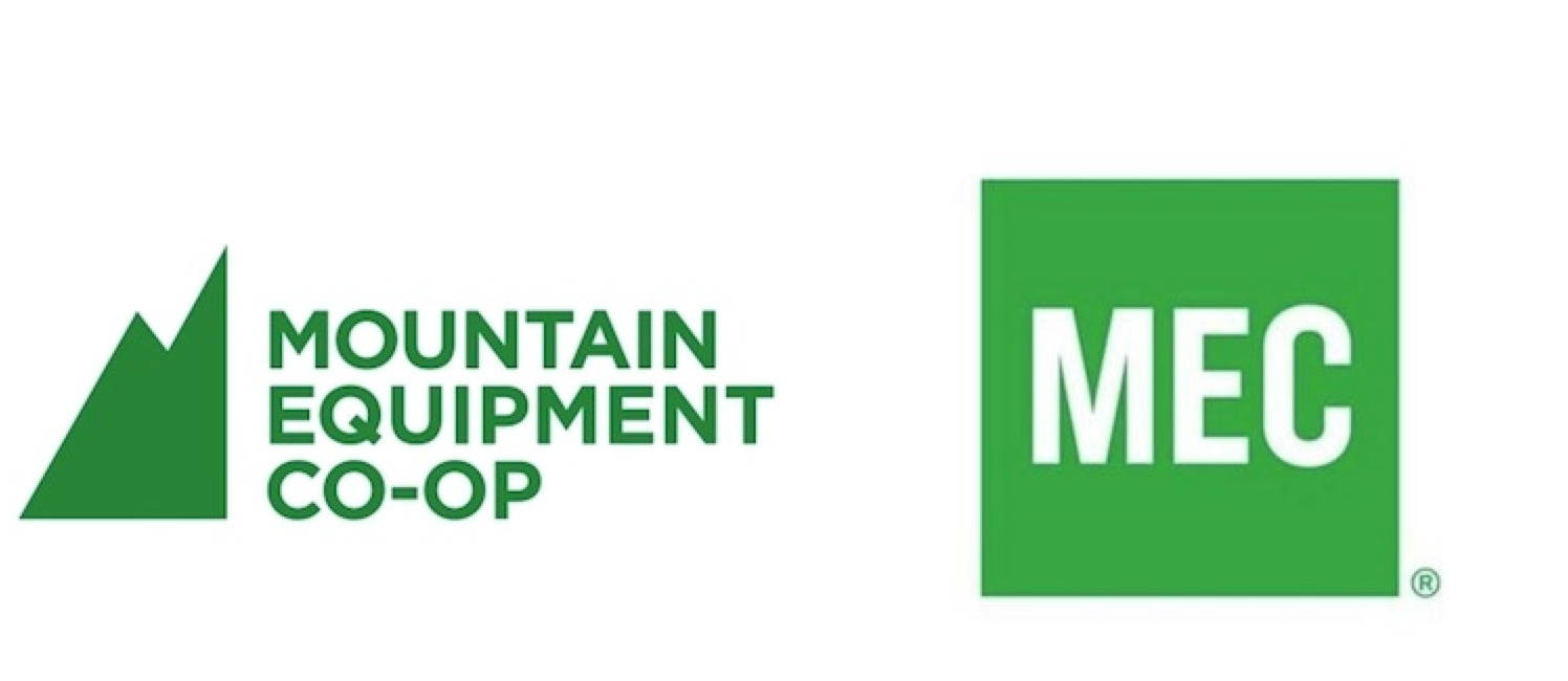
(Left) Original MEC Logo, (Right) New MEC Logo


In Vancouver 1971, six mountaineer’s came together and founded Mountain Equipment Co-Op (MEC). For those who are not familiar with MEC, it is a co-operative that sells outdoor recreation gear and clothing exclusively to its members.  It is a retail store that strives to encourage and inspire Canadians to step outside and live active lifestyles.

8 months ago, MEC decided to rebrand their logo. Instead of embracing their full name and original mountain symbol, MEC decided to reference themselves by the acronym “MEC” in simple, green letters.

Immediately after MEC released the new logo, an intense debate exploded on MEC’s Facebook page. After reading a couple of the comments I noticed a quick pattern; MEC’s members, especially their advocates, loved their original logo and are furious with the rebranding. Certain remarks that stood out were, “Your new logo looks like the Gap logo”, “It says nothing about anything”,  “Out go the hippies, in comes the corporates” and “My reaction to “MEC” is “MEH”… it’s just boring and uninspiring”. I don’t blame them. No one likes losing an attachment.

So why did the rebranding occur? Was it necessary? Will this lose certain loyal members?

In a CTV press release, MEC’s chief marketing officer Anne Donohoe claims it was time for a “facelift”. Donohoe expressed that this new logo is adapting to the needs of its members and that this change will stay true to MEC’s mission, “to inspire Canadians to be active outdoors.”  This doesn’t make sense to me because by removing the mountain symbol, it takes away the only part of the logo that represented “the outdoors”. If Donohoe states that the new logo is a response to “shifting consumer needs,” how does a logo of 3 green letters “inspire Canadians to be active outdoors?”  I feel that many of us who look at the new logo, wonder how many other logo possibilities there are that would speak more to the uniqueness of MEC’s culture.

I understand that MEC is trying to adapt themselves to new target audiences. But realistically, how many of these new members would feel disclosed from the original logo? Turning their logo into a basic, GAP look-a-like design, turns MEC’s brand to feel remotely inspiring or adventurous. All I get from the new logo is that MEC is reflecting the fact that they are turning into a huge retail giant.


Label Lies

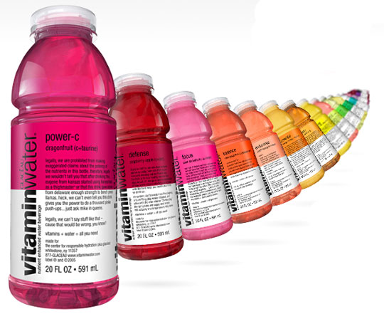
Vitaminwater uses colourful, sleek bottles with appealing text to stand out to consumers. By using flavor names such as “endurance”, “focus” and “balance”, we as consumers automatically think we are choosing the healthiest drink in the marketplace. As a previous consumer myself, I automatically think “healthy, smart, motivational and rejuvenating” when I see these attractive bottles. Like my friends and family, I have turned to Vitaminwater has a healthier option to sugar filled soda drinks. It was only until recently that I understood the truth behind their “vitamin infused” water.

In a recent report from Huffington Post, they stated that every bottle contains 33 grams of sugar, making it classify more as a “pop” than healthy beverage. Since I had no idea what 33 grams of sugar looks like, I did some quick calculations and soon realized that 33 grams is equivalent to 8 teaspoons. Another way to look at it is putting 11 sugar packets into your morning coffee. This disgusts me.

Furthermore, Coca-Cola, the current owners of Vitaminwater, have spent millions to use the face of 50 Cent, NBA players such as Dwight Howard and Kobe Bryant, Ellen Degeneres and American Idols, Kelly Clarkson and Carrie Underwood to persuasively state that these products are a healthy hydration choice for consumers.With Vitaminwater promoting their products to such a broad consumer population, it feels impossible to not fall into their marketing schemes. When 36% of all adults and 17% of all children in the U.S. today are already classified obese, how can a company so well-known think it is ethically acceptable to market themselves so deceptively? It makes me wonder how many of these obese adults have bought Vitaminwater for themselves and their children, and believed they are taking the first steps into a healthier lifestyle.

Spam prevention powered by Akismet