In Vancouver 1971, six mountaineer’s came together and founded Mountain Equipment Co-Op (MEC). For those who are not familiar with MEC, it is a co-operative that sells outdoor recreation gear and clothing exclusively to its members. It is a retail store that strives to encourage and inspire Canadians to step outside and live active lifestyles.
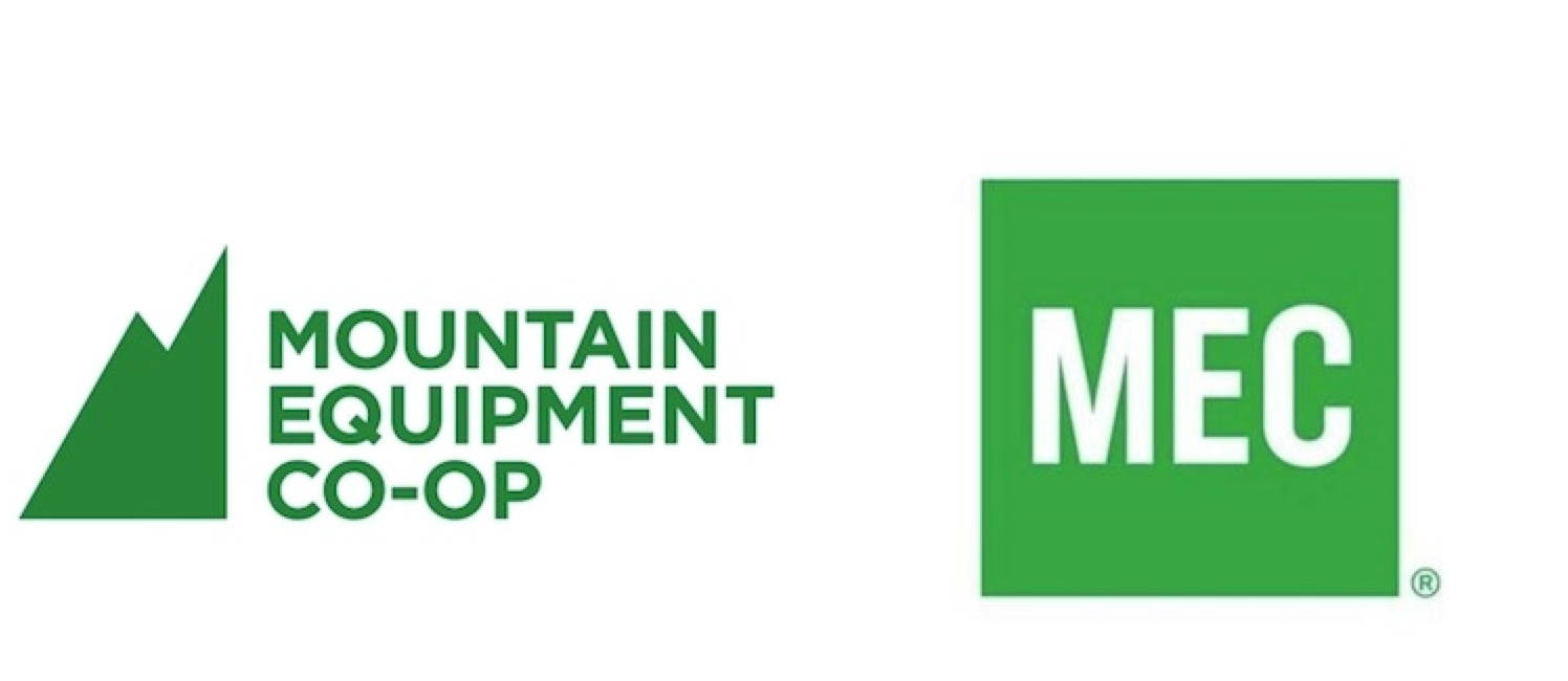
8 months ago, MEC decided to rebrand their logo. Instead of embracing their full name and original mountain symbol, MEC decided to reference themselves by the acronym “MEC” in simple, green letters.
Immediately after MEC released the new logo, an intense debate exploded on MEC’s Facebook page. After reading a couple of the comments I noticed a quick pattern; MEC’s members, especially their advocates, loved their original logo and are furious with the rebranding. Certain remarks that stood out were, “Your new logo looks like the Gap logo”, “It says nothing about anything”, “Out go the hippies, in comes the corporates” and “My reaction to “MEC” is “MEH”… it’s just boring and uninspiring”. I don’t blame them. No one likes losing an attachment.
So why did the rebranding occur? Was it necessary? Will this lose certain loyal members?
In a CTV press release, MEC’s chief marketing officer Anne Donohoe claims it was time for a “facelift”. Donohoe expressed that this new logo is adapting to the needs of its members and that this change will stay true to MEC’s mission, “to inspire Canadians to be active outdoors.” This doesn’t make sense to me because by removing the mountain symbol, it takes away the only part of the logo that represented “the outdoors”. If Donohoe states that the new logo is a response to “shifting consumer needs,” how does a logo of 3 green letters “inspire Canadians to be active outdoors?” I feel that many of us who look at the new logo, wonder how many other logo possibilities there are that would speak more to the uniqueness of MEC’s culture.
I understand that MEC is trying to adapt themselves to new target audiences. But realistically, how many of these new members would feel disclosed from the original logo? Turning their logo into a basic, GAP look-a-like design, turns MEC’s brand to feel remotely inspiring or adventurous. All I get from the new logo is that MEC is reflecting the fact that they are turning into a huge retail giant.