Categories
McDonald's Promotion Seasonal

Shamrock Shake It!

The McDonald’s Shamrock Shake is back and its a sure sign that spring is back with us! Actually, it’s the first time I’ve heard of McD’s Shamrock Shakes. But the first thing I though was “Oh cool!” and then I thought “Ew.. looks kind of nasty” and so I never tried one. It is “a mint flavored, green-dyed vanilla milkshake, is a seasonal dessert sold at McDonald’s during March to celebrate St. Patrick’s Day”. 

Shamrock Shake was first introduced in 1970. “It all began with a little girl, a football team, and a visionary doctor.” (said on the McDonald’s website) And basic story goes like this — There was a football player’s daughter who was diagnosed with leukemia and began treatment. That family realized that many family’s like them had to camp out in waiting rooms while their family members were receiving treatment. So the family and the team decided to raise some funds, called up a friend who worked in McDonald’s advertising and suggested the team for the next promotional push. It just so happened to be St. Patrick’s Day. The Shamrock Shake raised enough money to buy a four-story house which was the first Ronald McDonald House Charity.
Story from: Wikipedia  – Shamrock Shake

I might now go get a Shamrock Shake after knowing that it has a symbolic meaning behind it. So I really think that having a story behind a product really allows for products to sell, sometimes even if they aren’t very good products. It’s the story that the customers buy.

McDonald’s clever marketing promotion to play off of Chicago’s annual green dying of the river for St. Patrick’s Day! A great way to catch people’s attention — not to mention Dramatic!

     
Pictures courtesy of Rindert Dalstra’s post on CreativeCriminals.
Categories
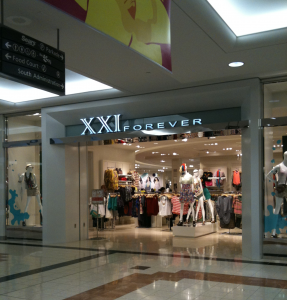
XXI Forever

XXI Forever – Richmond Centre

So I’ve just added Tracy Chan as my friend on my marketing blog. And I came across her Jan 23 post about Forever 21 opening in Richmond Centre. I was definately excited about it when I first heard about that news. I mean seriously, like Tracy said. Who wants to go all the way from Richmond to Metrotown for some new clothes?! Now this also brings up “location, location, location”. Opening a Forever 21 in Richmond Centre is great for the customers, the Richmond Centre (RC) shopping mall and for Forever 21. Too bad for those stores like, as Tracy said again, Bluenotes and Sirens who are not doing so well. I’m sure many of you who shop at RC also have noticed A LOT of stores being relocated! I guess they are making way for the bigger stores, like Zara is rumoured to be moving into RC! *very excited!* So this brings up a question about supply chain management (SCM). In marketing class, we’ve read about how Zara has one of the best SCM in the apparel industry – very efficient! I’m definate that Forever 21 also has a very similarily efficient SCM as Zara does. How else would Forever 21 be able to have new styles of clothing every week in-store?! Like Zara, their SCM efficiency is most likely what allows Forever 21 to demand low sales prices from their customers, yet still adding value to customers by offering a variety (with their different lines, such as Forever 21, Love 21, Heritage, and mens line) of trendy clothing and accessories.

Categories
Advertisements

Typo9rAphy Ad5!

You know those ads with a lot of stylish writing, something like this…

Ad taken from Beautiful & Creative Typography Print Ads blog.

These ads are called typography ads. Not only is it interesting to figure out what the heck they are saying, but I also believe that these companies are very successful in making people aware of their ad. I maybe spend around at leat 20 seconds trying to read the message, and then I go look around on the poster to see who was advertising this. The main purpose of these ads is for firms to get people to be aware of their ad. Another great thing about using typography ads is that there can also be illustrations used to enhance the main message. In the ad above, there are little heads with sad face, stick figures jumping off the “S” and train tracks. Another observation is that ads that have writing fonts similar to our daily writing style seems to capture my attention more. Maybe that is because I feel that the writing style is more consistent with what I’m used to reading (for example, when I proofread my own writing). With all these good things said about typography ads, firms should also be careful not to over-clutter or put too much small font writing into such ads – this may have a reverse affect and cause people not to want to read the ad.

Categories
Internet Technology

Trend of Exams via the Internet – Sauder Edition

The Internet is definately a big topic in marketing. For instance, in our marketing textbook, there are several sections thoughout the book dedicated to “The Power of the Internet”. It is always important for firms to be innovative to add value to their products and services. Consumers love to use innovative technology like the Internet because it makes everything they do much more convenient!

In Rob’s post in the Sauder Technology Bleeding Edge Club blog, he blogged about the successful Comm 293 Midterm exam for 570 students that was hosted online. I have personally never taken an online exam like this before, but would like to get a chance to try it out. From what I have heard about the Comm 293 (Financial Accounting) online exam, some of the major issue that students encountered was the time-consuming process of putting “zero’s” into the spaces where, for example, the “overtime hours” was not applicable. If there was no “zero” in that box, a mark was deducted. I can also relate to the issue with time management when working on Lyryx Learning Inc. (an online assignment software); it is also very time consuming to click “enter” and then click into the next box that I want to fill-in. During an exam, time management is critical, and in my opinion, using the Internet to host a numerical exam seems to be inefficient in a student’s point-of-view (but probably very time-friendly for the markers!). But there are definately certain course’s exams that have the potential to being hosted via the Internet (discussed next).

Rob also praises the idea of taking advantage of the Internet and predicts that all of Sauder’s exams will be fully online 2 years from now. I also admit that the Internet a great invention, but I also believe that not EVERYTHING is best done via the Internet! Some things like accounting exams (or any exams that allow for part marks in the work), do not seem best marked on a online exam that only requires for the answers (and very little work).

Suggestions: Try the HR exams online because, from experience, it was VERY writing intensive. And I’m sure that we type faster on a keyboard. That way you can actually mark us on our knowledge and not let that be affected my cramping hands!

Anyway, my point is that not all exams are best taking via the Internet. Some exams like accounting are not suitable via the Internet, but some like Human Resources are. Sauder must take into consideration of its students (consumers) when developing new products and methods of teaching. Doing this will add much value to students’ learning and experiences at Sauder and truly drive Sauder in leading innovative teaching in an efficient way.

Categories
Brand Logos Starbucks

The Future of Starbucks’ Logo

Picture from here.

I found this picture so funny. It is very interesting to see company logos evolving over time. I would have thought that logos should not change because it represents the company and so if they changed it an issue that may arise would be people not recognizing it anymore. But after thinking a bit deeper, it would be okay to alter it every 10 years, like Starbucks has done. Updating a logo to make it more appealing to the current generation is actually quite smart. They don’t have to worry about their existing customers not recognizing the logo (since they are already customers!). In fact, they can attract a new generation of customers! I also remember Tamar (my marketing teacher) saying that simplifying company names (General Motors –> GM) may take away from the company’s mission or the whole meaning behind the company. For starbucks, the iconic mermaid may mean something to what Starbucks is trying to represent. If that was reduced down to a big green dot, all meaning behind what Starbucks is trying to represent will be gone from the logo. Anyway, I’m prettyyy sure Starbuck’s logo will not end up as a green dot in 2041. But who am I to say, maybe the future generation will find that attractive. I guess we’ll just have to wait 30 more years to see!

Spam prevention powered by Akismet