Typo9rAphy Ad5!
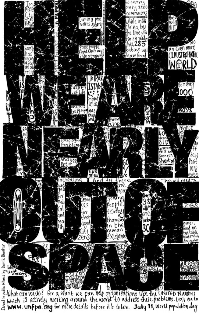
 You know those ads with a lot of stylish writing, something like this…
Ad taken from Beautiful & Creative Typography Print Ads blog.
These ads are called typography ads. Not only is it interesting to figure out what the heck they are saying, but I also believe that these companies are very successful in making people aware of their ad. I maybe spend around at leat 20 seconds trying to read the message, and then I go look around on the poster to see who was advertising this. The main purpose of these ads is for firms to get people to be aware of their ad. Another great thing about using typography ads is that there can also be illustrations used to enhance the main message. In the ad above, there are little heads with sad face, stick figures jumping off the “S” and train tracks. Another observation is that ads that have writing fonts similar to our daily writing style seems to capture my attention more. Maybe that is because I feel that the writing style is more consistent with what I’m used to reading (for example, when I proofread my own writing). With all these good things said about typography ads, firms should also be careful not to over-clutter or put too much small font writing into such ads – this may have a reverse affect and cause people not to want to read the ad.

