Group Members: Mandy Choie, Brian Mayne, Bryan Wood
Our project ended up being far more complex than we realized; it was a lesson in how mining and analyzing datasets can drastically change the trajectory of a data-driven assignment.
Initially, we sought to track the historical trajectory of anti-Asian hate crimes in the United States to better understand how the COVID-19 pandemic led to an increase in anti-Asian hate crimes across North America, comparing and contrasting the number of hate crimes against this group over different historical periods. However, we soon realized that the information we needed was unavailable – this might be because this data is too new to be definitively tracked or because tracking anti-Asian hate crimes is still a fairly new idea (Chen, 2017). Regardless, our narrative shifted from comparing historical incidents of hate crime data to investigating the nature of race-based hate crime data that is officially collected in the United States.
The FBI has been collecting hate crime data annually since 1996 and last reported hate crime statistics in 2018. While the FBI’s website provided the race-based hate crime data we were looking for, we quickly learned how problematic this data is. A number of sources including ProPublica (Thompson & Schwencke, 2016) and Southern Poverty Law Center (Shanmugasundaram, 2018) explain how hate crime data is under reported at all levels of the government, and many hate crime survivors (Schwencke, 2017) choose not to report being victimized. There is also clear evidence of confusion and errors in the data reporting, which is evidenced in the 2012 addendum to the FBI’s annual hate crime statistics (FBI, n.d.a). For some reason, nearly 1,500 agencies did not report their data to the FBI in time to be included in the annual aggregated report (FBI, n.d.a). The ways that the FBI categorizes the hate crime data are also questionable. The “Anti-Multiple Races, Group” and “Anti-Other Race/Ethnicity/Ancestry” categories obfuscate the racial identity of the victims in a way that gives no real meaning to these groups, which include a huge number of people. This highlights how poorly hate crimes are meaningfully identified and recorded which, by extension, questions law enforcement’s ability to competently address them.
Because hate crime data covers a massive amount of information across a diversity of marginalized groups, our analysis of this data does not and cannot fully represent all survivors of these crimes or the complex history of systemic racism against Asians or any single minority group in the United States. Instead, we hope to illuminate the issues of this data collection and how it creates an inaccurate picture of the reality of hate crimes in the U.S. Additionally, we hope that our visuals demonstrate how this data lacks nuance and context and is deceptively objective. This realization could help encourage more critical readings of all datasets, particularly those that are produced by the government or any large organization.
To develop our narrative, we reviewed the FBI’s definitions and methods of identifying hate crimes, the history of U.S. federal hate crime legislation, comparisons of hate crime reporting at the local and state levels, and multiple news sources that were critical of the FBI’s hate crime data collection. We were surprised by how recent many of the changes to the definition and collection of hate crime data are; however, since this data has only been officially collected since 1996, it’s no surprise that the government and law enforcement agencies are still trying to figure out how to collect and categorize this data.
The most troubling data point we discovered was that white Americans are the second-most victimized group in the United States. This places them just after black and African Americans, who experience the highest number of hate crime incidents. Given the current backlash against systemic racism and proliferation of white supremacy hate groups (Mathias, 2020), this assertion – while backed by hard data – is absurd. We also wondered what the motivation was to change and amend the names of the categories listed under “Race/Ethnicity/Ancestry.” For example, “Asians” and “Native Hawaiians and Other Pacific Islanders” were treated as a single group (“Asian/Pacific Islander”) until 2013. “Anti-Arab” was not a category until 2015. The “Other-Anti Race/Ethnicity/Ancestry” category was previously labeled “Anti-Not Latino or Hispanic” between 2013 and 2014, which confusingly implies that someone was targeted because they weren’t Latino or Hispanic, though that was not the case.
These discrepancies in reported numbers and categorization were the main reason why we shifted our focus from anti-Asian hate crimes to how the FBI datasets misrepresent hate crime data across all demographics. However, we still wanted to go beyond the data to better understand how Asians in America are impacted by hate crimes. We searched for sources that speak to the psychological and social impacts that hate crime victims may endure as well as some of the broader societal and geopolitical issues that motivate anti-Asian hate crimes.
Converting all of our data from PDF tables and article excerpts into information visualizations was a multi-pronged effort, but this confluence of information ended up strengthening our story. Mandy and Bryan started by accessing raw data from the FBI’s annual hate crime data. Mandy searched the FBI’s Hate Crime Statistics page, part of the Uniform Crime Reporting (UCR) Program’s website, which contains datasets from a number of related federal agencies (FBI, n.d.b). This website was the main source for gathering all hate crime data reported by Race/Ethnicity/Ancestry over the last two decades. Most years post their hate crime data directly on the FBI’s website, but the earlier years’ data can only be accessed through lengthy PDF files. Luckily, the same table – “Table 1” – was consistently used to report this data, so it was fairly simple to find this data from each year’s report. Mandy manually input the data into an Excel workbook, cleaned the data for consistency, and uploaded the clean versions into Tableau to create interactive visualizations. Similarly, Bryan extracted and cleaned data from the FBI’s UCR website and reporter Tara Rosenbaum’s Westchester/Hudson Valley Hate Crimes Database, converted the data into Excel spreadsheets that could be ingested by Tableau Prep, and used the data to investigate specific instances of hate crime reporting discrepancies at the local, state, and federal levels.
Tableau allowed us to create a variety of visual idioms that simplified tens of pages of datasets into colorful, user-friendly graphs with a range of visual channels including gradients that highlighted quantifiable variations. Users are able to hone in on individual data points within the visualizations, which is sometimes linked to other graphs, while simultaneously viewing all the aggregate data. Through trial and error, we were able to create a variety of tables that highlighted different aspects of our different datasets (Figure 1).
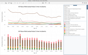
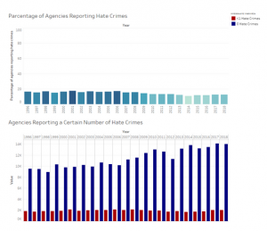
Figure 1: Tableau visualizations
Brian used Excel for his visualizations. Though it is more straightforward to use, Excel lacks the flexibility of changing the visual channels of data and is far less useful and sophisticated than Tableau. Tableau made it easy to create and manipulate different kinds of idioms, while Excel lacks any kind of interactivity. Still, Excel was helpful in the creation of new – albeit simple – charts that could effectively express less complex data points (Figure 2).
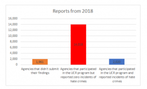
Figure 2: Excel graph
We used Canva to create the rest of our visuals. Of all the services that were suggested to us, we found that Canva was the most user-friendly and eye-catching platform for successfully creating the kinds of visuals we wanted for this project. It was also the easiest to access, as we could easily sign up for a free trial upgrade that gave us full access to the tool – something that other platforms did not seem to easily offer. We created our own set of visuals based on the research we had conducted and agreed to use a fairly subdued palette of black, white, grays, and red (for the most part). Canva’s attractive and easy-to-use templates made designing our visuals much easier, and we were able to use a mix of Canva’s graphic elements (Figure 3) and elements imported from Excel files.
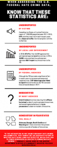
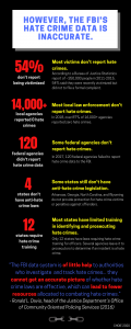
Figure 3: The first and final draft of the same infographic; Canva made editing and transforming this data easy and fun to manipulate
We considered the principles of expressiveness and effectiveness when designing our visuals. Our visuals are expressive in that they visualize the facts in a clear and accurate way, with many explanatory notes to fully contextualize the data. To create the Tableau graph of aggregated hate crime data, color gradients, clear labeling, and clarifying details were included to ensure that the data can be accurately and easily interpreted. It is important to see each group’s individual statistics and compare them all against each other, so two different charts addressed each of these goals. A line chart and a bar chart of the same statistics were made to show different ways of visualizing disparities among the groups, and the dashboard links these two graphs to make these comparisons even clearer. For data points that could not be visually expressed, explanations were included. For example, there are no “Anti-Arab” crimes from 1996 to 2015 because data was not recorded for this group until 2015, so that is denoted on the first table.
Similar principles were considered in creating the static graphs. For example, the “Law Enforcement’s Failure to Report and Record” slide uses a bar graph to show how many U.S. government agencies reported their hate crime data to the FBI and, of those who reported, how many agencies reported no hate crimes in their jurisdiction. A year-by-year breakdown of these figures is provided in a separate table, proving that the apparent decrease in reported hate crimes is from a decrease in hate crimes but an increase of agencies that did not report any hate crimes. These tables display information that underscores important themes in our narrative: most government agencies do not keep good records of hate crime reports, and these agencies often fail to send them to the FBI even when they do keep good records.
We sought to create effective visuals through identity channels such as size and color; specifically, we increased font sizes, bolded words, and tweaked the luminance and contrast as needed to make the graphics more readable and visually engaging. Colors were crucial to distinguishing the datapoints in the Tableau tables while also making them more visually impactful. Linking data created a “pop-out” effect, highlighting the data that someone clicks while graying out the other datapoints. On the “Law Enforcement’s Failure to Report and Record” chart, the most significant piece of data – that most agencies report zero hate crimes – is given the largest bar on the graph and encoded with the brightest color to create a pop-out effect. Finally, we used consistent design elements throughout the visuals, such as highlighter-style markings, to help strengthen the unity narrative (Figure 4).
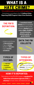
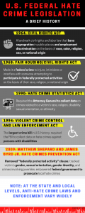
Figure 4: Infographics with the same highlighter motif
There are many advantages as well as disadvantages to using graphs and textual visuals as tools for storytelling and communications. If you are trying to present number-driven data, the average user is likely to feel overwhelmed or bored by rows of monotonous text and numbers. An interactive dashboard or colorful pie chart can communicate this data and its analysis in a simple yet dramatic manner, visualizing abstract ideas in a way that illuminates trends and discrepancies that may not be obvious (or interesting) otherwise. If done properly, these visualizations can present data in a memorable way that may change someone’s way of thinking about that topic. Furthermore, this mix of visualizations can help complement and reinforce the data that is being presented. For example, the data presented in the “Law Enforcement’s Failure to Report and Record” graph is very simple compared to the voluminous data presented in the Tableau interactive visualizations, which give nuance to how this story is being told. Collectively, they share different aspects of the complexities of hate crime data collection that highlight the many flaws in this system.
What these visualizations cannot do, however, is provide specific context that would help humanize these numbers and facts. Interviews with survivors, social justice groups, and law enforcement would add much-needed nuance to this project and perhaps some answers to questions that were unable to find the answer to, such as: what prompted the name changes and additions to “Race/Ethnicity/Ancestry?” Are Asians less likely to report hate crimes than other groups? What exactly is the FBI doing to encourage (or enforce) the reporting of hate crime data?
Though they aren’t capable of conveying the enormity of someone’s lived experience, we hope that our information visualizations tell a clear story about how problematic the FBI’s hate crime data is, how it disadvantages minority communities like Asians, and how we should be more critical of federal datasets that may not be telling the full story.
ARTICLE REFERENCES:
Chen, J. (2017, February 17). First-Ever Tracker Of Hate Crimes Against Asian-Americans Launched. NPR. Retrieved from https://www.npr.org/sections/codeswitch/2017/02/17/515824196/first-ever-tracker-of-hate-crimes-against-asian-americans-launched
Federal Bureau of Investigations (FBI). (n.d.a). FBI – About Hate Crime Addendum 2012. Retrieved Jun 16, 2020 from https://ucr.fbi.gov/hate-crime/2012-addendum
Federal Bureau of Investigations (FBI). (n.d.b). FBI – Hate Crime. Retrieved Jun 16, 2020 from https://ucr.fbi.gov/hate-crime
Mathias, C. (2020, May 23). Study: White Supremacist Groups Are ‘Thriving’ On Facebook, Despite Extremist Ban. Huffington Post. Retrieved from https://www.huffingtonpost.ca/entry/facebook-white-supremacist-groups-tech-transparency-project_n_5ec82f17c5b6423c5ca9aa94?ri18n=true
Schwencke, K. (2017, July 31). Confusion, fear, cynicism: why people don’t report hate incidents. ProPublica. Retrieved from https://www.propublica.org/article/confusion-fear-cynicism-why-people-dont-report-hate-incidents
Shanmugasundaram, S. (2018, April 15). Hate Crimes Explained. Southern Poverty Law Center. Retrieved on Jun 16, 2002 from https://www.splcenter.org/20180415/hate-crimes-explained
Thompson, A. & Schwencke, K. (2016, November 15). Hate crimes are up – the government isn’t keeping good track of them. ProPublica. Retrieved from https://www.propublica.org/article/hate-crimes-are-up-but-the-government-isnt-keeping-good-track-of-them
VISUALIZATIONS:
(Links will open a PDF file)
Final Presentation (all files combined)
Individual vis:
Hate crime definition: clarification
Different definitions of hate crimes
What does this hate crime data look like?
Police Bias in Defining Crimes
Reasons for Police Misreporting
More Reasons for Police Misreporting
Law Enforcement’s Failure to Report and Record
Anti-Asian Hate Crimes: 2018 Spotlight
Highlighting data inaccuracies: victims aren’t reporting
Why do victims choose not to report hate crimes?
Recent Anti-Asian discrimination
Address the Reporting Gap/Create Your Own Database
REFERENCES FOR VISUALIZATIONS:
Bibliography (Choie)
Bibliography (Mayne)
Bibliography (Wood)
Mandy, Brian, and Bryan thank you for your insightful blog post and honesty.
I loved how you explained your journey from the scope and topic decision to the final result. I can see how you say that the project ended up being more complicated than anticipated, but I think you did a fantastic job with the constraints you had.
I would say that one of the biggest highlights of your project is where you mention your goal as being “to illuminate the issues of this data collection and how it creates an inaccurate picture of the state of “hate” in the U.S., which may downplay the reality of these crimes and the resources needed to combat them.” And how you invite the audience to pursue “more critical readings of all datasets, particularly those that are produced by the government or any large organization.”
I also really liked your conclusions on the pros and cons of using the tools, especially how they turn the persons into numbers and statistics and cannot provide some of the contexts and personal insights that are much needed. As you mention in your report, this whole project could trigger some fascinating and very needed revisions of the classification of hate crimes that could help develop a more comprehensive response.
A couple of things that you could be easily improved:
– In the report, you reference the “Law Enforcement’s Failure to Report and Record” chart several times to provide an example of your design decisions. I think it could be useful to include it as a snapshot along with the narrative so the reader can take a look at it while reading your reflections. I know that you use a similar graph when talking about the use of excel, but I would say it’s appropriate to paste this one too since you’re talking about in several instances.
– Also in the report, you have a small typo (you forgot an ‘a’ in ‘may’): “the visual form of these abstract ideas can illuminate trends and differences that my not be obvious (or interesting) otherwise.”
– On some of the infographics, I would reduce the amount of text so you can increase the text size and make them a bit less cluttered. Alternatively, I would reduce the use of bolded fonts a bit so the truly crucial points can be easier identified. For example:
In “U.S. Federal Hate crime Legislation”
You have “(*)Removed “federally protected activity” clause(*);tracked victim’s (*)gender, sexual orientation, gender identity(*), and crimes involving juveniles; empowered (*)federal government to prosecute(*) local hate crimes”
You could do “(*)Removed(*) “federally protected activity” clause; (*)tracked(*) victim’s gender, sexual orientation, gender identity, and crimes involving juveniles; (*)empowered(*) federal government to prosecute local hate crimes”
That way, the viewer quickly gets that the Hate Crimes Prevention Act involved removal, tracking and empowering. If they want to go further, they just have to locate what follows those words.
– I appreciated your use of a consistent and coherent colour palette and font as well as how you delivered the facts in your infographics. I was wondering, however, if perhaps you could lower the saturation of the red just a bit, so it’s easier to read. Also, the use of some colours is inconsistent across the visualizations, maybe that could be addressed somehow (by adding them across the board or integrating them with the rest of the designs).
Overall, great job, and thank you!
Hi Mandy, Brian, and Bryan,
I really liked that your report guided me through the critical analysis process you had while working with your data. You offer an honest, transparent, and thoughtful explanation of how your project goals and plans changed based on the data that was available. I think your evaluation of the data is sensitive to the very real impact that discussions and presentations of information on your topic may have. Your decision to shift from analyzing the content of the data toward analyzing the nature of data was really interesting and, I think, very important; I think these questions around the trustworthiness and accuracy of data should be presented more often in this kind of accessible infographic/InfoVis form. Your report is clearly written and engaging, and I felt like you were taking me “along for the ride” as you explained your process of understanding the data and then portraying it for others to analyze. Your review of your process and evaluation of different tools was clearly written and your use of screenshots was helpful.
One small thing I noticed was that I could differentiate between different team members’ “voices” in the different paragraphs; for instance, some paragraphs felt more like formal essay writing and others felt a bit more conversational. In some ways I felt this was an indication of strong teamwork on both the report and the visualizations, but you could consider reworking the language to make it feel more “unified”.
I felt that your infographics were visually appealing, while also maintaining the serious tone appropriate for the data. Your divisions of pages into sections and your concise use of language made the information easy to follow and take in. Your use of familiar formats was helpful; for instance, I felt that the use of timelines to discuss the history of US legislation, changing descriptions of ancestry, and the history of government-led racism made the information easier to understand so that the reader could focus on analysis of your key points. I liked the way that you used colour and bolded font to “highlight” important pieces of text. I felt that your use of illustration was effective for keeping the reader’s attention, while also remaining tasteful given the serious subject matter. I thought your infographics had a strong narrative, and I liked that you had some clear calls to action at the end.
While I liked your choice to limit your colour palette and to make the colours match the serious tone of the data, I felt that in some case the brightness of the red, yellow, and white against black was a little bit jarring visually. I think that the serious nature of your topic will still come through with a slightly more subdued colour palette, and the formatting of the pages and focused text will still grab your audience’s attention. I also think that the final product would be easier to read as a single PDF document, rather than separate files. If there was a way to incorporate all of your linked Tableau infographics into the PDF (even as still images that still link to the interactive versions), that could be helpful for readers; because of the length of your project and its narrative structure, I think incorporating the visualizations directly might make readers more likely to really engage with them as they read through the infographics. I also think that if it is possible to condense your final product into less pages, it may make for a tighter narrative. On a somewhat nitpicky note, I noticed that when I clicked on one of the links to FBI data it said that the page was no longer available, so it might be worth double checking the links.
Your infographics definitely made me think about the importance of critically analyzing information, and I thought you made a really good point in your report, that your work is just one part of understanding the issue and that interviews could provide nuance that is not possible with the kind of data you had access to. If you were interested in continuing this work, perhaps your information visualizations could become tools for engaging in these kinds of discussions, whether in a formal interview setting or more informally in an ongoing way. Overall I thought this was a really thought-provoking, well-researched, and nicely presented project!
Hey Mandy, Brian, and Bryan!
I’m so happy to see how your project turned out! I was excited for your topic when Mandy informed me about it, and your work lived up to what I envisioned for this project. I will say: when I heard about the topic of hate crimes connected to COVID, I was worried that there wouldn’t be enough data. Reading through your post, it appears that this in fact ended up being a major hurdle. I respect your resourcefulness in adapting your project to more readily available data!
I was shocked to see how under-reported hate-crime is. I suspected it would be under-reported, but your project did an excellent job of indicating to what extent this is the case and the systemic reasons for it. I enjoyed the design of your eye-catching Canva infographics. I was initially going to suggest uploading larger, higher resolution images of them, but then I noticed that you had them hyperlinked at the end of post. My suggestion for those hyperlinks is to go into your settings and to have them open into a new tab when clicked, so that the reader can quickly open multiple pages of interest to them at once in different tabs without having to leave your blog.
A couple of the visualizations are a bit text-heavy, but I don’t see this as bad. Maybe I’m biased because I enjoy the precision of lengthy explanations. However, I do think it’s helpful to make use of available design tools to make key terms and stats as impactful and memorable as possible. For instance, where you have longer quotations, simply bolding or highlighting key pieces of information would help the reader commit the information to memory (you did just that in some of them; the viz about the inaccuracy of hate crime statistics–as well as the “problem States” viz–was visually perfect to me). I don’t think you should scrap anything; I support what you chose to bring to the fore.
The images you used are great. This is a sensitive topic, and so I’m glad you chose icons and photos that were effective but tasteful. I do think that the photo of what looks like a Caucasian female with her hands on her face might not be the most effective image to use for an infographic about race-based hate crime. I am not criticizing you for using it; I just think that a different model might be more fitting.
I like your graphs. They effectively convey the information they were supposed to, and make great use of colour for side-by-side comparison. I will say that the pie chart might not be necessary, especially to demonstrate a 55-45 split. A reader can easily visualize “half” without a visual aid, so I think such a pie chart is best reserved for multiple, smaller percentages that are difficult to visualize and compare without a visualization. I don’t think you should get rid of it, but I think it’s worth noting that such a split is easy enough to grasp without a viz, so there could have been other elements used there instead to add dimension to the concept.
Overall, this project is excellent. Small tweaks to the visuals, and you have something that could easily be distributed to workplaces and public institutions as educational tools!
Nicely done y’all!
Note for Bryan: I’m so stoked you used Hollaback as a resource! 🙂 A friend of mine works for Hollaback and started the Vancouver chapter of their Good Night Out campaign. I helped out with the street team in its infancy. Great people doing great work!!