Group Members: Mandy Choie, Brian Mayne, Bryan Wood
Our project ended up being far more complex than we realized; it was a lesson in how mining and analyzing datasets can drastically change the trajectory of a data-driven assignment.
Initially, we sought to track the historical trajectory of anti-Asian hate crimes in the United States to better understand how the COVID-19 pandemic led to an increase in anti-Asian hate crimes across North America, comparing and contrasting the number of hate crimes against this group over different historical periods. However, we soon realized that the information we needed was unavailable – this might be because this data is too new to be definitively tracked or because tracking anti-Asian hate crimes is still a fairly new idea (Chen, 2017). Regardless, our narrative shifted from comparing historical incidents of hate crime data to investigating the nature of race-based hate crime data that is officially collected in the United States.
The FBI has been collecting hate crime data annually since 1996 and last reported hate crime statistics in 2018. While the FBI’s website provided the race-based hate crime data we were looking for, we quickly learned how problematic this data is. A number of sources including ProPublica (Thompson & Schwencke, 2016) and Southern Poverty Law Center (Shanmugasundaram, 2018) explain how hate crime data is under reported at all levels of the government, and many hate crime survivors (Schwencke, 2017) choose not to report being victimized. There is also clear evidence of confusion and errors in the data reporting, which is evidenced in the 2012 addendum to the FBI’s annual hate crime statistics (FBI, n.d.a). For some reason, nearly 1,500 agencies did not report their data to the FBI in time to be included in the annual aggregated report (FBI, n.d.a). The ways that the FBI categorizes the hate crime data are also questionable. The “Anti-Multiple Races, Group” and “Anti-Other Race/Ethnicity/Ancestry” categories obfuscate the racial identity of the victims in a way that gives no real meaning to these groups, which include a huge number of people. This highlights how poorly hate crimes are meaningfully identified and recorded which, by extension, questions law enforcement’s ability to competently address them.
Because hate crime data covers a massive amount of information across a diversity of marginalized groups, our analysis of this data does not and cannot fully represent all survivors of these crimes or the complex history of systemic racism against Asians or any single minority group in the United States. Instead, we hope to illuminate the issues of this data collection and how it creates an inaccurate picture of the reality of hate crimes in the U.S. Additionally, we hope that our visuals demonstrate how this data lacks nuance and context and is deceptively objective. This realization could help encourage more critical readings of all datasets, particularly those that are produced by the government or any large organization.
To develop our narrative, we reviewed the FBI’s definitions and methods of identifying hate crimes, the history of U.S. federal hate crime legislation, comparisons of hate crime reporting at the local and state levels, and multiple news sources that were critical of the FBI’s hate crime data collection. We were surprised by how recent many of the changes to the definition and collection of hate crime data are; however, since this data has only been officially collected since 1996, it’s no surprise that the government and law enforcement agencies are still trying to figure out how to collect and categorize this data.
The most troubling data point we discovered was that white Americans are the second-most victimized group in the United States. This places them just after black and African Americans, who experience the highest number of hate crime incidents. Given the current backlash against systemic racism and proliferation of white supremacy hate groups (Mathias, 2020), this assertion – while backed by hard data – is absurd. We also wondered what the motivation was to change and amend the names of the categories listed under “Race/Ethnicity/Ancestry.” For example, “Asians” and “Native Hawaiians and Other Pacific Islanders” were treated as a single group (“Asian/Pacific Islander”) until 2013. “Anti-Arab” was not a category until 2015. The “Other-Anti Race/Ethnicity/Ancestry” category was previously labeled “Anti-Not Latino or Hispanic” between 2013 and 2014, which confusingly implies that someone was targeted because they weren’t Latino or Hispanic, though that was not the case.
These discrepancies in reported numbers and categorization were the main reason why we shifted our focus from anti-Asian hate crimes to how the FBI datasets misrepresent hate crime data across all demographics. However, we still wanted to go beyond the data to better understand how Asians in America are impacted by hate crimes. We searched for sources that speak to the psychological and social impacts that hate crime victims may endure as well as some of the broader societal and geopolitical issues that motivate anti-Asian hate crimes.
Converting all of our data from PDF tables and article excerpts into information visualizations was a multi-pronged effort, but this confluence of information ended up strengthening our story. Mandy and Bryan started by accessing raw data from the FBI’s annual hate crime data. Mandy searched the FBI’s Hate Crime Statistics page, part of the Uniform Crime Reporting (UCR) Program’s website, which contains datasets from a number of related federal agencies (FBI, n.d.b). This website was the main source for gathering all hate crime data reported by Race/Ethnicity/Ancestry over the last two decades. Most years post their hate crime data directly on the FBI’s website, but the earlier years’ data can only be accessed through lengthy PDF files. Luckily, the same table – “Table 1” – was consistently used to report this data, so it was fairly simple to find this data from each year’s report. Mandy manually input the data into an Excel workbook, cleaned the data for consistency, and uploaded the clean versions into Tableau to create interactive visualizations. Similarly, Bryan extracted and cleaned data from the FBI’s UCR website and reporter Tara Rosenbaum’s Westchester/Hudson Valley Hate Crimes Database, converted the data into Excel spreadsheets that could be ingested by Tableau Prep, and used the data to investigate specific instances of hate crime reporting discrepancies at the local, state, and federal levels.
Tableau allowed us to create a variety of visual idioms that simplified tens of pages of datasets into colorful, user-friendly graphs with a range of visual channels including gradients that highlighted quantifiable variations. Users are able to hone in on individual data points within the visualizations, which is sometimes linked to other graphs, while simultaneously viewing all the aggregate data. Through trial and error, we were able to create a variety of tables that highlighted different aspects of our different datasets (Figure 1).
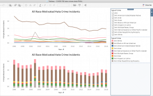
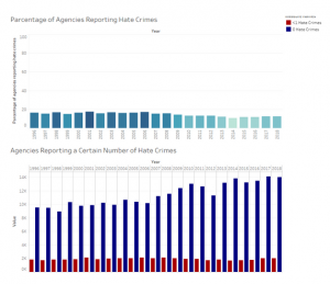
Figure 1: Tableau visualizations
Brian used Excel for his visualizations. Though it is more straightforward to use, Excel lacks the flexibility of changing the visual channels of data and is far less useful and sophisticated than Tableau. Tableau made it easy to create and manipulate different kinds of idioms, while Excel lacks any kind of interactivity. Still, Excel was helpful in the creation of new – albeit simple – charts that could effectively express less complex data points (Figure 2).
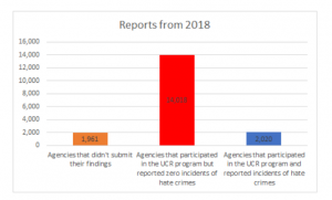
Figure 2: Excel graph
We used Canva to create the rest of our visuals. Of all the services that were suggested to us, we found that Canva was the most user-friendly and eye-catching platform for successfully creating the kinds of visuals we wanted for this project. It was also the easiest to access, as we could easily sign up for a free trial upgrade that gave us full access to the tool – something that other platforms did not seem to easily offer. We created our own set of visuals based on the research we had conducted and agreed to use a fairly subdued palette of black, white, grays, and red (for the most part). Canva’s attractive and easy-to-use templates made designing our visuals much easier, and we were able to use a mix of Canva’s graphic elements (Figure 3) and elements imported from Excel files.
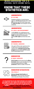
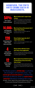
Figure 3: The first and final draft of the same infographic; Canva made editing and transforming this data easy and fun to manipulate
We considered the principles of expressiveness and effectiveness when designing our visuals. Our visuals are expressive in that they visualize the facts in a clear and accurate way, with many explanatory notes to fully contextualize the data. To create the Tableau graph of aggregated hate crime data, color gradients, clear labeling, and clarifying details were included to ensure that the data can be accurately and easily interpreted. It is important to see each group’s individual statistics and compare them all against each other, so two different charts addressed each of these goals. A line chart and a bar chart of the same statistics were made to show different ways of visualizing disparities among the groups, and the dashboard links these two graphs to make these comparisons even clearer. For data points that could not be visually expressed, explanations were included. For example, there are no “Anti-Arab” crimes from 1996 to 2015 because data was not recorded for this group until 2015, so that is denoted on the first table.
Similar principles were considered in creating the static graphs. For example, the “Law Enforcement’s Failure to Report and Record” slide uses a bar graph to show how many U.S. government agencies reported their hate crime data to the FBI and, of those who reported, how many agencies reported no hate crimes in their jurisdiction. A year-by-year breakdown of these figures is provided in a separate table, proving that the apparent decrease in reported hate crimes is from a decrease in hate crimes but an increase of agencies that did not report any hate crimes. These tables display information that underscores important themes in our narrative: most government agencies do not keep good records of hate crime reports, and these agencies often fail to send them to the FBI even when they do keep good records.
We sought to create effective visuals through identity channels such as size and color; specifically, we increased font sizes, bolded words, and tweaked the luminance and contrast as needed to make the graphics more readable and visually engaging. Colors were crucial to distinguishing the datapoints in the Tableau tables while also making them more visually impactful. Linking data created a “pop-out” effect, highlighting the data that someone clicks while graying out the other datapoints. On the “Law Enforcement’s Failure to Report and Record” chart, the most significant piece of data – that most agencies report zero hate crimes – is given the largest bar on the graph and encoded with the brightest color to create a pop-out effect. Finally, we used consistent design elements throughout the visuals, such as highlighter-style markings, to help strengthen the unity narrative (Figure 4).
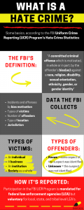
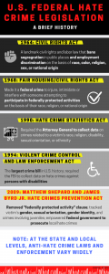
Figure 4: Infographics with the same highlighter motif
There are many advantages as well as disadvantages to using graphs and textual visuals as tools for storytelling and communications. If you are trying to present number-driven data, the average user is likely to feel overwhelmed or bored by rows of monotonous text and numbers. An interactive dashboard or colorful pie chart can communicate this data and its analysis in a simple yet dramatic manner, visualizing abstract ideas in a way that illuminates trends and discrepancies that may not be obvious (or interesting) otherwise. If done properly, these visualizations can present data in a memorable way that may change someone’s way of thinking about that topic. Furthermore, this mix of visualizations can help complement and reinforce the data that is being presented. For example, the data presented in the “Law Enforcement’s Failure to Report and Record” graph is very simple compared to the voluminous data presented in the Tableau interactive visualizations, which give nuance to how this story is being told. Collectively, they share different aspects of the complexities of hate crime data collection that highlight the many flaws in this system.
What these visualizations cannot do, however, is provide specific context that would help humanize these numbers and facts. Interviews with survivors, social justice groups, and law enforcement would add much-needed nuance to this project and perhaps some answers to questions that were unable to find the answer to, such as: what prompted the name changes and additions to “Race/Ethnicity/Ancestry?” Are Asians less likely to report hate crimes than other groups? What exactly is the FBI doing to encourage (or enforce) the reporting of hate crime data?
Though they aren’t capable of conveying the enormity of someone’s lived experience, we hope that our information visualizations tell a clear story about how problematic the FBI’s hate crime data is, how it disadvantages minority communities like Asians, and how we should be more critical of federal datasets that may not be telling the full story.
ARTICLE REFERENCES:
Chen, J. (2017, February 17). First-Ever Tracker Of Hate Crimes Against Asian-Americans Launched. NPR. Retrieved from https://www.npr.org/sections/codeswitch/2017/02/17/515824196/first-ever-tracker-of-hate-crimes-against-asian-americans-launched
Federal Bureau of Investigations (FBI). (n.d.a). FBI – About Hate Crime Addendum 2012. Retrieved Jun 16, 2020 from https://ucr.fbi.gov/hate-crime/2012-addendum
Federal Bureau of Investigations (FBI). (n.d.b). FBI – Hate Crime. Retrieved Jun 16, 2020 from https://ucr.fbi.gov/hate-crime
Mathias, C. (2020, May 23). Study: White Supremacist Groups Are ‘Thriving’ On Facebook, Despite Extremist Ban. Huffington Post. Retrieved from https://www.huffingtonpost.ca/entry/facebook-white-supremacist-groups-tech-transparency-project_n_5ec82f17c5b6423c5ca9aa94?ri18n=true
Schwencke, K. (2017, July 31). Confusion, fear, cynicism: why people don’t report hate incidents. ProPublica. Retrieved from https://www.propublica.org/article/confusion-fear-cynicism-why-people-dont-report-hate-incidents
Shanmugasundaram, S. (2018, April 15). Hate Crimes Explained. Southern Poverty Law Center. Retrieved on Jun 16, 2002 from https://www.splcenter.org/20180415/hate-crimes-explained
Thompson, A. & Schwencke, K. (2016, November 15). Hate crimes are up – the government isn’t keeping good track of them. ProPublica. Retrieved from https://www.propublica.org/article/hate-crimes-are-up-but-the-government-isnt-keeping-good-track-of-them
VISUALIZATIONS:
(Links will open a PDF file)
Final Presentation (all files combined)
Individual vis:
Hate crime definition: clarification
Different definitions of hate crimes
What does this hate crime data look like?
Police Bias in Defining Crimes
Reasons for Police Misreporting
More Reasons for Police Misreporting
Law Enforcement’s Failure to Report and Record
Anti-Asian Hate Crimes: 2018 Spotlight
Highlighting data inaccuracies: victims aren’t reporting
Why do victims choose not to report hate crimes?
Recent Anti-Asian discrimination
Address the Reporting Gap/Create Your Own Database
REFERENCES FOR VISUALIZATIONS:
Bibliography (Choie)
Bibliography (Mayne)
Bibliography (Wood)