After having taken GEOB 270, I can analyze spatial data using ArcGIS and create professional-looking maps that demonstrate the results of the analysis and contain information that can be used to influence decision-making. I gained new computer-based technical skills applicable to geography concepts I’m learning in other courses along with other parts of my life. Being able to make spatial information more accessible by presenting it as a map, and to come up with answers to geographic problems using the skills learned in this course will likely be very valuable in my future and is exciting to me now.
Author: Emma Sherwood
2nd year science student pursuing a major in Geographical Sciences.
Canadian junior national team orienteer.
UBC quidditch TSC athlete and fundraising executive.
From Calgary, AB.
Final Project Reflections
For our final project, we did a GIS analysis to find the best areas in Greater Vancouver to make an orienteering map of. Orienteering is a competitive sport where participants navigate between checkpoints in diverse terrain (in this case, parks or forests) at running speeds, using a map and compass. As a 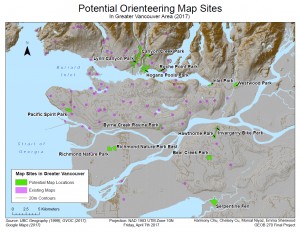 competitive orienteer and member of the Greater Vancouver Orienteering Club, this project was super exciting to me! Our analysis was based on park type, accessibility by roads and transit, not being at the same location as an existing map, and area size. We found data from the UBC Geography G:Drive and a couple online sources, imported it into ArcGIS and performed a variety of analyses to narrow it down to 14 potential areas. These areas were all large, accessible park areas that had not yet been mapped. We summarized our findings in this map , this report, and this flowchart. We also included some maps of the steps we took to get to our final map: 1 2 3 4 5 6 7 8 9.
Initially, I was concerned about this being a group project because I expected complications with sharing versions of files or having disagreements about what steps to take or creative processes. Luckily, none of these turned out to be issues and it turned out to be quite beneficial to have multiple group members. We ended up all working on map and analysis in ArcGIS together, on one group member’s account. This was good because often we wouldn’t all know what the next step to take was, how to add a layer, how to use a certain tool or some other challenge, but a different group member would. We all had different strengths such as problem-solving, technology, logic, or being able to explain things well which ended up allowing us to be able to figure out the vast majority of the difficulties with the project on our own. Since we all had worked on it together and so all knew the steps we took and why, we could divide up the written report fairly equally write our own parts, and then read through and check others for errors or omissions. While some people did end up writing larger parts then others, I believe it was still close to as fair as it could have been.
I learned a lot during this project! I learned some new GIS skills, such as how to combine adjacent polygons into just one polygon so that you can calculate their area as a single object. I also learned how to properly save the layers we made so we didn’t have to redo everything we’d done last time, like I’d done twice in lab 5! It was also interesting to be able to see how the knowledge I’d learned in the GEOB 372 cartography class this semester helped me with the GEOB 270 class. I hadn’t realized how much more the other group mate who had taken 372 and I knew about map design then our peers. On the other hand, several of the people I was working with were a lot quicker at finding and doing easier commands such as clips and buffers, or better at managing the database, then I was. This was honestly one of the first group projects I’ve done where every person made a very positive impact on the project.
As a follow-up, I sent our final map to one of the Greater Vancouver Orienteering Club executives. He said he is going to check the areas out by satellite imagery or in person, and then make a new orienteering map for a competition in the future if any of them work out. I’d likely race in the competition. It’s super cool to see how the things we learn in class can actually have direct applications for things in my person life and potentially result in real changes.
Lab 5: Planning a Ski Resort: Environmental Impact Assessment (EIA)
Map & Memo
In this lab, I did an Environmental Impact Assessment for a potential ski resort. As part of this lab, I produced a map showing four different types of 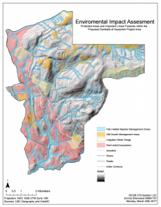 protected areas along with base data showing elevation (also symbolized with a hill shade), rivers, roads and an approximate snow line. I then wrote a memo explaining the steps I took, my results, and recommendations, from the perspective of being an actual natural resource planner. The memo I wrote is as follows:
The Garibaldi at Squamish project is a proposed mountain resort situated between Vancouver and Whistler. As a natural resource planner retained by BCSF, I have analyzed several aspects of this project including protected vegetation, fish and wildlife habitat and provided my results and recommendations below.

In this analysis, I found and imported data related to protected areas along with elevation data, the project boundary and linear features such as rivers and roads. Ungulate areas and old growth forest management areas were simply imported from DataBC into the map. Areas with red-listed ecosystems were selected based on the terrestrial ecosystem mapping information. Areas with specific biogeoclimactic units along with soil moisture and nutrient regimes are known to contain red-listed ecosystems, and those were selected and added to the map. Please consider the first map for further information about areas with red-listed species, shown based on a common species to that red-listed area type. For the riparian fish zones, a buffer of protected area was added around the river information. This buffer extended 100m on either side of streams with an elevation of less than 555m, and for other streams was 50m from streams. All four of these protected area types were then combined into one layer to calculate the total area they cover without overlap. I also analyzed how much of the project area is less at less than 555m of elevation based on a DEM. This is all summarized in the second map with a background hill shade added to facilitate understanding of the slopes on the map.

The results found in this assessment were that 52.62% of the project area is covered by one or more of the following types of protected areas: old growth management areas (6.78%), red-listed ecosystems (24.82% including 6 types of red-listed ecosystems), ungulate winter range (7.98%), or fish habitat riparian management zones (26.02%). The listed percentages of each protected area type add up to more than the total protected area percentage as there are several locations that are protected for multiple reasons. Of the total project area, 29.93% is below the snow line of 555m elevation and so would potentially not have enough snow for reliable skiing. The proposed resort is not in any parks. There are several roads leading to and within the proposed project boundary, meaning access would not be a big issue.

I believe that the two greatest environmental concerns associated with this project are the old growth management areas and the fish habitat.

Although there is a very large proportion of area with red-listed ecosystems, most of these areas are below the snow line and therefore would not be very useful for the resort anyways as there is potentially not enough snow. These areas could therefore be avoided with minimal losses in success of the resort. Were the resort to want to do something besides ski runs in the area (as it is proposed as a year-round resort) this would be extremely detrimental and destroy a very large amount of red-listed ecosystems area.

Although the fish habitat has smaller buffer areas above the snow line, there is still a lot of buffer area above the snow line that would be problematic. Additionally, these areas are spread across the whole area evenly so it would be difficult to develop large swathes of forest without these areas getting in the way. A solution would be to leave these areas as forest because normally people would not ski in the gullies anyways, but to go laterally across the hill overpasses may need to be built over the streams. The ungulate winter ranges are also considerably important because they cover 7.89% of the project area including a considerable part above the snow line. Additionally, these animals will be negatively affected by fragmentation so although it could be legal to alter forests surrounding these areas, it would still not be good for the animals. Ungulate areas are less of a problem though, because they are almost all on the edge of the area so could be not included in development.

The old growth management areas are importantly detrimental because they are small sections scattered throughout the project area. They are also very close to a number of fish habitat buffer areas. They would interrupt a lot of ideal runs, especially in the northern half or the proposed project areas, disrupting ideal planning for skiing. Nonetheless, with careful route planning, these could be avoided (since they are all quite small areas), but not without harming the Garibaldi at Squamish resort’s success.

In conclusion, I would recommend BCSF to continue opposition to the project. Not only is a large section of the project below the snowline (and also almost entirely covered by protected areas such as areas with red-listed ecosystems and river buffers for fish protection), but over half of the total project area is covered by protected areas. It would be quite difficult to successfully plan runs avoiding red-listed ecosystems, ungulate winter range, old growth management areas and river buffers for fish protection as they (particularly the last two) are scattered across the project area intersecting most ski lines down. Even if permissions were granted to disrupt those lines, there would still be many plants, animals and ecosystems that would be harmed. Even if the areas were avoided, fragmentation because of the ski resorts along with other nearby human impacts such as noise would still be detrimental to those species.
Ethical Issues
I personally do not believe this project should be allowed to continue because as explained above, more than half of the project area is covered by old growth forests, red-listed ecosystems, ungulate habitat (in winter), or fish habitat. I believe it would be impossible to build a successful ski resort without harming these threatened species and ecosystems, and that these sensitive areas should not have to be sacrificed for economic gain and the creation of another ski resort near to where several others already exist. In general, I tend to value the environment over the economy. This does not differ from what I wrote in my memo (that BCSF should continue to oppose the project). Had my opinion differed from the likely opinion of the company that hired me, this could have been an unethical conflict of interest. I would have been very uncomfortable writing an actual memo in support of the project, given the evidence, however hypothetically it would not be impossible to provide enough evidence to satisfactorily claim either side of the issue.
Accomplishment Statement
Created an informative and polished map demonstrating potential environmental impacts of a ski resort.
Lab 4: Housing Affordability
In this lab, I learned about how to classify quantitative data and the ethical implications behind it. I looked at several different 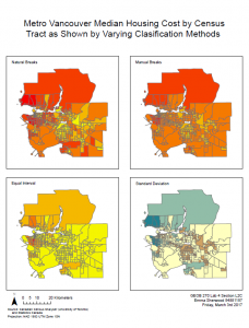 classifications for data related to housing, and created a series of maps comparing them. I also wrote the following response to a question asking about which classification systems would be better in which situations, and ethical issues relating to classification and data source.
Were I a journalist, a narrative I might want to tell is how problematically high Vancouver housing costs are. If I wanted to demonstrate this, I would use Manual Breaks as it seems like the largest number of census tracts in that one are red and dark orange. It makes Vancouver seem very problematically and news-worthily expensive.

If I were a real estate agent, I would likely want to make Vancouver, or the specific area of Vancouver look less expensive. As such, I would likely choose Equal Interval method as there is less red/expensive seeming housing on that map. The area near UBC is also shown as mid-range in the colors and therefore seems mid-range in price. Another option would be using the Standard Deviation map which also shows UBC area housing as not insanely expensive. The other two maps both show UBC as belonging to the most expensive classes.

There are certainly ethical implications of classification method choice. As explained above, varying classification method can make the map as a whole, or areas of the map seem more or less expensive (for example). Ultimately, the map maker must choose a classification system and can use this to show what they want to show, but this bias would be difficult or impossible to eliminate.

While the housing costs and incomes from 2011 are probably very different than the 2017 incomes and housing costs, and for that reason it is problematic to use that data, there is no more recent complete data out because the 2016 census has not yet been released. As such, there is not much else that can be done besides using the 2011 data so even though it is old and would be giving problematically out of date information, it is the only option and so must be used.
The choice of classification system in this case makes a huge difference in how housing costs are perceived and as such is an ethical issue.
Another outcome of this lab was a map comparing housing affordability in Metro Vancouver and London, Ontario.
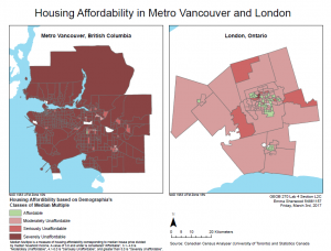 Housing affordability is a measure of housing cost compared to income. In this case, I used Median Multiple which is a measure of housing affordability corresponding to median house price divided by median household income. This is a better indication of how affordable houses are than simply the cost of housing because if someone has a higher income, the same housing is less comparatively expensive or a lesser proportion of income. The relative cost of housing actually shows a persons ability to buy a house, whereas the cost alone does not.
The housing affordability rating categories used when making this map were from the Demographia International Housing Affordability Survey. They are four categories, ranging from Affordable to Severely Unaffordable based on the mean multiple, which is median house price divided by median household income. The category names are attached to mean multiples of 3.0 & Under, 3.1-4.0, 4.1-5.0 and 5.1 & Over. This means that for any map, there could be any number of data points in that category. The two middle categories are equal, but since the data points could hypothetically range from just above zero to infinity, the range of the first and last categories are not equal to the other two. Nonetheless, for creating a standardized set of categories, they did a decently credible job. Since they couldn’t use classification by natural breaks, quantiles or standard deviation, because there is no one set of data it will be used on, the only other option is equal interval or manual breaks. Manual breaks would be more arbitrary than choosing a precise interval. Inherently, at least the top class cannot be capped. Based on the maps of Metro Vancouver and London, they chose to have classes that made sense for displaying what might be regular values while still showing enough detail in the differences. I believe they are trustworthy because they chose the best possible classification method for the categories they had to make.
Although housing affordability provides some interesting information about what it’s like to live in a certain area, it is not a good measure of overall livability, or how suitable an area is to live in. There are a lot of other things to look at such as education, accessibility, or life expectancy; affordability only shows a little information about economic factors.
Accomplishment statement
Demonstrated the effects of various classification systems on map interpretation and created a map comparing housing affordability between two cities using an appropriate classification system.
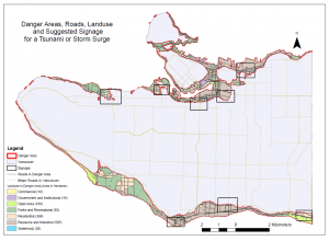
Lab 3: Planning for a Tsunami (or Storm Surge or Sea Level Rise)
In lab 3, I did a GIS Analysis to determine areas in Vancouver that would be at risk of danger from a storm surge, tsunami or sea level rise. In this lab, I created two maps, one of the danger area in Vancouver along with land use in those areas, locations where signage is needed, and roads,
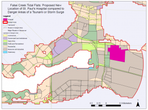
and one of the dangerous area around the proposed new location of St. Paul’s hospital.
I also determined which education and health facilities were in the danger area. They were as follows:
HEALTH
- Villa Cathay Care Home
- Broadway Pentecostal Lodge
- Yaletown House Society
- False Creek Residence
EDUCATION:
- Emily Carr Institute of Art & Design (ECIAD)
- Henry Hudson Elementary
- False Creek Elementary
- St Anthony of Padua
- Ecole Rose des Vents
In order to find this, I selected by location to select features (of the facilities) that intersected the layer I had created of the danger area. I then created a layer of the selected features, and opened the attribute table of the layer to find their names. I did this with both education and health.
In this lab, I also discovered that the entirety of the new site for the St. Paul’s Hospital is within the danger area. This means that the area is less then 10m above sea level and less than 1 km away from the shore, so it would be very likely be damaged by a flood, which is very concerning given the importance of hospitals and expected difficulties with their evacuation.
Accomplishment statement
Used tools in ArcGIS (edited features, created buffers, selected by location, intersected layers and converted between raster and vector data) in order to analyze potential flood hazard zones.
Lab 2: Understanding Geographic Data
In lab 2 we learned about using ARC GIS to interpret geographic data.
Fixing misaligned and improperly referenced spatial data is critical for producing maps using GIS. ArcCatalog allows management of files and to preview them including seeing the spatial reference information.
Geographic coordinate systems are a 3D coordinate system in which every location on the globe has a specific coordinate designated, generally, by numbers. Projected coordinate systems are a 2D approximation of an area and coordinates so that it can be visualized on a map. Each projected coordinate system also has a geographic coordinate system because in order to make a 2D approximation of a 3D world, you must define starting points where it matches the real 3D world, in this case using a geographic coordinate system.There are two types of possible projection processes. The Projection-on-fly process visually shifts spatial coordinate systems so that map layers seem like they line up. This is useful for looking at maps (such as displaying or printing them), but not dealing with data from maps as it doesn’t actually change any of the data. Projecting a layer using the ArcToolbox Projections and Transformations tools actually changes the data to create a new/different layer with data in a new coordinate system. This allows for calculations and other data manipulations to be done on the new data.
Remotely sensed data allows for precise information about large areas to be taken with relative ease. Landsat data is very useful for geographic analysis because it consists of very frequent satellite images taken across the entire world, with each area being captured every 16 days. It can be used to create colour images, or false colour images which highlight differences in ground cover such as between water, vegetation or dry soil. It has a huge variety of uses, for example in analyzing floodplain migration.
Accomplishment statement
Acquired skills in GIS relating to (among others) map projection and analysis of Landsat data in scenarios including results of natural disasters.
The year ahead: 2017
I’m really looking forward to this year! Here’s what’s coming up:
ACADEMICS
Starting in January, I’m taking two geographical sciences courses: GEOB 270 (Geographic Information Systems) and GEOB 372 (Cartography). Both have very practical applications related to making maps, the first including data associated with maps.
I’m also taking MATH 200 (multivariable calculus), EOSC 222 (geological time and stratigraphy) and ENGL 110 (literature), all of which I’m excited for.
I’ll be starting my 3rd year in September.
CAREER
I’m hoping to get a job back in Calgary in May and June, either working at Riverwatch (teaching kids about sciences as we raft down a river), or teaching orienteering to school groups.
SPORTS
I’m really looking forward to Junior World Orienteering Championships this July in Finland. The terrain should be really interesting. I’m training super hard as it is my last year of eligibility for JWOC. My goal is to place top 90 in every race. I’m also excited about Canadian Orienteering Championships in Ontario.
I’m continuing to play TSC Quidditch, including my role as the fundraising officer. I’m super excited for nationals this year, in Victoria at the beginning of April.
Drivers
Increases in human population
Food production (All pressures)
Increasing global population has led to an increase in the demand for food (WWF, 2014); this results in conversion of land for agriculture, increase in greenhouse gas concentrations including the production of methane by livestock, crossover of invasive species from agriculture, and direct overexploitation of plants and animals for food. Food production leads to increase in nitrogen pollution by a variety of mechanisms including fertilizer, growing certain crops including soy, or flooding fields for rice (Cain, Bowman, & Hacker, 2014, pp. 576-577).
Infrastructure (Habitat loss and overexploitation)
Growing populations result in residential and commercial development and related consumption demands. These demands lead to habitat change (i.e. road building resulting in fragmentation or conversion of forests into urban areas), along with overexploitation of resources such as wood for construction (WWF, 2014).
Energy (Climate change, pollution, and habitat change)
The use and production of fossil fuels leads to production of CO2, a greenhouse gas, along with air and water pollutants (Covert, Greenstone, & Knittel, 2016). Habitat loss can also be attributed to energy production, for example in dam construction or mining (Rosser & Walpole, 2012).
Increases in global economic activity
Globalization (Invasive species)
Global economic activity has increased by a factor of seven in the past 50 years and is expected to continue; a facet of this, globalization, increases interdependence and removes regional barriers. The associated increase in trade and travel results in the spread of invasive species (Millennium Ecosystem Assessment, 2005).
*Words in parenthesis in the sub-titles indicate the major pressures that the drivers influence.*
Pressures
Habitat Change
Habitat degradation
Habitat degradation is human-caused change (e.g. logging) that reduces habitat quality for certain species. As it affects some species more than others, it results in changes in evenness and thus a loss of biodiversity (see 3.1). Habitat degradation also leads to increased venerability to invasive species (Cain, Bowman, & Hacker, 2014, p. 530).
Habitat fragmentation
The effects of habitat fragmentation, the division of originally continuous habitat into smaller, separated areas due to human impacts such as road building, as per the island biogeography theory, depend on island size and separation distance. Larger ‘islands’ or fragments, that are closer together, will have higher species richness than smaller, more isolated fragments (Cain, Bowman, & Hacker, 2014, p. 420). This is because smaller habitats cannot support species that require a larger range, or as many individuals as larger fragments. A locally declining population is more likely to be resuscitated by a closer nearby population. Furthermore, habitat fragmentation results in isolation, meaning that species cannot disperse across a landscape in order to find resources. Finally, more fragmented areas have higher proportions of edge areas that have differences in climate and where access is easier for invasive species and pollutants (Rei, et al., 2010).
Habitat loss
Habitat loss is the complete conversion of habitat into other use areas by humans, leading to loss of entire ecosystems and death of organisms previously inhabiting the area. It has been uneven between ecosystem types, for example effecting 50% of wetlands in the 20th century (Rosser & Walpole, 2012). Cultivated systems such as livestock production areas cover at least quarter of the earth’s terrestrial surface and 10-20% more grassland and forestland is expected to be converted by 2050 (Millennium Ecosystem Assessment, 2005).
Climate change
Climate change, a DPSIR pressure on biodiversity, leads to extinctions because species (especially specialists) are unable to adapt to rapid changes in temperature, shifts in climactic zones or extreme weather events such as droughts and floods (Omann, Stocker, & Jäger, 2009). These changes in climate can lead to deaths due to trauma from extreme conditions or decreases in water availability and quality (Millennium Ecosystem Assessment, 2005).
Invasive species
Invasive alien species (introduced, non-native species with growing populations that have large effects on communities) can result in large declines or extinctions of native species by either out-competing them, preying on them, or changing the properties of the ecosystem around them (Cain, Bowman, & Hacker, 2014, p. 530). Additionally, diseases can cross over from domesticated animals, leading to deaths in wildlife.
Overexploitation
Overexploitation, harvesting at a rate not sustainable for the population, leads to species extinctions and thus a loss of biodiversity as above. Harvesting food and other resources for fueling a growing population, from a diminishing natural area is one example of this, but it can also include harvesting live or dead animals for trade, or overhunting. Rare species can become more sought after, raising their value and leading to an overexploitation vortex towards extinction (Tournant, Joseph, Goka, & Courchamp, 2012). Overexploitation can also lead to habitat degradation (Cain, Bowman, & Hacker, 2014, p. 531).
Pollution
Pollutants cause physiological stresses on organisms along with habitat degradation and biodiversity loss. For example, persistent organic pollutants such as DDT or flame retardants get bioaccumulated and biomagnified, causing immune, reproductive, and developmental problems in mammals (Cain, Bowman, & Hacker, 2014, p. 533). Human-caused increases in pollutants are considered one of the most important pressures on terrestrial ecosystems; their importance is expected to increase in the future. (Millennium Ecosystem Assessment, 2005). More biologically available nitrogen is now produced by humans than nature; the deposition of nitrogen into terrestrial ecosystems leads directly to lower plant diversity. Phosphorus has similar effects to those of nitrogen; its use has tripled between 1960 and 1990 (Millennium Ecosystem Assessment, 2005).
*These pressures all lead directly to the state of terrestrial biodiversity: general biodiversity loss, (or to deaths and extinctions of individuals or populations, which constitutes a reduction in biodiversity due to loss in species richness, changes in distributions of species, or resulting ecosystem collapses).*
State
Measurement
In order to comment on the state of biodiversity, the methods of measurement of biodiversity must be outlined.
It is difficult to quantify biodiversity, or even the rate of biodiversity loss for several reasons. To start with, as per the definition, biodiversity ranges from genetic differences between species up to global scales. For example, it can be said that there are four defined levels of biodiversity in ecology[1].
Measures of local or alpha biodiversity can be calculated via several different indices. This could include species richness, the total number of organisms present, or other indices such as the Simpson Index, Shannon-Weiner index, or the Evenness index, which include not only the number of species present but also factors such as how similar the abundance of each species, in order to account for communities with very large numbers of organisms of few species not being very diverse.
Although species richness can be estimated on a global scale, it fails to give the whole picture as it ignores beta diversity and so doesn’t accurately represent effects such as biotic homogenization (see 3.2).
A further complication is that the very large, unknown number of species on the planet is difficult to estimate, and it is challenging to determine with certainty that a species is globally extinct. Nonetheless, for certain groups of species with more complete data, estimations can be made. For example, species extinctions in mammals and birds now happen at a rate of about 1 per year, which is quite extreme compared to a natural ‘background rate’ of the expected natural extinctions (derived from fossil record data) of 1 extinction per 200 years (Cain, Bowman, & Hacker, 2014, pp. 524-525). Nonetheless, including only extinctions as indicators of biodiversity loss is flawed because it omits smaller-scale biodiversity losses (i.e. if a species is only extirpated).
Several scientific studies have tried to estimate global biodiversity. For example, the PREDICTS database is a meta-analysis of studies with data pertaining to local-scale biodiversity across the planet and how it is effected by anthropogenic pressures (Hudson & Newbold, 2014). Another example of an attempt to estimate global terrestrial biodiversity uses extrapolation of data from local richness and measures of complementarity[2] (Colwell & Coddington, 1994).
Worldwide trends
Biodiversity loss has already exceeded its planetary boundary[3] (Rockstrom, et al., 2009)
By pressure
Human activities, especially conversion and degradation of habitats, are causing global terrestrial biodiversity declines (Newbold, et al., 2015). The effects of the pressures on biodiversity (see 2.1-2.5) and their effects in the past century along with their current trend are outlined in the following table:
Table 1: Historical and current trends in impacts on biodiversity by pressure in selected terrestrial biomes (After Millennium Ecosystem Assessment, 2005)
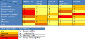
From Table 1, it is clear that in the past, habitat loss has had the most high or very high effects biodiversity in terrestrial biomes. Those effects are generally expected to stay relatively constant. Contrastingly, climate change has primarily had low effects in the past but those effects are expected to rapidly increase in all terrestrial biomes.
Species loss
The earth is losing species at an accelerating rate (Cain, Bowman, & Hacker, 2014, p. 524). According to the WWF’s Living planet report in 2014, there has been a sharp decline in biodiversity, marked by a 39% decrease in terrestrial species between 1970 and 2010 (WWF, 2014).
Figures from Newbold et al. 2012 show a steep loss in biodiversity (by the species richness index) starting in the mid-1800s. Predictions take into account different changes in land use, climate and human population sizes, and show either a continued loss or a lessened net richness change; however, no predictions show biodiversity returning near pre-1800s levels. A map from Newbold et al. 2012 demonstrates that, similarly to how biodiversity is not constant around the world, local biodiversity loss varies by location, dependent upon driving factors and pressures.
Biotic homogenization
Biotic homogenization is when groups of species become dominated by a small number of pervasive species and is an example of a loss in biodiversity ignored when considering only species richness. It is the result of humans having diverse impacts on species: some positive leading to the expansion of certain species, some negative leading to the decline of certain species. (Millennium Ecosystem Assessment, 2005).
[1] This includes alpha diversity, or diversity at a community scale; beta diversity, the difference in species between communities; gamma diversity, species diversity at a regional scale; and finally, global biodiversity (Cain, Bowman, & Hacker, 2014, p. 406)
[2] Related to beta diversity
[3] Planetary boundaries are thresholds which, if surpassed, result in unacceptable environmental change impacts on humans (Rockstrom, et al., 2009)
*The sharp decline in biodiversity including biotic homogenization and loss of species richness leads to many negative impacts on humans and the environment*