Illustration
The illustrator of the book is French artist Albert Decaris, who engraved over 500 postage stamps for the French and French colonial postal services, and also illustrated many classics including Euripides, Don Quixote and Homer. He was born in a Normandy village in 1901. He started to study engraving and etching since 1915 and in 1919, at the age of 19, he won the Concours de Rome, the most priced award for young artists in France at the time.
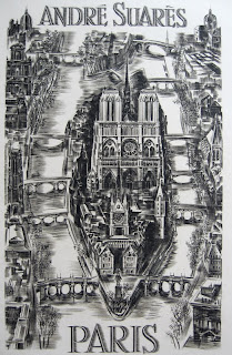
Throughout his lifetime, he illustrated more than 200 books with steel and copper engraving. In just one novel Don Quixote, he did more than 400 plates. He has other 6000 engravings with some that are big enough to be hung in the church. No doubt that he was attributed to the Master Engraver of France in 20th century.

This cock stamp is one of the most iconic stamps in France, made in 1962.

In 2001, to mark the birth centenary of Decaris, Claude Jumelet designed this stamp.
The style of Decaris’ artwork is described to be “a mix of classicism and audacity”. Some people find it too stark and his works don’t change much once he set the tone. Yet he was also an all-round artist who can depict everything from architecture, landscape to portraits and historical scenes.
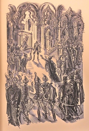
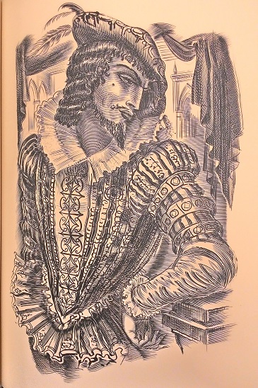
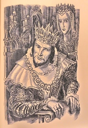
In Four Plays of Christopher Marlowe, Decaris made 16 copper engravings. And I will share some of my favorites below. Decaris’ engravings are lively and eye-catching yet pertain many details. The black and white illustration looks everlasting as an enduring classic, just like Marlowe’s words.
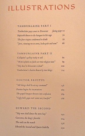
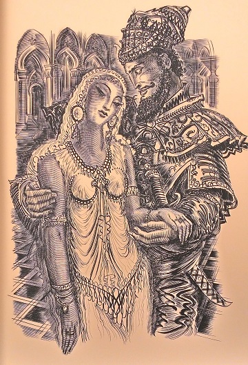
p 12: The first illustration of the book and the play. It portrays the scene of Tamburlaine courting Zenocrate.
p 52: Tamburlaine puts Bajazeth, Emperor of the Turks, in a cage and feeds him scraps of food.
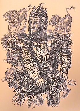
p 63: This is the first illustration I saw and probably the determining element of my immediate love of this book. The portrait captures the confidence and valor of Tamburlaine perfectly.
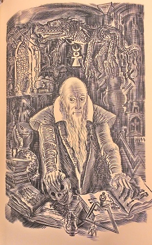
p 148: The first illustration for Doctor Faustus.
p 204: Gaveston, Edward II’s favorite subject.
p 252: The final illustration of the book and the play. I find it corresponds to the first illustration, the courtship of Tamburlaine and Zenocrate, yet Edward II and his queen Isabella don’t share the love like Tamburlaine and Zenocrate.
Binding
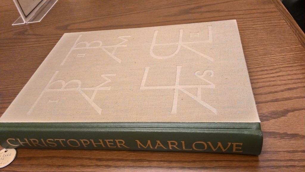
Described by Adrian Wilson, the designer of the book itself, the binding includes the spine in olive green leather, gold stamped, on which the name of the author is written and the front blind stamped with the designer’s devices cut in wood by Fritz Kredel. The devices are medieval monograms drew by Adrian Wilson, with initials and numerals of each play. They are enlarged to occupy the entire front cover on natural linen fabric.
The whole production was put together by Russel-Rutter Company of New York, directed by Willian Fortney.
Type Face
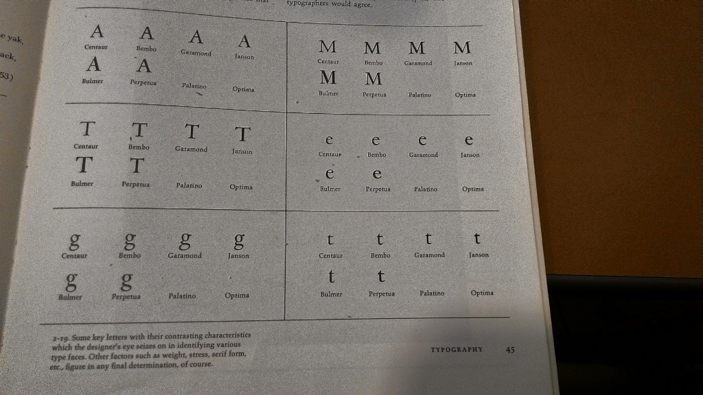
For the text, Adrian Wilson chose Bembo type, one of the oldest type which was originally cut by Francisco Griffo in 1495. Carolus type is used for the main title lines, and it was designed by K. E. Forsberg in 1954. They are a series of capital letters with clearly-shown pen-drawn origin. Interestingly, I find Carolus type similar to the hand writing on some medieval manuscript, echoing the context of the plays in Elizabethan period.
Adrian Wilson compares Bembo and other types in his book, The Design of Books.
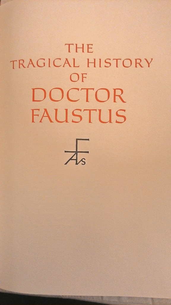
The Title Page of each play.

The Text in both Bembo and Carolus type. (Photo credit to The George Macy Imagery)
Printing
According to Wilson, the text was printed by The Thistle Press, New York. And the illustration was printed by M. Beaune in Créteil, France, which is not far from the studio of Decaris and allowed him to watch over the work personally. Yet in the monthly letter, it is written that “The printing task was taken by Clarke and Way of New York. The laid stock was made by the Curtis Paper Company of Newark, Delaware, to complement the paper made in France for the hand printing of the engraving of M. Decaris.” I don’t have a third source to determine which one to believe. The Thistle Press and Clarke and Way are apparently not operating any more when I tried to search them online.
Reference
2. Wikipedia entries: Albert Decaris

