Multivariate Cluster Analysis
Note: Cluster 2, which was initially generated, was omitted on the map because of lack of census tracts belonging to that cluster.
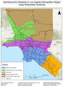
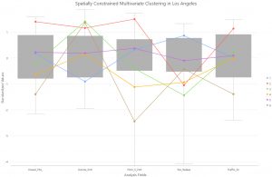
These maps and boxplots show communities with different relative amounts of air pollutants. Each cluster can be classified in terms of the highest and lowest air pollutants. They can tell us about the local patterns of emissions in different parts of the cities. In Los Angeles, the blue cluster, indicating the highest toxic release and lowest ozone, includes Long Beach, which is an ocean port with industrial activity. The purple cluster includes Downtown Los Angeles, which means a larger volume of traffic emissions, hence the higher than average cluster. The green cluster has the highest ozone, which may be due to topography, with the area being bounded by mountains, resulting in air trapped in the valley. In the Bay Area, the orange cluster has high PM2.5, Diesel PM and toxic releases because it is an industrial region.
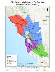
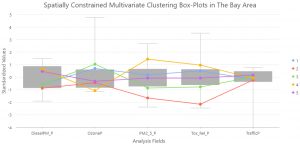
In the San Francisco bay area, the red cluster located mostly in the rural region has the lowest overall air pollutant concentration. The blue cluster that includes the inlet bays has a mid to high air pollution concentration. The orange cluster that includes the city of Oakland has the highest PM2.5 and Diesel PM. The purple cluster that includes San Francisco, San Mateo and San Jose has a medium overall air pollution concentration. The green cluster located in southern Santa Clara has the highest ozone.
Average Air Pollution Percentile
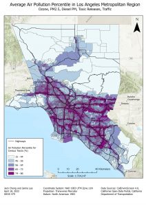
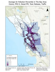
This metric describes the combined air pollution burden of ozone, PM2.5, Diesel PM, toxic releases, and traffic. In both the Los Angeles Metropolitan Area and the San Francisco Bay Area, we can see that a high air pollution percentile score closely aligns with census tracts that are in close proximity to highways within populated areas. Mountainous and sparsely populated areas have low air pollution percentile scores. A few census tracts did not have values because at least 1 of the 5 variables was missing a value in those tracts.
Exploratory Regression
Los Angeles Metropolitan Region
| Regression | Top Variable | R-squared | AICc |
| Asthma + Air Variables | Toxic Releases | 0.06 | 27929.23 |
| Cardio + Air Variables | Toxic Releases | 0.05 | 27634.69 |
San Francisco Bay Area
| Regression | Top Variable | R-squared | AICc |
| Asthma + Air Variables | PM2.5 | 0.09 | 16375.12 |
| Cardio + Air Variables | PM2.5 | 0.01 | 16120.38 |
**Note: For Cardio + Air, top variable would have been Ozone, which had R-square of 0.05, but the GWR model failed to run, so the runner-up, PM2.5, was selected as the candidate variable.
The top variable had the highest R-squared and lowest AICc. In LA, this was found to be toxic releases, while in SF, this was found to be PM2.5, in both asthma and cardiovascular disease regressions.
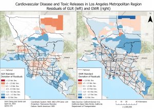
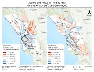
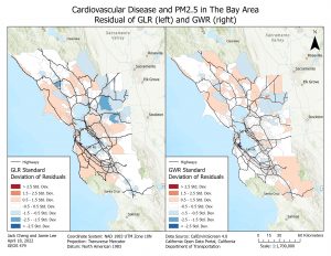
Regression Residuals
Spatial Autocorrelation for Asthma (LA)
| Value | GLR | GWR |
| Moran’s I | 0.329975 | 0.003994 |
| z-score | 165.956319 | 2.177482 |
| p-value | 0 | 0.029445 |
Spatial Autocorrelation for Cardiovascular Disease (LA)
| Value | GLR | GWR |
| Moran’s I | 0.282435 | -0.003032 |
| z-score | 142.073598 | -1.353940 |
| p-value | 0 | 0.175756 |
Spatial Autocorrelation for Asthma (SF)
| Value | GLR | GWR |
| Moran’s I | 0.239645 | -0.002176 |
| z-score | 55.675822 | -0.421506 |
| p-value | 0.000000 | 0.673386 |
Spatial Autocorrelation for Cardiovascular Disease (SF)
| Value | GLR | GWR |
| Moran’s I | 0.248781 | -0.002518 |
| z-score | 60.016187 | -0.527789 |
| p-value | 0.000000 | 0.597646 |
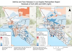
The mapping of residuals shows the degree of prediction and spatial autocorrelation. Overprediction is positive residuals while underprediction is negative residuals. From the maps, it can be seen that the residuals for GLR are more clustered and spatially autocorrelated, while the GWR residuals are more dispersed and fragmented. This is confirmed by the results of the spatial autocorrelation, with more positive Moran’s I values in the GWR model and Moran’s I values closer to 0 in the GLR model. The location of the GLR residual clusters between the two diseases are similar, with overprediction in primarily built-up areas and underprediction in less populated areas.
Note: SLR residual maps were not shown here because of unit issues. An attempt was made to import the residuals from the GeoDa output file to ArcGIS, but the map symbology would not allow for consistent symbology. But the SLR model values, including R-squared, AICc, and coefficients are included in the next section.
GWR coefficient maps
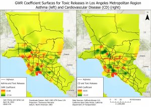
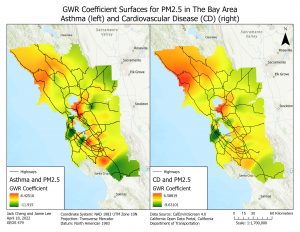
The coefficient surfaces tell us the degree of dependence between variables. A coefficient is essentially a rate of change, defining how much the dependent variable changes if the independent variable changes by 1. The positive and negative signs of the coefficients determine the direction of the rate of change (Princeton University Library).
In Los Angeles, there are many clusters of high coefficients, with the most concerning cluster in the Long Beach Port, which is home to an oil refinery. In the Bay Area, there are fewer patches of high coefficients and are more continuous. There is an anomaly that stands out, where there is a high correlation between PM2.5 and cardiovascular disease in a sparsely populated area. This could be related to other environmental factors such as forest fires, and the lack of sampling data.
Spatial Lag Coefficients
LA, Toxic Releases
| Asthma | Cardiovascular |
| 0.92 | 0.85 |
Bay Area, PM2.5
| Asthma | Cardiovascular |
| 0.68 | 0.62 |
The spatial lag coefficients, or Rho, tell us about how dependent the neighboring census tracts are on a particular census tract, and is also a measure of spatial autocorrelation (Matthew, 2006). In both cities, although the top explanatory variables are different, asthma as a dependent variable has a larger lag coefficient than cardiovascular disease as a dependent variable. This could be interpreted as neighbouring census tracts having a greater impact on the census tract in question for asthma compared to cardiovascular disease, showing greater spatial autocorrelation for asthma.
Tables of Akaike’s Info Criterion Values to Determine Model Fit
LA
| Variables | GLR | Spatial Lag | GWR |
| Asthma + Tox Release | 28034.43 | 23690.2 | 23145.87 |
| Cardiovascular + Tox Release | 27734.57 | 24965.1 | 24283.44 |
Bay Area
| Variables | GLR | Spatial Lag | GWR |
| Asthma + PM2.5 | 16375.10 | 15758.9 | 15368.66 |
| Cardiovascular + PM2.5 | 16059.77 | 15665.6 | 15359.27 |
Tables of R-squared Values to Determine Model Fit
LA
| Variables | GLR (Adjusted) | Spatial Lag | GWR |
| Asthma + Tox | 0.06 | 0.83 | 0.86 |
| Cardiovascular + Tox | 0.05 | 0.70 | 0.77 |
Bay Area
| Variables | GLR (Adjusted) | Spatial Lag | GWR |
| Asthma + PM2.5 | 0.09 | 0.44 | 0.56 |
| Cardiovascular + PM2.5 | 0.05 | 0.32 | 0.43 |
Tables of Coefficients
LA
| Variables | GLR | Spatial Lag | GWR |
| Asthma + Tox | 0.41 | 0.026 | -17.16 ~ 33.88 |
| Cardiovascular + Tox | 0.34 | 0.022 | -15.23 ~ 38.83 |
Bay Area
| Variables | GLR | Spatial Lag | GWR |
| Asthma + PM2.5 | 1.16 | 0.34 | -11.92 ~ 8.43 |
| Cardiovascular + PM2.5 | 0.37 | 0.11 | -9.63 ~ 6.59 |
All the above indicators tell us about the model fit. For Akaike’s Info Criterion, or AIC, the lower the value, the better the model fit. GWR consistently has the lowest AIC values for both cities and in terms of both diseases, followed by the spatial lag and GLR models, which have higher AIC values.
R-squared values are also an indicator of model fit, by determining the goodness of fit of the regression, with values ranging from 0 -1, and is the proportion of dependent variable variance accounted for by the regression model. GWR consistently has the highest R-squared value, followed by spatial lag and GLR, which have lower R-squared values.
As mentioned earlier, coefficients are the degree of dependence between two variables. In terms of the coefficients of all models, GLR has higher values than SLR. GWR coefficients are in a range so they cannot be compared to the other models.